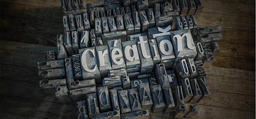
DESIGN
Explore the art and science of typesetting.
Typesetting is the arrangement of words to create an optimal reading experience. Explore how to create legible, beautiful type and compelling page layouts.
Not sure which apps are best for you?
Not sure which apps are best for you?
Take a minute. We'll help you figure it out.
Take a minute. We'll help you figure it out.
Discover the world of good typesetting and graphic design.
Typesetting is the way that text is composed using individual types — the symbols, letters, and glyphs in digital systems. It’s a crucial part of the world of design that requires an understanding of fonts, corresponding font sizes, and line spacing. Good typesetting and typography is invisible — it allows readers to enjoy the font without interruption. Bad typesetting draws attention to itself and distracts a reader. It’s like driving down a road. If it’s well paved, nobody notices and everyone enjoys the ride. But if the road is pocked with potholes, it can’t be ignored.
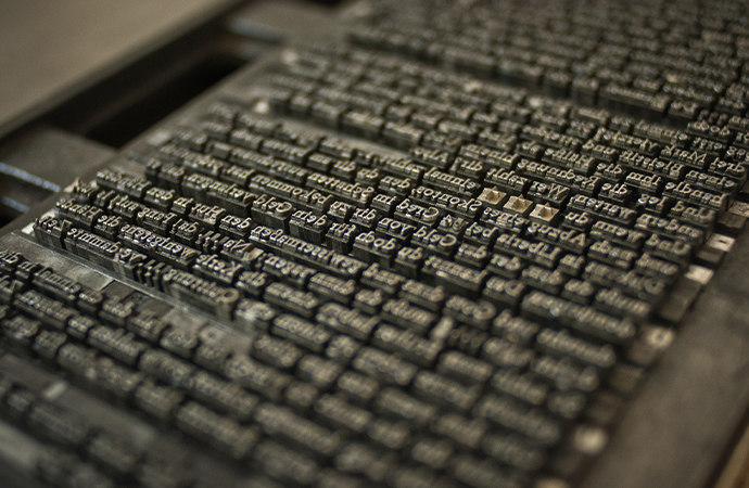
The ancient art of word spacing and book design.
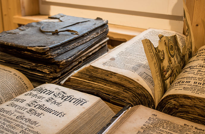
Typesetting is an ancient art. Moveable type dates back to around 1040 AD in China, when inventors created ceramic movable type for printing Chinese characters. In the West, Johannes Gutenberg usually gets credit for the invention of the printing press in 1440, which involved building frames of types that could be operated by hand to print books.
Typesetting progressed from there into mechanical printing presses, then automated versions, and finally, the primary tool that most typesetters use today: vector graphics software. What used to take months or years can now be accomplished in a matter of minutes with digital software.
If you’re looking for firsthand knowledge about typesetting, you can take classes at local colleges and artist guilds. Art director and book designer Dylan Todd recommends it: “You set the metal type by hand and use a press to print everything. It gave me a real appreciation and understanding of type and type tools.”

Good versus bad typesetting is all about reading experience.
There are a few foundational steps that you should always consider when putting together your text in a design or document: hierarchy, font(s), spacing, padding, and tracking.
- Hierarchy: Before beginning any typesetting or typographic project, establishing a typographic hierarchy is essential. Figure out the size and weight of the different fonts you will use to organize text, then save them as styles to ensure you have consistency and a sense of cohesion throughout your design.
- Fonts: Picking the right fonts for your designs is its own art form. An old design standby is choosing a sans serif font for titles and a readable serif font for body text. You can experiment with other interesting fonts, but remember that you don’t want any font to get in the way of the reader’s experience.
- Spacing: While it can be visually interesting to make the spacing between lines very tight, this usually decreases readability. Taking a critical eye to the spacing in your documents is crucial for readability.
- Tracking and padding: Tracking refers to the spacing between letters, and padding refers to the amount of space between a block of text and the page’s margins. You can explore many different visual effects with just these two text settings.
Typesetting also evokes mood, time period, and setting. Serif type gives a glimpse back to classic styling, craftsmanship, and tradition, whereas sans serif type conveys modernism and simplicity. “You’ll see a lot of serif fonts (along with roman and black-letter stylings) that are related to the Middle Ages — around their adaptation into the lexicon of the printed word,” says designer Robin Casey. “Understanding those time frames makes sense if you’re using types to set a tone.”

Modern tools for modern typesetters.
To begin creating the foundations of your typesetting endeavors, start by exploring design and illustration software. You can build your own fonts in Adobe Illustrator, which will help your typesetting as you learn concepts like kerning. Vector graphics software enables you to draw, smooth, and scale your font projects, then export them for easy use in other programs.
For typesetting and document creation, Adobe InDesign is the premiere platform. This software was built to enable content creators of all kinds to craft functional and beautiful documents. InDesign gives you complete control over the document creation process. Continue your exploration with information about text formatting, building out document borders and guides, and much more.
Share this article

Creativity for all.
Photography, video, design, UI and UX, and social media.
Creative Cloud has everything you need, wherever your imagination takes you.