Go beyond a bulleted list of facts and figures — present your data with compelling visuals. These design tips will help you to communicate important information with efficiency and style.
Data visualisation 101.
Numbers are good, but numbers with pictures are better. It’s why infographics are such an effective way to communicate data-heavy information — numbers are more compelling with context. Whether you’re communicating with potential customers via a marketing infographic, breaking down your business plan for investors or presenting a flowchart to a new team member, the goal of any infographic is the same: use that data to tell a story.
The best infographics start by considering the audience. What do they need to know? What do they want to know? With the right tools and resources, you can engage your audience — and even entertain them a little — as you help them to visualise important data.
Show, don’t tell.
The best infographic designs represent data, instructions, routines or systems, while keeping text to a minimum. They can be a fun visualisation of a single data point supporting a larger story or an entire page that uses visuals to share multiple pieces of information about one topic.
The principles remain the same no matter your purpose:
- Clearly articulate your main message.
- Leverage the visuals as proof points to your thesis.
- Let your design do the rest of the work.
Before you begin to design your infographic, think about the information you’d like to gather to support your story. If your main idea is that social media is more all-consuming now than it was five years ago, look for statistics on the number of social media users over those years so you can show a trend. You might also find data on how much time individuals spend on social media sites every day or information on which demographics use social media the most.

Check and recheck your numbers.
Make sure you have good data before moving too far down the design path. You can’t depend on hoped-for numbers becoming available later — a survey may come back that disproves your hypothesis, regulatory or privacy concerns may prevent you from sharing certain facts or you may discover that you simply can’t find the source of a stat you found on the Internet. Don’t leave anything to chance. Even the most impactful visuals will fall flat if your numbers are incorrect.
Make a sketch.
Before launching into building the individual parts (charts, graphs, icons and images) that will comprise your infographic, start by sketching ideas for your overall composition.
This process can and often should, be literal. Draw out rough sketches of your infographic. Many designers prefer to work with pencil and paper or to use tools like Adobe Photoshop Sketch or Adobe Fresco on their tablets, to quickly work through several ideas. Trying out different schemes can help you to determine hierarchy, balance and the flow of the design.
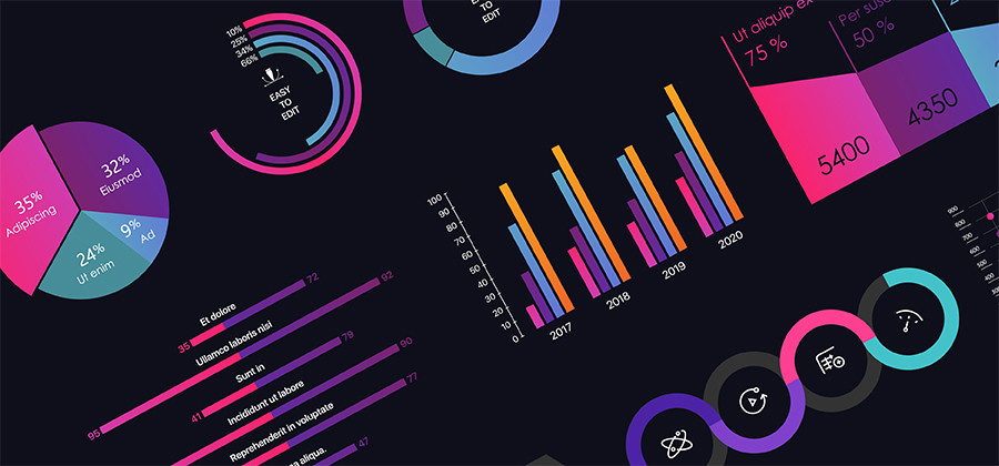
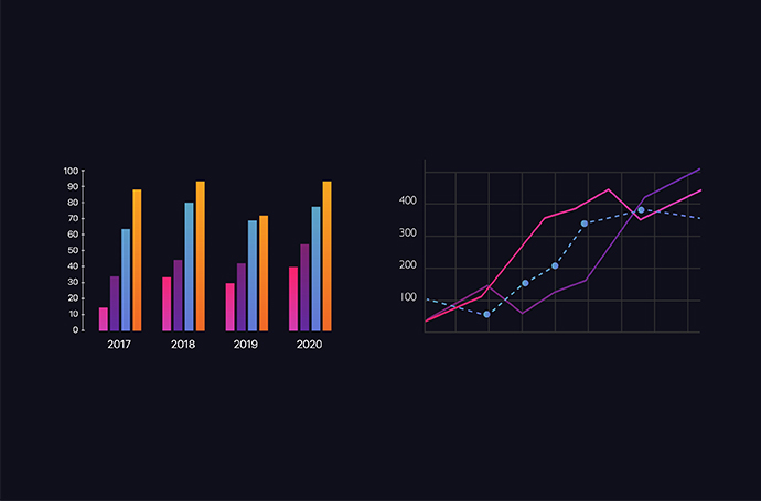
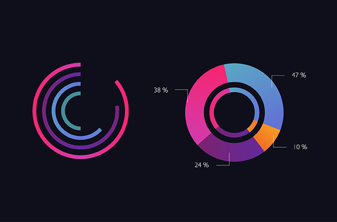
Next, think about the best way to visualise your data. Line charts are effective at showing changes over time. Columns work for comparing two sets of data over time. If you’re comparing several items, a horizontal bar chart may be easiest to read. Finally, the trusty pie chart is great for displaying percentages. Leave out anything that doesn’t help tell the story or that might get in the way of quick comprehension.
Keep design in mind.
Once you have solid data and a working plan, you’re ready to dive into design. Consider the following points as you begin creating your project.
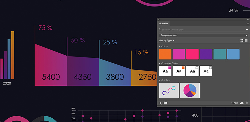
1. Use the right tools. Adobe Illustrator provides all the tools your team needs to create infographics and data visualisations. Consider an Adobe Creative Cloud for teams membership, which gives you access to Adobe Illustrator, InDesign and Photoshop — plus, you can download free, fully customisable infographic vector templates from Adobe Stock.
2. Develop a visual hierarchy. Following the ideas you sketched, begin your design by laying out the main element. Make sure your most important point is the most prominent, either in the centre of the infographic or carrying the greatest visual weight at the beginning or end. Don’t let design elements compete for attention.
3. Establish the flow of information. If your infographic includes a linear storyline, make sure you’re leading the reader’s eye from one element to the next. Use white or blank space to highlight important points, give the reader visual cues and achieve balance. Aligning text, objects and margins with invisible ruler guides can also help you to organise the layout. Another great way to make information more visual and avoid crowding your graphic with text is to use icon sets from Adobe Stock. Think about how you can connect the images relevant to your topic with the graphs and charts you’ll use to convey your data.
4. Pick a colour scheme. Because infographics can contain a lot of information, avoid chaos by keeping your colour scheme simple. Choose colours that are consistent with and complement your brand. For help choosing a colour theme, explore current colour trends or check that your choices are harmonious in Adobe Color.
5. Pick a type — or two. Simplicity is important with text, as well. Limit your use of different type families and pay attention to how they can be consistent with your branding. If you use more than one typeface, be sure they aren’t too similar and have adequate visual contrast. For example, you might pair a serif font (a font with “tails,” like Times New Roman) with a sans serif font (a font without “tails,” like Arial), but not two serif fonts. Also, limit the use of different sizes and styles to what is really necessary. Practicing restraint here will help your design feel unified and accessible.
6. Add the finishing touches. Include sources for your data and add your logo and other branding. Depending on the goal of your infographic, you might want to add a call to action. Finally, export your design to the right file format, either as a graphics file for your presentation or a PDF for online use.
Kick-start your creative process by taking a look at different infographic formats and design templates on Adobe Stock or Behance — part of Adobe Creative Cloud for teams.
More topics you might be interested in…
Find creative ways to grow your business.
CUSTOMER STORIES
See how Adobe customers are building great experiences with Creative Cloud for teams.
BEST PRACTICES
Browse the latest guidelines in effective design, marketing and more.
TUTORIALS
Take your creativity to the next level with step-by-step tutorials.
Discover apps that can help you to design compelling infographics.
Choose your Creative Cloud for teams plan.
All plans include the Admin Console for easy licence management, 24/7 tech support, unlimited job postings on Adobe Talent and 1 TB of storage.
Single App
€33.49/mo per licence (excl. VAT)
Your choice of one Adobe creative app such as Photoshop, Illustrator, lnDesign or Acrobat Pro.*
BEST VALUE
All Apps
€77.49/mo per license
Get 20+ Adobe creative apps including Photoshop, Illustrator, InDesign, Adobe Express, XD and more.
Call 1800-946-197 or Request a consultation
Questions? Let's chat.
Buying for a large organisation? Learn about Creative Cloud for enterprise
* Acrobat Pro, Lightroom and InCopy single apps come with 100 GB storage.