10 font pairings for maximum impact
Summary/Overview
Font pairing recommendations made easy
Smart font choices can mean the difference between someone resonating with, liking, and sharing your message or continuing to scroll through their feed. And as with complementary colors, certain fonts pair well together and can help enhance your message, solidify a brand, and establish hierarchy. In other words, typography and how fonts work together form important design principles. Whether you are trying to create a logo, invitation, flyer, resume, advertisement, or something else, font pairing is a necessary factor to consider. Because of the sheer volume of fonts available, choosing the best font pairs can be overwhelming.
Adobe Express includes 20,000 licensed fonts, was well as curated font recommendations for your use in your next project. The recommendations suggest which standalone font you should use, but also include suggestions for complementary fonts, font colors, and font effects to help you create unique designs. These typography recommendations are curated from free fonts in Adobe Express templates, which are created by professional designers.
While Adobe Express helps you pick font pairings directly in the app, this blog post explores font combinations by content type. Finding fonts that go together can be difficult, but this post will make the process for your next design easy by recommending project-specific font pairs and teaching you about the moods or messages that certain font pairings inspire.
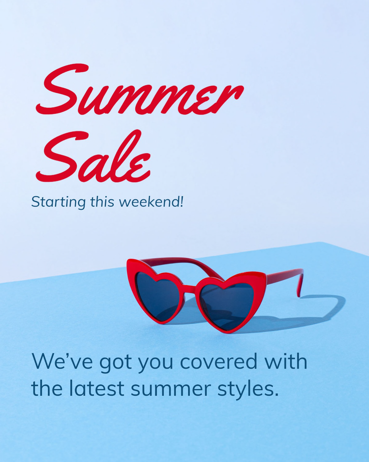
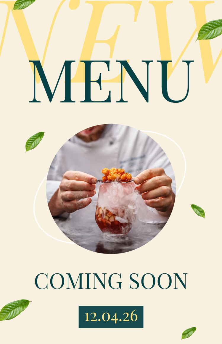
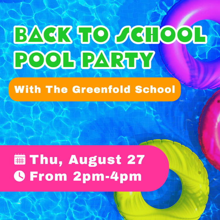
1. Event flyers
Funky headers & clean body text
Grab your audience’s attention with a flyer by pairing a funky header with a clean body text. When making flyers, it is important for people to be able to quickly glance at a flyer and instantly digest all the crucial information. Although it may seem counterintuitive, funky and clean texts are often complementary fonts – they work together to create a contrast by using different weights that simultaneously and instantaneously catches the eye and communicates vital information.
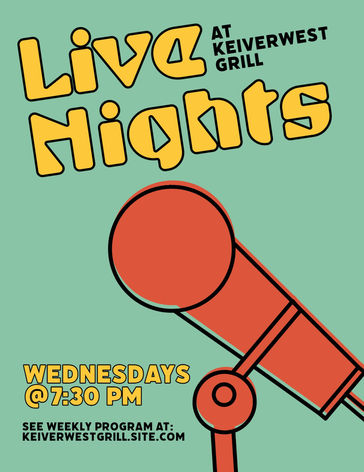
A good example of a go-to ‘clean’ font is any sans serif font. Sans serif fonts are fonts without “serifs”, aka the line or pen stroke hanging from a letter, meaning they often come across as cleaner and crisper. Some great sans serif typefaces to use in flyers include Open Sans, Multi Display, Depot New, Roc Grotesk, Forma DJR, Raleway, Roboto, and Condor. The simplicity of these fonts makes them the perfect font pairing for a funky header. Some funky fonts to consider using that will really make your flyer pop include Birra, Custard, Funkydori, Glodok, Mythos, and Whomp, although the possibilities are endless – find more funky fonts here. Pairing bold and quirky styles with simpler and cleaner letterforms is a great way to create a flyer that looks both interesting and stylish.
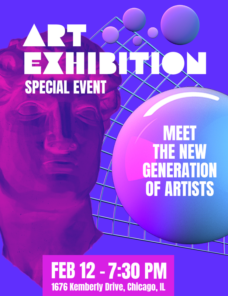
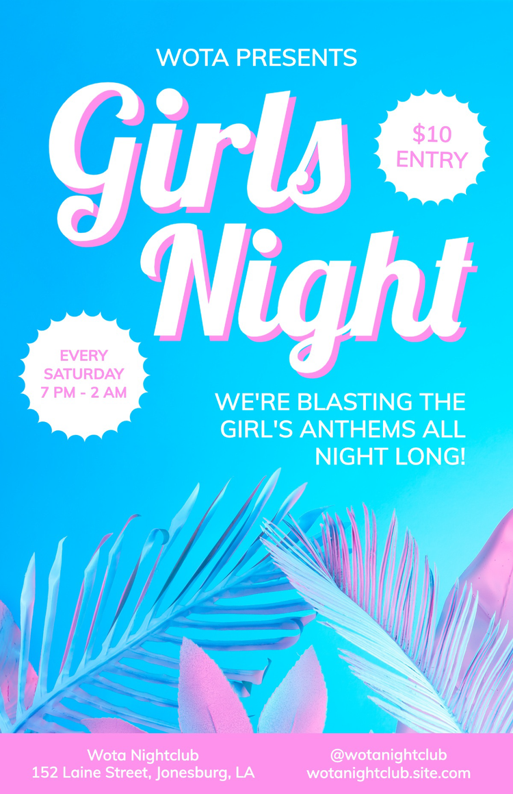
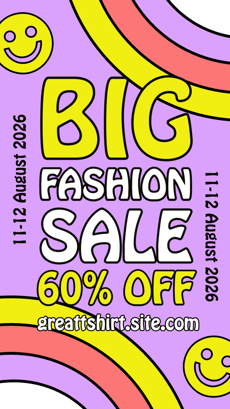
2. Social media ads
Stylish header & crisp text
As with flyers, it is important to quickly catch the attention of your audience and draw them in when creating social media ads. However, successfully interrupting someone's scroll can be a difficult task. That’s why when creating social media ads, more stylist, extravagant, and bold fonts help you to stand out. However, it is important to create a contrast between the header and the text, which is why one of the best font pairings for a stylist header is crisp text. Grab your audience’s attention with an extravagant header but then, use a clean-cut font to convey more specific information.

As you can see in the social media ads above, your eye is first drawn to the big, bold, and unique fonts in the headings before you look at the supplementary information. This font pairing creates an eye-appealing contrast that helps your social media ads to stand out. Some examples of unique and stylish typefaces to use for a header include Bungee, Usurp, Embryo, Hobeaux Rococeaux, Lora, and Gurkner. Pair your funkier header fonts with some more simple and crisp ones, such as Forma, Elza, Open Sans, Articulat CF, Lato, or Roboto.
3. Corporate communications
Bold & modern
Pairing bold and modern fonts works well to attract — and keep — your audience’s attention. This font pairing is ideal for brands that want to simultaneously stand out and look professional. Pairing bold and modern comes across as contemporary and sleek and conveys a message of professionalism. It is vital for a company to maintain a favorable point of view, internally and externally, and eye-catching yet professional corporate communications is one way to ensure confidence in your business and products.
Some bold font recommendations include Monarcha, Mundial, Greycliff, Oswald, Archivo Black, and Elza. Pair these bold fonts with modern ones such as Ofelia, Avant Garde Gothic, Kallisto, Bebas Neue, Source Sans Pro, or Forma DJR Display. Although they are separated out into bold and modern, many of these typefaces represent font families, meaning they have both bold and modern font variations. Feel free to explore the font families and mix them around to create font combinations that suit you and your business the best.
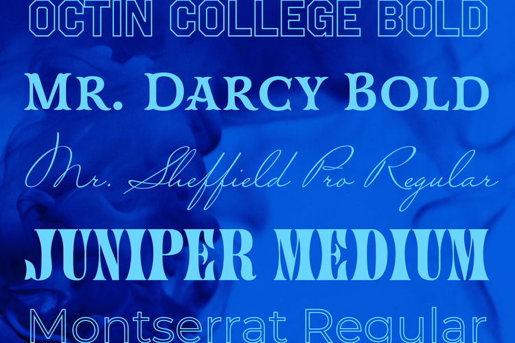
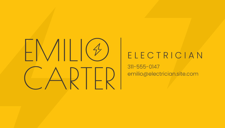
4. Logos
Two crisp fonts
Choosing the correct font for a logo can be difficult. You can’t just cram a lot of text into a logo, you must get your message across in only a few words. Choosing the best font combinations for your logo is vital because everything stands out in such a small space. When it comes to logos, you can’t go wrong with pairing two crisp fonts.

Sometimes less is more when it comes to logos, and the same often goes for font choices. Some contemporary font combos that keep it crisp and clean include Century Gothic, Montserrat, Darkmode Off, PT Sans, Dazzle Unicase, Hypatia Sans, Usual, Ingeborg, Lato, Poppins, and Scotch Display. Pair any of these fonts with each other to create modern, clean, and sophisticated font combinations for your logo.
5. Resumes
Heavy headers & clean text
When designing a resume, it is important to utilize different fonts to help potential employers quicky digest vital information about the candidate with the option to read further if necessary. However, it is crucial to consider legibility as well. A great font pairing for resumes is heavy headers with clean text. Heavy fonts are those that carry more weight and appear thicker and bolder; they are useful for highlighting vital information. Pairing heavy headers with clean text creates an eye-appealing contrast that helps the most important information stand out while increasing readability and allowing the descriptive text to be clear and crisp.
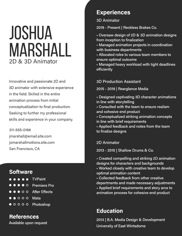
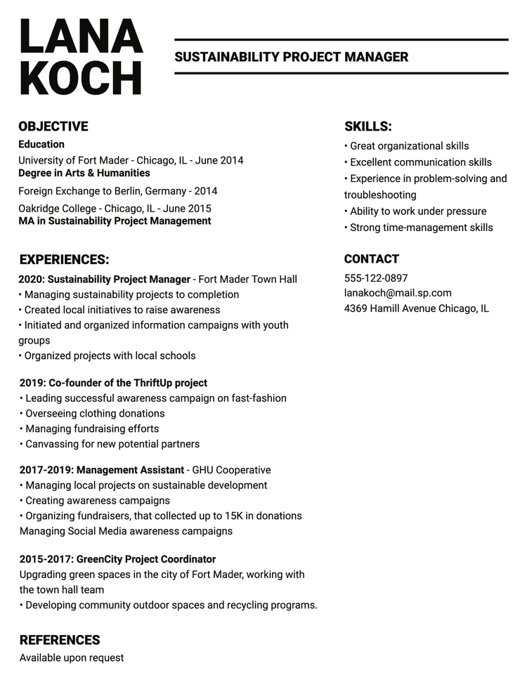
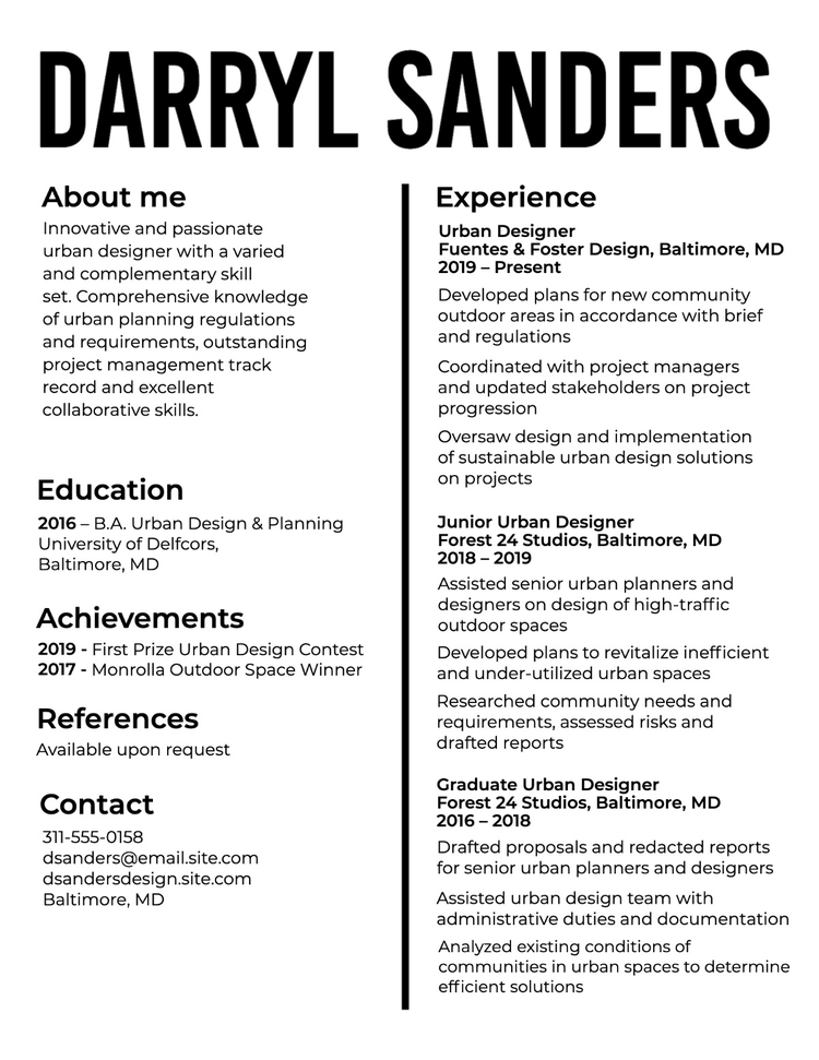
Heavy headers and clean text are complementary fonts that look both professional and interesting. Some font recommendations to use for bold headers include, Odile, Depot New, Bilo, Garamond Premier, and Bely. For a clean body text, look no further than Auto, Forma DJR Text, Acumin, Open Sans, Source Sans, or Cronos. Most of the font families listed here include font types that can be used for a bold header or a clean body text, so feel free to explore and mix them around to create a resume that will help you to stand out from the crowd.
6. Formal event invitations
Two elegant fonts
Pairing two elegant fonts elevates your invitation by creating a sense of refinement and class that conveys quality and timelessness. Elegant fonts are pleasing to the eye and keep your audience engaged. Elegant fonts do not necessarily have to be cursive or script fonts (although they can); fonts like sans serif variations can also convey crisp and simple elegance. When pairing elegant fonts, consider pairing a complex font with a clean font.
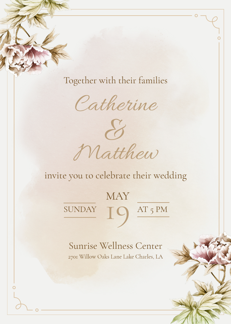
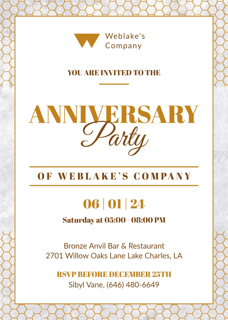
There are many different types of elegant fonts, so we have divided our recommendations into three groups: cursive, handwritten, and general. Some great cursive typefaces include Allyson, Dalliance, Alfresco, Sloop Script, and any font from the Bluemlein Script Collection. For cute handwritten fonts, check out Adore You or La Bohemienne. Pair a cursive or handwritten font with a more standard elegant typeface such as Krul, Romana, Guyot Press, Cormorant Garamond, Source Sans Pro, or Chapman. Consider making one of the fonts you choose italic to really bring out the elegance.
7. High-end services and products
Two luxury fonts
When you market high-end services or products, it is vital that your company exudes a sense of luxury. Pairing two luxury fonts can evoke a feeling of high fashion elegance but be careful not to go too far and create something that looks tacky. When pairing luxury fonts, we recommend either pairing a more overstated font with an understated one, or meeting in the middle and pairing two more moderate yet still tasteful fonts.

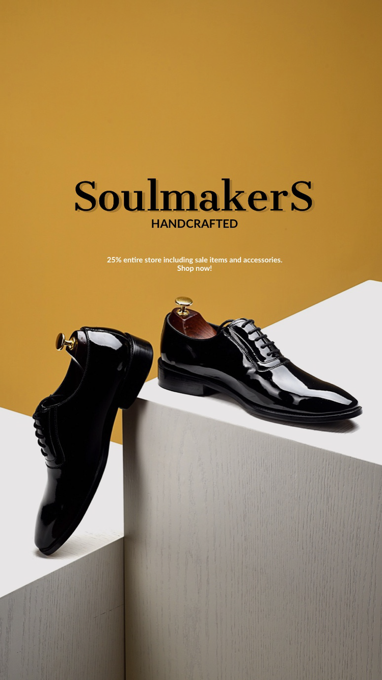
Be careful not to overstate the product. Luxury is a subtle concept that deserves a light touch, which is why a classic serif is always a good option. Some elegant font recommendations that you can pair with each other include Condor, Rhythm, Didoni URW, Contralto, Gastromond, Dashiel Fine, Map Roman, Quiverleaf CF, Abril Fatface, Merriweather, and Playfair Display. Consider making any of these fonts italic and see how it changes the look. Choose any two of these fonts and pair them together to create a sense of high-class refinement.
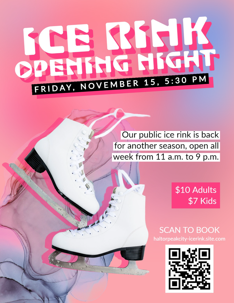
8. Event announcements
Decades collide
When you want to make an exciting announcement about a new event like a laid-back party, a limited-time sale, or a grand opening, consider mixing the old with the new. Fonts that inspire moods reminiscent of bygone decades (think 70s disco, 80s new wave, or 90s grunge) pair well with contemporary, straight-forward fonts. Rounded letters and readable shapes are a fun way to catch your audience’s attention while keeping the mood light and building excitement.
Events call for chunky fonts, geometric designs, and lots of bright colors. Some great retro typefaces to consider using for your next font mix include BD Retrocentric, Gin, Blakley, Acier, Tomarik Display, and anything from The Tipoteca Series. Mix these nostalgic fonts with more modern, polished fonts, such as Greycliff CF, Serenity, Gibson, Quasimoda, Futura, Josefin Sans, or Arvo.
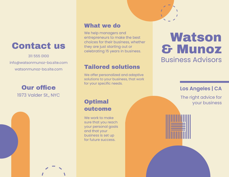
9. Business cards
Two classic, clean fonts
Business cards are a necessary part of networking – they are a tangible way to promote yourself and your brand. Business cards are meant to leave a lasting professional impression, but because they visually commit your brand to memory in such a small space, the fonts you choose reflect your brand itself. To remain approachable but maintain an air of professionalism, we recommend pairing two classic, clean fonts on your business cards.
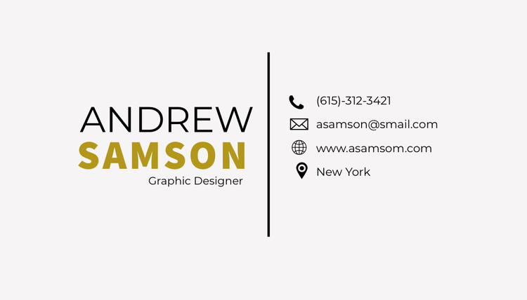
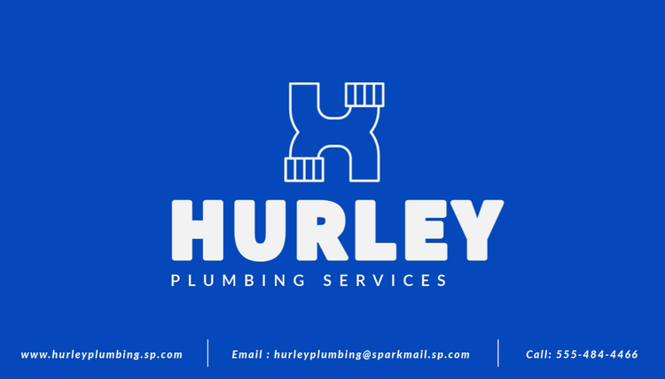
Creating the right font pairing on business cards can often be tricky. Some of our recommendations for clean and classic fonts are Monarcha, EB Garamond, Gimlet Display, Montserrat, Karmina Sans, Chaparral, Trade Gothic Next, Forma DJR Text, Basic Sans, Quicksand, Josefin Sans, and Apparat. Explore these fonts and play around with them when creating your business card.
10. Brochures
Geometric header & friendly body text
Brochures are a great way to spread a lot of information in condensed form. They are easy to distribute, cost effective, and can help to establish the credibility of your business or services. However, because brochures are meant to hold a lot of information in a small space, choosing correct font combinations can be a difficult task. Don’t worry, we’ve simplified the process for you. For brochures, we recommend pairing geometric headers with a friendly body text.
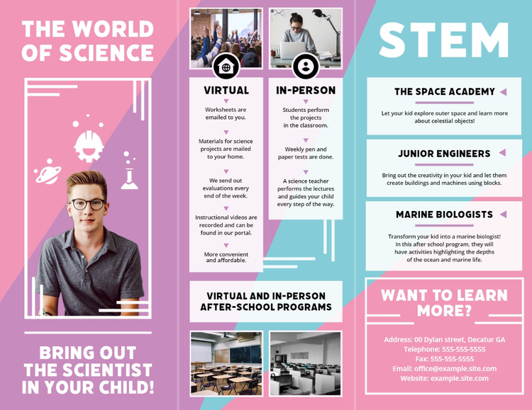

Geometric fonts are comprised of rounded letters and simple shapes, but when bolded and used as a header they help specific information to stand out. Geometric headers pair well with friendly fonts (aka basic fonts that are easy to read) because this font pairing creates a welcoming and approachable feeling. Some geometric typefaces that are great for headers include Noka, Dazzle Unicase, Urbane, JAF Domus Titling, Bodoni URW, Alegreya, and Gibson. When searching for friendly fonts, we recommend Gimlet, Embury, Calibri, Obliqua Sans, Chaparral, or Montserrat.
Font pairing is a vital, sometimes daunting task when creating any new piece of media. The font combinations you choose say a lot about you, your brand, your event -- you name it. Font pairings are a necessary and yet often overlooked aspect to consider when attempting to efficiently communicate a message to your audience. Use this blog post as a guide for font combinations and as an inspiration to push yourself and your brand to the highest possible level.
This post was updated on January 10, 2024.
Next Steps
Explore more fonts
Didn’t find the fonts you were looking for in this blog post? Explore over 20,000 different Adobe fonts to choose from.
Start your next project
Want to create your own standout flyer, advertisement, logo, business card, or something else? Start for free with Adobe Express and pick from thousands of templates to easily design your next project.
Adobe Express blog
Want to see more articles like this? Explore design trends, how-tos, branding tips, and so much more on the Adobe Express Blog.