Mobile-first design is user-first design.
Sarah is having a first-class digital journey. At a coffee shop waiting for her colleague Steven, she’s just opened the website of her favorite outdoor apparel brand on her phone for the first time. A jacket she found on her laptop earlier this week is the first thing that pops into view.
She checks out its quality by zooming, watching a video, and rotating her phone as she browses. Even after a barrage of interruptions — a text, a data drop, a phone call, and a Snapchat notification — her jacket is waiting when she reopens the page to purchase. A buzz hits her phone with the delivery date and tracking information. And all this before her first sip of cappuccino.
Colleague Steven also wants a high-performance jacket and has been looking for one on a competitor’s stunning website. Waiting on the train platform, he opens the site from his phone to browse…and finds the mobile layout is visibly different from the full desktop version. Where is the jacket he liked at the office? After several long scrolls to find the item, he zooms in on a high-res photo — but turning his phone resizes the image in a way that obscures navigation options. In just a few seconds, he’s feeling stuck and disconnected, and he closes the browser tab with a tap.
In a world of digital immersion, mobile is first.
Every mobile user has had experiences like these. In a world where digital interaction has quickly become digital immersion, 93% of internet users are accessing new experiences via mobile devices — and those users now expect seamless, engaging, and customized experiences in every interaction. Designing experiences like these requires a multiplatform mobile-first strategy, presenting both a challenge and a fresh opportunity for creative teams in the digital space.
“The challenge is pivoting away from being a one-trick pony and toward being a utility knife,” says Mark Ramel, creative director at FiveStone. “What you’re designing for now is an experience of consistency and cohesion across a variety of platforms and devices.”
This kind of seamless user experience and mobile-first orientation can be a tall order for creative teams at small and midsize businesses. The good news is that a clear mobile-first strategy, the right tools, and a willingness to experiment are all it takes to succeed.
“The challenge is pivoting away from being a one-trick pony
and toward being a utility knife.”
Mark Ramel
Creative Director, FiveStone
Get a clear snapshot by mapping the user journey.
So how can your creative team anticipate the way users will move through an array of both digital and physical contexts, including the distractions, interruptions, and detours in these environments?
“I'm a huge proponent of user journey mapping,” says Ramel. “To get this stuff right you’ve got to understand the critical junctures, the real moments of conversion. Once you understand where the journey is and what it looks like for your varying audiences and segments, you can start to highlight those critical junctures and then let that guide your actual experience design.”
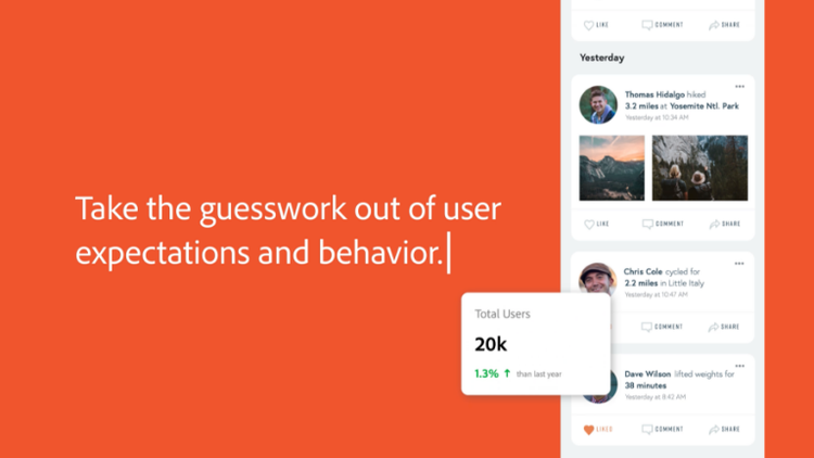
Using data to provide a clear picture of user behavior is an important first step. “As you start to attach different channels and touchpoints to customer data and track user preferences and patterns, you're really creating that connective tissue that will inform design decisions,” Ramel says.
From there, it’s important to layer in components and plugins — and ensure both internal and external stakeholders understand the journey and the user experience as a whole.
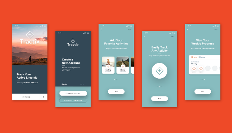
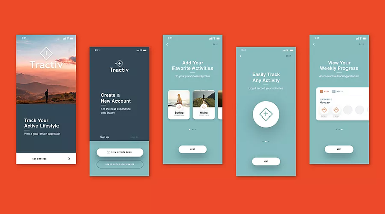
“By using components and component states, you can build your knowledge, your top and bottom navigation, your buttons, everything — like Legos,” says Mickael Denie, a mobile user experience (UX) designer at Adobe. “With Adobe XD, you can create a prototype and people can review and comment on the design and UX. They can ask questions, click through everything, and understand what we’re building.”
With feedback in place, mobile designers can then generate specs instead of sending a JPEG to the development team. Providing specs gives the engineers precise insights into the mobile experience — everything from button height to font size to specific colors.
“Now engineers can see exactly what we were envisioning, as well as the margins,” Denie says. “Everything can be very consistent and precise."
Form plus function — some responsive design considerations.
Once your team has a good sense of your user’s path, turn their attention to design elements that will facilitate that journey. In choosing each function or feature of your overall UX and device-specific user interface (UI), think about how you want users to feel as they experience each element.
“Remember that everything is emotional,” says Juraj Molnár, creative director at Buzzworthy Studio in Brooklyn. “Use emotionally impactful design elements like animation, motion, imagery, vivid color, typography, and dynamic layouts to really grab a user's attention and create a subconscious feeling of wonder.”
To marry form with function, use mobile-first best practices such as avoiding “long scroll” issues and sticking with consistent, familiar navigation. Consider how people hold their mobile devices and in what contexts. Design finger-friendly buttons, keep tab bars clean and clear, and allow enough spacing and padding for readability and easy access.
“Ultimately, the content itself has to be powerful — but accessing that content seamlessly from point A to point B is just as important,” says Molnár.
“Ultimately, the content itself has to be powerful — but accessing
that content seamlessly from point A to point B is just as important.”
Juraj Molnár
Creative Director, Buzzworthy Studio
The right toolbox does the heavy lifting.
To allow your team the freedom to focus on mobile-first design dynamics, create a mobile UX toolbox. The right collection of tools — flexible, easy to implement, and accessible to remote teams — will support intuitive workflows and enable your team to solve problems faster and more creatively.
“Tools, structures, templates, and libraries that help facilitate consistency across the user journey are essential,” says Ramel. “Systems need to be able to work well as you hit new channels and new applications, and be universally accessible and adaptable. That’s really where the rubber meets the road for designers, especially for remote or decentralized workforces.”
For Denie, that toolbox is anchored in simple, tactical products and solutions that help him get immersed in the authentic customer experience he’s creating.
“I always connect my phone to my computer so I can see what I’m designing as I’m working,” he says. “I see the size, I see what looks different, I zoom. I get the real-life user experience and can adjust as I go.” Beyond that, he says, his toolkit includes Adobe Photoshop, XD, Sketch, and iOS- and Android-specific guidelines that help bridge the UX gap between the two systems.
Saving valuable work from loss, maintaining brand integration and integrity, and providing easy access to assets down the road are other vital parts of a complete toolbox. “Robust storage and admin features are really critical to building high-quality creative systems,” Ramel says. “Setting up the right toolbox will serve the evolving needs of your creative team over time."
Pivot to mobile-first and watch the customer experience flow.
Whether at the office or on the road, an engaging mobile journey is one of the most important experiences a customer can have with your brand today. “If the content is served smoothly, it allows the customer to experience that emotional connection,” says Molnár. Designing for a seamless mobile-first experience will pay big dividends.
Mobile trends represent massive opportunities for creative teams. While creative teams need to be mindful of the platform and key customer touchpoints, having the right mobile UI toolbox in place ensures that you’re starting from a solid foundation — and that your team is well-equipped to create better, more meaningful cross-channel experiences.
Adobe can help.
Adobe Creative Cloud for teams gives you the world’s best creative apps and services in a single, secure, integrated platform. With 20+ desktop and mobile apps, Creative Cloud Libraries for keeping assets in sync across apps and devices, and 1TB of storage per user, this complete creative software solution is designed to support your business at every stage of growth. Plus, you can count on simplified license management and total control over your software to help your team stay focused on creating great work.