Introduction
Hi there.
This tutorial is going to be about media queries.
Now, media queries are sections of CSS that determine the layout and style of your website for different device sizes like mobile, tablet and desktop, as well as a variety of other outputs.
Let's say what happens to your site when it gets printed.
Now, Dreamweaver CC has features that make adding and updating media queries super easy.
Let's go look at those.
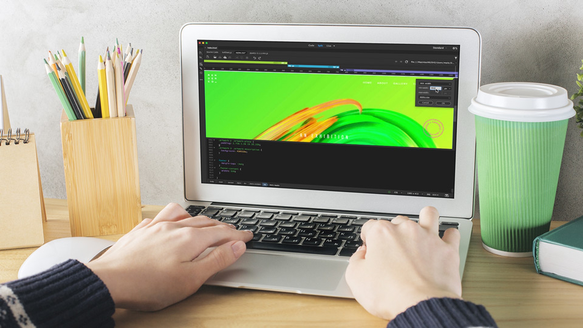
Now I am working in Standard View.
Using the media query bar and live previews
I am also working in Live View, because what I want to show you is this option here: it's called the Media Query bar.
This is a visual representation of the media queries that are in my CSS Code.
And watch this.
I can click on these and it resizes my site based on these media queries to see what the site looks like at the different views.
If for some reason you can't see it, it's this little option here on the left.
And when you wanted to stop lining up with the media queries, you can just double-click this grey area here on the right.
So, at the moment we are previewing it within Dreamweaver CC within Live view, which is great.
But if you want to work within a browser, you can use the Real-time Browser Preview by clicking this icon in the bottom right here.
And it allows me to preview my responsive media queries live in a browser or on any of my devices.
So I can see and interact with them in real time.
Now, there is another tutorial on setting up Real-time Browser Previews.
So go and check that out.
Now let's look at the code that is used to create a media query.
Understanding media query code and global styles
I am going to switch to Split view and then jump to my styles.css.
So let's go down the bottom here of my existing site.
You can see down here this is what a media query looks like.
They always start with an @media.
And you can see here my three different views with the different screen width.
And all that happens with the media query is that, when a browser opens your website, it looks to see how wide the browser is.
And if it's opening up on, say, a tablet, it's going to trigger all the CSS that is inside this media query.
See this little arrow here?
If I twirl that down, this is the code that gets triggered and displayed on our tablet device.
It's the same here for this larger media queries, maybe desktop and really large displays.
So, let me open up my CSS Designer panel.
It is under Window, CSS Designer.
Now this Sources window here shows the linked and any internal style sheets that are associated with this web page.
In this example we just have one: the styles.css.
I'll click on that.
And down here, where it says @Media now I can click on any of these media queries.
And you can see there that the Selectors down at the bottom keep changing, depending on which one I have selected.
The Selectors section is all the selectors that are defined within the media query I have selected here.
Now, these are all the media queries defined in the site, including the GLOBAL styles for this page.
Now, the GLOBAL styles are the foundation for the entire site.
And these 3 here are media queries that override the GLOBAL, when it gets to these different views.
Now, GLOBAL in our case means the mobile device.
Because we've designed the site with a mobile first approach, which means the first style and layout that we did for this site, was done for a mobile device or at least a browser that is less than 768 pixels wide.
And as the site gets past that number, these selectors come into play to make it look good and tablet and larger desktop sizes.
Okay, so let's go and make an amend to our media query.
Editing styles within existing media queries
First thing you need to do is make sure you've got our styles.css selected.
And what we want to do is, I want to adjust this title here, which uses a selector called hero-title.
But I only want to adjust the size here, the 992px, which is my traditional desktop.
Say, I want to make it bigger just for this media query.
What you do is you click on the media query here and down the bottom here there's my _hero-title.
And what you would have noticed there, is that in my styles.css code it's jumped to the line.
So I can start editing this in Code view, if I prefer.
You can see over here my CSS Designer panel, it's jumped to it and it is giving me all the properties that are listed in the Selector.
In my case this one is the font-size I want to change.
I'm going to click, hold and just drag it.
I made mine far to big I know, but for this example, what it's going to allow me to show you, is, I am going to just tidy in this panel, so we can see all the different media queries.
So at the really large size, you can see, it's still fine.
It's an appropriate size.
Down here at tablet, it's still fine.
And down here, anywhere lower than that, I'm dragging this by here in mobile, it looks fine.
But at the media query that we are working at, 992px, you can see, it's really, really big.
Now, an alternative way of working without this CSS Designer panel is, you can simply click on the element you want to adjust.
And you can see here is my .hero-title that I am working on.
I can right-click it, Go to Code.
And it's displaying the hero-title as it is in GLOBAL, which is the top one.
The next one down here is in my media query there, 768px.
This next one down is the one we just worked on, 992px.
And there's the really large one.
All you need to do is, figure out which one you want to work on.
Now I click on this guy and it jumps to that line that controls it in the code down the bottom.
So I can go down here and manually adjust it.
Maybe we put it back to 8.4vw Now in this example we have a page that doesn't have any media queries.
So, let's look at adding them through the CSS Designer panel.
Creating new media queries with the CSS Designer and media query bar
First thing you need to do is to ensure you've got the CSS sheet that you want the styles to go into.
In our case styles.css.
And under @Media, we're going to hit the plus button.
Now each of this Conditions from the drop-down have additional settings. media here has the option to indicate the output of your design, such as whether it would be output to a screen or it is going to be formatted for print.
You can see, this is the code to make that happen.
This orientation query here will look to see whether the device is in landscape or portrait mode.
There is another one here for resolution, for high resolution displays, say, maybe 144 dpi.
You can see, the code gets generated for you down the bottom here.
What we want to do is add a media query for our responsive design.
So, we're going to pick something called min-width.
We're going to set it to 768px.
Now, the units are defined as pixels, but there are a lot of other measurement options in there.
I could also add multiple conditions here by adding this plus symbol.
I can set it to a max-width of, say, 991px.
You can see down here, it shows the 'and' statement, meaning that both of these numbers need to be true for this to work.
That's not what I want for this one.
I'm going to delete the second one by clicking the minus here.
Let's click OK.
And you can see the media query appears here in the CSS Designer panel.
It's also up here in my Media Query bar.
And because we have used the minimum width, we have these little helpful arrows showing us that the media query gets triggered from this minimum number all the way to the right until I get to my next media query.
It's also a helpful purple colour, which always denotes the minimum width.
Check out this other separate project I'm working on here.
Just to show you that if I choose to use the max-width, it's coloured green.
And the min and max together are easy to see, because they are coloured a helpful blue.
Let's jump back to our project.
Now, the third place our media query appears if I scroll down here to the bottom of my styles.css.
There's my media query here down the bottom of my code.
So, let's go and add some code to this media query.
Now I put a couple of returns in, between the curly braces there.
I'm going to put paste.
I have got one, that I have already made earlier.
And this selector, this class selector, affects this exhibition type here at the top and plays around with the font and the spacing.
And what's happened here is...
See along the top here?
There's my media query.
That's the one that I just made in my CSS Designer panel appearing. ...
And what happens is, if I drag this sidebar here, - remember we designed mobile first, which means I designed it all like this, to look exactly like this.
But when it gets to my media query, I'm overriding that style, the .hero-leadin.
And watch.
Bam.
It gets bigger and more appropriate for my tablet size.
And that my friends is how media queries work.
So, we created this media query here using the CSS Designer panel.
I'm going to close that down or at least collapse it down now, just so I can see a bit more, because we're going to use this Media Query bar to create the next one.
It doesn't matter which way you like to create them.
This is a more visual way.
It doesn't really matter where this is.
But you can see this little plus button here.
I am going to click plus.
It's picked a max-width and it's picked the number of where the sidebar was, but what I want is, I'm going to use the min-width like we did earlier.
And I'm going to use 992px.
And where it says Create A New CSS File, I'm going to put in the one I have got existing, styles.css, and click OK.
It doesn't matter whether you want to use it that way or use the CSS Designer panel.
The same thing happens.
You can see down the bottom of my code here, I have my min-width.
Now I'm going to add a selector I've already made.
You could use you CSS Designer panel.
It's no problem.
But I'm going to paste this one in.
And it's affecting the same class, .hero-leadin, but it's only being triggered when it's a minimum of 992px or above.
So, you can see up here, I've got my mobile version.
Then it changes here when I get to my next media query.
And then across 992px, it changes again.
We can click on these to jump between media queries.
So that's going to be the end of our media query video.
If you want to download the code that gets used in this video, there will be a link on the page here.
So, I hope that showed you how the Live view of the top here, the code down the bottom here and the CSS Designer panel all tie together to make quick easy media queries for your responsive websites.
That's going to be it for this one.
Remember there are lots of other Dreamweaver CC tutorials here.
So check those out as well.

