![]()
Premiere FEATURES
Get the right look, every time.
Quickly balance colors and match shots from different cameras to ensure consistency from scene to scene. Then use color grading tools to add drama, visual interest, and emotion to your story.
Premiere FEATURES
Quickly balance colors and match shots from different cameras to ensure consistency from scene to scene. Then use color grading tools to add drama, visual interest, and emotion to your story.


With color management, your raw and log footage is normalized on import without LUTs, so you can drop footage from nearly any camera into Premiere and go from log to “looks great” instantly. Edit and color right away with great-looking footage and access the rich color data of your media.
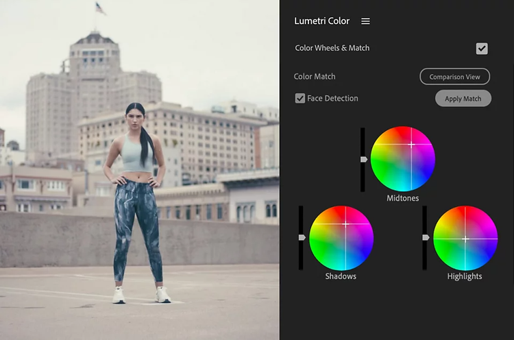
Make basic corrections to exposure, white balance, and contrast in a snap with Auto Color. Preserve natural skin tones and automatically match color between shots with Color Match. Use Color Wheels to adjust shadows, midtones, and highlights, and see the difference side by side with Comparison View.


Natural and consistent color is just the beginning. Shape the mood of your project with tools to shift vibrance, saturation, and tint. Isolate a specific color, make precise changes to contrast, or apply a vignette to fade the edges of a clip and draw attention to a focal point.
Take advantage of Lumetri looks to emulate different film stock and give your footage a timeless cinematic look. Also, use Look Up Tables (LUTs) to create and save your own custom color grades to give your clips a unique, consistent style. Adapt your LUTs to look great with any RAW or encoded format.


Easily edit advanced settings with Lumetri Color. Monitor color and luminance levels with total accuracy with hardware-accelerated Lumetri scopes like Vectorscope, Histogram, Parade, and Waveform.

Annual, billed monthly
Includes 100GB of cloud storage, Adobe Fonts, and Adobe Portfolio.
Annual, billed monthly
Get 20+ Creative Cloud apps, including Premiere.
Annual, billed monthly
Save over 71% on Creative Cloud Pro.
See terms | Learn more
Annual, billed monthly
Get Premiere and 20+ Creative Cloud apps, plus features to easily manage licenses, simplify billing, and more.

![]()
Visualize shots and effects ahead of the shoot, generate assets missed in production to complement your edit, and eliminate tedious tasks to stay focused on your creative ideas.


