https://main--cc--adobecom.hlx.page/creativecloud/img/icons/designer.svg | Designer https://main--cc--adobecom.hlx.page/creativecloud/img/icons/painter.svg | Painter
Feb. 28, 2023, by Charlotte Stobrawe
Real-world Suit Design Meets 3D Garment Creation
Charlotte Stobrawe discusses her creative influences within Fashion, and breaks down the creation of her embroidered suit project.
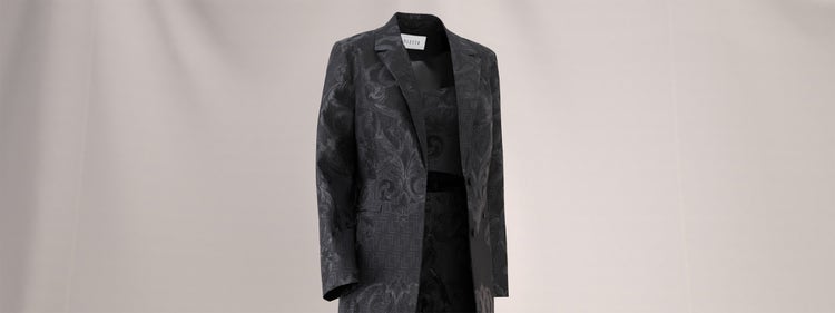
I am Charlotte Stobrawe, and I am currently working as Head of 3D for a Danish fashion brand called VILA, which belongs to the BESTSELLER group. My background is in fashion design, and I developed 3D skills in an effort to make fashion more digital and sustainable.
My journey started with a traditional fashion design education in Berlin. After my bachelor’s degree in 2017, I interned as a Production Coordinator for a fashion start-up hub in New York where I learned about production processes in the fashion industry. A lot of this knowledge about the processes from the first sketch to the final garment transfers well into 3D as it comes down to similar steps.
The Impact of Real-World Design Experience
After gaining some experience in the fashion industry I decided to attend a master’s program at Polimoda fashion school in Florence, Italy. Besides courses about business, fashion, art, and more, I had the opportunity to learn about traditional craftsmanship.
I immediately fell in love with high quality fabrics and formal clothing; this passion impacts my approach to 3D design. We spent a lot of time studying the traditional construction of suits: the pattern construction, different linings and interlinings, stitches etc. Hours of hand sewing, and sore fingers were the result. It was quite an intense but beautiful process. I also gained much knowledge about the drape of fabrics and fibers on a chemical level. Later, when I started creating fabrics in 3D, this hands-on experience gave me an excellent point of reference to evaluate whether my 3D materials were behaving appropriately.
After finishing the program, I worked as a Designer for a high fashion accessory supplier with a strong focus on sustainable materials. It was a fascinating job! I realized, however, that I wanted to have a real impact on the democratization of sustainable fashion, and therefore I had to approach fast fashion.
This was my main motivation when I started with 3D – designing in 3D makes it easier to avoid consumption and save fabrics. I saw the immense potential this could have on a larger scale production.
With a heavy heart I decided to leave Italy and high fashion behind to chase my vision of digital fashion and sustainability. My next stop was Barcelona where I worked for a big fast fashion supplier. I tried to push digital tools and realized how hard it is to change the mindset in a company. How could 3D compete with physical samples? Could it ever look ‘real enough’? How can the technology be implemented in existing workflows? Can it be more efficient than a traditional design approach?
And this is where the Substance 3D apps come in. If you want to convince people to invest in 3D or buy products from computer-generated images, it needs to look as photorealistic as possible.
After years of self-learning, I finally felt confident enough to apply for a 3D Designer position and I moved to Denmark to work for the BESTSELLER group. Now, as Head of 3D at VILA, I am working with a team that is looking into the various Substance 3D apps and how to implement them into our pipeline. The potential is huge.
Creating a Complex Material
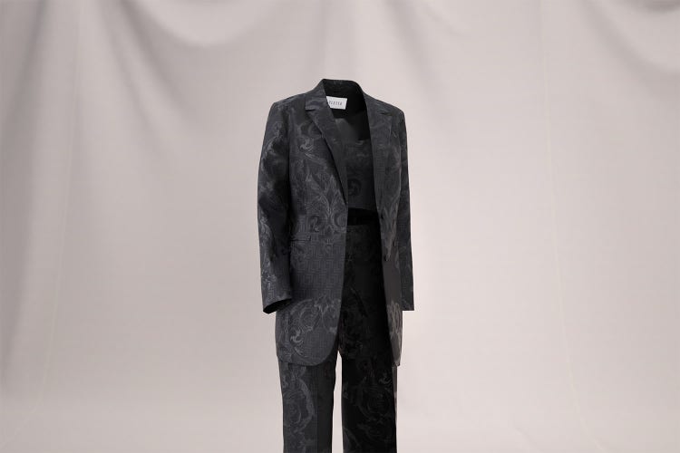
When I started working with 3D garments, I used scanned materials. That approach works well with simple fabric weaves but reaches its limits with more complex fabrics. For example, scanned Jacquard fabrics or scanned embroidery elements never looked crisp or truly appealing to me.
‘The Suit’ was created about a year ago as a personal project. One of my objectives was to test and challenge my development with the Substance tools. I had already followed a few Substance 3D Designer tutorials and created some basic materials. I approached this project as somebody who does not have a professional education in 3D and who does not have thousands of hours of experience with the software. I consciously wanted to test the limits of what sort of result I could achieve, coming into the project under those constraints.
I suppose there was also an element of research in this – I wanted to gain a sense of how easy or difficult it would be for fashion designers to familiarize themselves with the Substance apps, with what I would call a ‘realistic’ amount of dedication.
A Fabric-first Approach
A project often starts with a spontaneous inspiration which leads to a mood board that captures the overall aesthetic and message. In this case, I came across an amazing collaboration between Fendi and Versace. The collection featured a gorgeous suit which sparked my attention immediately. The fabric seemed to incorporate a shiny metal thread and I decided to investigate the construction further.
Suits have a special meaning to me. When I wear a suit, it provides me with a lot of strength and confidence. The suit was shown on a male model, and I decided to alter the look by translating it into 3D with a similar fabric and more feminine fit.
I enjoy working with subtle contrasts. In this case, I aimed to create a looser blazer shape combined with more fitted pants and highlight the contrast between matte and shiny areas of the fabric. One of the most interesting points was the light reflection of the fabric and if I could replicate this effect in 3D.
Starting a project with a mood board is common, but how I conduct my research from there is a little different to most 3D Designers. Before I sketch or create a shape, I typically venture out to find variations of fabric swatches that are like my inspiration. This is due to my background in ‘physical fashion,’ and a habit I cannot let go.
As a student in fashion school, I did not have enough resources to design and produce my own fabrics and I had to work with whatever was available. I have maintained that habit of fabric hunting as a first step even though working in 3D enables me to design and create my vision without compromise. Fabric hunting helps me to study different fibers and construction types up to the point where I feel comfortable replicating them in 3D.
On my mission to create ‘The Suit’ my first step was to figure out the base composition. The suit was made of some sort of Jacquard fabric which I identified as a classic mix of wool and silk. While the wool gives the suit a matte look, the silk adds an elegant shininess.
Afterwards I investigated the floral elements – is the metallic-type thread an embroidery? Is it part of the Jacquard weave? Is it a coating of some sort? The only way to find out was the manufacturer’s websites which described the material as ‘metallized polyester.’
Defining the fabric texture and drape early on is vital to my 3D design process. As with the physical design process, the pattern construction, ease, and fit of the style should be defined by the fabric properties. Later in the project I will need to define the fabric’s properties in CLO, to simulate the garment realistically. If I were to create and simulate a garment and afterwards decide on a fabric / texture for the shape, the texture would not necessarily be cohesive with the properties of the simulation. Working with the fabric first, and then worrying about the pattern and simulation of the garment later, allows me to avoid that issue.
The Substance 3D tools help me with this first step. They allow a great deal of precision in defining textures and getting a realistic result. I can define the thickness and direction of the threads, work on the roughness and add noise for imperfections based on the real-life appearance of the fabric. It is a logical process.
The LL Logo
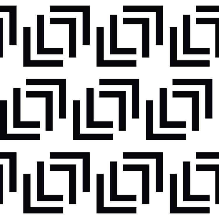
I created the ‘LL’ logo a long time ago. It stems from ‘LOLETTA’, an old nickname of mine which I used when designing collections. The logo was created a long time ago as an Adobe Illustrator file and I decided to use the software to try out different layouts, sizes, and angles for a repeating pattern. Illustrator works well as a quick preview tool before creating a pattern in Substance.
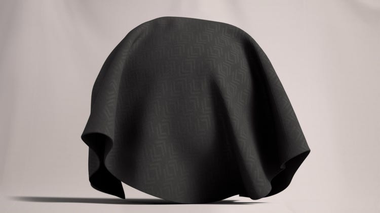
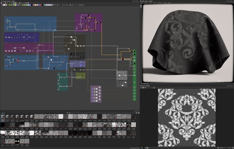
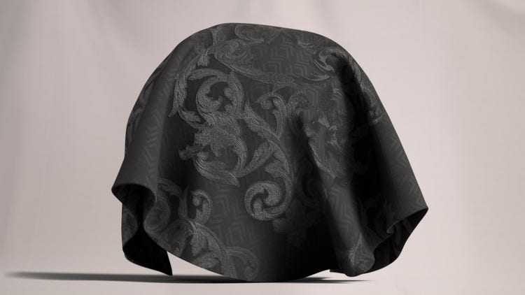
After I found the right layout, I added the repeating pattern into my node graph in Designer. I decided that the repeating ‘L’ in that logo should have a defined and crisp edge compared to the embroidery edge. The goal was to resemble delicate woven Jacquard fabric that does not distract from the embroidery but is still interesting enough to give it a closer look. The ‘LL’ logo should be visible but subtle and defined by roughness and thread direction rather than by height or color variation.
Creating an Embroidery Effect in Designer
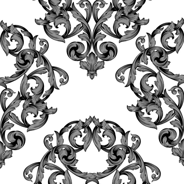
I created the embroidery effect very much by approaching it the same way I would with a real-life fabric – that is, I made the base fabric first and then added the embroidery thread as a second step.
The most important thing when replicating an embroidery effect is to consider the length of the fibers. Embroidery is typically manufactured by stitching long, continuous threads on top of the base. Creating the feel of long and smooth threads was essential to make the 3D embroidery credible. Where embroidery thread passes through the base material there is tension. Therefore, I spent some time working on the edges of the embroidery – those edges are not perfectly straight; I added a little noise and distortion to bring them closer to a real-life look.
Afterwards I looked at the height. Embroidery is adding an extra layer of thread to the base fabric, which adds thickness and dimension. However, creating two flat levels of height is not enough; it is more nuanced than this. It is important to give the applied embroidery a round edge as it enters the base fabric which shows the gradual change in height. I used the height map for the thread blur which provides that roundness.
I intentionally decided to work without color contrast and put my focus on the texture maps. The base fabric and the Jacquard on top were both created in the same black Pantone color. Early in the process, I set the color of the embroidery to a bright pink to get a better understanding of the dimensions. As soon as I was happy with the result, I changed the color of the thread back to black. The key challenge was to work with a black material that would expose any little mistake on the maps. Everything must be done correctly; there is little room for error.
Lookdev
The lookdev was very intense. Creating all the threads and maps was extremely easy in theory but giving it the finishing touch was more laborious than expected. Slight changes would impact on the overall look of the style. I had to go back and forth changing values by one percent at a time and checking how that impacted my project.
As the embroidered areas of the fabric are thicker and therefore higher than the base material, they would cast small shadows. I started with a displacement map to enhance the height of the embroidery, but this did not give me the desired effect. I enhanced the shadows by adding an ambient occlusion node. Later I worked with an inverted version of this ambient occlusion path node to remove the shininess in the shadows on my roughness map.
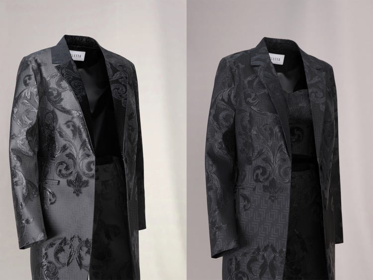
A comparison of lighting and shading that produced unrealistic results, with more effective lighting.
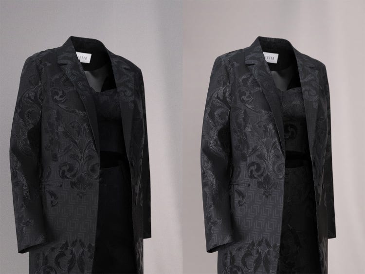
A comparison of overly dark lighting with more effective lighting
UV Layout
I am usually quick with UVs but this time I had to tackle 2 positions: the base and the embroidery.
In fast fashion the position of a repeating pattern like a flower motif is often not important. The position of the pattern depends on the fabric consumption as the dresses are being manufactured. So, each dress is slightly different.
For this specific suit, the positioning was crucial. The base had to be mirrored at the center back, and I wanted to make sure the repetition aligned nicely at the shoulder seams and the lapel collar. I wanted the embroidery to pronounce the chest area and be less prominent around the waist while aligning well at all seams. It was a lot of trial and error.
Many artists use Substance 3D Painter to ensure the correct texture placement without changing the existing UV layout. I did not do that here purely because I was not familiar with using Painter for this purpose at the time. In this case, I personally found it easier to create a custom UV layout for this project in Blender.
Explosive Layers
Many 3D fashion designers know the problem of exploding garments during simulation. It sounds fun – but it can be quite frustrating and time-consuming.
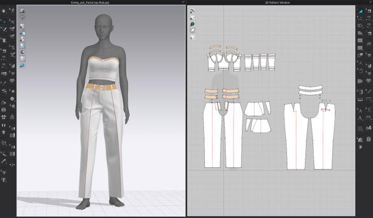
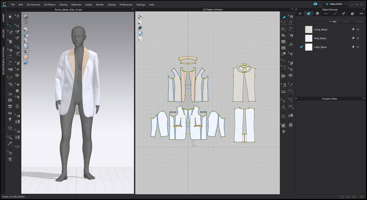
When simulating various layers in CLO, each layer needs to keep a certain distance from one another to keep them from colliding. ‘The Suit’ is a style with various places where many layers are close to one another – for example, under the armpit. The style was created in an A-pose. However, as soon as I changed to a pose, the problems began.
I included a corsage underneath the blazer, which had two layers – the outside layer and a facing. Then there is the blazer itself, which has another two layers around the upper body – the lining and the shell. Also, there are two more layers for the blazer sleeve – the outside and the lining. So, in total: six layers underneath the armpit, all squishing together when the avatar’s arms move down.
Every software package has its limits but also some hidden tricks to work around it. I resolved the issue by simulating the different layers separately. Using the exact same avatar, I simulated the pants with the top first and exported them as an OBJ. Afterwards, I simulated the blazer on top of the OBJ. Using a small offset helped to fit them together perfectly.
Communicating the Design
In the industry it is vital to be able to communicate designs accurately to fabric and garment manufacturers. For shapes, CLO provides a good solution. Designs in CLO can be exported as DFX files, which is a 2D format that can be used in all main pattern design CAD software. In my day-to-day work we use Gerber or similar types of CAD software to draw patterns and communicate with CLO. In practice, we will typically create a pattern in 2D and then export it to CLO or we’ll start in CLO and then bring it back to the 2D CAD software before sharing the style with manufacturers. This has proven to be a very efficient approach when producing physical garments with the help of 3D.
I currently see the Substance 3D apps mainly as previsualization tools for designers. Conventional fabric design methods are limiting designers to 2D drawings and often create a flat look that fails to convey the full complexity and beauty. I believe the Substance 3D apps are incredibly useful to show the fabrics in different lighting setups and environments which makes them come alive.
And yet, to make the Substance apps more useful to garment manufacturers, it would be necessary to include more data to make the fabric ‘production-ready’. For instance, when a machine is weaving a fabric, data on the construction, threads, and level of tension are necessary. Currently, this sort of information is not present in materials created in Substance apps – and so it is not possible to convert the Substance material file for manufacturing software. In my opinion, including this sort of information would be a big step forward in making this app more attractive for manufacturers.
Staging and Choice of Renderer
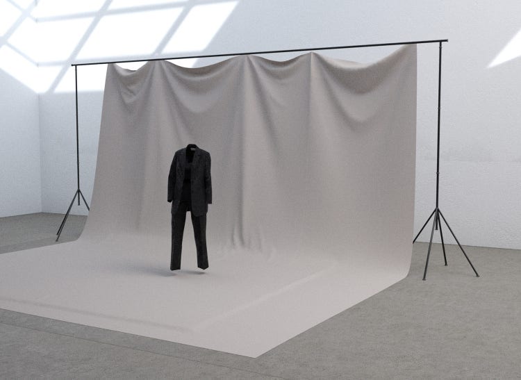
As a first step I placed the suit within a very straightforward 3D studio scene in front of a white wall. I felt that the background needed to be softer to balance out the strong and slightly masculine-looking suit. Placing a drapey white fabric sheet behind the suit helped me to add softness without diverting focus.
In 3D there are always 10,000 things that can go wrong. If there is a problem with your project, it helps to go through a process of elimination to track down the issue. I decided to use a lighting that was created based on a real photo studio during a previous project. Knowing the light in and out helped me to identify problems within the fabric.
The final scene is based on a 3D replica of a studio with some windows that allow natural light to fill the room if needed. My studio was already set up in Daz Studio, which led me to render this scene in this software. Moreover, Daz Studio is known for having a great range of customizable avatars available to use. It is convenient that these rigged avatars can be easily moved between Daz Studio and CLO.
Lighting
In terms of how I positioned my lights, I intentionally focused on highlighting the details and textures. One of my objectives with ‘The Suit’ – and maybe this was an objective that became more clearly defined as the project progressed – was to create a garment with a very classic chic look. It looks quite high-end, and there is a lot of focus on the complexity of the fabric. To put this suit in a very hectic or colorful environment would take focus away from the details.
With this project, it was my ambition to showcase what a self-taught 3D fashion designer could achieve with the Substance tools. To highlight this, the textures needed to be clearly visible. Therefore, I positioned multiple lights around the suit to create different reflections and create depth. I used lights with different strengths, so they would not completely eat each other up.
I placed a larger softbox on the left side of the suit and 2 smaller spotlights to really emphasize the shimmery textures of the fabric. I positioned a black wall to establish a strong contrast on the right side of the suit. This is a technique I learned on set a while back. The wall absorbs the light when it strikes and therefore reduces unwanted bounce light in the scene.
One of the spotlights is positioned over the top of the suit – not straight down, but at a slight angle to emphasize the chest area. Thanks to the reflections, it also creates a clear division between the lining and the corsage.
The goal when creating the lighting was absolutely to keep the images clean, and to keep the focus on the texture and details.
Test Renders
My first renderings are usually with an avatar in the frame. The skin of the avatar serves as a reference to check if the lighting is credible. As mentioned above, it is quite easy to pick an avatar provided in Daz Studio. It is a great starting point. Over time I have created a set of customized avatars based on real-life models. Putting the garment on an avatar with a realistic skin tone acts as a safeguard. It happened multiple times in the past that I was tweaking and tweaking the light to make a garment look perfect – but the light became unrealistic. When putting an avatar in the scene and its skin starts turning strange colors, you know the lighting setup is not working.
Getting to the Final Render
For me, there is no single key involved in getting a good render. That comes from the combination of every factor working well: the geometry, the texturing, the shading, the lighting – if one element in the scene is off, a photorealistic result is almost impossible. It will look very ‘3D’.
That said, I think the fact that I managed to set up realistic lighting absolutely boosted the final quality of this project. I am by no means a professional photographer, but I have tried to pick up as much as I can along the way. learned a lot about ‘real-life’ photography from a great colleague of mine at VILA. He taught me about setting up a black or gray screen close to the model to reduce light bounce, how to set up spotlights and soft boxes in different ways and how to control the lighting precisely. I apply most of these ‘real-life’ principles when working in a 3D studio.
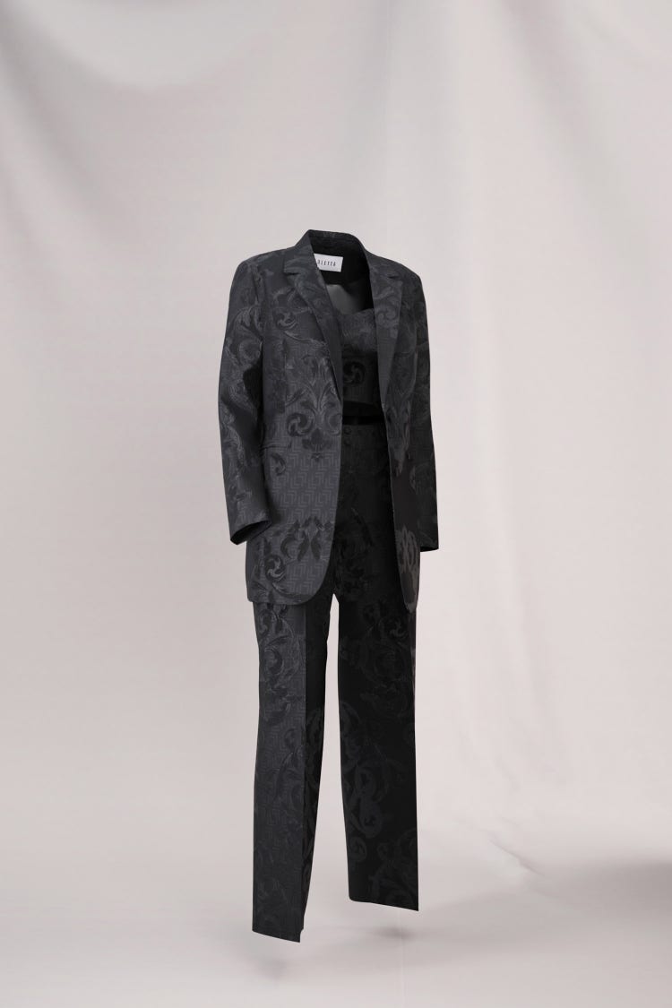
Also, the 3D camera mimics a ‘real’ camera lens. The focal distance is quite visible in the renders – some parts are crisp, while others are slightly blurry. The image becomes a bit blurry at the shoulder, notably.
A lot of designers like to go into Photoshop and then adjust the colors of the render after the fact. Personally, I try to avoid any post-production in Photoshop. I prefer to establish the lighting and the overall mood and warmth of the picture in the render itself. For the warmth of the lighting, I work a lot with the Kelvin scale, which indicates the thermodynamic temperature. The renderings of ‘The Suit’ were cropped in Photoshop and I added a little bit of contrast. The vast majority of what you can see comes from the render itself.
Takeaways and Tips
One of my favourite aspects of the Substance 3D apps is how well they interact with other software. For instance, when you publish a material created in the Substance apps, it generates a single Substance file which can be opened in CLO by drag and drop. You immediately see how the material looks on the style. If you were to work with individual maps, you would have to export them separately, think about the resolution of all the maps and probably adjust some of the values. This can take a really long time. If you are working with the Substance apps, everything is packaged together, which makes it much easier and faster to work with software like CLO or Browzwear. I think that is wonderful.
My key tips for designing clothing in 3D: have lots of patience; never give up.