Not sure how to get from rough ideas to polished creations?
In this tutorial, I'll show you how I sped up my workflow while creating brand assets for a fresh food store.
My name is Sydney Michuda Designer, Illustrator and Director behind Super Creative.
Let's jump in.
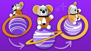
To start, I have a series of font options, rough sketches for icon ideas, and some style inspiration, but I'd like to iterate and refine these icons.
Let's open the Contextual Task Bar and use Gen Shape Fill to expand on these ideas.
I'm going to start with the Apple icon.
I'd like to begin by keeping the prompts and settings relatively simple, see what needs to be changed, and then build from there.
I'm going to select my sketch, click Gen Shape Fill, click Settings, add my prompt, inside of an apple, leave the sliders in the middle, but add a Style Reference so I can get a similar style to my inspiration and hit Generate.
Sweet.
The first, that's pretty cool, but not exactly logo material.
Let's refine the settings.
I'm going to slide the Detail way down, because I want this to be simple and reduce the colors to only two.
We're definitely getting there.
This is super close, but I don't love the three options.
Let's use the same settings but try again just to see what we get.
Perfect.
I really like that first option.
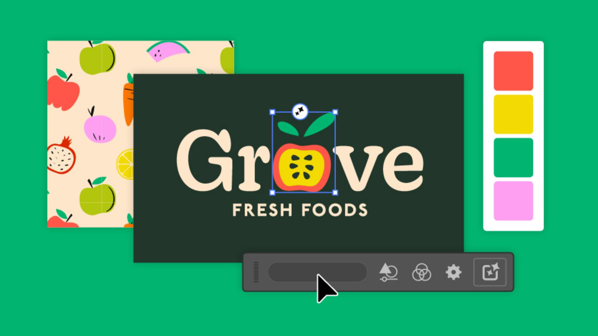
I'm going to do some quick refining of my own to get this logo ready and eventually pair it with logo type.
Let's experiment with some of these other concepts and use the same process of ideating and iterating.
I have an idea for a little sprout on a reusable bag, so let's click into Gen Shape Fill and Settings, add our prompt, tote bag with leaf and branch icon on it, bring the Shape and Details sliders down and limit the colors to two.
That's a great third option.
After more exploration, some finishing touches and refinement, we have a set of concepts and a polished logo.
To create these logo icons, I used Gen Shape Fill, since it allows me to start with my concept sketches and explore more unconventional ideas.
Text to vector graphic, on the other hand, helps in creating more standalone, elaborate graphics, so I don't have to sketch out a whole scene beforehand.
Let's use Text to vector graphic in our next process, I need to create some illustration assets to use within the brand.
Let's head back to the Contextual Task Bar and click the Text to vector graphic feature.
I'm going to type in my prompt, under Content type, click Scene, drag the Detail down a bit and select the same Reference as the logo round's.
Now Generate away.
Those are really great first options.
I could see myself mix and matching the illustrations from all three results.
And just because I like to experiment, I'm going to duplicate the asset, open Settings, and test out what happens when I select Subject for the Content type.
I'm also going to open Color and Tone, and from the Color Presets, select Vibrant color.
Those are nice, but I really like the originals.
Let's go with those.
With a little tweaking, I now have a full set of illustration assets for this fresh food store brand.
Next, let's create some pattern ideas for the in-store packaging.
Head to Object, Pattern, Generate Patterns to open the window.
I'm going to create a square that's at least 300 pixels wide.
And while selected, type my prompt into the window.
Those are fun options, but not quite what I'm looking for.
Let's refine these settings.
I'm going to adjust my prompt, and under Settings, I'm going to lower the Density, so the items in the result don't appear quite as compact.
There we go.
That's closer to what I had in mind.
It still needs some adjusting to make it cohesive with the rest of the brand, but it's a great start.
I love the bright palette we got from the Text vector graphic process, but I'd like to explore a more muted option, just in case.
I'm going to select my illustrations, click the Recolor Artwork button and select Generative Recolor.
I'm going to add a prompt that fits a more toned-down palette and hit Generate.
Nice.
Those are all beautiful variations, just in case our client wants a softer palette.
And with that, we've taken our rough concepts ideated and iterated, polished with our own style and expertise, and delivered client-ready brand assets that are safe for commercial use.
Again, my name is Sydney Michuda of Super Creative.
Give this process a try yourself and show your results.