The way you use and pair fonts has a profound effect on your message and the feelings your graphics evoke. You may have brilliant and compelling copy, but if your typography — the art and technique of arranging type — isn’t working, it will turn people off.
This isn’t just about aesthetics (although pleasing design is a must in today’s style-driven social feeds). Typography influences action. Research has found that when information is presented in harder-to-read fonts, people subjectively perceive the task as more difficult, even when the underlying content is the same. It’s a phenomenon linked to cognitive processing fluency. In other words: If our brain struggles to process the text, we assume the thing behind the text is harder too.
That’s not the vibe you want your content sending — especially if you’re designing ads, flyers, or social graphics meant to inspire confidence or spark action.
So, here are 13 practical, creator-friendly typography rules to help your designs communicate better, feel clearer, and look more intentional — no matter your niche.
Key takeaways
- Good font choices improve comprehension, trust, and audience engagement.
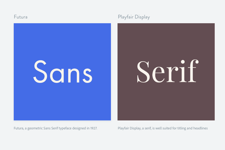
- Sans-serif fonts generally perform better on screens, but mixing font types can strengthen hierarchy.
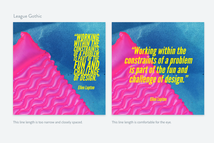
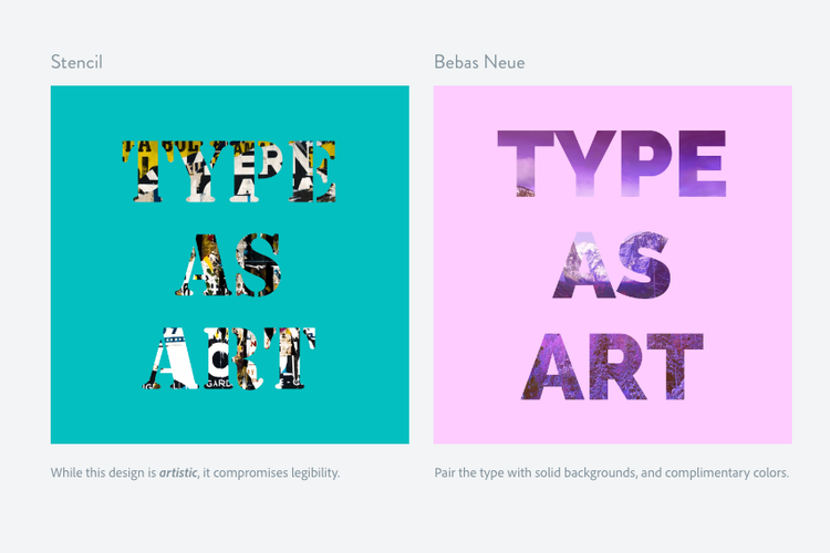
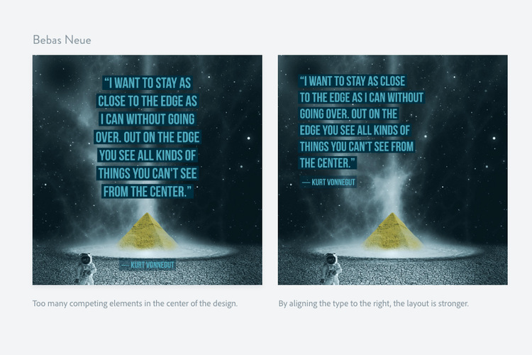
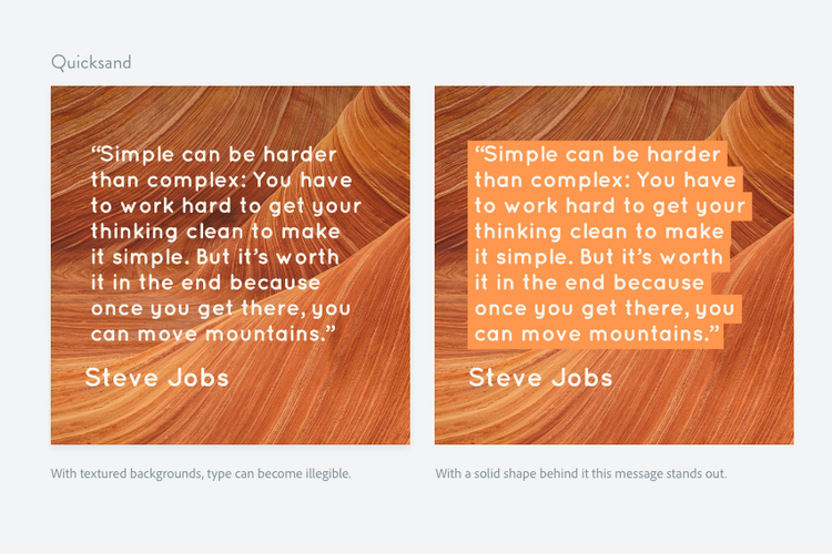
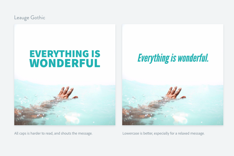
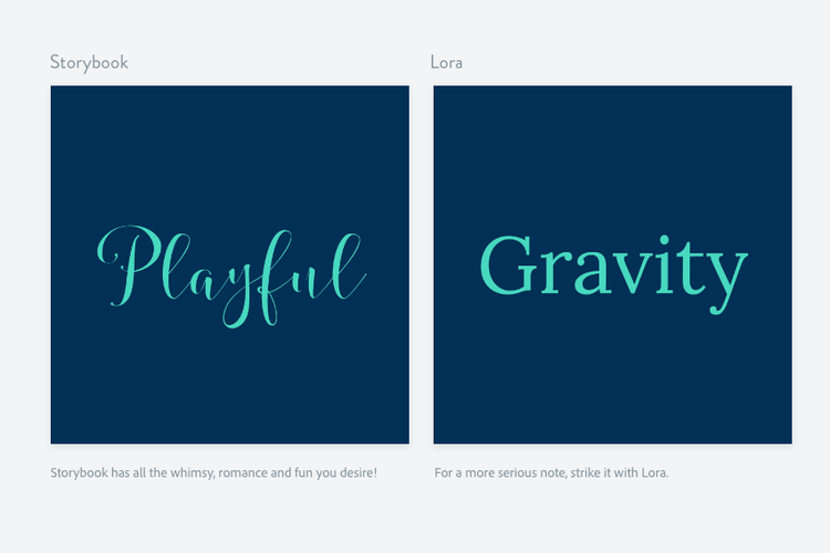
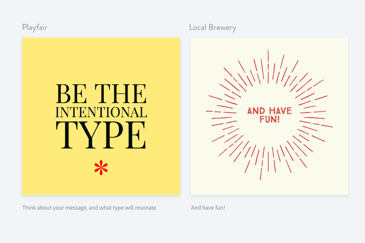
- Typography should support your message, not compete with it.
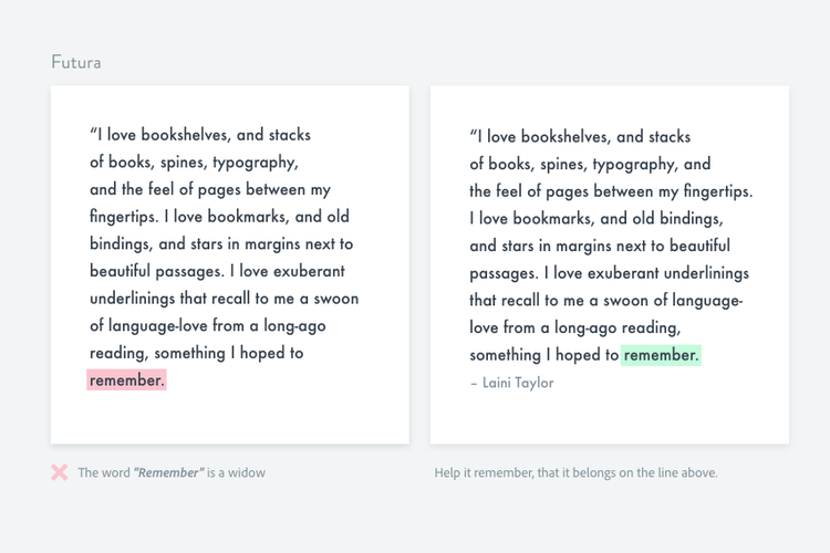
- Limit fonts, tighten spacing, and remove distractions to improve legibility.
Great typography influences how easy (or hard) a reader feels something will be to do.