For visitors and locals alike, the world’s great cities offer a seemingly endless supply of things to see and do — and their vast transportation systems make it possible for millions of people to experience them daily. In cities like New York City and London, riders navigate these underground systems with ease thanks to clear, concise, and attractive signage and maps that seamlessly manage the flow of ridership.
But the New York Subway and London Underground weren’t always the efficient marvels they are today. In the beginning, navigation was fragmented and confusing. It was only through intentional design that today’s user-friendly signs and underground maps were developed.
Clearly communicating a message to an audience in a small space is an art form. Today, the signage in these two leading metro systems sets the standard. Their stories highlight the principles of functional design that do a lot of heavy lifting with just a little content — principles that can guide your creative projects when space is limited.
The evolution of exceptional UX design.
The NYC subway system began operating in 1904, and by the 1960s, its signage was a mess. Various printers over the years had used different colors, typefaces, and sizes, resulting in a cluttered accumulation of wordy, mismatched signage that was often more confusing than helpful.
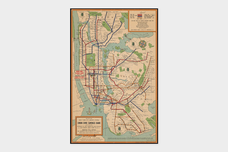
Renowned designers Massimo Vignelli and Bob Noorda took on the project of overhauling the subway signage in the mid-1960s. They started by sitting in subway stations, studying how people used the system and where they looked for signage. Based on their observations, they developed the simple, effective system of numbering and color-coding each train line that’s still in use today.
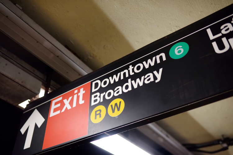
They also created the Graphics Standards Manual, which specified exactly what signage should appear at certain points in a journey and how each sign should be formatted, from the colored circles down to the amount of text and even the spacing between each letter.
The London Underground, by contrast, developed its iconic red and blue logo early on. The roundel, as it came to be known, made its debut in tube stations in 1908 as a solid red disk overlaid with a blue bar and white lettering. At the time, several different railroad companies were each running a part of the Underground, and the new logo standardized a systemwide graphic identity that made navigation easier.
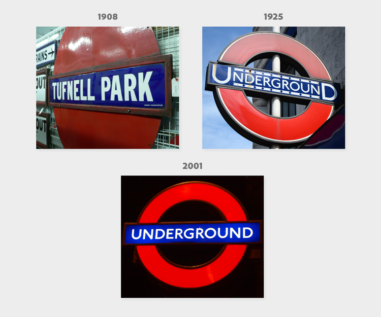
Image credits, clockwise from upper-left:
1. Chris McKenna (Thryduulf), CC BY-SA 4.0, via Wikimedia Commons
2. Lachlan Fearnley, CC BY-SA 3.0, via Wikimedia Commons
3. Danbu14, CC BY-SA 3.0, via Wikimedia Commons
When the London Underground map was created in 1933, it was initially met with resistance because it eliminated above-ground details and simplified train routes and distances to fit better on the page. Designed by electrical draftsman Henry Beck, the map was based on the circuit diagrams he used in his work. It didn’t take long for riders to realize how much easier the simplified tube map was to use, and it quickly became beloved by Londoners.
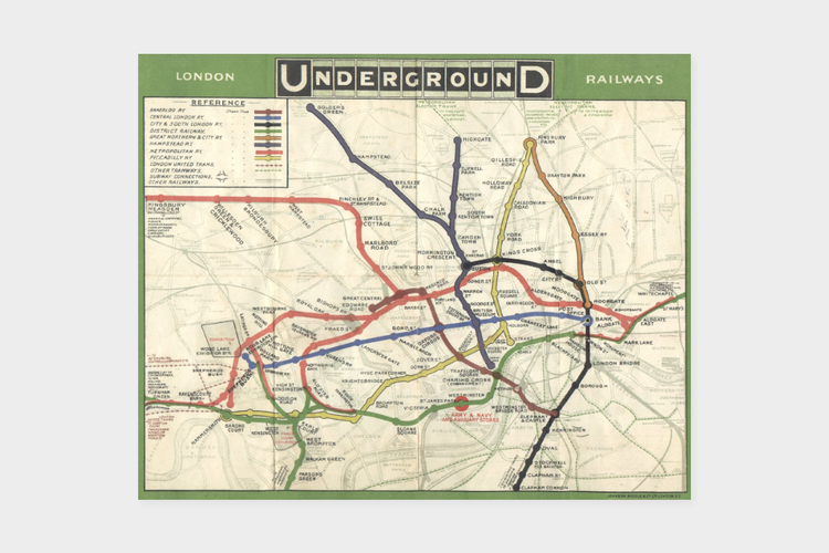
Forty years later, Beck’s design influenced Vignelli in New York, and in 1972, Vignelli created the first version of the modernist, color-coded New York Subway map still used today.
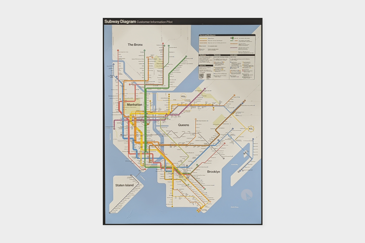
Image credit: Adapted from The All-Nite Images, CC BY-SA 2.0, via Wikimedia Commons
The cases of the London Underground and the New York Subway both illustrate that simplicity is the key to great signage. Both systems became more efficient and easy to use when designers removed all unnecessary information from signs, strategically placed signs only where they were needed, and produced simple maps that stripped out extra information.
This particular style of design keeps the New York and London subway systems moving along so that riders barely notice the extensive signage — and that’s the point. Their success is among the most famous early examples of exceptional UX design.
Five tips for getting creative within constraints.
Whether your audience is looking at a post in a social feed or standing in a storefront where your poster is hanging, they often need to get actionable information quickly.
Drawing inspiration from the signage in the NYC and London subway systems, you can use short messaging and clear design signals, along with Adobe Express templates, to create your own high-impact content.
Here are a few tips to keep in mind when creating content with limited real estate.
1. Determine the purpose of each asset.
Do your research to understand what information people want or need at specific times or in specific locations, and create assets that deliver it.
Are you trying to lure people to a restaurant, inform them of an event, or prompt them to purchase something for sale? Make sure your content relays the relevant information at exactly the right time in the place they’re most likely to look for it.
recipe
2. Keep your design simple and your message short.
Like subway riders, people in today’s fast-paced environment are often looking for information en route to accomplishing a specific task, and they need to absorb information quickly. Too many words and design elements slow them down, so keep your content simple and visual.
As the writer Antoine de Saint-Exupéry said, “Perfection is achieved not when there is nothing more to add, but when there is nothing left to take away.”
recipe
3. Use eye-catching visuals.
When your online and in-person audiences are in motion with a purpose in mind, your job is to get your point across in the few seconds you’ve managed to pull their attention. If your work isn’t eye-catching, they may not see it at all, and nothing else you do with the asset matters.
Strong visual elements appeal to the unconscious and emotional mind. Use engaging, colorful graphics, bold typography, and unusual shapes to break through the clutter and get attention.
recipe
4. Choose the right size for fonts and images.
Make sure your assets stand out without overpowering other items in the environment where people will come across them. The Underground logo might take up an entire wall on a train platform to make it easy for people on the train to see which station they’re entering, but it would be rendered much smaller on a sign directing people to the entrance of a tube station.
Consider the context for your asset and how it will look as someone walks or scrolls past it, and scale your design elements accordingly.
recipe
5. Incorporate your logo and other visual signals.
Any asset is an opportunity to increase brand awareness, especially if it also offers helpful information that empowers people.
Create a visual association in the minds of potential customers by finding ways to incorporate your brand logo and colors into your design, even when space is limited.
recipe
recipe
Create standout short-form content with Adobe Express.
If there’s one lesson to learn from the New York and London subway signage, it’s that using limited space effectively matters — and this applies to both digital and physical experiences.
When you understand what information people need and how to communicate it, Adobe Express can help you create eye-catching assets that help your audience accomplish their goals quickly and easily.
Start creating now with Adobe Express.