
Color is a powerful tool in a marketer or business owner’s arsenal as it communicates emotion and intent instantly on a deep, subliminal level. The most successful brands become almost synonymous with the colors they use: Coca Cola and Target are red. Starbucks is green. Facebook, Twitter, and IBM come in shades of blue. These colors are used so intentionally and consistently you’re likely able to recognize them in seconds, before even reading the tagline or logo. Research even suggests that between 62-90 percent of consumer decisions are based on color.
You don’t need a brand strategy team to make good color choices for your business. And the great thing about color is that once you establish brand colors, you can use them in strategic and fun ways across social media that will make your content more recognizable—and the way visual media travels around the internet, it’s more important than ever to have your brand hitch a ride with it. Creating a strong color scheme, using fonts strategically, and thinking through the images that represent your business on social media are important elements in creating a brand. Here’s what you need to know about using color effectively in your business communications.
1. Understand basic color theory.
Before you start selecting color, you’ll need to understand basic elements of color theory. Let’s talk about the color wheel:

The 12-step color wheel was originally developed by Sir Isaac Newton. This wheel can aid you in making color choices in a harmonious way. Each color in the wheel is called a hue (the name of the color in the color wheel, for example: blue-green, red-orange). Creating balanced contrasts between the colors you use is essential to creating visual harmony and aiding readability. Pairing color can be tricky, but here are the basics:

Complementary colors are directly across each other. These are the most contrasting color relationships in the wheel and tend to be eye-catching and bold. When selecting these combinations, be careful if you use the true hue—as in the exact colors you find on the 12-Step Color Wheel. Not enough contrast between the two colors will create visual vibrations. Visual vibrations are when two overlapping colors seem to vibrate, making it hard to read. Check out the diagram below to see what we’re talking about.
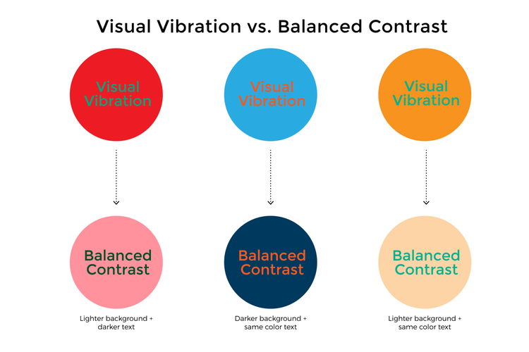
In the top section you can see how the type appears squiggly. Hard to read, huh? Avoid this fatal flaw of design by lightening or darkening the color values in order to create better contrast.
Sometimes, it’s hard to tell if you have the right contrast—especially as you learn about color. But here’s a trick. Squint your eyes until they’re almost closed. The colors will start to turn grey and blend together. If they look like the same gray tone, then you don’t have enough contrast but if they don’t, you are heading the right direction. Here is an example of what you could see.

Analogous colors are two or more colors that are close in proximity on the color wheel. These combinations are easiest on the eye.
Split complementary colors use 3 colors where two colors are split from the main complementary color (think of it connecting as a Y). You can achieve contrast with these combinations, but with less intensity.
Double complementary are the same as complementary colors, except it’s two pairs now. Remember it’s important to have enough contrast between the 4 colors.
Triadic are any 3 colors that are equally spaced around the color wheel.
Monochromatic colors are made up of tints and shades of a single color. Tints are mixed with white or a lighter color, and shades are mixed with black or a darker color.
Adobe Express takes some of the guesswork out of choosing color by suggesting professionally designed color palettes you can use in your designs, but having a basic understanding of these color relationships will help you be more intentional in your content creation.
2. Seek inspiration.
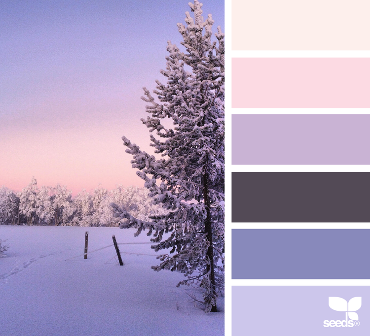
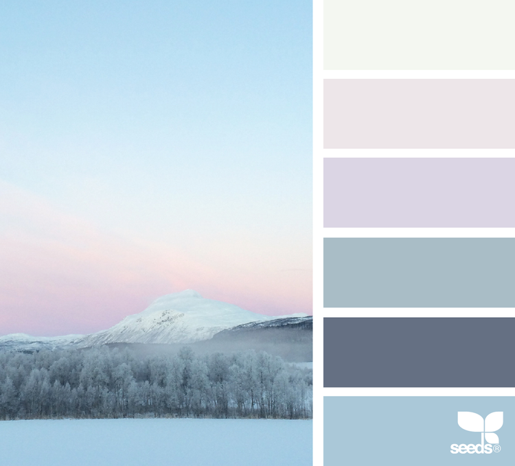
Now that you have a better understanding about color theory and harmony, you can start to focus on choosing colors for your brand. While we are talking about using color intentionally, sometimes you can feel completely stuck on what colors can work. Step away from the computer and look to your surroundings for inspiration—architecture, nature, fabrics, paintings are all great sources. As you look for these, write down HOW you felt as you encountered these colors. Make sure it aligns with the feeling you are trying to evoke. It’s also helpful to notice how color pallets work in design and in the natural world. Check out the multitude of shades that appear in these landscapes from Design-Seeds:
You can also look into websites like Adobe Color, Pinterest and Pantone for additional inspiration.
3. Know the meaning behind color.
Like fonts, color exudes emotion. It can enhance your message or detract from it. Once you found colors that inspire you, make sure you understand how their meaning can influence your message. Be sure to consider your color combinations too! Remember too little or too much contrast can affect your efforts. Here’s a downloadable (download) color chart to help you with your color selection.

The meaning of color can also be influenced by current market trends. These reflect current cultural shifts and growing habits. Each year Pantone selects a color of the year based on these shifts. These color trends influence various aspects of the market, from architecture, fashion, graphic design, textiles, interiors and even food. Understanding trends can help you gather some insight, but keep in mind that not all color predictions will align with your business and the emotional connection you want to achieve.
4. Maintain consistency.
If you think about the most recognizable brands out there—Coca Cola, Starbucks, Facebook—your mind likely conjures up a consistent brand identity. The more consistent you become with your colors, the easier it will become for people to recognize your brand in the long run.
Consistency also just helps your marketing materials and website look clean and orderly. A good rule of thumb is to choose two-to-four colors to represent your brand in various ways. Focus on one-to-two of your colors to make your main brand colors such as in logos, backgrounds, and banners and use the others as accents, like to note your social media handles on graphics or to use in call-to-action buttons. You can add more colors, but only use them for specific situations, like marketing campaigns
While you don’t need to use the same colors in all your social media posts, the most successful Instagram accounts tend to use a consistent filter to lend a general mood. Think about the color values (bright, muted, pastel) that best represent your brand and use them consistently in order to lend a cohesive look. You can also use design templates to create visual consistency around pieces of content or franchises.
For instance, say you post a #MotivationMonday tip for your followers each week. Design one template in Adobe Express or choose from pre-loaded designs in the app and use the duplicate feature to remix the design over and over with new content. You can do something similar with promotions so that your followers can start recognizing a recurring promotion or feature. This will also save you loads of time!
Check out how some brands and indiviudals use consistency in their social media posts to great effect:

Yelling Mule, a digital marketing agency based in Boston, uses photo filters in Adobe Express to establish visual consistency on their Instagram account. They also use consistent themes and fonts for quotes on Instagram by duplicating the design, which saves time. As a marketing agency, Yelling Mule knows it needs to stay in people’s feeds everyday, but as a boutique firm they work as a lean team and need to focus most of their efforts on client work.
Social media author and speaker Peg Fitzpatrick uses a variety of imagery on her Instagram so her posts feel authentic and true to her personality and not overly produced, but she intersperses graphics that speak to her brand, using vibrant pink hues and adding her logo to posts in many cases. You don’t have to shy away from featuring real, everyday images on your social pages, but color and graphics that represent your brand can take your feed to the next level. You may notice that most of Peg’s candids even have a pink hue somewhere in the picture.
https://www.instagram.com/p/BQMU304hFYl/
https://www.instagram.com/p/BPK8NdbhB1g/
While social media content presents an opportunity to expand your color scheme—and the content you share—the most popular accounts think about the types of colors or the values of the colors they post. They might use a multitude of colors, but the hues are similar or one in complementary tones. In general, the most successful Instagram accounts use a consistent filter, which is an easy way to infuse visual consistency into your posts as you develop a visual brand. Once you have figured out the colors that align with the feelings you want to convey, make sure you develop a consistent structure on how you use the colors. Here are some basic guidelines:
• Use 2–4 colors. Focus on one-to-two main brand colors and use the other two as accents. You can add more colors, but only use them for specific situations, such as a marketing campaign.
• Develop a strategy on where you will use certain colors for specific actions. For example: button colors, call to action text or background colors for a text box. You can even take it a step further and use specific colors for certain topics.
• Remember color will vary from print to web so be sure to have the correct color values to end up with closer outputs.
Tell us about your brand on social! Tag your posts with #AdobeExpress.
By Nicte Cuevas, Adobe Express contributor
Nicte Cuevas, Principal of Nicte Creative Design, empowers mission-driven businesses through strategic design & branding. This post was updated on January 27th, 2022.