Introduction
Hi everyone, it's Dave Clayton again, and in this final video of our trifold brochure tutorial, I'll show you how our final design adds some additional features and then get it ready to export and share your finished design.
Let's wrap things up and get your brochure ready to shine!
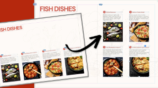
Let's have a quick reminder of what we're creating by looking at the final brochure again.
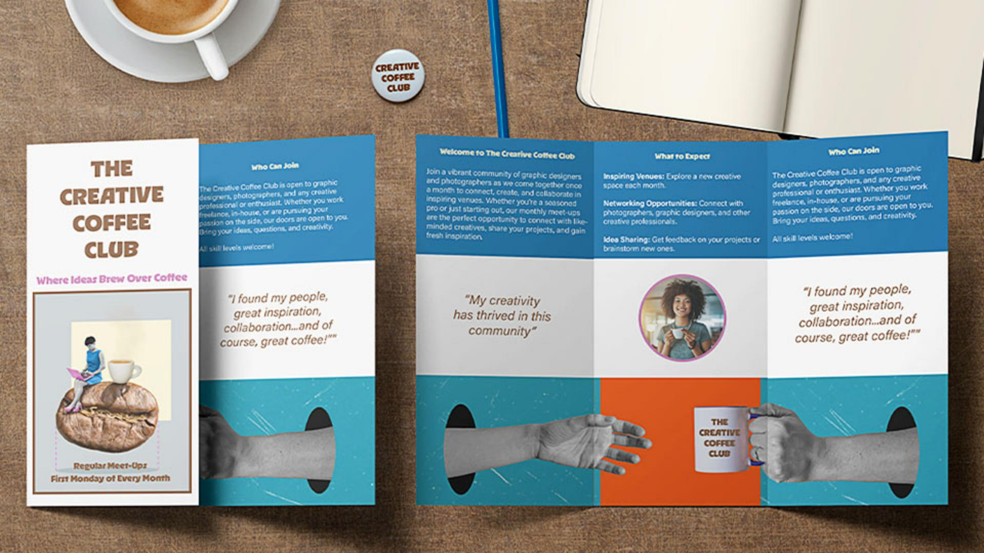
We have our text and images in place, so it's time to bring everything together, with color, refine the design, and get it ready for print.
Creating a cohesive color palette from images
To make our design more cohesive, we'll pull colors from the cover image using the Color Theme picker.
To do that, just select the Eyedropper Tool and then hold to select the Color Theme Tool mode.
Then just click on the cover image, and InDesign will instantly generate a color palette from it.
Simply click the Add this theme to Swatches icon, and now we have a set of custom colors ready to use.
Applying colors to text and layout elements
Let's now start applying them.
First, we'll highlight the cover title text and change it to the brown color, and then we'll do the same for the subtitle, but using the pink color.
Simple changes, but they really bring the design together.
Next, let's apply the blue color to the upper frame.
To do this, just select the frame, go to the Swatches panel, find our new color theme again, and apply the blue.
We also need to extend the blue frame to fit to the bleed lines, the same way we did with the lower image to ensure the color goes all the way to the edges.
Once we've done that, you'll see that the text isn't readable now, so let's fix that.
We're going to change the color to white from the Swatches panel.
In InDesign, white is called Paper.
We'll apply that color to the text in all the affected frames by highlighting the text and clicking on white or Paper.
For the section titles, let's use the cream color from our swatches to keep the design consistent.
Now, let's introduce a circular design element for balance.
Adding shapes, strokes, and visual accents
To do that, just select the Ellipse Tool in the Toolbar, hold Shift, and drag to create a perfect circle.
Position it in the center of the middle in the panel on the second page here.
To place an image inside, select the circle, go to File, Place... as before, choose the image, and click Open.
And if you need to, adjust it using the Content-aware Fit for the best composition.
To make the circle stand out, we'll add a stroke using one of our theme colors.
We'll select the stroke color in the Control panel by clicking on the swatch and selecting the pink color.
Then increase the Weight to 4 pt.
We'll also add a stroke to the cover image, but this time in brown to match the title.
Now, a cool little addition,
Inserting interactive elements with a QR code
let's add a QR code for some interactivity.
To do this, just go to Object, Generate QR Code..., then select Web Hyperlink and then to the website URL.
Click OK, and InDesign will generate this QR code.
Then drag it into position like it was a frame, and resize it, so that it fits neatly in the center area of the brochure, next to the QR code text.
We'll just add a couple of little extra elements to refine the design, and then our design is finished.
With everything in place, it's time to export for print.
To do this, go to File, Export...,
Exporting a print-ready trifold brochure
decide where you can save your PDF, and click Save.
And then, under Marks and Bleeds, check Use Document Bleed Settings to include our 3 mm bleed.
Then, click Export, and your print-ready PDF is complete.
And that's it!
We've added color, refined our layout, placed final images, and included a QR code for engagement.
Now, your trifold brochure is polished and ready for print.
And that's a wrap!
I hope you enjoyed this InDesign tutorial series and picked up some valuable design tips.
Now you're ready to create and share your very own trifold brochure.
Thanks for watching, and happy designing!