Introduction
Hi there.
In this video we're going to preview our website that we've built in Dreamweaver.
We're going to use Dreamweaver's new Real-Time Browser Preview.
Now right now we've got a site that we're working on and we want to check it on different devices.
Now why would we want to?
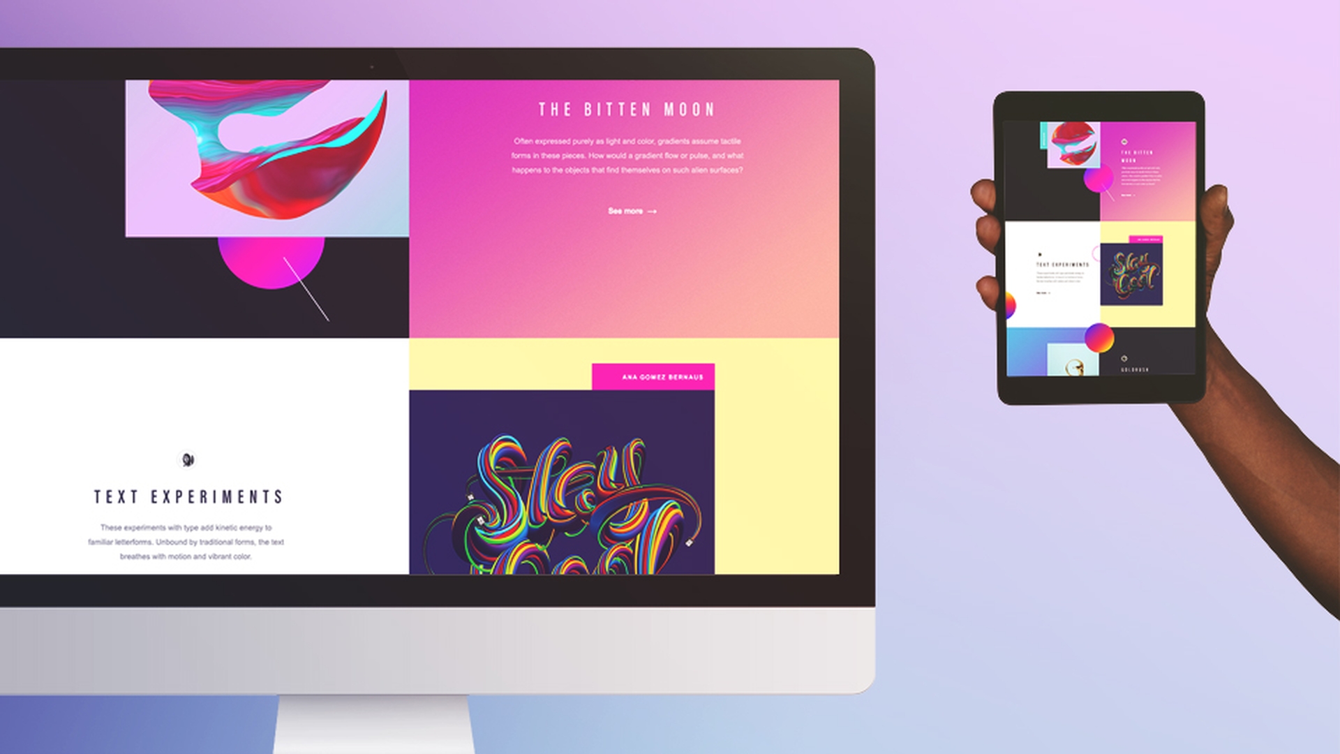
It's because we've built a responsive site, which just means this side changes to best suit the screen it's being viewed on.
Launching real-time browser preview in Dreamweaver
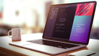
So to load browser preview, it's down here in the right, and we're going to use Google Chrome.app in this case.
Great, so this is the site in Chrome.
Now when I'm working what I like to do is: I like to have the browser window open up here in my second monitor so I can see how my Dreamweaver adjustments affect the desktop view while I'm working.
And while it's important to check the desktop screen,
Previewing responsive layouts on multiple devices
it's equally important to check it on other devices like a phone or tablet.
Now for this to work all the devices need to be connected to the same WIFI-network.
So I've got all of my devices connected to my office network here.
Now the preview on these devices, there're a couple of ways.
Connecting mobile devices using URLs and QR codes
You click the Real-Time button preview here again and you can simply type out the URL.
I'll do it here on this tablet.
Let me get up.
And look, it's a website, but it's on my tablet.
But the next technique is probably more exciting.
It's using a QR-code that's on the screen here and you'll need to download a QR-code reader for your device.
Now there're lots of free ones available.
So I open mine and if I point it at the bottom of my screen here eventually - jackpot.
And wait for it - hey, it's on my phone!
Now you can see that the site is responsive and that it has different layouts: The text is different, the layout is different, just the best use the different screen sizes.
Viewing instant live updates across devices
But where this gets super exciting is how immediate changes appear on them.
So let's go down on both of these and down to the footer here.
And in Dreamweaver let's find the code that controls this gradient color here.
Let's change it to zero here.
And like magic - look, they both adjusted.
So you'll find this super valuable when you're making a small adjustment to what you think is just like the mobile screen and you see: As soon as you make it, it impacts other screens in a way you hadn't intended, right?
And it's so handy to catch it immediately and just make the changes as you're going along.
And that, my friends, is the end and together we have learned how to preview pages using the amazing real-time browser preview in Dreamweaver.

