Introduction
Improving your photos in Lightroom can often be done with only a few basic adjustments to Brightness, Contrast, and Color.
Hi, I'm Seán Duggan from the Adobe Learn team.
In this tutorial, you'll learn the essentials of using the powerful edit tools to adjust the light and color qualities in your photos.
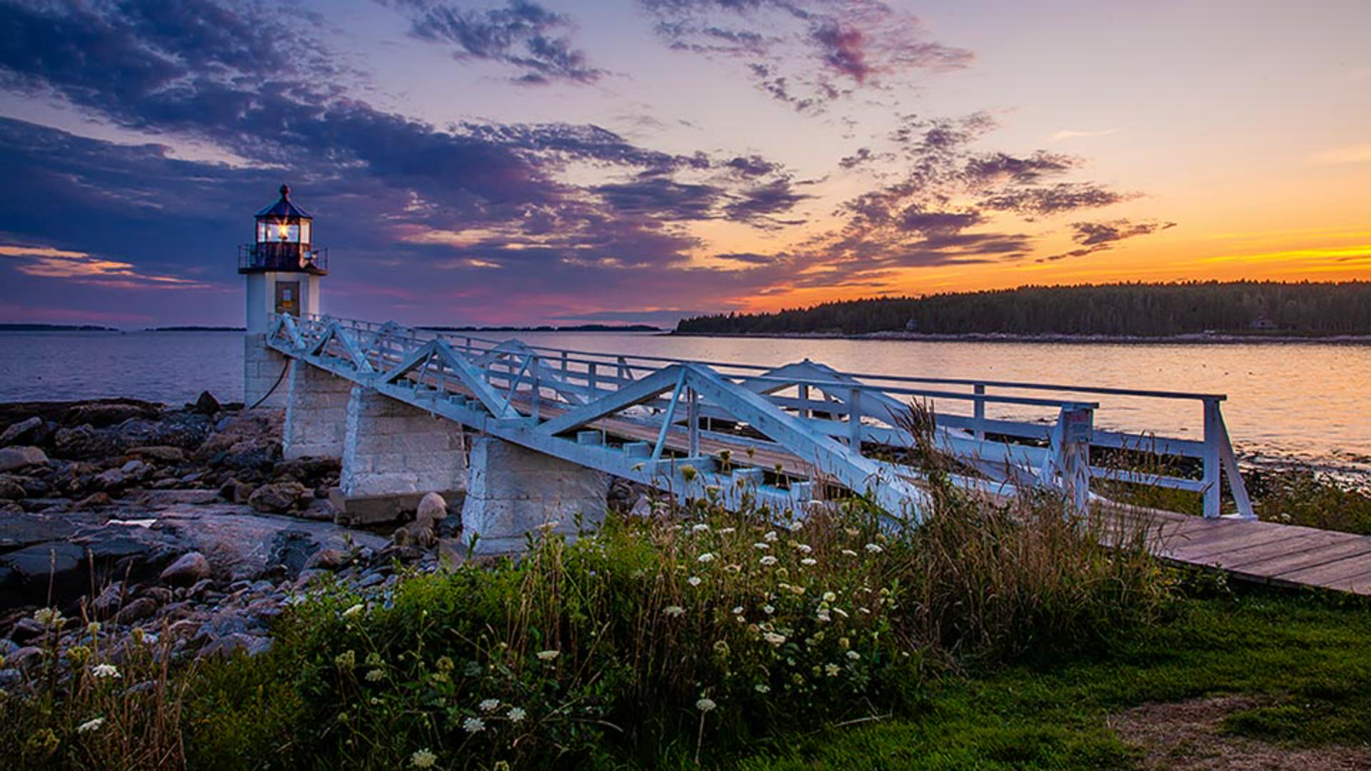
This image of a lighthouse in Maine is a raw file straight from the camera.
No adjustments have been applied yet.
Since it was taken just after sunset, the exposure conditions were a bit challenging, with a dark foreground and a very bright sky.
Fortunately, with only a few adjustments, we can make it look much better with Lightroom.
I'll click the Edit icon on the right side.
In this tutorial, we'll concentrate on the Light and the Color panels.
Starting with automatic adjustments
Let's begin at the very top of the Edit panel with the Auto button.
This is often a good place to start and it's always worth a try.
That's definitely a big improvement.
I'll click the Show Original icon in the lower right for a before and after view.
You can see how the shadow areas are brighter, the highlights in the sky are a bit darker, and overall, the tones in the image are more balanced.
If you look at the sliders in the Light panel, you can see the adjustments that the Auto setting made.
Studying what the Auto adjustments do can be a good way to start learning how to make your own adjustments.
Now, if you don't like what the Auto setting does, just click Auto again to turn it off.
Or you can fine-tune the initial Auto setting with your own adjustments.
This is a good start but now let's see what else we can do.
Controlling brightness with the light panel
The sliders in the Light panel let you adjust the brightness and contrast qualities in a photo.
The Exposure slider controls the overall brightness of the image and you can make it darker or lighter.
For this photo, I'm going to move the slider to the left to darken the image a bit.
I like the effect that this has on the sky, but now the shadows are too dark.
So, I'll go to the Shadows slider and I'll move that farther to the right to lighten those dark areas.
The sliders for Highlights, Shadows, Whites, and Blacks are designed to affect those specific areas of the tonal range, and these can be used to fine-tune the image after you've adjusted the overall exposure.
The sliders for Whites and Blacks affect the brightest and the darkest tones in the photo.
For this scene, I don't think that the Auto adjustments for those settings are doing much.
So, I'll double-click on those sliders to reset them to the default position.
That's a really useful shortcut that works with any slider in the Edit panel.
Finally, I'll return to the top and adjust the Contrast.
I often save the Contrast adjustment for last, after I've set the rest of the Light sliders.
Contrast in a photo refers to the difference between the light and the dark values.
You can see that when I increase the Contrast, the difference between the brightest and the darkest tones becomes much more noticeable.
If I decrease the Contrast by a significant amount, there is less difference between the darkest and the lightest parts of the photo, causing the image to look flat and muddy.
For this scene, I'll boost the Contrast a little bit, maybe to about + 30.
While we're on the subject of contrast, let's take a quick detour down to the Effects panel
Enhancing contrast and detail with clarity
and see what adding a little Clarity will do for this image.
Clarity is a contrast adjustment that specifically targets the contrast values that occur along the detail edges in a photo.
I'll click the image to zoom in for a closer view.
As I increase the Clarity, you can see that the contrast along those detail edges is becoming more pronounced.
A little bit of clarity can often be a nice touch for some images.
Now let's move on to the Color panel.
Adjusting white balance and overall color
If you want to explore modifications to the overall color balance, try out some of the White Balance presets.
There are several White Balance choices available for Raw files.
If this was a JPEG file, there would be fewer options.
I'll set this to Auto, which creates a warmer color balance.
After choosing a White Balance preset, you can fine-tune the color balance with the Temp and Tint sliders.
Now let's explore how you can adjust the intensity of the colors.
There are two sliders for this
Improving color intensity with vibrance and saturation
Vibrance and Saturation.
The Saturation slider will affect all the colors in an image by the same amount, and this can often lead to results where some colors look oversaturated and you can see that in the orange areas of the sky.
For more realistic results, Vibrance is often the better choice because it affects the less intense colors more than those that are already highly saturated.
So, if I adjust the Vibrance to the same setting that I used for Saturation, the result in the sky is much more realistic.
Vibrance is also a better choice if there are people in an image.
I'll click the Show Original icon in the lower right, so that we can see where we started and compare it to our adjusted version.
That's quite a transformation for the basic adjustments that we made.
There are many settings in the Edit panel and several ways to combine settings to achieve a specific look.
In this tutorial, we focused on the Auto, Light and Color settings, because these are the adjustments that you're most likely to use on most of your photos, and they're also an excellent foundation for further exploring how to enhance your images in Lightroom.
I'm Seán Duggan with the Adobe Learn team.
Thanks for watching.