14 brochure ideas for design inspiration.
Explore a collection of our favorite eye-catching brochure designs.
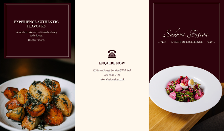




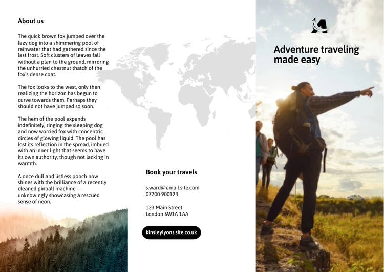
A well-designed brochure can capture attention, communicate key information, and leave a lasting impression. This guide showcases a variety of brochure design ideas, from using striking photography and bold icons to experimenting with colour-blocking, creative layouts, and full-page imagery to make your content more engaging.
Whether you're promoting a business, event, product, or service, Adobe Express makes it easy to create professional-looking brochures with customisable templates, design tools, and visual elements that help bring your message to life.
1. Use images to make an impression on your audience.
As the old saying goes, a picture is worth a thousand words.
recipe
2. Mix different types of imagery.
Photos are a very strong communication tool. But so are other types of imagery, such as icons, illustrations, or graphics.
recipe
3. Make icons your primary imagery.
Using icons rather than watercolor illustrations or photos as the main form of imagery typically communicates a more modern idea or sentiment. Icons are also generally more playful and more versatile. You can change their colors to match your design and make them as big or small as you’d like. Explore how icons can support the statement you’re making with your brochure. You can start by browsing through our selection of icons.
recipe
4. Feature a full-bleed image.
With brochures, there are many ways to show off an image. You can divide it across one panel, split it between two, or stretch it out across your canvas. This is a great strategy if you’re offering something you want your readers to be able to experience for themselves, such as the refreshing breeze and feelings of relaxation from the beach, as seen here. If you have strong image content to show off in your brochure, prioritize that first and then implement spots for text and details second.
recipe
5. Crop creatively with daring designs.
Here we have a three-panel image with a title panel page in the middle that provides the hotel name and description. We turn something ordinary into something extraordinary by adding an undulating shape to both the top and bottom of the canvas, creating a dynamic border in the design. Use borders for your photos, text blocks, or your brochure overall to make it stand out.
recipe
6. Divide up your design with color-blocking.
There are many ways to divide up information using design elements. One approach is with color-blocking. Color-blocking uses complementary or contrasting colors to create blocks or distinct divisions of space. This is an excellent tool for design as you can fill your color blocks with text or graphic content. Be sure to use the colors you chose elsewhere in your design.
recipe
7. Try cohesive color-blocking with filters.
This color-blocking approach is a little different from our previous examples, as this one demonstrates color-blocking across a cohesive design. The Illusion Theater brochure uses colored filters to create division through the panels and gives a nice artistic effect over the bridge photo that runs the brochure’s length. The second example uses different hues and shades of pink, which creates the three different sections, yet each remains pink overall. These are more subtle, unique ways of using color to create divisions.
recipe
8. Play with grid-like layouts.
A standard brochure is trifold, meaning there are two folds creating three sections per side. That gives us six sections in total. You can divide up those sections even further by sectioning individual components off in a grid-like layout.
recipe
9. Create patterns with layouts.
You can also create a pattern with your grid layout.
recipe
10. Play with exciting shapes and angles.
Lines, shapes, and angles can be used to create a dynamic effect that takes the reader’s eye on a journey across your design. If your content aims to communicate something edgy, modern, or thrilling, consider diagonal lines and shapes to break up space and add movement.
recipe
11. Choose bold, impactful fonts and colors.
Make a statement with a unique font choice that matches your brochure’s branding. If you’re making a professional brochure, you might want a more traditional or modern font. But if you’re making a brochure for something fun and creative, explore all the possibilities.
recipe
12. Showcase a quote, slogan, or motto.
Quotes are an excellent way to communicate a sentiment. You can use quotes that are recognizable to create a shared understanding between you and the reader or feature a specific quote to provide insight into your brand or business. In design, quotes are generally emphasized more than other texts. Make it bold text when next to regular-sized copy. Type it out in a striking font different from the rest of the design. Or, as we see here, you can put it on its own panel, on a contrasting background, taking up a good amount of space to truly command your reader’s attention. Use quotation signs or attribute the original author to indicate that you’re providing a quote.
recipe
13. Be bold by layering images, text, and graphics.
As you craft your brochure, allow yourself to think outside the box and try something unconventional. Find a captivating, relevant photo, then overlay shapes on top of it – in this case, opaque and semi-transparent ones. For imagery that has important details, keep those prominent and easy to decipher. Take a collage sort of approach as you layer in all your creative elements.
recipe
14. Design with a motif, theme, or intention.
We’ve talked a lot about cohesive design. Why is it important to have things that relate to each other in a design? In the same way, when you’re speaking to someone, you want to share your thoughts in a clear way that your listener can comprehend. We tie words and phrases together in ways that make sense to tell a story. The same applies to design. Here, we have a traveler’s guide to Tokyo that is emphasized by depicting many Japanese motifs. We have the red circle from the flag, the yen symbol, the torii (an iconic Japanese gate), and even the Japan is placed in a vertical line the way you might read traditional Japanese. All these nods to Japan help take us there.
recipe
How to make a brochure with Adobe Express.