Introduction
Choosing the right color palette is a great way to grab attention, set the tone and steer the eye where you want it to go.
Hi, I'm Colin Bright, and over the next few minutes, we'll walk through some great new features in Illustrator that make it easier than ever to build a killer color palette, apply it to your art, and carry it seamlessly across the rest of your workflow.
Stick around until the end for a bonus tip that will help you keep an eye on how small edits impact the big picture.
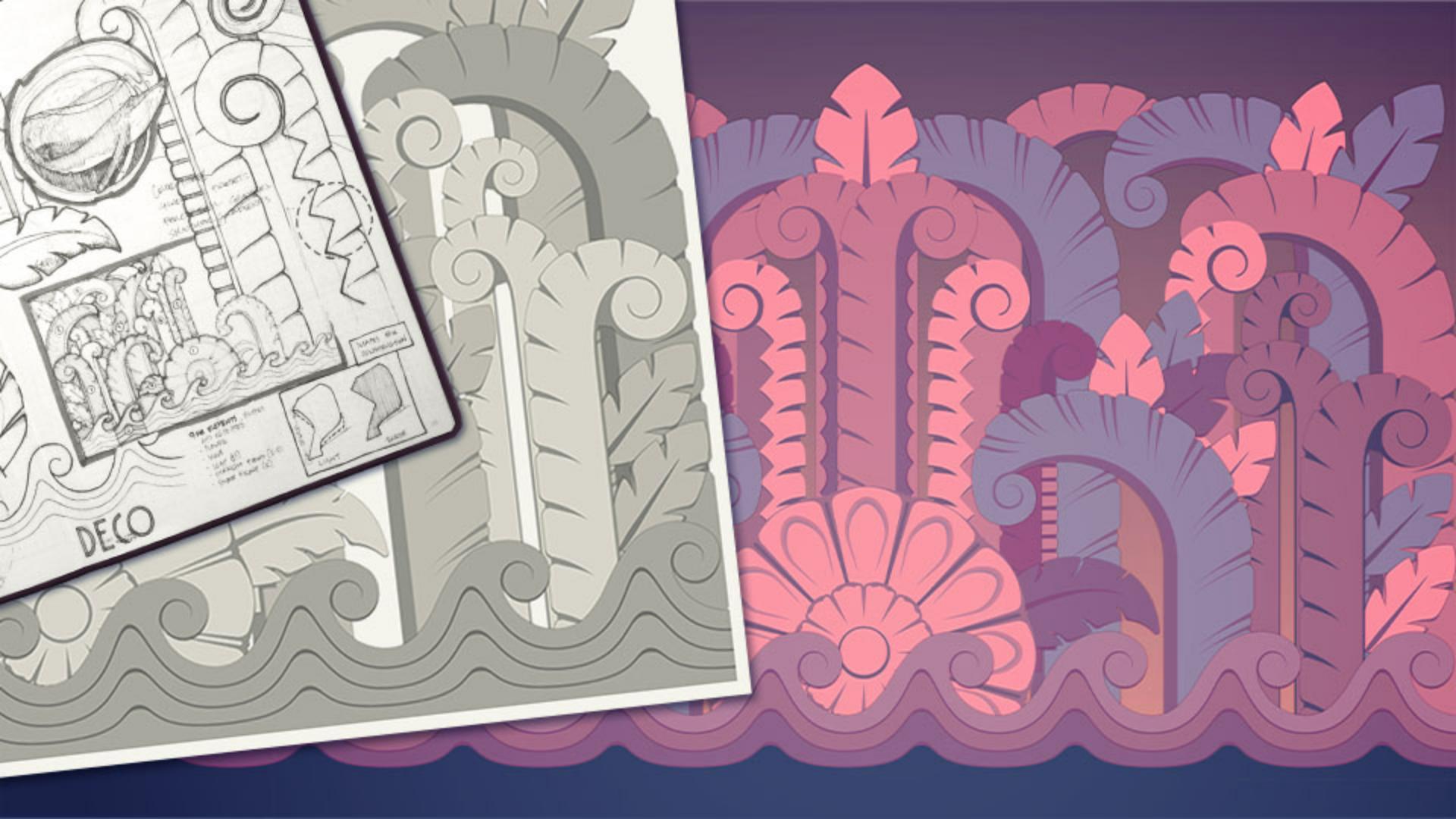
Some of my favorite parts of traveling are the architectural details I bring home in my sketchbook, like this amazing frieze that I saw on Miami Beach.
While I've captured the shapes, if I want this thing to really remind me of where I was when I saw it, we need to find some local color,
Sample colors with precision
and the new Color Picker takes so much of the guesswork out of that process.
With the Eyedropper Tool selected, holding down Shift displays a sampling ring with a more accurate preview of the color I'm selecting at the top and the previously selected color at the bottom, which is great for when I'm trying to see how two colors will play together.
With my palette selected, I'm ready to splash some color on the screen, and the new Recent Color section in the Color panel lets me do that consistently anywhere in my document.
Recent Colors will store your latest selections, whether you're sampling from images or building them with color sliders, keeping them at your fingertips and without needing to build out a new swatch group.
To get this art ready to use, we need a background.
While this dark blue helps to set the mood,
Build smooth and vibrant gradients
I think a gradient will help to add a little more energy.
And getting it right just got a lot easier.
For starters, when you open the panel and select a gradient like this linear one, it starts with your base color on stop, so there's that much less to modify.
Also new to the Gradient panel is a huge library of Presets to get you started, like this great dark-to-light from the Sky collection.
If I want to modify it, adjusting a stop to a precise color from my palette is now as simple as copying the hex code from the Color panel and pasting it into the stop's dialog box.
I think this background gradient is looking solid, but what's really going to make it sing is the combination of the new Perceptual setting and Dithering controls, allowing for a buttery-smooth transition no matter how far apart your stops are on the Color Wheel.
Sync colors across design projects and apps
When we're ready to bring this design over to Photoshop to finish it up, we can now bring our colors with us too.
In the Color panel, clicking this new icon copies the hexadecimal code to your clipboard, ready to paste into another app wherever else your heart desires.
With some great sampled colors, a buttery-smooth background, and now some text and texture, I'm ready to put the done stamp on this thing.
But before we go, this is one of my favorite pro tips: To keep a better eye on the big picture while making small edits, just go to Window, New Window, and then Window, Arrange, Tile to see two views of your file.
I like to set one to the extend to the relevant artboard, and then pan, zoom and work around the other as needed without losing sight of that bigger picture.
Well, that's about it for now.
Until next time, I'm Colin Bright.
I'm going to make something colorful.