Introduction and meet author Dave Clayton
Have you ever wished you could move and resize elements in your InDesign layouts without constantly nudging and realigning everything?
Well, now you can.
Adobe has introduced a brand-new feature called Flex Layout, and it's going to make your design process so much smoother.
I'm Dave Clayton, and in this quick tutorial, I will show you how Flex Layout works, what it's great for, and how you can use it in your own designs right away.
So what is Flex Layout?
Here we have InDesign 2026 open with our example design.
Flex Layout can be applied to frames to make designs adjust dynamically as the content changes.
In simple terms, it's a new way to make sure InDesign frames and objects behave more like flexible containers.
Let's look at our example file and see how we can use Flex Layout to rearrange the content.
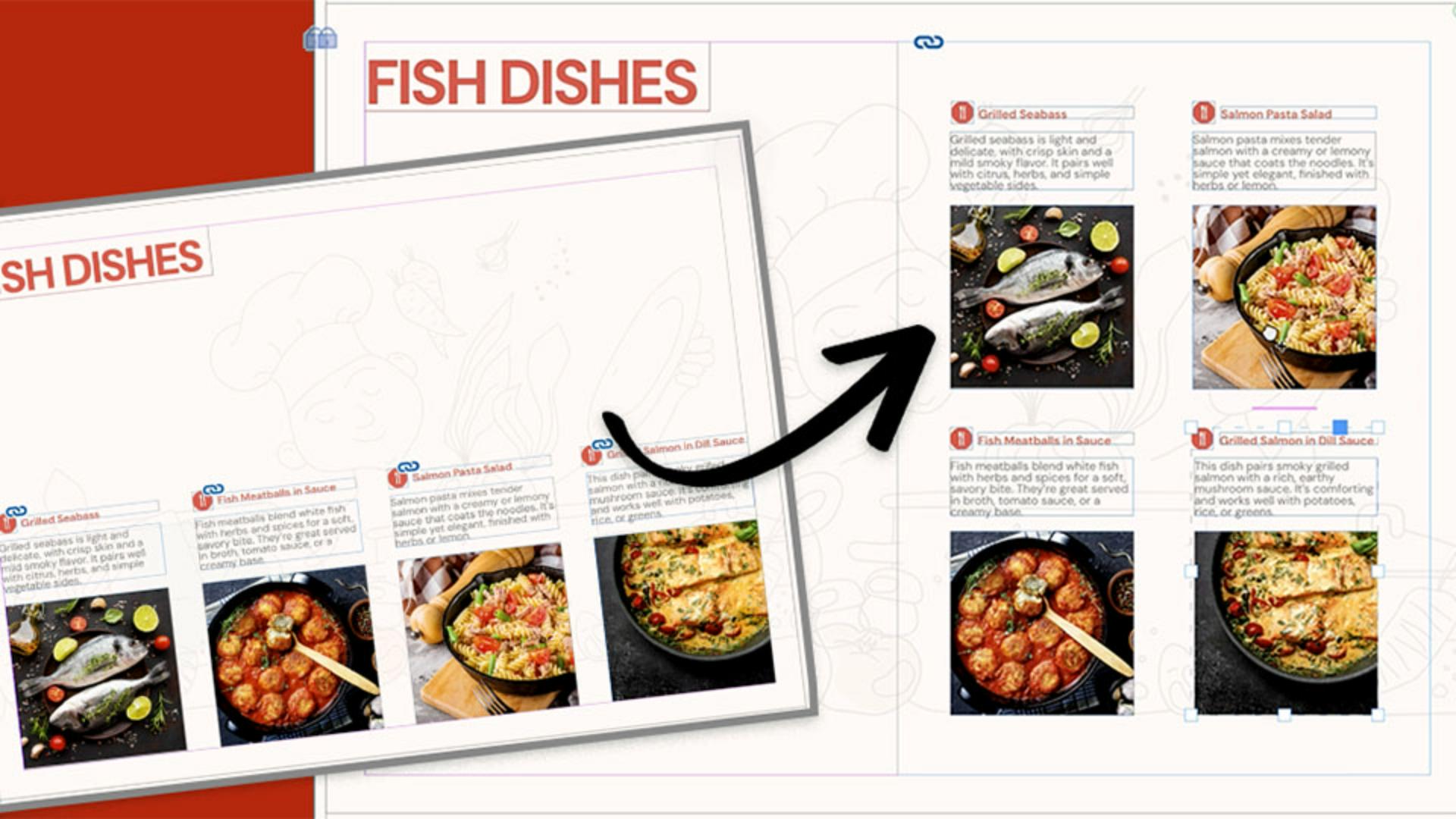
I have a premade design here, a simple recipe card cover layout with a few text frames and images.
Normally, if I were to resize this one page or move one of the boxes, I would need to manually readjust everything else and line it all up again.
To help us see the before and after, we'll duplicate the page in the Pages panel to create a copy to work on.
Prepare your grouped elements
To make the process easier, I've grouped each dish with its title, text, and image.
This makes it much easier to manage when using Flex Layout.
Before applying Flex Layout to the design, it's important to understand that this feature only reflows and adjusts the spacing of the content, it does not resize it, so we need to do that first.
To demonstrate, I'm going to select all four of these groups, then I'll hold Shift Cmd on a Mac or Shift CTRL on Windows, and drag any corner of the group to resize it.
We want the group of four on the right-hand side of the page, so I'm reducing the size because I want it to fit over two columns.
Now let's activate Flex Layout.
To access the Flex Layout panel, go to Window and choose Flex Layout.
You'll also find it under the Object menu, and you can right-click the selection or access it in the Properties panel once something is selected.
From here, the Flex Layout panel gives us multiple options for adjusting the layout, but we'll come back to these in a moment.
Apply Flex Layout and set the structure
With all my group selected, I will enable Flex Layout.
You'll notice a highlight frame appear around the selection, showing that it is now inside a flexible container.
We can now resize and position our container where we want the new content to sit.
So, let's place it on the right-hand side of the page.
And now we can begin adjusting the layout using the panel.
First, we can decide on the alignment of the content within the container.
The first option aligns the content to the top, the second centers it, and the third aligns it to the bottom.
Let's keep it aligned at the top for now, we can change it again later.
To the right of the Alignment options are the values for Width and Height of the container.
These currently show the size we adjusted earlier, but you can change them manually if needed.
Next, we'll look at the Justification dropdown.
This setting determines where the content begins inside the container and how its spaced.
We will use Flex Start, which places the items at the top of the container and aligns them to the start of the row.
Next, we can choose the direction of the layout.
Right now, it is set to flex by Row, which is why everything is arranged in a single row.
You can also see that the content is cut off inside the container on the right-hand side.
In this case, we would need to adjust the container width to make the row fit.
There is also an option to reverse the row, which flips the order of the items.
The next option is flex by Column, which is what we need for this layout.
I'll click Column, since we want two columns and two rows.
Selecting this gives us one column inside the container, so we need to turn the Wrap option on.
This is the Wrap Content icon.
Go ahead and click that.
And now you can see the content flowing into two columns inside our container.
Adjust spacing and fine-tune alignment
Now that Flex Layout is set to the correct direction and wrapping mode let's adjust the spacing.
Spacing controls the padding around the container frame.
All values are currently set to 0.
The values are linked by default, but you can unlink them by clicking on the Chain icon.
You can now increase these settings manually.
As I increase the values, you can see the spacing inside the container expand.
Let's just set this to 5 mm.
Next, we will adjust the horizontal and vertical spacing fields.
You can increase these by using the up and down arrows, and you will see the spacing update instantly.
These values can be set precisely, or you can adjust them visually.
The last thing we want to do is adjust the alignment of the content within the container.
Let's return to that first Alignment setting.
I want to set this content to align to the center of the container.
You can also choose left or right alignment.
You can now see how quickly Flex Layout allows you to reflow and readjust content to create an alternative version of a layout.
Another useful feature is that you can reposition content inside the container.
In this example, I can click on one of the dishes and just drag it into a new position, giving me more creative control.
If we go back to the first image, we can also set each group as a Flex Layout and quickly adjust the content inside each one.
Now that it's complete, I can add some additional content to the shape by dragging it onto the page from the pasteboard, and we now have an alternative and adjustable layout that we can present to a client or use for ourselves.
And that is Flex Layout in a nutshell, a small feature that can make a big difference to your workflow.
So, try it in your next project and see how much time it saves.
If you'd like to explore more new features, check out the other tutorials on Adobe Learn.
Thanks for watching and happy designing.

