Introduction
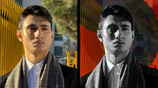
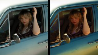
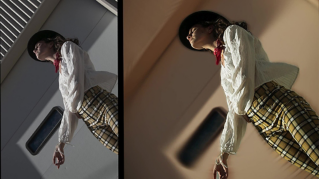
Have you ever been in a place with amazing colors, but the colors in your photos, are less intense as you remember them being in real life?
That's okay, because adding saturation in Photoshop can change subdued or washed-out colors to the rich colors that you experienced at the scene.
I'm Jan Kabili from Adobe's Learn team.
In this tutorial, I'll show you how to add life to your photos by boosting individual colors without having to make selections.
It's all done with one Hue/Saturation adjustment layer.
Adding a hue/saturation adjustment layer
Start at the bottom of the Layers panel and click the Create new Adjustment Layer button and choose Hue/Saturation...
You'll see a new Hue/Saturation adjustment layer above the photo in the Layers panel and controls for that adjustment layer are up here in the Properties panel.
If you drag the Saturation slider in the Properties panel to the right, all the colors in the image will be saturated to the same degree, which may not be the look you want.
So let's set Saturation back to 0 either by dragging it or double clicking the Saturation label.
Instead, let's go to the menu toward the top of the Properties panel,
Boosting specific color ranges
which now reads Master, which means that changes you make affect the whole image, to Reds, which means that changes you make will affect only a range of red colors in the image.
Beneath that, you've got a Hue slider, which you can use to change the actual color.
The Saturation slider, which changes the intensity of color and which we'll be focusing on in this lesson and the Lightness slider, which is one way to change the brightness of a color.
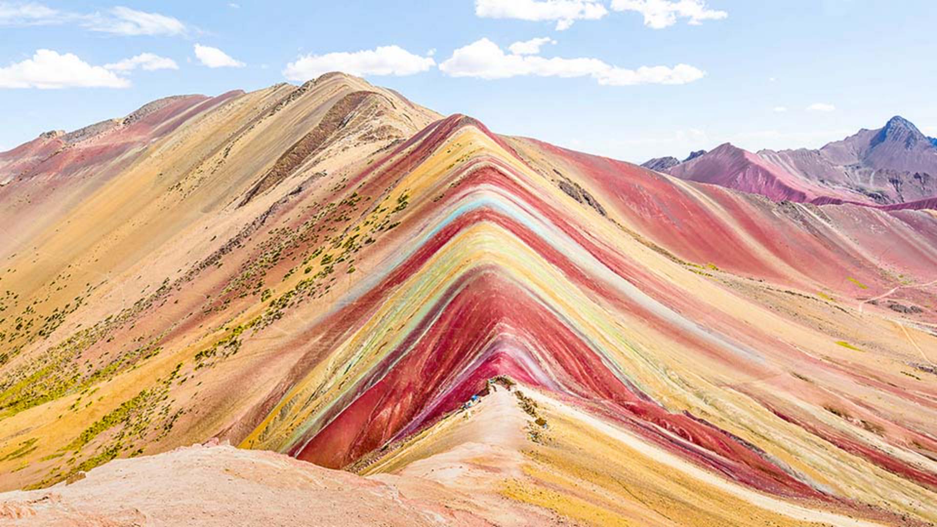
Let's drag the Saturation slider to the right and that increases the saturation or the intensity of all the red areas in the photo, the red at the front as well as all the way to the back.
Great.
Next, let's saturate the yellows in the same way by going to the same menu and choosing Yellows and then dragging the Saturation slider to the right.
And as you do this, you'll see that only the yellows are getting more saturated.
I'd like the yellows to be dominant, so I'll increase the saturation of yellows a little more than I did for the reds.
There are some other more unusual colors in this landscape, like this cool colored stripe over the mountain.
It's not clear whether the color of the stripe would fall into the blue, the cyan or the green color range in the dropdown menu we've been using.
Using the on-image adjustment tool
So this is a good time to use the On-Image Adjustment Tool instead.
This tool is a real timesaver because it not only selects a color range, it also lets you make your adjustment right on the canvas.
In the Properties panel click the button that looks like a hand with two arrows through it to activate the On-Image Adjustment Tool.
Then go into the image and click on that cool colored stripe and drag to the right.
That affects not only the color of the stripe, but also the saturation of the color in the sky.
If you look at the Properties panel, you'll see why.
The dropdown menu has now been automatically set to Cyans, which means that the color we clicked on with the On-Image Adjustment Tool falls in the Cyans color range.
So that's why our change affected the sky as well as the stripe.
If you like, you can experiment further with the On-Image Adjustment Tool by clicking and dragging right or left on other colors to change their saturation throughout the image.
Or if you hold the Command key on a Mac or the Control key on Windows as you drag with the On-Image Adjustment Tool, then you'll be changing the hue of colors.
You can always undo those changes by pressing Command or Control Z.
Congratulations.
Final color enhancements and wrap-up
Now you know how to make different colors in a photo pop with a single Hue/Saturation adjustment layer.