9 famous green logos and how to easily make your own

The color green is everywhere — from lush forests and fresh produce to traffic lights and leafy parks. Across cultures, green evokes feelings of growth, renewal, balance, and optimism. That versatility makes it one of the most powerful color choices for brand identities.
Depending on the shade and design style, green can communicate sustainability, health, innovation, prosperity, or luxury. That’s why green logos appear across industries — from food and finance to tech and fashion.
In this guide, you’ll explore the psychology behind green branding, discover 10 famous green logos and what makes them work, and learn how to create your own green logo using free tools and templates.
Key takeaways
- Green logos communicate growth, harmony, freshness, and renewal.
- Different shades of green evoke different brand emotions, from luxury to energy.
- Many globally recognized brands successfully use green across diverse industries.
- The right shade and typography can elevate brand trust and memorability.
- Creating a professional green logo is fast and simple with customizable templates.
Summary/Overview
Why choose green for your logo?
Green occupies a unique space in color psychology. It blends the optimism of yellow with the calm stability of blue, making it one of the most balanced and emotionally flexible colors.
Depending on tone and application, green can represent:
- Health and wellness
- Sustainability and eco-conscious values
- Growth and financial success
- Harmony and balance
- Innovation and vitality
Because of this versatility, green logos perform especially well for brands in food, finance, technology, wellness, outdoor lifestyle, and sustainability-driven industries.
9 famous green logos (and what they teach us)
Green may be a single color, but its brand expression varies widely. Let’s look at how major brands use green to communicate identity and values.
1. Whole Foods

https://en.wikipedia.org/wiki/Whole_Foods_Market#/media/File:Whole_Foods_Market_201x_logo.svg
Whole Foods uses deep green paired with classic serif typography to communicate freshness, sustainability, and trust. The darker shade adds sophistication, reinforcing the brand’s premium positioning.
2. Spotify

https://newsroom.spotify.com/media-kit/logo-and-brand-assets/
Spotify’s neon green stands out sharply in the tech industry. Rather than focusing on nature, the brand uses green to convey energy, creativity, and innovation — perfectly matching the dynamic world of music streaming.
3. Sprite

https://en.wikipedia.org/wiki/Sprite_(drink)#/media/File:Sprite_Logo.svg
#/media/File:Sprite_Logo.svg)
Sprite’s crisp green branding reinforces the refreshing qualities of its lemon-lime beverage. The bright hue feels clean, vibrant, and youthful, helping the brand remain fresh and modern.
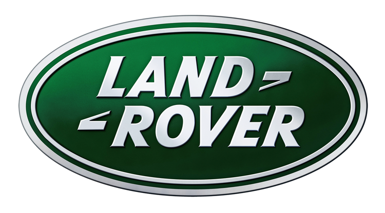
4. Land Rover
https://www.landroverusa.com/index.html
Land Rover uses dark forest green to connect its luxury SUVs with rugged landscapes and outdoor exploration. The color supports the brand’s adventure-driven and premium positioning.
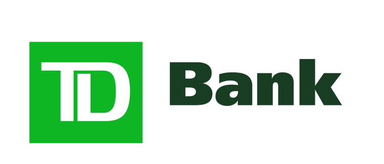
5. TD Bank
https://www.td.com/us/en/personal-banking/
TD Bank’s green logo communicates growth, prosperity, and financial success. By pairing bold green with black typography, the brand balances optimism with strength and professionalism.
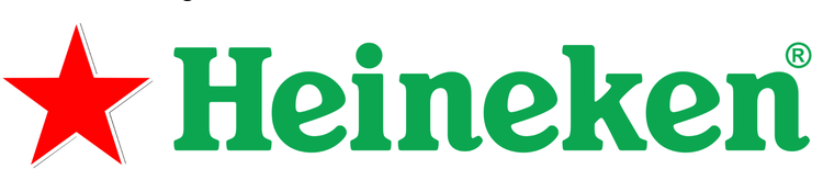
6. Heineken
https://www.theheinekencompany.com/age-gate/563
Heineken’s green logo evokes refreshment, approachability, and friendliness. Combined with its iconic red star, the brand strikes a balance between energy and tradition.
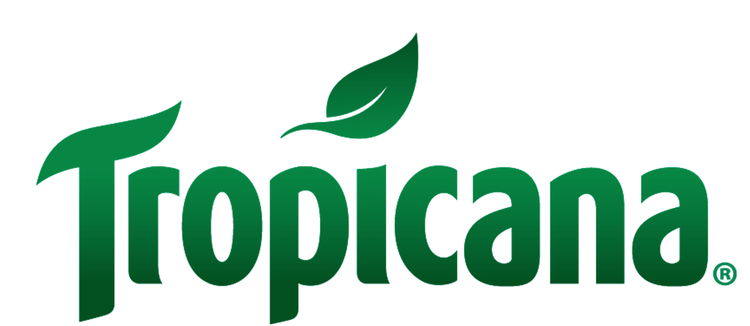
7. Tropicana
https://www.tropicana.com/products
Tropicana’s green reinforces its health-forward messaging and connection to natural ingredients. The color also evokes tropical landscapes and freshness.
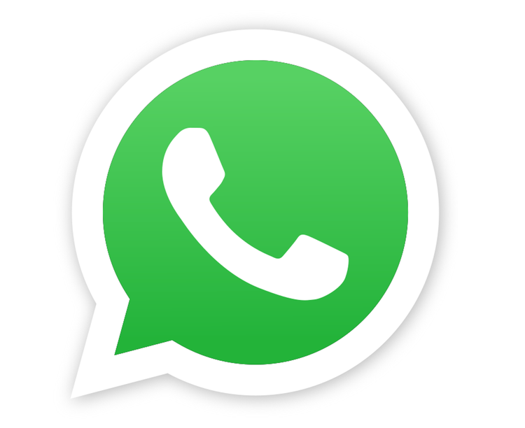
8. WhatsApp
https://commons.wikimedia.org/wiki/File:WhatsApp.svg
WhatsApp uses vibrant green to symbolize growth, communication, and connection. The welcoming color supports its role as a global messaging platform built on human relationships.
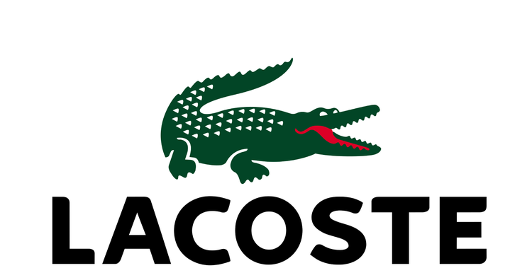
9. Lacoste logo
https://en.wikipedia.org/wiki/Lacoste
Lacoste’s iconic green crocodile draws from the brand’s tennis heritage and athletic roots. The green reinforces vitality, elegance, and sporty luxury.
Pros and cons of green logos
Pros
- Communicates growth, renewal, and harmony
- Works across many industries
- Highly versatile in tone and emotion
- Associated with health, sustainability, and trust
- Stands out well against neutral backgrounds
Cons
- Overused in wellness and eco markets
- Some shades can feel generic
- Bright greens may overwhelm if poorly balanced
- Dark greens can appear conservative without modern typography
How to choose the right shade of green
Not all greens communicate the same message. Here’s how different shades shape perception:
- Forest green: luxury, trust, heritage
- Lime green: youth, freshness, energy
- Olive green: organic, natural, grounded
- Neon green: innovation, tech, creativity
- Mint green: calm, wellness, simplicity
Your brand personality, industry, and audience should guide your shade selection.
How to make your own green logo
If green fits your brand identity, you can design your logo in minutes using Adobe Express’s free online logo maker.
Start by selecting a logo template that aligns with your style — minimalist, modern, classic, or playful. Then:
- Customize your color palette with your chosen shade of green.
- Replace placeholder text with your brand name.
- Select fonts that complement your personality.
- Add, remove, or refine visual elements.
- Save your brand colors and fonts for future projects.
Once your logo is complete, you can instantly apply it to social posts, ads, flyers, packaging, and more.
Free green logo templates
Browse a curated collection of professionally designed green logo templates you can customize instantly. Each template is fully editable, making it easy to test different shades, layouts, and typography styles before settling on your final design.