By Matte Rae
8 Dec.2020 ·
5 min read
I
nformation and data are everywhere. The technology we use every day creates and absorbs extensive data, numbers and other information and this data is plotted on charts, organised and filtered in tables or showcased in infographics. Data is an important part of the user experience design process too, helping to guide decisions and understand user behaviour. However, as datasets grow, designing tables and charts to accommodate the data can leave designers desiring more.
With scroll groups in Adobe XD, large data tables and charts don’t have to stop at static representations of the desired result, they can include rich scrolling interactions to communicate the full story. This tutorial will teach you how to integrate scroll groups into your own charts and tables within Adobe XD. To follow along, download the starter file and continue reading.
Opening the starter file will reveal a dashboard design including several charts and tables from the Dashboard UI Kit. All the graphs and elements within this design are what would typically be found in a dashboard or analytics interface design. There are various tricks to indicate that a chart may be scrollable on a static design, but this design can be taken a step further in XD and include actual scroll interactions.
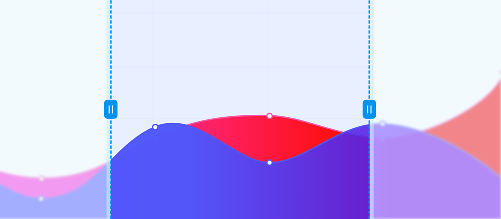
The line chart at the top of the page includes a set of data spanning 6 months on the axis at one time. However, the desired result is to have about 3 months visible and allow the content to be scrolled into view as desired.
To do this, layers need to be structured to ensure the right elements are contained within the scrolling area. In this case, the line charts and data points, along with the X-axis labels all need to scroll. Since this chart has horizontal and vertical grid lines, these should be included as well, though the effect can be achieved by simply including the vertical grid lines and leaving the horizontal lines fixed in the background.
With the desired scrolling elements selected (select multiple objects by holding CMD on Mac or CTRL on Windows while selecting them in the layers panel) create a new group and call it ‘Scroll Content’ or something similar to denote this as the group of content that should scroll.
Next, extend the graph content by clicking and dragging on the right side of the group until about 3 months of data is included within the chart boundaries. Responsive resize will reposition elements and calculate alignment while this is done. This should scale the grid lines, the X Axis labels and the line charts.
With the Scroll Content group still selected, enable the Horizontal Scroll Group option in the property inspector. Once enabled, two blue handles will appear on the group, representing the scrolling viewport.
Drag the handles into place. The left handle should be aligned with the y-axis and the right handle should be set to just inside the card, about 20-24px.
Additional elements can be added to give the sense that the chart is scrolling underneath the y-axis on either side by using a rectangle with a gradient fill and an additional border. Start by drawing out a narrow rectangle and select “linear gradient” from the fill options.
Set both colours to match the background colour of the chart, but set the opacity of the inner colour to 0% to allow the chart to be seen through it. Ensure the positioning is snapped to the y-axis lines to prevent any gaps.
The next table on the page is a data table including several clothing products. The table is fairly simple with only a few columns of information, but the content has the potential of getting rather long. To avoid taking up the entire dashboard with a long table, the list can be turned into a scrolling table, while keeping the header of the table fixed.
Start by double clicking into the content of the table to find the repeat grid element containing the table rows.
The repeat grid allows for easy duplication of content, like table rows. Click and drag the bottom handle until the desired number of table rows are present. This dashboard card has padding enabled, allowing the card to resize as the Repeat Grid is expanded.
With the Repeat Grid still selected, a scroll group will once again be enabled in the property inspector. This time however, the Vertical Scroll Group will be enabled and the blue handles will appear at the top and bottom of the group, rather than the left and right.
Position the top blue handle aligned to the bottom edge of the table header and drag the bottom blue handle so that the card background aligns with the adjacent card element. The card height adjusts automatically when resizing the scroll group, thanks to the enabled Padding.
The table can now be scrolled in preview mode by mouse over the table rows and using the scroll wheel or a track pad. Content can also be clicked and dragged up and down using the mouse if other scroll options are not available.
At any time, content can be added or removed by clicking into the scroll group, selecting the repeat grid and dragging the handle up or down accordingly.
A vertical table works great when there aren’t many columns of data to incorporate. When working with large datasets, there are many cases where many columns are needed to monitor various forms of information or statuses at once.
This also applies to including tables into mobile designs, where even a simple arrangement of columns can prove to be too cluttered on a phone or tablet.
In these situations, allowing a table to scroll horizontally while fixing a column or columns can be valuable for allowing users to see all data without losing context of line items. These columns are typically referred to as frozen columns.
To create this frozen column effect, the table needs to be constructed in a unique way, creating a separation between the to-be-frozen column and the remainder of the content.
Using the Frozen Column table at the bottom of the page, notice that the columns are divided into two groups. The first is the frozen column group called ‘Frozen Column’ and the second is the ‘Scrollable Columns’. The second group overflows the width of the table because there is too much data to include in this current layout.
A divider has also been added as a visual separation of column widths. For this application, the horizontal row borders do not need to be included in the scrolling area, as they will remain fixed throughout the scroll and act as a guideline for the table boundaries.
To make this table scrollable, simply select the ‘Scrollable Columns’ group and once again, enable a ‘Horizontal Scroll Group’ from the property inspector on the right.
In this situation, the blue handles will be dragged to the divider line and to the right edge of the border rows representing the edge of the table.
The table can now be scrolled horizontally in preview mode, though the last column of content appears to be stuck right at the edge of the table. This is because there is no background asset and the group is only as wide as the text content within.
There are a couple of ways to fix this, but the easiest method is to enable padding on the Scrollable Columns group. Double click into the scroll group to select the Scrollable Columns group. In the property inspector on the right, enable padding. By default the padding will be set to 0. To create space on the right hand side of the group, the right padding should be increased. As the cursor enters each input field, the icon will change representing which dimension is being modified. The right value is the second input field.
With padding added, the table content should now scroll horizontally within the table view while maintaining the initial column in a frozen state.
Location widgets are a common feature on dashboards and a great way of showing geolocation based information in an interface. Depending on the geographic range of the data, the map may need to be zoomed to a level in which not all content is visible unless the map is panned around.
Creating this interaction is now straightforward thanks to Scroll Groups in Adobe XD. In the map widget on the right, there is both a list of locations and a map with the associated pins displayed. To make this map pannable, start by selecting the ‘Map’ group, containing the vector map and associated pins.
Next, enable the Horizontal and Vertical Scroll Group in the property inspector on the right to enable panning functionality on this group.
Adjust the blue handles once again to fit the boundaries where the map should be visible. In this case, aligned to the left and the right of the list. Guides are a great tool for ensuring precise alignment here.
At this point the map won’t scroll very much as it is about the same size as the scroll area. To fix that, click into the scroll group and select the “Map” group once again. Now resize the group to about twice its original size. Finally, position the map in the centre of the scroll group or in the desired starting position.
Now, preview the design. The map can now be panned by clicking and dragging around on the map area from preview mode or on one axis at a time by using the scroll wheel on a mouse. Just like that this dashboard has been brought to life with a variety of rich interactions.
This tutorial covered some of the primary use cases for using scroll groups in tables and charts. However, there are many more that can be created using various combinations of the techniques used above. Experiment for yourself and integrate other enhancements like components and states to add other interactive elements to your tables and charts.
Related content