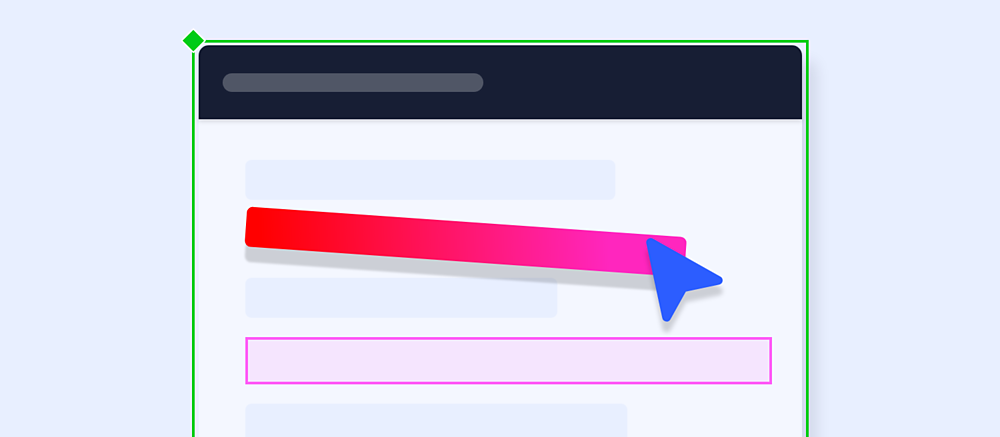
Drop-down menus typically have two core states; open and closed. This tutorial will be making use of component states to recreate this behaviour. Depending on your use case you may be incorporating hover, focused or other states into your element, but for the purposes of this tutorial, the base cases will be covered.
The starter file includes basic drop-down elements to start with: a header and the drop-down content list. These elements can be used to construct the drop-down menu design and contain padding so that as text resizes, the content itself resizes. However, if a fixed-width menu is desired, padding should be disabled for these groups in the Properties Inspector.

