When producing a realistic composition from multiple layers, it's important for the various elements to fit together well.
And very often, that's gonna be a question of adjusting the colors.
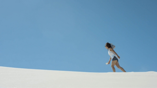
I've got three items in the sequence, I've got a background image, which you can see I've got in the source monitor as well, it's actually much higher resolution than the sequence I'm working in.
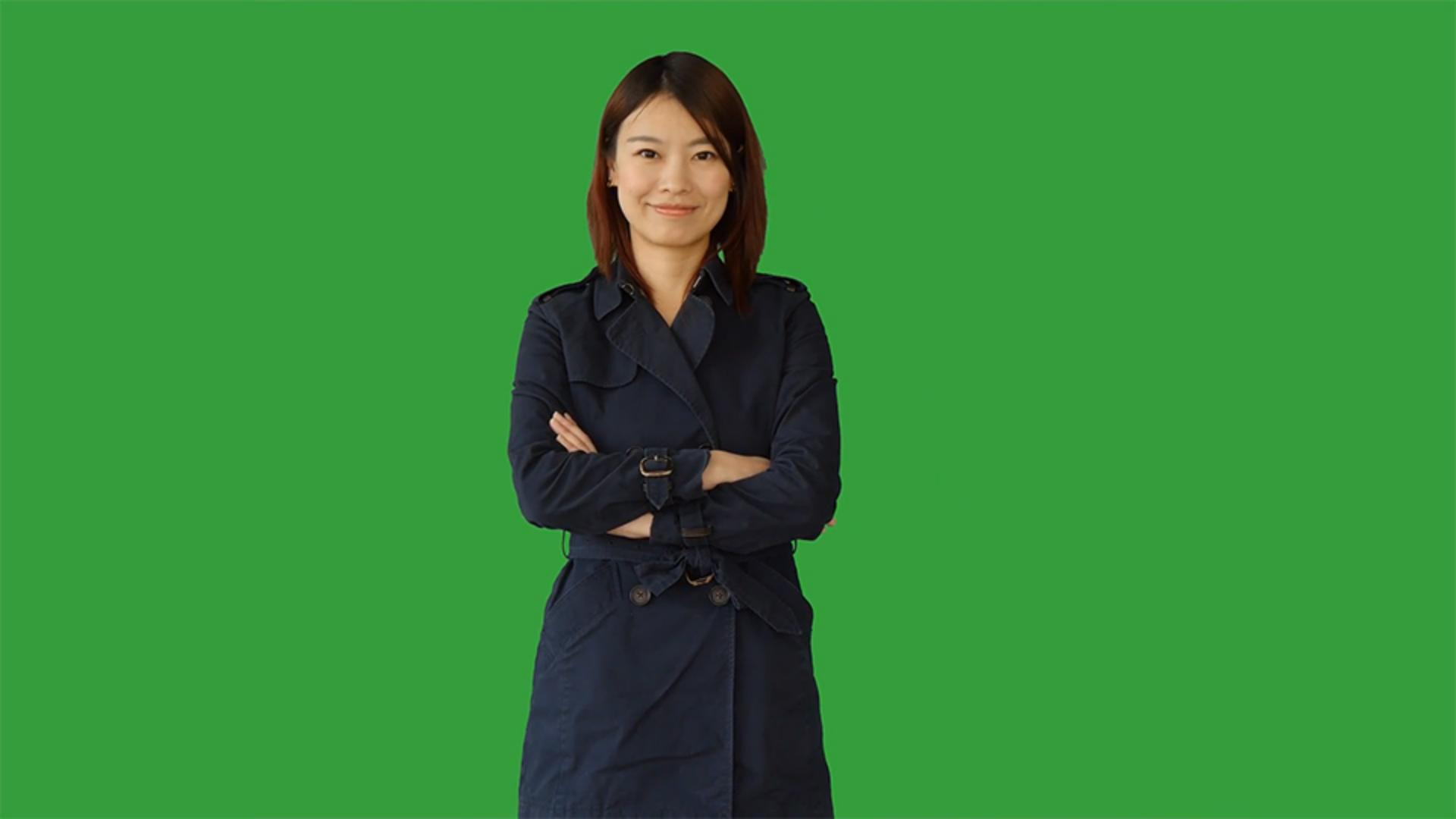
I have a lady in a coat in front of a green screen, and I have a foreground element that's a window frame.
Now again, if I just press F4 match frame, you can see this is much higher resolution than we need.
And we could produce an animated version of this where we track in on the window if we wanted to.
I'm gonna go simple for now though, and put these three elements together.
I'm seeing this transparency grid because if you look in the Settings menu for the program monitor, I've got transparency grid turned on.
Otherwise we'd be seeing black in the background.
This image of a window frame has an alpha channel.
It's a PNG and not all of your material will have that alpha channel.
Here, for example, our green screen footage needs to have the green turned into transparent pixels.
And in fact, let's do this right away, I'm gonna go to the Effects panel, I'll start typing in the name of the Ultra Key effect, and drag that onto the clip.
With the clip selected up in the Effect Controls panel, I can use the Key Color Eyedropper to pick the green and we're pretty much ready to go.
I'm quite lucky with this footage, it's a really clean green background and you may not be so fortunate you might need to spend a bit more time with the Ultra Key effect to get a clean key.
Before I drag these three elements into position, I'm going to work on the colors and I'm keeping them separate so I can do that color work more easily.
The first thing I'm gonna do is go to the Color workspace.
And I'm also going to switch the Program monitor to Comparison View.
We tend to be more aware of skin tones than anything else when it comes to color matching.
So I'm going to set my reference frame to an image that shows the face of this lady.
And next up, I'm going to start with the window frame here.
I'll just begin by right clicking and choosing Set to Frame Size so we can see the whole image.
And in the Lumetri Color panel, I'm gonna go to my Color Wheels & Match section and I'm gonna click Apply Match and just watch the colors adjust.
It's pretty subtle, but we've lost some of the saturation.
Next up, let's go to this background image.
And again, I'll just choose Apply Match.
While in the Color workspace, the clip under the playhead is automatically selected.
So this is a pretty fast workflow.
Now I'll go back to my Editing workspace, and I'll drag these three items into position, and I suppose we can come out of comparison view.
And let's take a look at the result.
Well, it's pretty awful.
The window frame is completely the wrong aspect ratio.
And the lady looks pretty big as well.
I'm gonna start by fixing the window.
I'll just select the clip in the Timeline panel, and let's adjust the scale.
I think something like that works pretty well, somewhere around 70%.
And I think we could use a little more of the background.
So I'll select that clip.
And let's scale it down a little.
It's about double the size of our sequence frame so we can come down to 61%, that's fine.
We've got a more interesting view.
And next up, I'm going to select this green screen shot.
I'm gonna choose the Motion heading in the Effect Controls panel and just reposition her on the screen, somewhere like that kind of works.
I think I'll maybe scale her down a little, that's okay.
And I'll deselect by clicking on the background of the Timeline panel.
It looks alright to me, but I think we've got a little bit too much red in the shot of the lady in the coat, it doesn't really match the blue cast in the other two shots.
So I'll go back to the Color workspace, select that clip, and I think I'll just use this mid tones color wheel to just pull her a little towards the blue in the mid tones.
That's pretty much where the skin tone is.
Let's take a look at this in motion.
Creating compositions in this way is an art and craft and the only way to be sure the visual elements work well together is to put them into position and watch the action in motion.
You'll often find that the colors change over time as the various different elements move.