Introduction: Use color to define your base energy using temperature, tint, and vibrance
[Cyn Lagos]: Have you ever chased a color trend so hard your posts began looking like everyone else's?
Today we're going to set a color direction that carries your energy across temperature, tint, and vibrance and everything you shoot.
Hi, I'm Cyn Lagos.
I'm an artist exploring mediums like design, photo, and video.
And today I am your visual mentor.
Color is part of your visual language.
It's how you communicate feelings before anyone reads a caption.
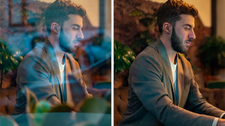
First, let's set your base identity by establishing the hue of the warm and cool colors in your scene.
This is the fastest way to make a photo feel like it lives in your world
Build a consistent color palette across every image
- every single time.
To make yours, go to Light and Color and tap on the Color mix tool on the top right.
Here, we'll start with the cool colors present in the scene - mine is blue.
Slide the Hue, Saturation, and Luminance until it feels like a blue that speaks to you.
Is it dark blue?
Is it vivid?
Is it vintage?
This will become your signature cool shade.
Next, let's focus on the warm colors in your scene.
Mine are yellow, oranges, and red.
With the same approach, define your warm color expressions so that it becomes your signature base for every image.
So we're not just chasing trends; we're building a palette that speaks to your point of view.
Use tint and hue to build a consistent visual language
Every hue has a range of tints and tones, and by defining them here, you begin to create a color pattern that just nods to your photos' visual language.
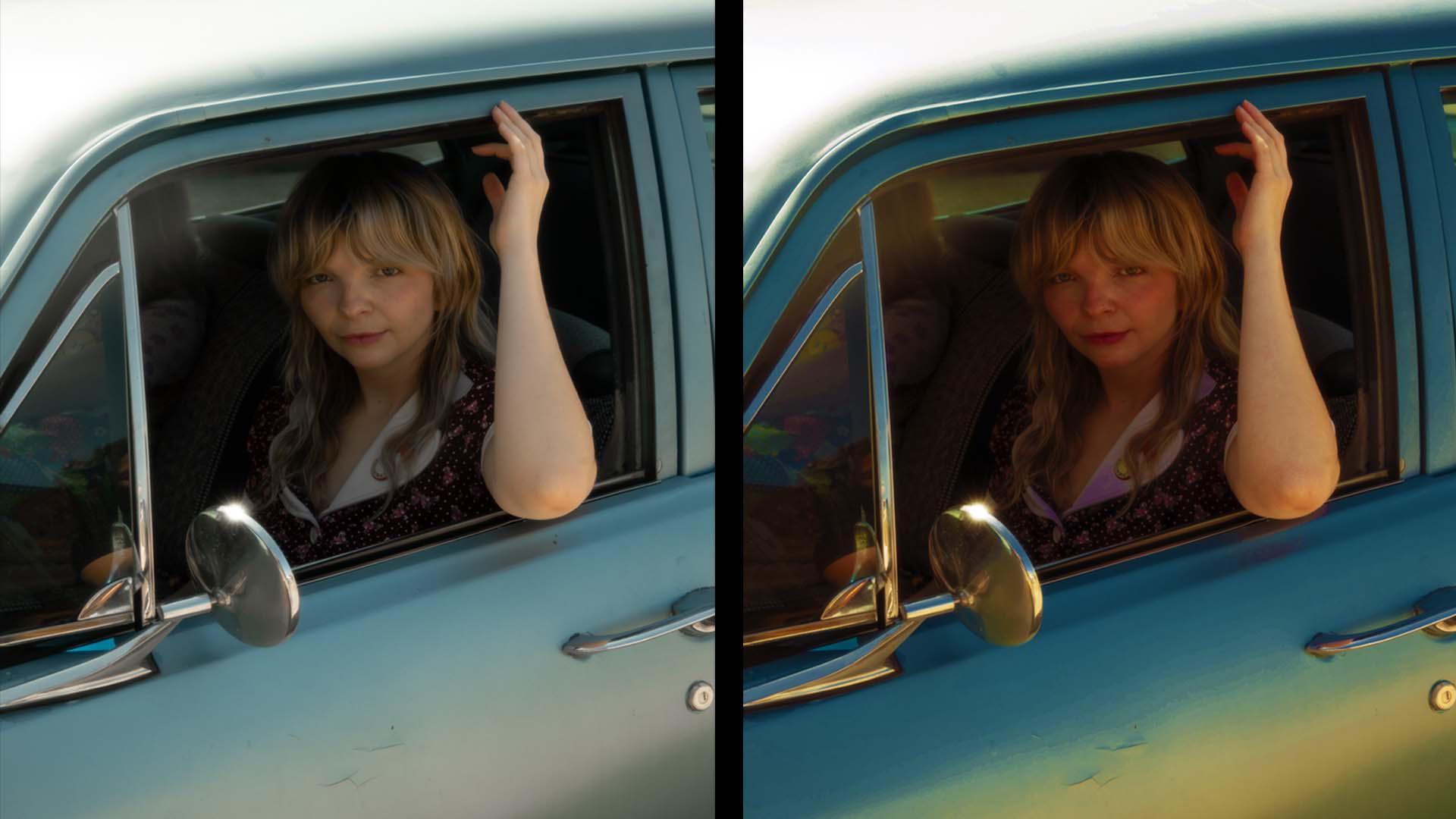
Vibrance is the secret sauce to your brand
Saturation may be a trend, but vibrance is your brand.
Let's use Vibrance to boost muted colors without turning your skin into neon soup.
Add an adjustment layer and click Vibrance.
Here, slide the Vibrance and Saturation all the way to the right - one at a time to notice the difference in color boost.
You'll find that for scenarios with subjects and landscapes, the vibrance blends seamlessly into your visual language.
That's your secret sauce.
For a pro tip, add a solid color, pick a hue that matches your brand or an alternative mood.
Set the Blend mode to Color or Soft Light, then drop that Opacity to about 5 to 15%.
It's a pro tip that will quietly pull totally different photos into the same energy without over-editing.
And congrats, you just built a color signature.
Trends come and go; your visual language stays.
Go back to your Photoshop mobile and set your color direction and make your next three posts feel like your voice. [laughs]