60 California captions to put you in a California state of mind.
California captions for every golden, coastal, and city moment.
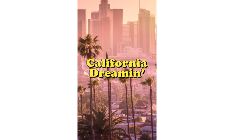




Find best California captions for beach days, sunsets and fun LA adventures.
Close your eyes and imagine catching a beach sunset, driving through palm-lined streets, or spending the day in Los Angeles soaking up the magic of the City of Angels. That easy, sunlit energy is what makes California so unforgettable. The right California captions can help you match that mood and make your photos feel more polished, playful, or personal. Whether you’re looking for California Instagram captions, California beach captions, California quotes, or sunset captions, this list can help you find the right words and bring your post together in Adobe Express.
California captions to get you feeling the California vibe.
Some California captions work because they instantly tap into the mood people associate with the state. They feel sunny, easygoing, and a little cinematic, which makes them a great fit for beach photos, road trip snapshots, city views, and everyday California moments.
This caption works well because it feels timeless and a little nostalgic. It fits photos that lean dreamy, scenic, or sentimental, and you can even use it as a header for a California moodboard.
Short captions like this tend to do well because they’re easy to pair with almost any kind of photo. It’s simple, catchy, and still gives your post that unmistakable California feel (especially if your photos are tinged orange or golden yellow).
This one has an easy warmth to it that fits beach shots, sunny selfies, and travel photos. It works especially well for photo collages that feel bright, relaxed, and carefree.
This caption leans more into the aspirational side of California. It’s a good match for photos that feel a little more polished, adventurous, or tied to travel and personal milestones.
This is the kind of caption that fits almost anything, which makes it especially useful. It has that breezy, open-ended tone that works well for casual social media posts and scenic snapshots.
If your design features a sunset or has an aspirational theme, this would work perfectly. It captures both the visual and emotional side of California pretty well.
This caption is ideal for posts that feel playful, warm, and relaxed. It works especially well for beach days, and it could even work as a banner.
This one is light, simple, and easy to use for beach content. It has a casual rhythm that makes it feel natural, especially for posts that have a more fun vibe.
If your photo is tied to a day out, a road trip, or a string of travel moments, this caption fits nicely. It gives the post a little more movement and makes it feel like part of a bigger story.
This is one of the strongest options for sunset photos or anything shot in warm evening light. It’s clean, memorable, and very easy to pair with aesthetically driven content.
These California captions work well because they leave room for the photo to do part of the storytelling. They bring in the sunshine, the scenery, and the mood without making the post feel too posed or overdone.
recipe
California Instagram captions for your next photo dump.
The best California Instagram captions usually feel easy and effortless, like they belong with the photo instead of competing with it. They work especially well for photo dumps because they can pull together all the fun activities you can do in California.
Think of this as a great slogan to use on a “Welcome to California” type of poster. It’s short, easy to use, and works for almost any kind of California post, from vacation snaps to casual weekend photos.
This caption has that relaxed, postcard feel people tend to love in California content. It works especially well for beach days, coastal drives, or photo dumps with a softer, more sentimental mood.
If your post leans warm, glowy, and carefree, this one fits naturally. It has that light, upbeat tone that works well for Instagram.
This caption is a good choice for travel posts or mixed photo dumps that capture different moments from one trip. It adds a little movement to the post and makes it feel more like a running story.
This one feels a little more reflective and slightly more poetic than the others. It works best for photos with scenic views and softer lighting.
California’s known for its iconic beaches. This caption’s a good match for bright beach shots, swimsuit photos, and casual posts.
This caption has a dreamy, almost cinematic feel to it. It works especially well for wide scenic shots, sunset photos, or posts where the sky is doing most of the work.
If your photo dump feels travel-heavy or full of outdoor moments, this one fits nicely. It captures that idealized California mood without being too on the nose about it.
This one works well for arrival posts, spontaneous trips, or any photo that feels tied to movement and adventure (and you can incorporate it into a letter). It’s simple, familiar, and still has personality.
This caption leans a little more playful and personal. It works well for selfies, beach photos, and casual lifestyle posts.
California Instagram captions tend to work best when they match the photo’s energy instead of trying to do too much. A clean, well-matched line usually goes further than something overly clever.
recipe
California beach captions for some fun in the sun.
The vibe here is breezy, light, and just a little bit dreamy, and we’ve gathered the top California beach captions that would showcase that exact mood. If your design is all about sun, surf, and that relaxed West Coast mood, these are strong options to keep on hand.
This one feels soft and reflective, so it works well for scenic beach shots and quieter ocean moments. It has a little more emotion to it without sounding overly dramatic.
This is an easy, go-to beach caption because it pulls together all the details people instantly connect with a coastal day. It feels casual and very natural for summer-themed content, like a card.
This caption has a little more energy to it, which makes it a good fit for surfing shots, action photos, or beach days that feel lively and spontaneous.
This one works well for wider scenic photos where the view is really the focus. It feels calm, open, and slightly more visual because it lets you picture California’s iconic coasts.
Simple captions like this can be really useful because they fit just about anything. It’s warm, straightforward, and works especially well for photo dumps or casual snapshots with friends.
This line has a softer, more romantic feel to it. It works nicely for sunset beach photos or a scrapbook-style design of your favorite California moments.
Simple and straightforward, this caption works when you want to express how much you love the beach. It’s simple, familiar, and easy to use for posts that feel joyful without needing much explanation.
Beach posts that are light and playful would work well with this caption. It’s especially good for photos that are more relaxed and easygoing, less editorial.
Color and imagery work really well with this California beach caption. It’s a strong choice for beach photos where the scenery is already doing most of the storytelling.
If the photo has that glowing, slightly dreamy coastal feel, this caption fits well. It captures the mood well and really gives you a sense of magic.
California beach captions usually work best when they sound relaxed and easy. The beach already gives you so much atmosphere, so the caption only needs to support it.
How to create scroll-stopping California captions.
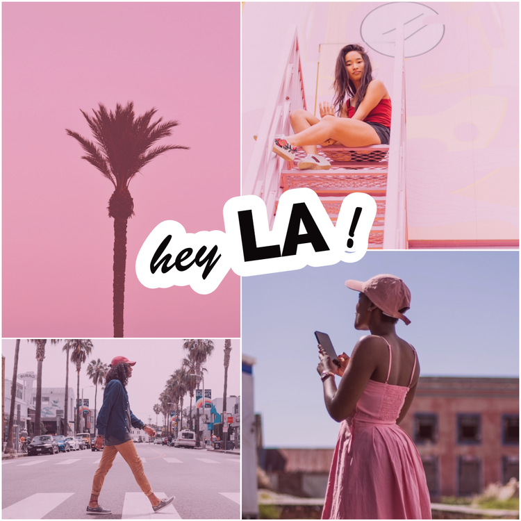
California quotes that you can also use as captions.
California quotes work well when you want your caption to feel a little more polished or memorable. They’re especially useful for scenic posts, travel photos, and aesthetic content, and these 10 are strong choices to keep in rotation.
This is one of those lines that works almost anywhere. It’s timeless, simple, and easy to pair with just about any California photo.
This quote has a softer, more reflective tone, which makes it a good fit for scenic photos and sunset content. It works especially well when the post feels more emotional.
This quote has a softer, more reflective tone, which makes it a good fit for scenic photos and sunset content.
This line has a slightly more aspirational feel, so it fits travel content, milestone moments, or posts that are meant to feel upbeat and inspiring.
This quote is a strong option for wide scenic photos where the sky really stands out. It feels dreamy without going too far and overpowering your design.
This one has an easy rhythm to it, which makes it feel very natural for Instagram. It’s especially good for beach, coastal, or vacation-style content.
This quote leans nostalgic and timeless. It works well for scenic shots, road trip photos, or posts that feel a little sentimental, like a shot of you and your loved ones at a California landmark.
This is a great one for sunset photos because it’s quick, specific, and easy to remember. It feels clean and very visual, and you can even amp up the saturation of your design to make the “golden” line come through.
Use this for beach content, outdoor adventures, or any photo with a bright and carefree mood. It instantly gives the post a warm-weather feel.
Pick this quote if you’re looking for something cheerful, simple, and easy to use across a lot of different post types. It’s a good default when you want something sunny and uncomplicated.
California quotes work best when they match the tone of the photo instead of trying to outshine it. A strong line should complement the moment, not pull focus from it.
Los Angeles captions for city lights and palm tree days.
Los Angeles captions have a slightly different energy from broader California captions. They usually feel a little bolder, more cinematic, and more tied to movement, ambition, and city atmosphere. If your photo has skyline views, palm-lined streets, golden sunsets, or that unmistakable LA mix of glamor and everyday chaos, these captions fit well.
This one leans into the classic romantic image of LA. It works especially well for scenic city shots or photos tied to travel, milestones, or new beginnings, especially if you’ve just moved to the area.
A line like this feels polished and a little glamorous, which suits LA content nicely. It’s a good fit for nightlife, skyline, or city-view photos.
This caption captures two of the most recognizable parts of the city in one line. It’s especially useful for posts that mix daytime warmth with a little urban edge, and you can even use it in a travel vlog.
This one has a more aspirational tone, so it works well for creative, travel, or personal milestone posts. It feels very LA without being too over-the-top.
Your Instagram followers would love this caption because it’s short, upbeat, and easy to pair with different kinds of city content. It works especially well for photo dumps.
This line feels slightly more thoughtful and works nicely for street photography, neighborhood shots, or candid LA moments.
This is one of the strongest options for photos that combine city views with warm evening light. It feels visual right away, which makes it easy to pair with a striking image.
This caption works well for day-in-the-life posts or content that feels personal and lifestyle-driven. It has that relaxed but aspirational tone people often associate with Los Angeles.
For travel content, events, studio days, or photos where the city’s in focus, this is a strong choice. It may be broad, but this is what makes it useful.
This is a strong option for sunset shots with a city backdrop. It brings together two of LA’s most photogenic elements in a way that feels smooth and easy to post.
Los Angeles captions usually work best when they strike a balance between style and atmosphere. The city already has a strong identity, so the caption only needs to sharpen the mood.
Sunset captions for golden hour in California.
When it comes to California sunsets, the light, the coastline, and the warm evening skies already do so much visually, so the caption just needs to bring in a little extra feeling. If your photo is all about glow, color, and mood, these are easy options to reach for.
There’s something reflective about this one, but it never feels too heavy. It works especially well for sunset photos that feel calm, emotional, or a little nostalgic.
A caption like this brings in a sense of movement, which makes it a natural fit for travel posts, beach evenings, or photo dumps built around one long day.
More thoughtful and hopeful, this one suits reflective posts or milestone moments. It’s a nice choice when you want the caption to carry a little more meaning.
Simple and visual, this line pairs easily with dramatic sunset colors. It works best when the sky is clearly the star of the photo, especially in a bold banner or wide scenic layout.
Short captions like this tend to land well because they feel polished without sounding too written or drawn out. It’s an easy option for warm, aesthetic sunset content.
Photos with strong outlines or shadowy figures pair especially well with this one. The wording feels visual right away, with just enough softness to keep it dreamy.
This one leans softer and a little more romantic. It fits scenic beach photos, quiet moments, or anything with a slower, more reflective feel.
Easy and versatile, this caption works for casual posts just as well as more polished ones. The tone stays light, which makes it useful when you want something simple for a sunset-themed Instagram story.
A little more poetic than the others, this line works best when the sunset itself is especially dramatic. It helps frame the image as the main event without overexplaining it.
Sometimes the most useful captions are the simplest ones. This is a strong fallback for almost any golden-hour photo, especially when you want something warm, familiar, and easy to pair with your image or a quick flyer design.
Sunset captions usually work best when they stay light and visual. The sky is already doing something beautiful, so the caption only needs to meet it halfway.
Best ways to design for California captions.
The best California captions usually feel easy, bright, and natural, so the design should feel that way too. You do not need to overdo it. A few thoughtful choices can make your post look more polished while still keeping that laid-back California mood.
1. Match the design to the kind of photo you’re posting.
A beach photo usually looks best with lighter, breezier design choices that feel soft and sun-washed. Los Angeles posts can handle something a little bolder, while sunset photos usually look better when the text stays simple and lets the sky do most of the work.
2. Let the image set the tone.
If your photo already has strong color, light, or scenery, the design doesn’t need to fight for attention. A good California caption layout should support the image, not compete with it.
3. Keep short captions visually clean.
Short California Instagram captions usually work best when they have plenty of breathing room. A clean layout and simple text placement often look better than adding too many decorative elements.
4. Give longer California quotes more space.
If you’re using a longer line, it helps to spread things out a bit. More spacing can make the design feel calmer, easier to read, and less cramped.
5. Use colors that already feel like California.
Warm neutrals, sandy beiges, pale blues, sunset tones, and soft golden shades all fit naturally here. These colors echo the scenery and help the post feel more connected to the mood of the caption.
Bring California captions to life with Adobe Express.
Once you’ve found the right California captions, Adobe Express makes it easier to turn them into something that feels polished and ready to post. You can use it to style your words for Instagram, build a scenic photo collage, create a beach-inspired poster, or design a clean banner that matches the mood of your photo. That flexibility is especially useful when you want your content to feel a little more personal and put-together.
It also helps when you’re working with different types of California captions. A casual California Instagram caption may look best on a simple social graphic, while a more reflective California quote might suit a card or a text-led design with more breathing room. If you’re putting together travel memories, beach snapshots, or a Los Angeles photo dump, Adobe Express gives you an easy way to keep the whole set visually consistent.
Adobe Express gives you room to experiment with typography, layout, color, and composition until the final post feels like it all belongs together.
Discover more you might like.
You might also like...