
A brand's color palette triggers powerful emotional associations that shape customer perception and differentiate businesses from competitors. This guide provides a practical three-step framework for selecting brand colors, combining color psychology and competitor analysis with testing methods for primary, secondary, and accent hues. It also addresses digital accessibility standards like WCAG contrast ratios and global cultural alignments. To ensure consistent visual identity development, Adobe Express features a free color palette generator and brand kit tools, making it simple to test, save, and systematically apply chosen brand colors across every template and marketing asset.
1. Start with a neutral color
Get started by choosing your base. One-to-two neutral covers will act as the canvas on which you’ll paint. Neutral colors are generally defined as black, white, ivory, silver, gray, brown, tan, gold, and beige colors. It’s helpful to think in terms of warm or cool colors, which can influence your entire palette. Blacks, browns, tans, golds and beige are considered warm, while white, ivory, silver, and gray are cooler in comparison.
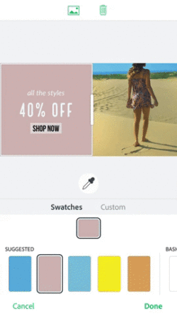
Pro-Tip: Get inspiration for neutral colors in Adobe Express Color Palette. You can do this by starting from a solid background color. Adobe Express Photo Editor will suggest basic colors across the spectrum. Tap into a neutral color you like to explore the shades and grab the hex value. Alternatively you can derive inspiration from a photo–try searching for things like “neutral” or “sand” in Adobe Express free image search, then explore the palettes Adobe Express auto-generates.
2. Add two “pop” colors
Next, we need to add some color to the canvas. These are going to be your main colors that represent your brand. This is the color that grabs the attention of your audience and becomes the star of your visual identity. Go for vibrant tones that play well together. With these tones specifically, it’s important to think about what your brand stands for and the mood you want to set. Here’s a quick primer on what brands need to know to use color effectively. In the simplest terms, cool colors (blues and greens, for example) tend to have a calming effect, while warm colors (reds and oranges) tend to excite. You might choose a cool palette as your main colors and then add a pop of warmth to liven it up.
This step can be the most intimidating choice. We recommend finding inspiration in your favorite photographs, places, and things. Adobe Express makes this discovery fun and easy because it extracts the colors from your images so you don’t have to do any guesswork in color-matching or hunt down the hex values yourself. Landscape and cityscape photography is a great place to find color inspiration. If your brand is lively and exciting, you might choose warm, active colors like reds and oranges. If you want to evoke a calming mood, cooler colors are the way to go.

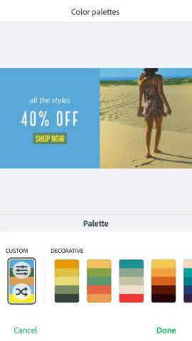
The following slideshow shows how two pop colors and a neutral color work together. These palettes were auto-generated in Adobe Express derived from desert vistas as inspiration.
3. Choose one call-to-action color
A call to action is usually a button, or a link, that tells viewers what to do. As such, this color should stand out, but be complementary to your main brand colors, such as a contrasting color on the opposite side of the color wheel. If you have a cool green-blue color scheme going, you might choose an active orange as the CTA color. The key to using this color effectively is to be very strict about where it goes. Use it only as buttons or calls to action so that viewers get accustomed to how and when this color shows up.

Bonus: Rely on Adobe Express color intelligence
There are a number of ways Adobe Express helps with choosing brand colors. The first is with professionally designed palettes. Choose from auto-generated palettes in bold, elegant, loud, modern, and more styles to match your color scheme to a mood. Tap a palette to have the colors cycle through your design until you land on a combination you like. Check out some palettes that Adobe Express offers.
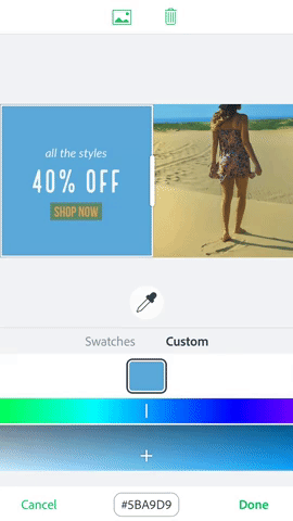
If you want more control, you’ve got it. Adobe Express takes the guesswork out of color picking. Control your colors down to the pixel with the eyedropper tool, or lean on Adobe Express smart recommendations to find the perfect match in a few clicks. If you have a certain shade already in mind, you can get the perfect match by applying the hex value to your designs.
Explore color with us!
We’re looking at the fall’s top color trends and exploring the ways color influences action, mood, and branding on our Instagram channel this week. These templates can get you started:
recipe
Bring your brand colors to your Adobe Express projects! Learn how to create branded stories in Adobe Express!
This post was updated on August 28, 2024.