[Kenneth Hines Jr.]: ¿Necesitas ideas para mejorar tus imágenes en Lightroom?
Gradación de color podría ser la herramienta perfecta.
Soy Kenneth Hines Jr., embajador de ZEISS.
Hoy veremos la herramienta Gradación de color y cómo puede mejorar el aspecto de las imágenes dándoles un toque extra de creatividad.
Gradación de color permite ajustar las imágenes con tintes de color en las sombras, los tonos medios y las iluminaciones, junto con el ajuste global que aplica un tinte a toda la imagen.
Puedes ajustar el Tono del color, su intensidad con Saturación, y el brillo o la oscuridad con los ajustes de Luminancia de cada selección.
También puedes aplicar los ajustes de Fusión y Equilibrio.
Fusión se utiliza para ajustar la intensidad o gradualidad de la separación entre sombras, tonos medios e iluminaciones.
Equilibrio cambia la tonalidad predominante del color hacia los tonos más claros u oscuros de la imagen.
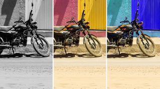
Pasemos a esta imagen en blanco y negro para ver los efectos de Gradación de color, ya que así se aprecian mejor los cambios de color sutiles.
Puedes elegir el valor que quieras para Tono, que controla el color del tinte que se aplica.
Al aumentar el valor de Saturación, el matiz se aplica en las zonas más oscuras de la imagen.
Ahora ajustemos la Luminancia, que hace que el ajuste sea más claro u oscuro.
Haremos lo mismo con los tonos medios.
Podemos controlar su brillo y oscuridad con Luminancia.
Y también lo haremos con las iluminaciones.
Pasemos a aplicar un ajuste global.
Antes, restableceré los ajustes de Gradación de color para ver mejor cómo se aplica el ajuste global a toda la imagen.
Hacemos clic con el botón derecho en el panel de Gradación de color para abrir un menú desplegable y elegir la opción de restablecer los tres.
También puedes mantener pulsada la tecla Opción o Alt para que aparezca la opción de restablecer arriba del panel, que restablece todos los ajustes.
El ajuste global aplica tintes a toda la imagen.
Esto va muy bien para imágenes en blanco y negro como esta, en las que se puede querer añadir un poco de color.
Vamos a hacerlo aplicando un tono verde y aumentando ligeramente la saturación.
Como puedes ver, hemos añadido un sutil tinte, sin restar protagonismo al blanco y negro.
Veamos un ejemplo de imagen en color con los estos métodos.
Esta imagen del interior de Grand Central es bonita, pero quiero minimizar un poco el color rojo anaranjado y darle un aspecto más vintage con un tinte verdoso.
Seleccionamos el valor de Tono que queremos y luego subimos el de Saturación.
También lo haremos con los tonos medios y con a las iluminaciones.
Ahora la imagen es más bonita que antes, en mi opinión.
Aquí tenemos un par de ejemplos más en los que Gradación de color ha mejorado la imagen.
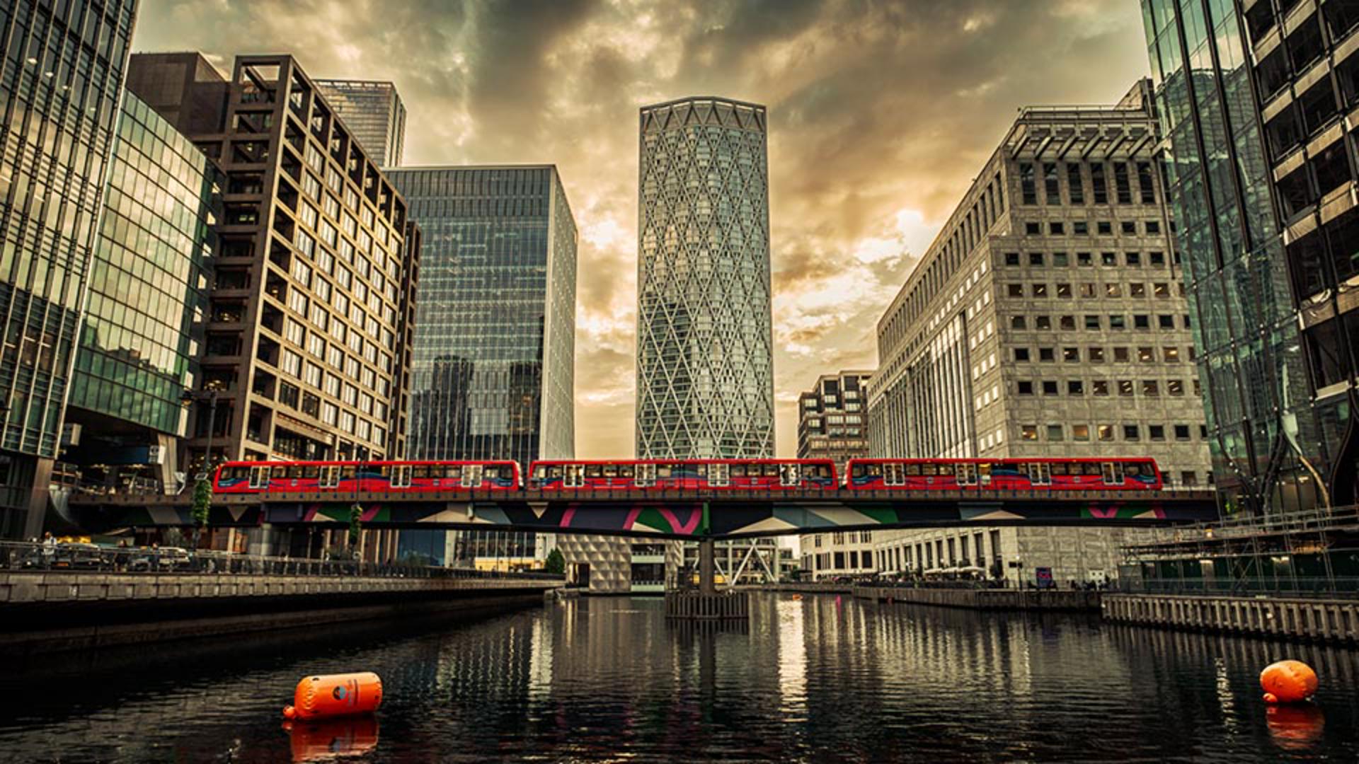
En esta imagen de Londres, solo he ajustado los tonos medios y las iluminaciones, lo que le da un tono más cálido a este atardecer.
En esta imagen de una boda, opté por añadir un tinte idéntico al color de las flores moradas.
Para darle un poco más de color a toda la imagen, ajusté solo las sombras para oscurecerlas con Luminancia.
En los tonos medios, apliqué un tinte cálido y, por último, ajusté las iluminaciones con el tono púrpura para aplicarlo al blanco de las flores del ramo.
Ya sabes cómo funcionan los controles del panel Gradación de color; prueba esta herramienta con tus imágenes y descubre qué combinaciones de tintes de color puedes crear.
Soy Kenneth Hines Jr.
Espero poder seguir explorando Lightroom contigo pronto.