Introduction
Welcome back!
In the second part of our trifold brochure tutorial, we're going to focus on adding the design content.
We'll cover everything, from placing text and images to selecting the perfect colors, also bringing your layout to life and make it truly stand out.
So, let's jump in and get started!
Now that we've set up our document, let's start adding some content.
If this is your first time using InDesign, don't worry, I'll walk you through it step by step.
By the end of this video, you'll have a great foundation for creating your first trifold brochure.
Preparing the workspace and understanding frames
Before we begin, let's make sure that we have everything we need visible.
If you don't see the Control Bar at the top of your screen, go to Window, Control to turn it on and off.
This will give us quick access to font size, colors, alignment, and making things a lot easier for us as we go.
InDesign works with frames, and the two most important tools we'll need today are the Rectangle Frame Tool and the Type Tool.
Creating image and text frames
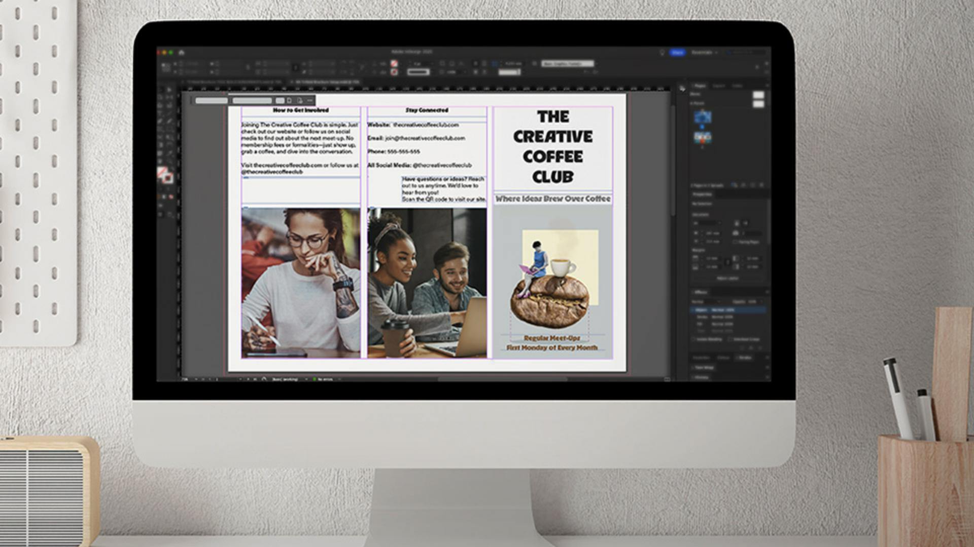
Let's start by adding some image frames throughout the document.
Over in the Toolbar, click on the Rectangle Frame Tool, and then click and drag to draw placeholders for your images like so, using the guides and columns to align them.
If you need to resize later, just click on a frame and adjust it, InDesign makes this super flexible.
Now that we've done that, let's add some text frames.
Frames enable you to control the placement and flow of objects, and the text that you add to them.
To begin with, we'll first select the Text Tool, but before drawing anything, let's set up our copy Font and Size in the Control Bar at the top.
For this project, we'll use Acumin Pro Regular at 12 pt for the body text, or any sans serif font of your choice, but I do recommend using a font already installed with InDesign from Adobe Fonts.
We're not going to touch the color at the moment, and with that set, click and drag to create your text frames throughout the document, just like we did for the images.
Designing the cover with titles and images
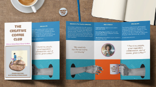
Let's move to the front cover, on the far right of the top page, and add our title, subtitle, and then our first image.
To do this, just select the Text Tool, then click inside the top frame, and type our coffee club title, and then the subtitle in the frame below.
Since we want the cover to stand out, highlight the text and either use the Contextual Task Bar to change the Font and Size or directly from the Control panel above.
We'll go with RL Aqva Black for this, or any decorative font you wish to use.
Then set it at 36 pt for the title, and 17 pt for the subtitle.
Colors will come later, so for now, we'll keep it black.
We're also going to center the text for the title and subtitle on the cover.
Now, let's add our images, starting with the cover.
Click on that first image frame and go to File, Place..., and select the cover image from where you saved the images supplied with this tutorial, and then click Open.
It might not look perfect at first, but don't worry, just click on the Content-aware Fit button in the Contextual Task Bar.
This uses Adobe's AI to automatically adjust the image, so it's well balanced in the frame, saving you time.
We'll repeat this process for the remaining images in the top two panels for the outside, using the images supplied.
For the final image on the inside of the document, the photo of the two hands and the coffee cup, we'll place it into the lower frame, using the same steps.
If we want this image to extend to the edges when printed,
Adding bleed for print-ready images
we'll need to add a bleed, which we skipped when setting the document up.
To set a bleed, just go to File, Document Setup..., or you can use a shortcut.
If you're on a Mac, press Command Option P, or if you're on Windows, press Control Alt P.
In the Document Setup window, find the Bleed and Slug section, then set the Top, Bottom, Left, and Right Bleed to 3 mm and then click OK.
You'll see that a red outline will appear around the document.
This ensures that the image doesn't have any white edges when printed.
Now, we'll slightly increase the size of the lower image frame, so that extends to the Bleed guide.
And once we've done that, we'll just click on the Content-aware Fit button again, just to make sure it fits.
With our images in place, let's add the body text.
Placing body text and finalizing the basic layout
I already have mine ready to copy and paste, which we supplied for you to use, but you can also type it in manually.
If your text is from another document and it has a different font, don't worry, InDesign will automatically apply the font settings we've assigned to the text frames earlier on.
To make the layout more engaging, let's change the font for the section titles, using the same title font from the cover.
And that's it for this stage.
We've now built the basic layout of our trifold brochure, complete with text and images.
In the next tutorial, we'll bring in color, creative touches, and extra design elements to make it really stand out.
I'll see you there.