Itten’s seven types of colour contrast.
Art theorist and painter Johannes Itten identified seven distinct types of colour contrast in his influential work on colour theory. Understanding these will help you apply contrast strategically in your designs.
1. Hue contrast.
The difference between two pure hues. For example, red against blue. This is the most obvious form of colour contrast.
2. Light and dark (value) contrast.
The difference in brightness between two colours. Black against white is the strongest example. This type of contrast is crucial for readability.
3. Warm and cool contrast.
The contrast between colours considered warm (red, orange, yellow) and those considered cool (blue, green, purple). This creates emotional and spatial effects in your design.
4. Saturation (intensity) contrast.
The difference in purity or intensity between two colours. For example, a vibrant colour against a muted or desaturated colour. Saturation contrast is particularly useful for directing attention.
5. Complementary contrast.
The contrast between colours that sit opposite each other on the colour wheel, such as red and green, or blue and orange. This type of contrast creates maximum visual impact.
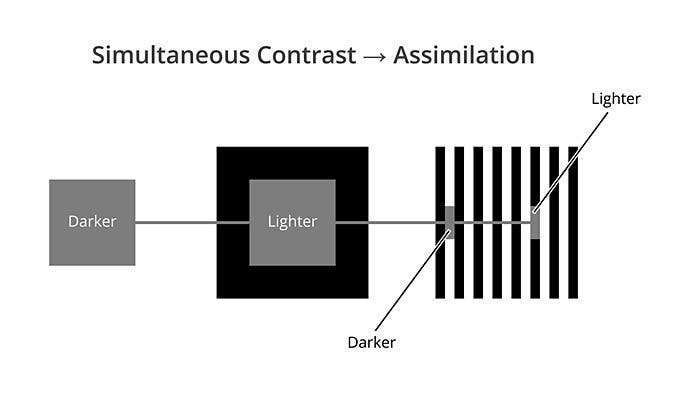
6. Simultaneous contrast.
An optical effect where two colours modify each other when placed side-by-side. For example, a grey colour can appear slightly blue-tinted when placed next to orange. This effect demonstrates how colours don’t exist in isolation.
7. Quantity contrast.
The difference in area or surface between two colours. For example, a large area of blue against a small area of red. Quantity contrast helps balance compositions and creates focal points.