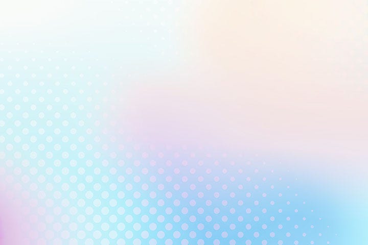
The best gradient colour combinations depend on your context and audience. Generally:
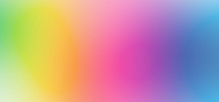
- Harmonious gradients: Choose colours close on the colour wheel (analogous colours). Examples: blue-to-green, yellow-to-orange
- Contrasting gradients: Use complementary colours (opposite on the colour wheel ) for bold effects. Examples: blue-to-orange, red-to-green
- Monochromatic gradients: Transition within a single colour family from light to dark. Examples: light blue to dark blue
For natural-looking results, draw inspiration from nature – particularly sunsets, skies and water. Use a colour wheel or Adobe Colour to explore options before committing.
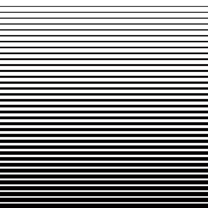
Banding occurs when gradients show visible lines instead of smooth transitions. To avoid this:
- Use gradients with more colour stops rather than just two colours
- Add subtle noise to break up visible transitions
- Increase colour depth (use 16-bit colour in Photoshop if possible)
- In print, work with your printer on appropriate screening techniques
- Test your gradient at the final output resolution and on the actual medium
Yes. Both Adobe Photoshop and Adobe Illustrator have gradient tools:
- Illustrator: Offers more gradient control and is ideal for logos and vector graphics
- Photoshop: Better for photograph-based work and composites with layers
- Both allow you to create custom gradient presets for consistency across projects
- Linear: Colour transitions along a straight line (horizontal, vertical or diagonal)
- Radial: Colour transitions from a central point outward in a circular pattern
- Mesh (freeform): Allows multiple colour points across a shape for organic, complex transitions
Choose based on your design needs: linear for simple transitions, radial for focal points, mesh for artistic complexity.
Gradients were hugely popular until flat design took over around 2008-2010. However, they've made a strong comeback since 2018 and remain very much in favour. Rather than asking if they're trendy, consider whether they serve your design purpose. When used appropriately, gradients add genuine value through depth and visual interest – they're not merely a trend.
Yes, but with caution. Gradients can look different in print than on screen due to:
- Colour separation and printing technology limitations
- Banding or posterisation in gradual transitions
- Colour profile variations
Always request physical proof from your printer before full production. Consider simpler gradients or adding texture/pattern to avoid banding issues.
Gradient effects in marketing include:
- Backgrounds that draw attention
- Colour transitions that guide eye movement
- Layered gradients for dimension
- Subtle gradients that enhance without overwhelming
- Gradient overlays on photography
- Gradient text effects for emphasis
Use gradients to enhance marketing messages, not distract from them.