#1e1e1e

Master colour gradients to elevate your designs.

Colour gradients are one of the most versatile and visually compelling design elements. Whether you're creating a striking logo, designing a website, crafting packaging or building a brand identity, understanding how to use colour gradients effectively can transform your work from ordinary to extraordinary.

Colour gradient

This comprehensive guide explores everything you need to know about colour gradients – from the fundamental principles that make them harmonious, to practical step-by-step instructions for creating them with Adobe’s tools. Let's dive in and unlock the full potential of gradient design.

What is a colour gradient?

At its core, a colour gradient is a smooth, progressive transition from one colour to another (or across multiple colours). Gradients add depth, visual interest and sophistication to designs in a way that flat colours simply cannot.

Why use colour gradients?

  • Visual appeal: Gradients create more sophisticated, polished designs
  • Depth and dimension: They add layers and visual richness to flat designs
  • Movement and flow: Gradients can guide the viewer's eye across a composition
  • Brand differentiation: Unique gradient colour palettes help your brand stand out
  • Modern aesthetic: Gradient design is a contemporary trend that feels current and professional

The key to successful gradient use is ensuring smooth colour transitions and avoiding overuse that can make designs appear cluttered or amateur.

Types of colour gradients.

Understanding the different types of gradients available to you is essential for choosing the right one for your project. Here are the three main types you can create in Adobe Illustrator:

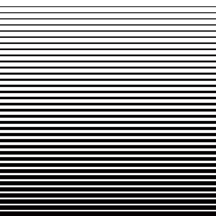
Linear gradient of white and black

Linear gradients.

Linear gradients feature a straight-line transition from one colour to another. The line can be horizontal, vertical or diagonal, and you can have a transition of multiple colours along the straight line.

Best for: Backgrounds, banners, text effects, web design headers

Radial gradients.

Radial gradients transition from a central point outward in a circular pattern. They create a focal point and are particularly effective for drawing attention to a specific area.

Best for: Spotlight effects, circular elements, UI buttons, badge designs

Mesh (freeform) gradients.

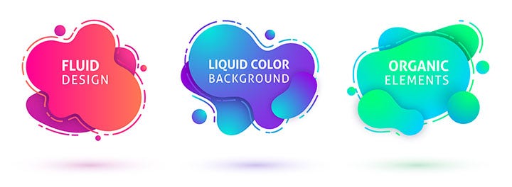
Mesh gradients allow you to form a graduated blend of colour stops to achieve a more fluid, organic-looking effect. You can apply colour transitions at multiple points to create complex, natural-looking effects.

Two application modes:

  • Lines: Shade the area around a line
  • Points: Shade the area around individual colour stops

Note: Linear and radial gradients can be applied to both the fill and stroke of an object, whilst mesh gradients apply only to the fill.

Best for: Realistic illustrations, complex backgrounds, artistic effects, mesh gradient design

Transition from red to green

History and inspiration behind colour gradients.

Where do gradients come from?

The history of colour gradients stretches back to humanity's first perception of sunsets and sunrises. Our brains are wired to find certain colour transitions beautiful because they mirror what we see in nature. Gradients that feel harmonious to us typically reflect gradients we've observed in the natural world.

Conversely, colour combinations we've never encountered in nature often feel uncomfortable or jarring – our visual cortex recognises the unnaturalness immediately. For example, a red-to-green gradient feels wrong because we rarely (if ever) see this transition in nature. But blue-to-purple, orange-to-violet, or red-to-violet gradients feel natural because they appear in sunsets.

The sky as inspiration.

The greatest source of natural gradient inspiration is the sky. Whilst we often take the sky for granted, its colours profoundly influence our aesthetic preferences.

Basic sky colours include blue and red, but the reality is far richer: a majestic blend of orange, yellow, violet, red and blue that varies throughout the day and across the different seasons.

Don't hesitate to use luminous gradients inspired by the sky in your graphic designs. Today's digital tools allow you to capture and reproduce any sunset or sunrise and translate it into digital form with stunning results.

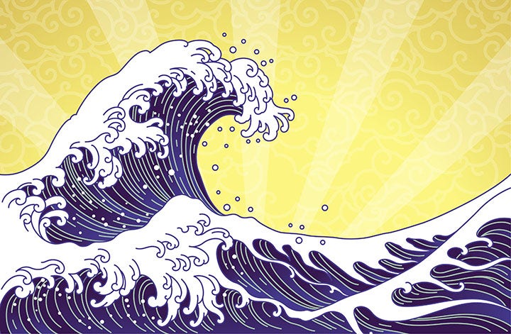
Katsushika Hokusai's The Great Wave off Kanagawa

Gradients in art history.

Great artists have used gradients throughout history to create masterpieces. A prime example is Katsushika Hokusai's The Great Wave off Kanagawa (19th century), which captures the power of the ocean through sophisticated gradations of Prussian blue – a pigment so rare and expensive that only wealthy artists could afford it.

The gradient design trend.

Several decades ago, gradients were the dominant way to add colour and depth to designs. This trend continued until the late 2000s, when flat design took over. However, gradients made a powerful comeback in 2018 and remain popular because they enhance flat designs, add visual interest, improve depth and create texture in ways that flat colours cannot.

Today, gradient design is a mainstream aesthetic used across branding, UI design, illustration, marketing and graphic design.

Real-world gradient applications.

Colour gradients are versatile and work beautifully across nearly every design discipline:

Logo and brand design.

Gradients can add a unique dimension to your logo that helps you stand out from competitors. A well-chosen gradient becomes part of your brand identity and remains memorable. When implementing gradients in logos, ensure they work at small sizes and in monochrome (for situations where colour isn't available).

Various logos

Packaging and product design.

The key to successful gradients in packaging is alignment with your brand identity and target audience:

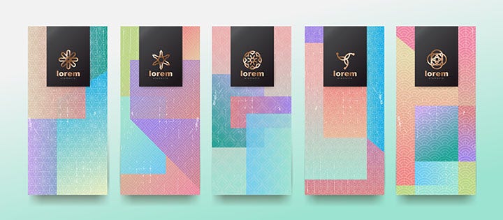
  • Bold, vibrant gradients work well for products aimed at younger demographics or extreme sports enthusiasts
  • Soft, subtle gradients suit luxury products, baby products or premium services
  • Muted, sophisticated gradients appeal to professional or corporate audiences
Multicolor prototype packaging

UI and web design.

UI gradients are particularly popular in digital design. They're used for:

  • Buttons and call-to-action elements
  • Background colour palettes
  • Hover states and interactive elements
  • App interfaces and dashboards

Web design benefits enormously from gradients because they add visual hierarchy and guide user interaction.

Ordinateur et clavier blanc sur bureau blanc

Advertising and marketing materials.

Gradients are inherently eye-catching and memorable. The most popular logos and designs stand out and communicate energy, modernity and creativity in advertising. Nearly every major brand has modernised its branding with gradient elements in recent years.

Examples of multicolor publications

Print offers excellent opportunities to showcase gradient design. Gradients work beautifully on:

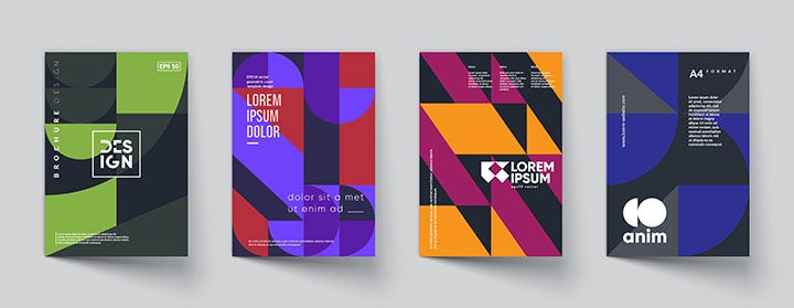
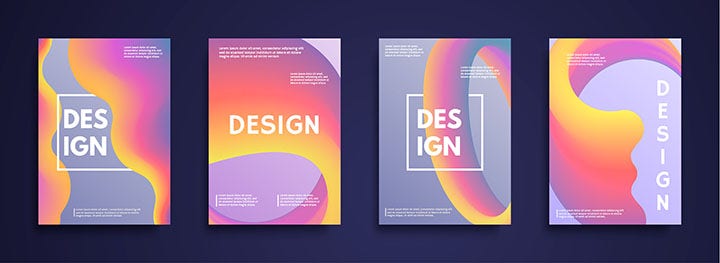
  • Magazine covers and feature spreads
  • Posters and promotional materials
  • Book covers and dust jackets
  • Brochures and collateral
Examples of designs

Infographics and data visualisation.

Gradients help differentiate data categories and create visual interest in otherwise information-dense designs.

Best practices for using colour gradients in design.

Now that you understand what colour gradients are and their applications, here are professional tips for maximising their impact:

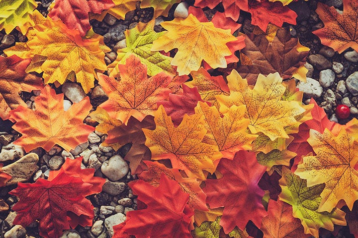
Autumn colours on the leaves

Choose your colours strategically.

The most important aspect of successful gradient design is colour selection. Random colour combinations appear messy and jarring, so always use a colour wheel when seeking inspiration.

Best approaches:

  • Choose colours with similar hue and tone for harmonious results
  • Use colour theory to select colours that work together
  • Select colours close on the colour wheel for smooth, natural transitions
  • Consider analogous, complementary or triadic colour relationships

Stay true to your brand.

Gradients amplify your brand colours, so any colours you choose become associated with your brand. Consistency is crucial:

  • Don't deviate from your established colour palette
  • Maintain visual consistency across all marketing materials and campaigns
  • Using gradients on your logo or in your designs will add a modern spin whilst staying recognisable
  • Document your approved gradient colour palettes for team use

Use gradients with restraint.

Gradients are powerful, but more isn't always better – sometimes less is more. Useful tips:

  • Keep designs simple and focused
  • Avoid multiple competing gradients in a single design
  • Not every logo or design benefits from a gradient (flat colours often work better)
  • When overused or misapplied, gradients can appear gimmicky or reduce readability

Professional tip: When designing a logo, always create a flat-colour version first, then add gradients. This lets you compare and choose the most effective approach.

Consider your medium.

Gradients often look stunning on screen, but don't always translate perfectly to print:

  • Screen gradients can display smooth, unlimited colour transitions
  • Print gradients can sometimes show banding or posterisation, creating visible lines instead of smooth transitions
  • Large brands often use flat colours in logos specifically because they print reliably
  • Always test gradient designs in your intended medium before finalising

Printing tip: Work with your printer to use high-quality gradients and appropriate screening techniques to minimise banding.

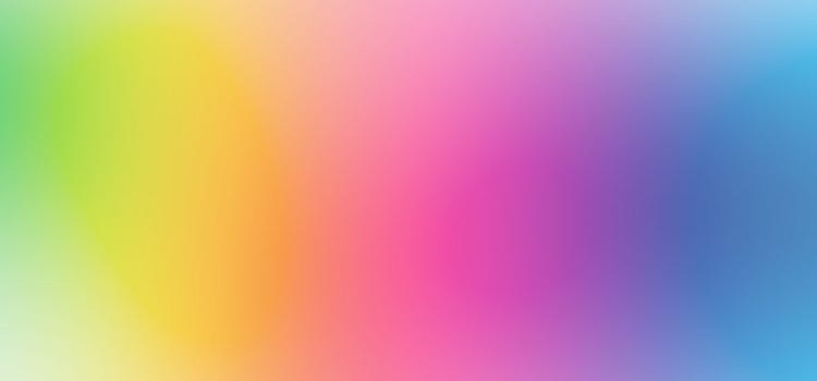
Gradient of pink, blue and orange

Understand your audience.

Effective gradient design requires deep knowledge of your target audience:

  • Corporate audiences typically prefer subtle, sophisticated gradients
  • Younger audiences often respond to bold, vibrant colour gradient combinations
  • Luxury brands use refined, muted gradients
  • Tech brands often favour modern, dynamic UI gradients
  • Cultural considerations: Colour meanings vary significantly across cultures

A neon pink-to-yellow gradient won't resonate with traditional business audiences, whilst a muted blue-to-grey might underwhelm a youth-focused brand.

How to create a colour gradient with Adobe.

Adobe Illustrator offers powerful tools for creating professional gradients. Follow these steps to create stunning gradient designs:

Step 1 – Set up your workspace.

  1. Open a new document in Adobe Illustrator
  2. Set artboard dimensions based on your project (e.g., 1600×1600 pixels for web)
  3. Select RGB colour mode for digital work (CMYK for print)

Step 2 – Prepare your colour palette.

To maintain a cohesive colour scheme:

  1. Create shapes filled with your chosen colours
  2. Position them to the side of your artboard for easy reference
  3. Alternatively, use the Colour Swatches panel or hex colour codes
  4. This ensures consistency throughout your gradient design

Step 3 – Add your base shapes.

  1. Use the Rectangle tool to create shapes for your gradient
  2. Hold Shift whilst dragging to create perfect squares
  3. Fill them with a placeholder colour

Step 4 – Select your gradient type.

  1. Access the Gradient panel (Window > Gradient if not visible)
  2. Choose from three gradient types:
    • Linear: Straight-line transition
    • Radial: Circular transition from the centre point
    • Freeform: Organic, multi-point transitions
  3. For this example, use Freeform Gradient with Points mode

Step 5 – Choose and apply colours.

  1. Double-click each colour point to change its colour
  2. Select colours using:
    • Swatches panel
    • Colour codes (hex, RGB, CMYK)
    • Eyedropper tool (to sample from your prepared palette)
  3. Repeat until all colours are set

Step 6 – Refine your gradient.

  1. Press Escape when finished with colour selection
  2. Move points to see how colours interact
  3. Adjust opacity and spread using the Gradient panel
  4. Drag the outer circle inward/outward to adjust colour spread
  5. Experiment with different configurations

Step 7 – Add effects and textures.

Once your gradient is complete, enhance it further:

  1. Go to Effect > Stylize to add effects
  2. Experiment with noise, texture or blur
  3. Use Effects > Distort for creative variations
  4. Layer multiple effects for sophisticated results

Adobe Photoshop alternative.

If working with photography or composites:

  1. Use the Gradient tool from the toolbox
  2. Define gradient stops and colours
  3. Apply across layers
  4. Adjust blending modes and opacity for creative effects

Here are some of the best gradient colour combinations proven to work across different contexts:

Sunset gradients (warm and inviting):

  • Orange-to-red
  • Orange-to-pink
  • Yellow-to-orange
  • Coral-to-peach

Sky gradients (calm and professional):

  • Blue-to-purple
  • Blue-to-pink
  • Teal-to-blue
  • Lavender-to-blue

Modern tech gradients (dynamic and contemporary):

  • Purple-to-pink
  • Cyan-to-blue
  • Green-to-teal
  • Pink-to-orange

Nature-inspired gradients (organic and balanced):

  • Green-to-teal
  • Sage-to-mint
  • Forest green-to-olive
  • Emerald-to-teal

Ombré gradients vs standard gradients.

Ombré gradients: A specific type where one colour gradually shifts to white or black, creating a fading effect. Often uses a single colour family transitioning in saturation or brightness.

Standard gradients: Transition between two or more distinct colours.

Both have their place – ombré creates elegance and simplicity, whilst multi-colour gradients create vibrancy and complexity.

UI gradient best practices for digital design.

When creating gradients for user interface design:

  • Keep contrast sufficient for readability
  • Avoid gradients that interfere with text legibility
  • Use subtle gradients on interactive elements (buttons, links)
  • Ensure gradients don't distract from content
  • Test across different screen resolutions and colour profiles

Three colour gradient combinations.

For more complex gradient colour palettes, consider these three-colour combinations:

  • Blue → Purple → Pink (dynamic and modern)
  • Green → Yellow → Orange (energetic and warm)
  • Red → Orange → Yellow (sunset-inspired and warm)
  • Purple → Blue → Green (cool and sophisticated)

Frequently asked questions.

What colours should I use to create a colour gradient?

The best gradient colour combinations depend on your context and audience. Generally:

  • Harmonious gradients: Choose colours close on the colour wheel (analogous colours). Examples: blue-to-green, yellow-to-orange
  • Contrasting gradients: Use complementary colours (opposite on the colour wheel ) for bold effects. Examples: blue-to-orange, red-to-green
  • Monochromatic gradients: Transition within a single colour family from light to dark. Examples: light blue to dark blue

For natural-looking results, draw inspiration from nature – particularly sunsets, skies and water. Use a colour wheel or Adobe Colour to explore options before committing.

How do I create a smooth colour gradient without banding?

Banding occurs when gradients show visible lines instead of smooth transitions. To avoid this:

  • Use gradients with more colour stops rather than just two colours
  • Add subtle noise to break up visible transitions
  • Increase colour depth (use 16-bit colour in Photoshop if possible)
  • In print, work with your printer on appropriate screening techniques
  • Test your gradient at the final output resolution and on the actual medium
Can I create a gradient in Photoshop as well as Illustrator?

Yes. Both Adobe Photoshop and Adobe Illustrator have gradient tools:

  • Illustrator: Offers more gradient control and is ideal for logos and vector graphics
  • Photoshop: Better for photograph-based work and composites with layers
  • Both allow you to create custom gradient presets for consistency across projects

What's the difference between a linear gradient, radial gradient and mesh gradient?

  • Linear: Colour transitions along a straight line (horizontal, vertical or diagonal)
  • Radial: Colour transitions from a central point outward in a circular pattern
  • Mesh (freeform): Allows multiple colour points across a shape for organic, complex transitions

Choose based on your design needs: linear for simple transitions, radial for focal points, mesh for artistic complexity.

Are gradient colour palettes timeless or trendy?

Gradients were hugely popular until flat design took over around 2008-2010. However, they've made a strong comeback since 2018 and remain very much in favour. Rather than asking if they're trendy, consider whether they serve your design purpose. When used appropriately, gradients add genuine value through depth and visual interest – they're not merely a trend.

How do I choose the best gradient colour combinations for my brand?

  1. Analyse your brand personality: Bold and energetic? Calm and professional? Luxury and refined?
  2. Research competitors: See how other brands in your space use gradients
  3. Consider your audience: Age, culture, industry and preferences all matter
  4. Start with your brand colours: Build gradients using existing palette colours
  5. Test options: Create 3-5 different gradient variations and get feedback
  6. Stay consistent: Document your approved gradients for team use

Can I use gradient design for print and packaging?

Yes, but with caution. Gradients can look different in print than on screen due to:

  • Colour separation and printing technology limitations
  • Banding or posterisation in gradual transitions
  • Colour profile variations

Always request physical proof from your printer before full production. Consider simpler gradients or adding texture/pattern to avoid banding issues.

What are gradient effects in marketing materials?

Gradient effects in marketing include:

  • Backgrounds that draw attention
  • Colour transitions that guide eye movement
  • Layered gradients for dimension
  • Subtle gradients that enhance without overwhelming
  • Gradient overlays on photography
  • Gradient text effects for emphasis

Use gradients to enhance marketing messages, not distract from them.