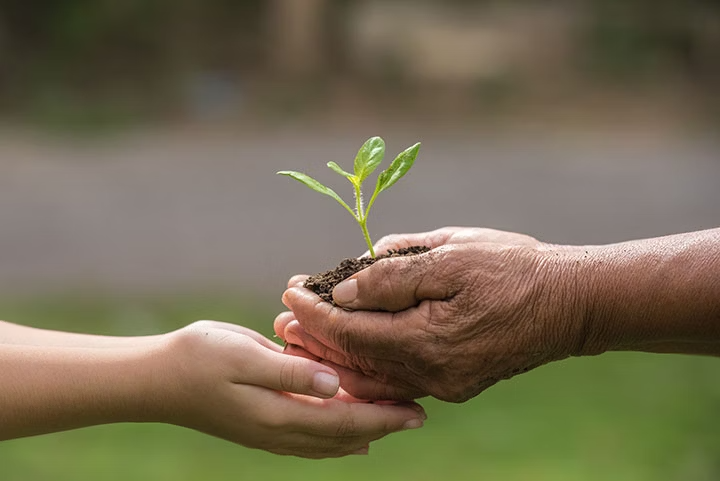
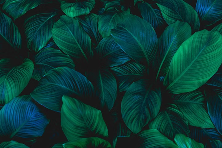
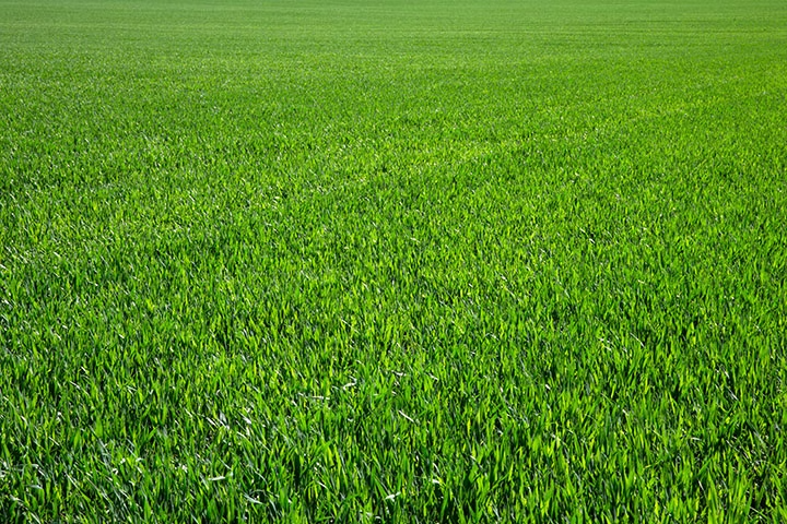
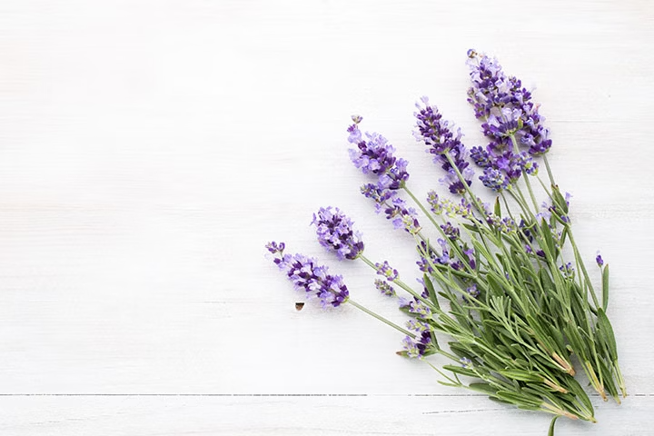
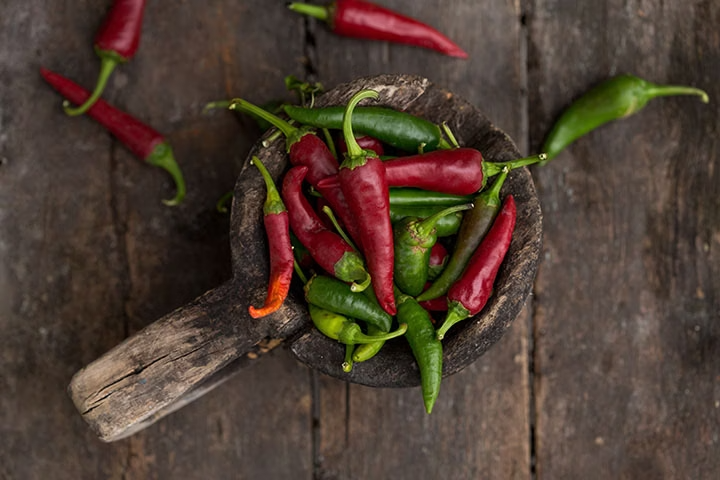
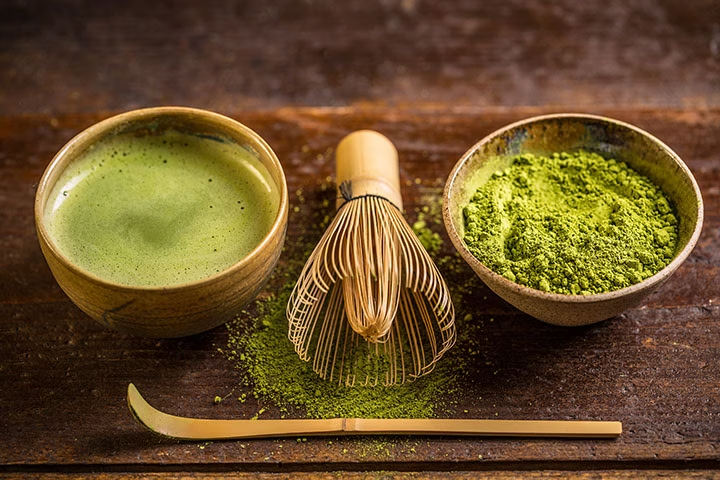
Green is a secondary colour in traditional colour theory, created by mixing blue and yellow. It represents growth, balance, calm and nature. It's psychologically associated with healing, safety, and renewal.
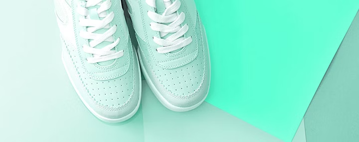
The variety of green shades available comes down to how you approach the mix. Get the balance right and you can produce anything from the soft, pale tones of pistachio green to the dark, rich depth of forest green, and plenty of interesting shades in between.
There's no single method for mixing green, which is part of what makes it such a versatile colour. Because there are so many variations of blue and yellow available, from ultramarine and cobalt blue to cadmium yellow, each combination produces a slightly different result. The best approach is simply to experiment with different primary pairings until you land on the shade you're after.
Green carries a lot of meaning. It's broadly associated with growth, nature, balance, renewal, hope, freshness and healing. Culturally, the symbolism shifts depending on where you are. In Western cultures, green tends to represent luck and prosperity. In parts of Eastern culture, it's more closely tied to eternal life. Psychologically, it's one of the more grounding colours, known for promoting calm, reducing stress and supporting focus.
The best colours that go with green include:
- red (complementary, high contrast)
- blue (analogous, cool pairing)
- yellow (analogous, natural)
- purple (triadic harmony)
- white (clean contrast)
- grey (neutral balance).
For a more hands-on way to explore green colour combinations, Adobe Colour lets you test pairings and see how they interact in real time.
It depends on where you are and who you ask. In most Western cultures, green is firmly associated with good luck, think four-leaf clovers and the green of the dollar bill. But that's not universal. Green is considered unlucky at racetracks, which is why you'll rarely spot a green vehicle there. In some Australian circus and travelling showmen traditions, green carries similar negative associations. Like most colour symbolism, context matters.
The terms are related but distinct. A shade of green is created by adding black, which produces a darker, more muted result. A tint is created by adding white, pushing the colour toward lighter, more pastel territory. A tone sits somewhere in between, produced by adding grey, which tends to create something more sophisticated and balanced. Understanding the difference between the three gives you much more deliberate control over the mood a green creates.
Green is one of the more psychologically purposeful colours. It promotes calm, reduces anxiety and encourages focus, which is why it features so heavily in wellness spaces, healthcare facilities and productivity-focused environments. Emotionally, it tends to evoke feelings of relaxation, balance and growth, with strong connections to safety, renewal and the natural world.
There's no single answer, but there are some important considerations. Screen displays render colour differently from print, so the colour model you work in matters. If you're using green as a text colour, contrast with the background is essential for readability. It's also worth testing across different devices, since green can look noticeably different from one screen to another. Tools like Adobe Colour and browser-based accessibility checkers are useful for making sure your choices hold up.
Brand colours can communicate a consistent set of values. For green, these include sustainability, growth, health and a connection to the natural world. That makes it a natural fit for eco-conscious brands, healthcare, wellness and technology companies looking to convey trust and responsibility.