.

Master colour palettes to transform your designs.

Colour palettes more than just random colour combinations. They're strategic, purposeful selections that form the visual foundation of your brand, product or design project.

Whether you're a beginner artist or an experienced designer, understanding how to build and use colour palettes effectively will elevate your work significantly.
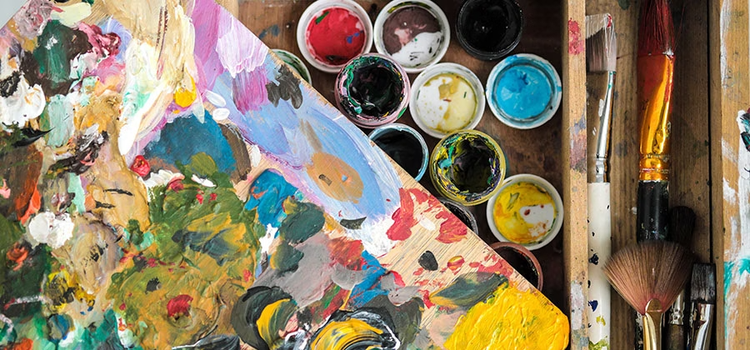

Open paint cans and splotches of multicoloured paint on the table

What is a colour palette?

A colour palette is a curated set of colours used throughout a design, brand or creative project. Experienced designers and graphic professionals rely on well-planned colour palettes to maintain visual consistency and create aesthetically pleasing work.

When used strategically, colour palettes:

  • Maintain consistency across designs and marketing materials
  • Create visual harmony that's pleasant to view
  • Increase brand recognition by up to 80%
  • Communicate your brand personality to audiences
  • Establish professional credibility

In the 1990s, digital colour palettes were limited to 8 colours. Today, you can choose from millions of hues, shades and tints using the colour wheel – which makes strategic selection even more important.

Why you need a colour palette.

Before selecting individual colours, determine the mood and atmosphere you want to convey:

  • Tone: Professional or casual? Modern or traditional?
  • Energy level: Energetic or calming?
  • Personality: Playful, serious, luxurious or functional?

Once you've answered these questions, ensure your palette balances three key principles:

Aesthetics.

Choose visually appealing colours that convey beauty, quality and sophistication, enhancing your design's overall impact.

Brand identity.

Your colours communicate your brand's personality and values. Select memorable, recognisable colours that attract and retain customers. Colour increases brand recognition significantly, so choose strategically.

Consistency.

Consistent colour use across campaigns, touchpoints and marketing materials increases customer recognition and builds trust. Maintain your colour palette through updates and brand refreshes to preserve recognition.

Water colour circles

Types of colour palettes.

Colours combine to create seven commonly used palette types. Understanding each helps you choose the right approach:

Monochromatic.

Uses various tones and shades of a single colour. Creates harmony and sophistication with minimal contrast – ideal for elegant, cohesive designs.

Analogous.

Uses 3 colours positioned adjacent to one another on the colour wheel. Naturally harmonious with minimal contrast – perfect when you want a cohesive, restful aesthetic.

Complementary.

Uses colours opposite each other on the colour wheel. Creates maximum visual contrast and impact, perfect for bold, eye-catching designs.

Triadic.

Based on 3 colours equidistant on the colour wheel. Typically uses one dominant colour with two accent colours. Vibrant and balanced with good contrast.

Tetradic (rectangle).

Uses 4 colours forming a rectangle on the colour wheel. More complex to balance but offers rich, varied contrast. Best for experienced designers.

Split-complementary (nuanced).

Combines one dominant colour with the two colours adjacent to its complement. More refined than pure complementary palettes whilst retaining contrast benefits.

Square.

Uses four equally spaced colours forming a square on the colour wheel. Offers substantial contrast but requires one dominant colour to prevent visual chaos.

Group of people in an office looking at colour palettes

How to define your colour palette.

Draw inspiration from nature.

Our eyes respond naturally to colour combinations found in nature. Look to sunsets, landscapes, foliage, water and animals for authentic colour inspiration. These natural palettes have an intuitive appeal to our vision.

Consider brand alignment.

Different industries and audiences expect different palettes:

  • Children/younger audiences: Bright, saturated colours
  • Corporate/business: Cooler, conservative palettes
  • Luxury brands: Sophisticated, refined combinations
  • Tech companies: Modern, dynamic palettes

Start with one base colour.

Begin by selecting a single base colour. This prevents colour conflicts and ensures harmony. As you get more confident using colours, slowly expand to more complex palettes.

Find complementary colours.

Once you've chosen your base colour, consider your desired mood:

  • Energy and passion: Add vibrant reds and yellows
  • Calm and tranquillity: Add softer blues and greens
  • Sophistication: Add neutrals with subtle accents

Use the 60/30/10 rule: dominant colour (60%), secondary colour (30%), accent colour (10%).

Account for user experience and accessibility.

Create a greyscale version first to ensure your composition works without colour. Verify:

  • Text is readable against backgrounds
  • Sufficient contrast for colour-blind users
  • Interactive elements are distinguishable
  • Design functions before colour enhancement
Stacks of colour palette samples

Tools for choosing colour palettes

Adobe Colour.

Adobe Colour (formerly known as Kuler), is the leading tool for designing professional colour palettes. It allows beginners and advanced users to create refined palettes with precision:

Key features:

  • Colour palette creation: Generate palettes using the colour wheel or from an image
  • Image-based extraction: Upload a photo and generate a customised palette matching the image's colours
  • Gradient extraction: Extract gradients from images and save them as reusable colour gradients
  • Community inspiration: Browse thousands of colour combinations created by the Adobe Colour community
  • Trend exploration: Explore colour trends and gain inspiration from other graphic designers and artists’ colour palettes from the wider Adobe Colour community

Pro tip: Don't start from scratch. Use Adobe Colour to accelerate your workflow and benefit from collective design knowledge.

Office desk with colour palettles and a tablet

Frequently asked questions.