.

Colour theory and the psychology behind effective colour design.

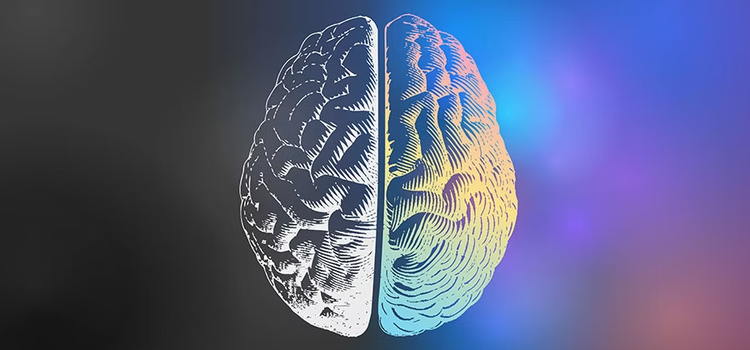
Many assume colour is merely aesthetic, but colour theory is far more profound. Colour psychology is the study of how specific hues affect human behaviour and mood.

Understanding colour theory fundamentals will help you build stronger brands, create compelling designs, and influence audience perception – all through strategic colour choices.

What is colour theory?

Colour theory is both the science and art of using colour. It explains how humans perceive different hues and the visual effects that occur when colours blend, match or contrast with each other.

Colour theory also encompasses the messages colours communicate, and the methods used to reproduce colour accurately across different media.

Why colour theory matters to your business.

Colour theory helps you build a recognisable brand and create designs that resonate emotionally with your audience – which can all help to increase sales.

By understanding how colours interact, you can make strategic decisions that strengthen your visual communication and achieve your creative goals.

The foundations of colour theory.

Colour theory rests on three key foundations:

  1. The colour wheel – the visual organisation of colour relationships.
  2. Colour harmony – principles for combining colours effectively.
  3. Context of use – how colours function within specific designs, cultures and applications.

Together, these foundations provide a logical framework for making colour decisions.

Historical context: the science of colour.

Sir Isaac Newton pioneered modern colour theory in 1666 when he demonstrated that white light comprises seven visible colours. By establishing the visible spectrum scientifically (the colours we see in a rainbow), Newton opened the door to scientific colour exploration.

This led to the creation of the first colour wheel (also called the chromatic circle) – a foundational tool artists and designers use today to find colour harmony. The traditional colour wheel comprises 12 colours built on three primary colours.

Understanding this history helps us appreciate why colour theory remains central to creative practice.

Learn more about the colour wheel

How colour affects psychology and behaviour.

The speed of colour perception.

It’s said that people form opinions about a product in 90 seconds or less.

This demonstrates colour’s power in influencing human behaviour and purchasing decisions.

How we perceive colour.

Colour is perception. Here’s how it works:

  1. Light reflection: Objects reflect light in different combinations of wavelengths.
  2. Neural transmission: Our eyes capture these wavelength combinations.
  3. Brain processing: Our brain translates wavelength data into what we experience as colour.

When colour reaches the eye and brain, the brain releases hormones that impact emotions, mental clarity and energy levels. This explains why colour carries such powerful psychological weight.

Positive versus negative colour associations.

Positive colours generally include bright, warm hues like yellow, orange, pink and red. Soft pastels such as peach, light pink and lilac can also lift the mood. Generally, the brighter and clearer a colour, the happier and more optimistic it feels.

Negative colour associations depend heavily on culture and context. For example, white can represent purity in Western cultures but mourning in some Eastern traditions. Black can symbolise sophistication and power in fashion yet represents mourning in many Western contexts. There’s no universal ‘negative’ colour – interpretation is contextual.

The colour wheel and visible spectrum.

The colour wheel organises the full spectrum of visible colours and shows their relationships. Understanding the colour wheel helps you:

  • Identify complementary colour pairs.
  • Explore harmonious colour combinations.
  • Make informed decisions about contrast and balance.
  • Create visually coherent designs.

The wheel is equally valuable for interior designers, graphic designers, fashion professionals and anyone making strategic colour choices.

Categorising colours: primary, secondary and tertiary.

Newton understood colours as human perceptions. He categorised colours into three groups – a system still used today.

Primary colours.

Red, yellow and blue are the three primary colours in traditional colour theory. They cannot be created by mixing other colours, and all other colours derive from these three fundamental hues.

Secondary colours.

Orange, green and violet are secondary colours, created by mixing two primary colours together:

  • Red + Yellow = Orange
  • Yellow + Blue = Green
  • Blue + Red = Violet

Tertiary colours.

Red-orange, yellow-orange, yellow-green, blue-green, blue-violet and red-violet are the six tertiary colours. They’re created by mixing a primary colour with a secondary colour. Tertiary colour names reflect this combination, showing exactly which primary and secondary colours were blended.

RGB versus CMYK colour models.

RGB (Red, Green, Blue) is used for digital media – screens, light sources and digital design. It’s additive colour mixing (you add light to create colours).

CMYK (Cyan, Magenta, Yellow, Key/Black) is used for print production. It’s subtractive colour mixing (you remove light through pigments and inks).

Understanding these models helps you work effectively across both digital and print media.

Using colour theory principles in design.

Colour harmony is visually pleasant and engages viewers by creating an inner sense of order and balance. Without colour harmony, designs can feel either boring or chaotic.

The balance principle.

The human brain rejects information that’s either under-stimulating or overstimulating. Your task as a designer is to present a logical structure:

  • Extreme unity → under-stimulation (boring, disengaging).
  • Extreme complexity → overstimulation (chaotic, overwhelming).
  • Harmony → dynamic balance (engaging, organised).

Effective colour harmony creates visual interest while maintaining clarity.

Colour theory in creative graphic design.

Successful graphic design requires an understanding of how colours are formed and how they relate to each other. This is why art students, design programmes and universities teach colour theory as a core discipline.

Mastering colour relationships allows designers to:

  • Create visual hierarchy.
  • Guide viewer attention.
  • Evoke specific emotions.
  • Build brand recognition.
  • Ensure accessibility and readability.

Colour theory in UI/UX design.

Designers that specialise in user interface and experience use colour theory to communicate with users through attractive colour schemes.

Designers reference the colour wheel and draw on knowledge of human optics, psychology, cultural colour associations and more to select optimal colours for each application.

Common UI/UX colour applications.

  • Primary brand colours: Dominant colour establishing brand identity.
  • Secondary colours: Supporting colours for balance and interest.
  • Accent colours: High-contrast colours drawing attention to calls-to-action.
  • Neutral colours: Backgrounds and text ensuring readability.
  • Dark mode colours: Low-contrast palettes reducing eye strain.

Colour theory in branding and logo design.

Entrepreneurs and marketers must understand colour’s impact on brand perception. Colours used in branding communicate a specific message wordlessly.

Studies repeatedly show colours profoundly impact brand perception and customer behaviour.

Brand colour philosophy uses a framework combining colour, emotion and product experience. Each colour in a brand palette plays a specific role:

  • Primary brand colour: Establishes instant recognition.
  • Supporting colours: Convey brand personality and values.
  • Accent colours: Direct attention and create urgency.

When designing logos, balance your brand identity with colour psychology principles. Don’t underestimate colour's power to trigger both physical and emotional responses that strengthen brand recall.

Colour psychology tips: understanding individual colours.

Each colour carries distinct psychological and physical associations. Strategic use of colour psychology enhances design effectiveness.

Red.

Wavelength: Longest visible wavelength – powerful and commanding.

Psychological effects: Red triggers some of the strongest emotions. It stimulates us physically, increasing pulse rate and creating the impression time passes faster than it actually does.

Symbolism: Passion, danger, excitement, energy and action.

Practical applications:

  • Appetite stimulation (food and beverage branding).
  • Calls-to-action and urgency (sale signs, buttons).
  • Traffic signals and safety warnings worldwide.
  • Luxury and premium positioning.
  • Energy and vitality (sports brands).

Caution: Too much red can feel aggressive or demanding. Balance with neutral or cool colours.

Green.

Wavelength: Centre of the visible spectrum – balanced and restful.

Psychological effects: Green strikes the eye without requiring adjustment, making it inherently restful. It represents balance and equilibrium.

Symbolism: Nature, growth, health, safety and renewal. Primitively, green indicates water presence and safety – triggering reassurance at a subconscious level.

Practical applications:

  • Eco-friendly and sustainability messaging.
  • Health, wellness and medical branding.
  • Nature and outdoor brands.
  • Financial stability (money associations).
  • Environmental consciousness.
  • Interior design for calm, restorative spaces.

Caution: Excessive or muted green can feel stagnant or fade into backgrounds. Use with sufficient contrast.

Blue.

Psychological effects: Stability, harmony, peace, calm and confidence.

Symbolism: The sea and sky. Trust, reliability and tranquillity.

Practical applications:

  • Corporate and financial institutions (building trust).
  • Healthcare and medical (safety and reliability).
  • Technology companies (innovation and stability).
  • Calming interfaces and applications.
  • Professional services and consulting.

Why blue dominates: Surveys consistently identify blue as the most popular colour for both men and women globally.

Caution: Overuse of blue can feel cold or corporate. Pair with warmer accents for personality.

Yellow.

Wavelength: Highly visible, stimulating.

Psychological effects: Happiness, positivity, optimism and mental clarity. Yellow stands out against other spectrum colours, creating stimulating mood effects.

Symbolism: Light, sunshine and summer. Associated with joy, energy and intellectual stimulation.

Practical applications:

  • Children’s products and playful brands.
  • Optimism and positivity messaging.
  • Attention-grabbing signage and warnings.
  • Luxury goods (summer aspirations).
  • Creative and innovation-focused brands.

Caution: Overuse creates overstimulation or frivolity. Use strategically as accents rather than dominant colours.

Orange.

Composition: Red and yellow – both physical and emotional.

Psychological effects: Stimulating and energetic. Focuses attention on physical comfort and sensuality.

Symbolism: Creativity, adventure, enthusiasm, success and balance.

Practical applications:

  • Creative industries and design services.
  • Children’s media and playful brands.
  • Home improvement and DIY retailers.
  • Food and beverage brands.
  • Social media and digital-first brands.
  • Energetic, youthful positioning.

Caution: Excessive orange suggests frivolity or lack of intellectual substance. Reserve for brands with genuine energy and dynamism.

Pink.

Psychological effects: Affects us physically like red but soothes rather than stimulates.

Symbolism: Love, femininity, playfulness, sweetness and romance.

Practical applications:

  • Beauty, cosmetics and personal care.
  • Fashion and lifestyle brands.
  • Feminine positioning (when appropriate).
  • Romantic or emotional messaging.
  • Health and wellness.
  • Nurturing and care-focused services.

Caution: Excessive pink becomes physically exhausting. Balance with other colours.

Black.

Light absorption: Absorbs all wavelengths – total absence of light.

Psychological effects: Creates protective barriers and conveys strength and security, but also represents the unknown.

Symbolism: Power, mystery, elegance, sophistication and formality. Also associated with mourning and darkness (culturally dependent).

Practical applications:

  • Luxury and premium brands (sophistication).
  • Fashion and high-end retail.
  • Formal and professional contexts.
  • High contrast for readability.
  • Night-time and mystery-themed applications.
  • Power and authority messaging.

Note: Black’s associations vary significantly by culture. Research your target market’s cultural meanings.

White.

Light reflection: Reflects all spectrum wavelengths – total light reflection.

Psychological effects: Communicates clarity and sets clear boundaries. Too much white can feel cold, sterile or overwhelming though.

Symbolism: Innocence, purity, spirituality and cleanliness. Also represents simplicity and minimalism.

Practical applications:

  • Minimalist and clean design aesthetics.
  • Medical and healthcare (hygiene and safety).
  • Technology and innovation (simplicity).
  • Luxury and premium positioning.
  • Clarity and organisation.
  • Accessibility and readability (contrast).

Caution: Excessive white space can feel empty or sterile. Balance with colour and texture.

Purple and violet.

Psychological effects: Wisdom, admiration, nobility and creativity.

Symbolism: Royalty, luxury, power and spirituality. Represents the rare and precious.

Practical applications:

  • Luxury and premium brands.
  • Spiritual and wellness contexts.
  • Creative and artistic positioning.
  • Women’s lifestyle and beauty (when appropriate).
  • Premium technology and innovation.
  • Mystique and exclusivity.

Practical applications: Luxury brands, premium services, creative industries.

Purple and violet.

Psychological effects: Wisdom, admiration, nobility and creativity.

Symbolism: Royalty, luxury, power and spirituality. Represents the rare and precious.

Practical applications:

  • Luxury and premium brands.
  • Spiritual and wellness contexts.
  • Creative and artistic positioning.
  • Women’s lifestyle and beauty (when appropriate).
  • Premium technology and innovation.
  • Mystique and exclusivity.

Practical applications: Luxury brands, premium services, creative industries.

Grey.

Psychological effects: Neutrality, balance, professionalism and calmness.

Symbolism: Sophistication, corporate professionalism and formality. Can also represent uncertainty or sadness in excess.

Practical applications:

  • Corporate and professional contexts.
  • Technology and innovation.
  • Modern minimalist design.
  • Neutral backgrounds for other colours.
  • Formal and serious messaging.
  • Contemporary and sophisticated branding.

Caution: Overuse of grey can feel bland or corporate. Pair with accent colours for personality.

Colour theory in different design contexts.

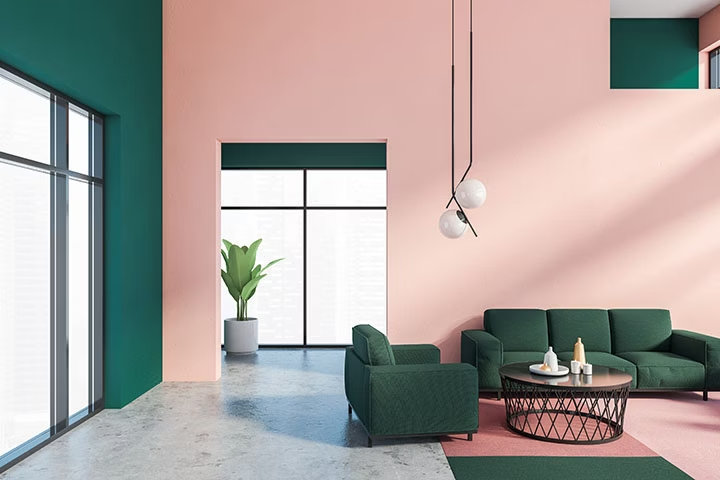
Interior design and colour psychology.

Interior design rapidly reflects colour theory principles. Strategic colour choices create specific atmospheres:

  • Warm earth tones (terracotta, ochre, rust) create cosy, inviting spaces.
  • Cool blues and greens promote calm and relaxation.
  • Neutral foundations (cream, grey, taupe) with bold accents create balance.
  • Bright accents draw attention to architectural features or artwork.

Colour harmony principles.

Beyond basic colour categories, several harmony principles guide effective colour combinations:

Complementary: Colours opposite on the wheel create maximum contrast and vibrancy.

Analogous: Adjacent colours create harmonious, peaceful combinations.

Triadic: Three colours evenly spaced on the wheel create balanced, dynamic energy.

Monochromatic: Variations of a single colour create sophisticated, cohesive schemes.

Frequently asked questions.