Primary colours: everything you need to know.
Primary colours are simple – they’re red, yellow and blue – isn't that what we learn in colouring books? Like most apparently simple concepts, the answer is much more complex.


Primary colours are simple – they’re red, yellow and blue – isn't that what we learn in colouring books? Like most apparently simple concepts, the answer is much more complex.

Primary colours are simple – they’re red, yellow and blue – isn't that what we learn in colouring books? Like most apparently simple concepts, the answer is much more complex.
Understanding primary colours, secondary colours and how they interact is essential for designers, artists and anyone working with colour. In this Adobe guide, we’ll investigate primary, secondary, and tertiary colours to dispel myths and highlight the differences.
Our modern understanding of light and colour begins with Isaac Newton and a series of experiments he published in 1672.
Newton was the first to truly understand the rainbow. He conducted experiments with a prism, producing a spectrum in which he identified 7 colours. Before this, scientists believed the spectrum contained only 5 colours. For example, in his book Experiments and Considerations Touching Colours, Robert Boyle described the spectrum he produced with a prism as having 5 colours: "red, yellow, green, blue and violet.
Boyle’s book was published in 1664, just before Newton began his experiments. However, the number 7 had long been considered mystical, denoting perfection and completeness. This kind of mysticism fascinated Newton as much as science did, so he believed there must be 7 colours in the rainbow. He added orange and split violet into indigo and violet.
At the time, people believed colour was a mixture of light and darkness, and that prisms coloured the light itself. Hooke was a proponent of this theory and had a scale ranging from brilliant red (pure white light with the least darkness added) to dull blue (the final stage before black, representing the complete extinction of light by darkness). Newton realised this theory was wrong.
Artists were fascinated by Newton's clear demonstration that light alone was responsible for colour. His most useful idea for artists was his conceptual arrangement of colours around a circle's circumference—allowing painters to position colours opposite their complementary colours (for example, red opposite green). This arrangement showed how each complementary colour would reinforce the effect of the other through optical contrast.
Whether you're talking about paint or physics, the primary colours are not the same. The reason for this contradiction is that there are 2 colour theories: one for physical colours used by artists, and one for spectrum light.
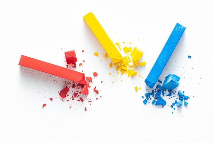
These 3 colours are called primary because they cannot be created by mixing other colours.
These theories are known as additive and subtractive colour systems.
In design, the 3 primary colours are:
Secondary colours are colour combinations produced by mixing 2 primary colours. On the colour wheel, secondary colours are positioned between the primary colours.
There are three secondary colours:
Understanding primary and secondary colours is fundamental to colour theory and helps designers create harmonious colour schemes that evoke the correct brand or visual identity.
Tertiary colours are mixtures of primary and secondary colours. They're also called intermediate colours because of their composite nature. On a colour wheel, tertiary colours sit between the primary and secondary colours.
There are 6 in total:
Learn more about colour theory.
You may notice a colour shift when converting from RGB to CMYK. If you're unhappy with the CMYK appearance, specify CMYK colour builds that look slightly lighter than desired, because ink dots "spread" on press, giving you more pigment on paper than you see on your monitor.
Also, keep backgrounds light if there's black or dark-coloured text on top, ensuring your text remains readable.
Like the additive colour model, subtractive colour mixes wavelengths of light to produce what we perceive as colour. However, the subtractive model uses pigments or ink to block and subtract light rather than add it.
The combination of two pure additive primaries produces a subtractive primary. The subtractive primaries—cyan, magenta and yellow—are the opposite colours to red, green and blue:
When two subtractive primaries overlap, an additive primary is produced. When all three subtractive primaries overlap in equal amounts, all light is subtracted and we perceive black—the absence of light.
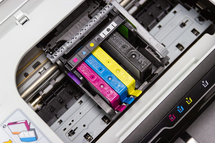
To render colour on paper, printers use reflected light and subtractive colour inks. By depositing cyan, magenta and yellow pigments onto a white substrate, each absorbs (or subtracts) it’s opposite counterpart from white light:
A blank sheet of paper appears white because all light wavelengths reflect off it. Adding cyan, magenta or yellow ink absorbs these wavelengths to produce different colours. Printing cyan, magenta and yellow in equal amounts blocks all colour to form black. As more ink is added, the colour becomes darker.
The human eye mixes the three additive primary colours—red, green and blue (RGB)—in various combinations and intensities to simulate the entire range of colours in nature. Reflected light contains a mixture of red, green and blue, which is perceived as white. When no light is present, we perceive black. This is the basis of the RGB colour model.
RGB is an additive colour mixing process where different light wavelengths combine to form white light. Input and output devices that use RGB start with darkness and add red, green and blue light beams onto a black surface or screen to display colour.
Each of these beams has an intensity level ranging from on to off. These red, green and blue beams overlap at different intensities to form a spectrum of colours. The colour we perceive is determined by the intensity of each beam. For example if:
We see colour based on the intensity of each beam if the:
If you mix red, green and blue light, you get white light. Red, green and blue (RGB) are called the primary colours of light. Mixing colours generates new colours, as shown on the colour wheel. As colours are added, the result becomes lighter, moving towards white. RGB is used to generate colours on a computer screen, television and any coloured electronic display device.
When you mix colours with paint or through the printing process, you use the subtractive colour method. The primary colours of light are red, green and blue. If you subtract these from white, you get cyan, magenta and yellow. Mixing colours generates new colours. Mixing these three primary colours generates black. As you mix colours, they tend to become darker and turn black. The CMYK colour system (cyan, magenta, yellow and black) is the colour system used for printing.
Warm colours are composed of orange, red, yellow and similar colour combinations. They evoke warmth, like sunlight and heat. In contrast, cool colours are characterised by blue and green. Whilst warm colours remind you of heat and sun, cool colours suggest water and sky, even ice and snow.
Neutral colours are muted shades that change with lighting, such as beige or brown. They don't appear on the colour wheel but complement the primary and secondary colours.

The Pantone code comes from the Pantone Matching System (PMS), a standardised colour space and colour matching system for identifying each colour using the Pantone numbering system.
HEX is a 6-digit hexadecimal representation of colour forming 'RRGGBB', where these are hexadecimal values for red, blue and green. Unlike Pantone colours, hexadecimal colours are "web safe." This means they'll display the same way, regardless of which browser or device you're using. They are commonly used in HTML. Learn more here.

The colour wheel was the first organised colour system. It's still used to illustrate the relationship between colours. Painters use it to identify which colours to mix, and designers use it to choose colours that work well together. The classic colour wheel shows hues arranged in a circle, connected by lines or shapes.
The colours include primary colours, secondary colours and tertiary colours. Secondary colours are created by mixing primary colours. For example, mixing red and yellow produces orange.
Want to dive deeper into the world of design? Explore related guides from Adobe:
Based on your location, we think you may prefer the United States website, where you'll get regional content, offerings, and pricing.


