Wenn die Farben auf einem Foto nicht richtig herauskommen, hat das vielleicht eine ganz einfache Ursache: zu wenig Farbsättigung.
Das Foto wirkt dann oft blass oder verwaschen.
Versuche in diesem Fall, die Farbsättigung an einzelnen Stellen gezielt zu erhöhen.
Das zeige ich dir in diesem Tutorial.
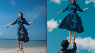
Damit erhalten wir ausgehend von diesem Original dieses Ergebnis.
Wenn du die Farben in einem Foto intensivieren möchtest, auf dem wie hier eine Person abgebildet ist, empfiehlt es sich, zuerst mit Dynamik zu arbeiten.
Bei einer Dynamikänderung wird verhindert, dass die für Hauttöne typischen Farben zu stark gesättigt werden.
Um die Dynamik zu ändern, navigiere zum unteren Bereich des Bedienfelds „Ebenen“ (Layers).
Klicke auf das Symbol mit dem schwarz-weißen Kreis, und wähle „Dynamik“ (Vibrance).
Damit wird eine Einstellungsebene für die Dynamik oberhalb der ausgewählten Ebene hinzugefügt.
Die Änderungen, die du auf dieser Dynamikebene vornimmst, wirken sich auf alle Ebenen darunter aus.
Ebenfalls geöffnet wurde das Bedienfeld „Eigenschaften“ (Properties).
Wenn ich in diesem Bedienfeld die Sättigung (Saturation) erhöhe, siehst du, wie schnell das Gesicht des Models übersättigt wird.
Ich setze den Regler also zurück auf 0.
Stattdessen schiebe ich den Regler „Dynamik“ (Vibrance) nach rechts.
Ich kann den Dynamikregler ganz nach rechts schieben und so die Intensität der Blautöne im Schal und einige der anderen Akzentfarben erhöhen, ohne dass die Farbsättigung im Gesicht des Models zu stark wird.
Wenn dir das Ergebnis gefällt, bist du schon fertig.
Aber vielleicht möchtest du nur bestimmte Farben im Foto gezielt satter machen.
Zu diesem Zweck müssen wir eine andere Einstellungsebene hinzufügen: Farbton/Sättigung.
Ich wechsle also wieder zum Bedienfeld „Ebenen“ (Layers) und klicke auf das Augensymbol neben der Dynamikebene, um die Ebene vorerst zu deaktivieren.
Dann navigiere ich im Bedienfeld „Ebenen“ (Layers) nach unten, klicke auf das Symbol mit dem schwarz-weißen Kreis und wähle „Farbton/Sättigung“ (Hue/Saturation).
Damit wird eine neue Einstellungsebene erstellt, und das Bedienfeld „Eigenschaften“ (Properties) mit Reglern für Farbton und Sättigung wird eingeblendet.
Hier ist der Regler „Sättigung“ (Saturation).
Wenn ich ihn nach rechts schiebe, werden die Hauttöne übersättigt.
Wir versuchen also eine andere Methode.
Ich wähle dieses Werkzeug aus: zielgerichtete Korrektur (Targeted Adjustment Tool).
Dann bewege ich den Mauszeiger auf das Bild und klicke auf den grünen Schal.
Wie du siehst, wird im Menü jetzt „Grüntöne“ (Greens) angezeigt.
Das bedeutet: Wenn ich den Sättigungsregler jetzt nach rechts schiebe, werden nur die Grüntöne im Foto stärker gesättigt.
Die gerade vorgenommenen Änderungen wirken sich auf die Grüntöne im gesamten Foto aus.
Du kannst aber auch noch präziser steuern, wo die Farbsättigung erhöht werden soll.
Dazu arbeitest du mit der Ebenenmaske, die zu jeder Einstellungsebene gehört.
Um das zu üben, navigiere wieder im Bedienfeld „Ebenen“ (Layers) nach unten, klicke auf den schwarz-weißen Kreis, und wähle „Farbton/Sättigung“ (Hue/Saturation).
Hier siehst du die neue Ebene für Farbton/Sättigung.
Nachdem ich die neue Ebene ausgewählt habe, wechsle ich zum Bedienfeld „Eigenschaften“ (Properties).
Dieses Mal will ich nur die Gelbtöne (Yellows) sättigen.
Ich ziehe den Regler „Sättigung“ (Saturation) nach rechts.
Mir gefällt die Veränderung beim Armschmuck und beim Schal, aber nicht bei der Hautfarbe des Models.
Daher verberge ich die Korrektur im gesamten Foto und male sie anschließend nur dort hin, wo ich sie haben möchte.
Ich vergewissere mich, dass ich Schwarz als Vordergrundfarbe ausgewählt habe, hier unten im unteren Bereich der Werkzeugleiste.
Um die Ebenenmaske mit der Vordergrundfarbe zu füllen, drücke ich Wahltaste+Löschtaste (macOS) bzw.
Alt+Rücktaste (Windows).
Jetzt ist im ganzen Bild keine Gelbtonkorrektur zu sehen.
Ich wechsle die Vordergrundfarbe, indem ich auf diesen Pfeil mit der Doppelspitze klicke oder auf der Tastatur „X“ drücke.
Ich wähle das Pinsel-Werkzeug (Brush Tool) aus, bewege den Mauszeiger auf das Bild und male mit Weiß überall dort, wo ich die Gelbtonsättigung wiederherstellen möchte.
Hier und hier.
Vielleicht hier.
Ich wiederhole das jetzt an verschiedenen Stellen.
Im Video überspringen wir diese Schritte und kommen direkt zu meinem Endergebnis.
Diese kleinen Verstärkungen bei der Sättigung bestimmter Farben haben dieses Ergebnis aus diesem Originalfoto erzeugt.
Mit einigen Farbtupfern ist es richtig lebendig geworden.