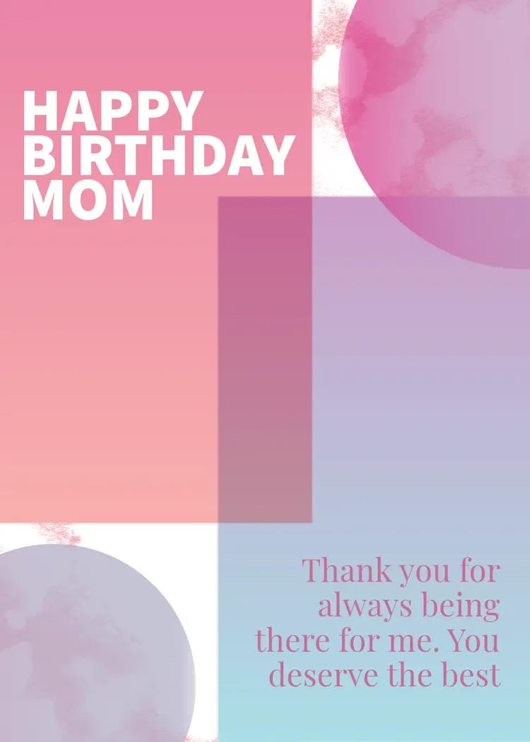
Quick design tips to make your birthday cards for mom pop.
A beautiful message deserves a design that feels just as thoughtful. Whether you’re crafting something modern and minimal or soft and sentimental, these design tips can help you create a card your mom will want to keep forever.
Contrast is key.
Make your words easy to read and hard to forget. Use light text on dark backgrounds (like cream on navy) for elegance, or bright colors on pale backgrounds for cheerful energy.
Let motion help you with storytelling.
In Adobe Express, you can animate text, confetti, or sparkles to bring your message to life. A gentle fade or shimmer effect works beautifully for heartfelt designs, while lively animations fit playful or funny cards.
Play with composition.
How you position your text changes how it feels. Centered layouts feel formal and classic, while off-center text feels modern and personal. Try adding a soft photo of you and your mom in the background and placing the text diagonally for a cinematic look.
Match fonts to emotion.
Handwritten or script fonts feel intimate, and these would work great for sentimental messages. For a balanced card, pair one expressive font with a simple one that keeps it readable.
Choose meaningful color palettes.
Colors carry emotion. Soft pinks, pastels, and creams evoke tenderness, while deep greens and blues feel strong and calm, and gold or rose tones add warmth and luxury. Keep your palette limited to two or three shades for better harmony, and to make your design easier to look at.
Add texture for depth.
Use watercolor strokes, subtle grain, or linen-like textures to make digital cards feel tactile. A well-placed shadow or glow effect can also add visual depth without overwhelming your message.
Think of your design like wrapping paper for your words. With Adobe Express, you can experiment endlessly until your message and layout feel perfectly in sync.