With a literal rainbow of color options to use in your logo design, there’s still reason to consider a black-and-white logo. Read on to learn the meaning of black-and-white logos, the reasons to consider opting for one, and whether a black-and-white logo design is the right branding choice for your company.
Why a black-and-white logo?
With a global economy and instant online access to pretty much any business anywhere, it’s more important than ever for brands to stand out from the crowd. One of the most powerful ways to get in front of your target audience is through a strong, communicative logo that underscores your brand identity.
There are a number of elements that go into great logo design, including the shape, whether you use a symbol (logomark), your company name, a monogram, or a combination of those elements, and the typography (font style) you use. Your choice of logo colors is just as important — or, in the case of black-and-white logos, the lack thereof.
In the world of colorpsychology, which explores how colors affect mood and emotions, black is symbolic of sophistication, power, mystery, and strength. It’s solid, in-your-face, easy to see, and always stylish. On the negative spectrum, it can also be associated with fear and even death (skull and crossbones, anyone?), depending on the culture. Consequently, black logos tend to be characterized as authoritative, sophisticated, classic, luxurious, and, depending on the design, minimalist. That’s a heck of a lot of influence for a shade that’s sometimes regarded as a default or an absence.
White, on the other hand, is black’s opposite, literally and figuratively. It’s inclusive, inviting, and brilliant. White famously symbolizes purity, integrity, innocence, and simplicity. It’s clean, fresh, unadulterated, neutral, and can convey a sense of calm and comfort. Not surprisingly, the prominence of white in a logo design is a choice often made by health organizations like hospitals and also charity organizations. It’s also leveraged when a company is trying to simplify complex ideas, which is often the case with high-tech businesses.
Interestingly, it’s said that since white light contains all colors, it can trigger all the possible emotions associated with other colors recognized in color psychology, for better or worse. Additionally, too much white can come across as sterile and empty, inspiring feelings of loneliness or dismay.
This is why the virtual blank slate of a white background needs contrast to give it definition and emphasize its positive traits. While its neutrality makes it a fine partner for any color, pairing white with black gives you two serious power players working together to make a bold, elegant, and timeless brand statement. Plus, depending on how they’re used in your black-and-white logo design, each can create negative space, or breathing room, which is critical to good business logo design.
Another bonus: black-and-white logos look good in all kinds of formats, from social media iconography to temporary tattoos to printed branding materials. This means it’s usually a bit less of a challenge to make a logo that works for all formats.
Finally, since no additional colors are required, black-and-white logos are the most cost-effective for printing, whether it’s business cards, letterhead, T-shirts, or packaging. Read more about understanding black and white as colors.
Well-known black-and-white logos.
One of the coolest things about black-and-white logos is their versatility. Just look at some of the better-known black-and-white brand logos, shown below. They span a wide variety of business categories, yet the color combo works successfully for each of them. What these brands have in common are the personality traits associated with black-and-white logos: authority, timelessness, style, power, and elegant minimalism.
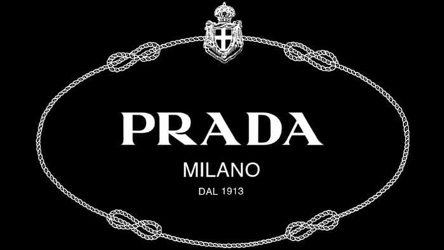
Prada logo

https://logos-world.net/prada-logo/
https://logos-world.net/prada-logo/
What’s interesting about the Prada logo is that while it’s most commonly showcased in black, it can sometimes appear in white (or gold). The lack of color allows for a white or black background without disrupting the chic, luxury vibe of the famous monochrome logo.
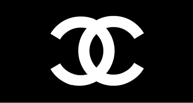
Chanel logo

https://1000logos.net/chanel-logo/
https://1000logos.net/chanel-logo/
Keeping with designer brands, this French favorite also leverages the black-and-white combo to emphasize its brand identity. Elegant, powerful, authoritative, and pure? Yes, across the board. The black interlocking C’s (designed by and standing for Coco Chanel) are instantly recognizable anywhere, and the logo is as chic now as it was when it was created in 1925. Also, notice how the monochrome black-and-white combo can be reversed so that when the lettering is white, black becomes the background and vice versa. As with all black-and-white logos, the interchangeability allows for different vibes and uses while remaining on-brand and not muddying the brand identity.
Apple logo

https://1000logos.net/apple-logo/
What launched in rainbow colors in 1977 changed to an all-black apple logo in 1988. Sleek, stylish design and minimalist simplicity are core to the Apple brand, and the use of black (and sometimes gray) on white echoes the sentiment perfectly.
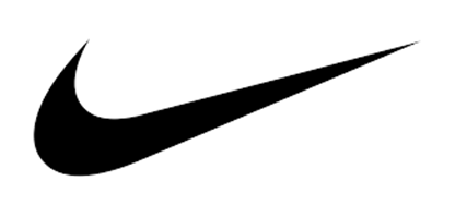
Nike logo
https://uxplanet.org/simple-logo-design-principles-lesson-from-nike-logo-49c147fc1c53
Speaking of elegant minimalism with a big impact, the Nike swoosh (i.e., the brand’s interpretation of the wings of the Greek goddess of victory) is so iconic that it needs neither introduction nor text. Whether it’s the perfect black swoosh with a white background or white swoosh with a black background, the black logo conveys a message of powerful movement.
Wikipedia logo

https://en.wikipedia.org/wiki/Wikipedia:Wikipedia_logos#/media/File:Wikipedia-logo-v2.svg
The world’s free online encyclopedia also leverages black and white to get its point across. The point? Authority, facts (the world in black and white), and knowledge. Combined with its puzzle-globe shape and multilingual typefaces, this simple logo holds a wealth of meaning.
Are black-and-white logos right for your brand?
Now that you’ve seen some examples, you probably get the idea of how black-and-white logos communicate specific core values. Now, the question is, are these core values in line with your brand? To determine the answer, ask yourself:
Is your brand serious, sophisticated, elegant, authoritative, classic, luxurious, and timeless?
Are you less likely to associate yourself with playfulness, whimsy, and vibrancy?
Do you think your branding collateral will look good in black and white in its various uses, be it a window graphic, website header, or social media logo?
If the answer to all of these is yes — great news. The next step is making your own custom logo, with ease, for free.
How to make your own black-and-white logo.
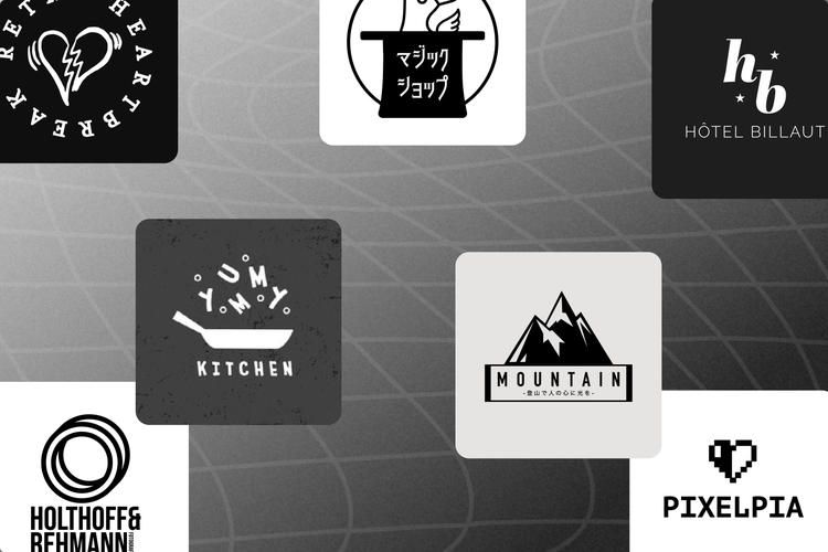
Graphic design is easier than ever, thanks to Adobe Express’s free online logo maker. Use it to make your own custom logo from scratch, or get great logo ideas from the following black and white logo templates, all of which you can tap and customize however you want.
Bonus: if you already have an existing logo and want to see how it would look in monochrome, use the free black-and-white filter to transform it instantly into a minimalist black-and-white logo.
Want more design tips for existing and new logos? Check out 10 ways to pair fonts for maximum impact and Logo redesign: How to update your most important symbol.