Logo design trends for 2026
The landscape is shifting from flat minimalism to what designers call "tactile digitalism." This trend blends clean, digital lines with textures that feel organic and human. We’re also seeing a rise in kinetic logos — designs built specifically to move and animate in digital spaces rather than remain static.
Another major shift is the use of AI-assisted brutalism. This style uses raw, unpolished shapes and bold typography to create a sense of digital honesty. It’s a direct response to the perfectly polished designs of the last decade, offering a look that feels more authentic and less corporate.
Pro tips for 2026 logo trends
These expert strategies for implementing the latest design movements will help your company logo and brand stand out in a digital-first world.
Tactile digitalism
This trend focuses on making digital assets feel touchable and human. The goal is to move away from the "uncanny valley" of perfect AI generation and toward artisan craft.
- Embrace intentional imperfection: Don’t be afraid of scuffed edges or slight grain. Introducing "analog noise" to a digital vector can act as a credibility marker, signaling to the customer that a human designer curated the final look.
- Focus on soft-touch textures: Use gradients that mimic physical materials like brushed clay, liquid glass, or organic fiber. These textures create a sense of weight and quality that flat designs often lack.
- Use variable line weights: Avoid perfectly uniform strokes. Slight variations in line thickness suggest the pressure of a hand-held pen, which builds an immediate emotional connection with the viewer.
AI-assisted brutalism
Brutalism in 2026 is about raw, architectural honesty. It uses AI to push the boundaries of geometry and scale, resulting in a look that’s both monolithic and high-tech.
- Use prompt scaffolding: When using AI tools to brainstorm, build your prompts using a SUBJECT + MATERIAL + LIGHT formula. For example, "monolithic logo + board-formed concrete + raking side light" will yield much more structural, brutalist results than a simple keyword.
- Test at thumbnail size: Brutalist designs can become overwhelming if they’re too complex. Always evaluate your logo as a tiny icon first. If the heavy, aggressive shapes still read clearly at small sizes, the design is structurally sound.
- Balance mass with white space: Because brutalist shapes are so dense and "loud," they require extra breathing room. Pair your bold, industrial icons with generous margins and simple, airy layouts to prevent the brand from feeling cluttered.
Kinetic logos
In 2026, a static logo is a liability. Kinetic logos are designed to move, shift, and respond to the digital environments they live in.
- Identify a core anchor: Even if your logo morphs or animates, one "core" element must remain consistent. Whether it’s a specific curve, color pair, or central dot, this anchor ensures your brand stays recognizable throughout the animation.
- Design for micro-interactions: Think about how your logo behaves when a user hovers over it or scrolls past. Small, responsive movements — like a letter bouncing or a shape shifting its lighting — make the brand feel alive and attentive to the user.
- Simplify for speed: Kinetic logos must be optimized for fast loading times. Use clean, geometric shapes that are easy for browsers to render. Avoid heavy textures within the moving parts to ensure the motion remains fluid and "snappy" on all devices.
Eco-conscious branding and earthen palettes
As sustainability becomes a non-negotiable for consumers, 2026 logos are shifting away from synthetic, high-energy neons toward a more grounded aesthetic. This trend focuses on transparency and a visceral connection to the natural world.
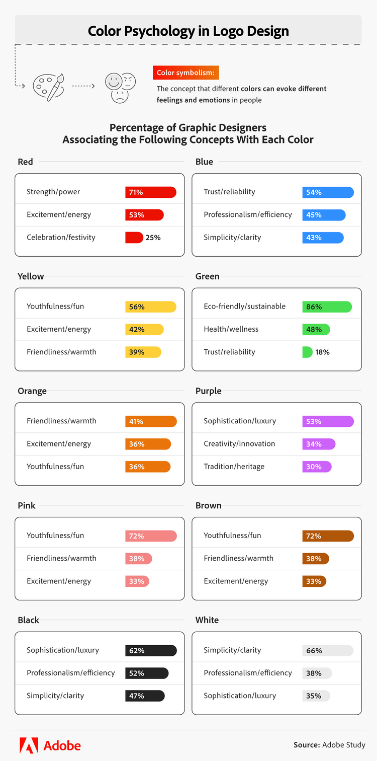
- Natural color stories: Expect to see palettes dominated by moss green, terracotta, sun-bleached sand, and deep ocean teal. These colors suggest authenticity and environmental responsibility without relying on the cliché green leaf icon.
- Transparency graphics: Brands are increasingly building "trust indicators" directly into their visual marks. This includes integrating subtle symbols for carbon neutrality or material origins into the secondary elements of a logo system.
- Tactile organic forms: Moving beyond perfect geometric circles and squares, new designs utilize soft, irregular shapes that mimic the flow of water or the texture of recycled materials.
Popular fonts and typography
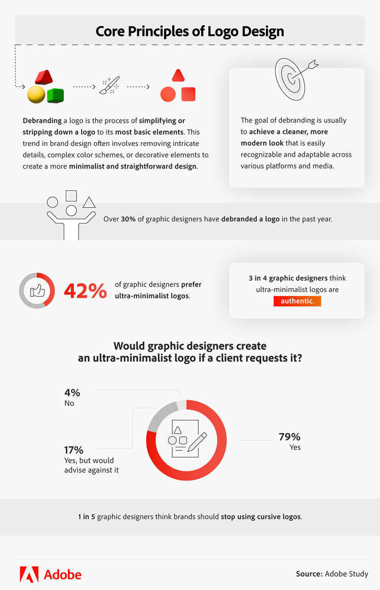
The text you choose is just as important as the icon. While experimental typography is gaining traction, the classics still hold a significant lead due to their reliability. Helvetica remains the gold standard for 41% of designers, followed closely by the geometric precision of Futura (39%) and the modern, open feel of Montserrat (34%). If you’re considering a cursive font, proceed with caution — 20% of professionals suggest that brands should move away from script styles to maintain better legibility.