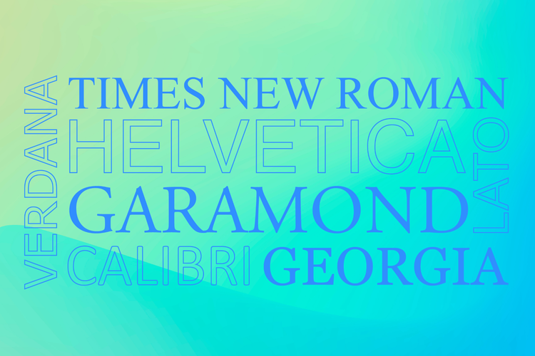
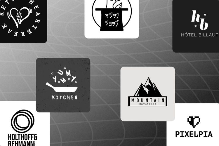
Choosing the correct font or fonts for your logo is an often overlooked yet critical step to successful logo design. Although there are many vital aspects of logo design–like choosing the color of your logo or the shape of your logo–finding your perfect font is a particularly important step. Different typographies convey specific feelings and moods, meaning selecting the wrong logo font can completely alter the message your brand is attempting to communicate. But how do you wade through the seemingly endless typeface options to find the best fonts for logos? Don’t fear! Whether you are a startup creating your first logo or you are redesigning your current logo, this blog post provides you with some of the best fonts for logos. However, before diving head first into logo font ideas, it is vital to understand the 4 main types of logo font styles and how to choose your own.
Design
The best logo fonts and how to choose your own
See some of the best fonts for logos and free logo design templates to get you inspired in 2024.
Adobe Express
December 19, 2022

Types of logo fonts
Typography is tricky because different fonts evoke different feelings, and choosing the right font pairings is more challenging than one may first think. Although there are many kinds of fonts out there, in this blog post, we will focus on the main 4 types of logo fonts, when to use them, and the feelings they evoke.
Serif logo fonts
Serif fonts are typefaces that have little lines or pen strokes hanging from the letters. These decorative lines improve legibility and give the letters more character, often exuding a more classy yet subtle vibe. Serif fonts suggest a more historical experience, evoking feelings of institutional repute. Some common examples include slab serif, garamond, bodoni, and didot. Serif typefaces are best used as business logo fonts if your brand is attempting to convey feelings of elegance and tradition.
Sans serif logo fonts
Sans serif fonts are those without ‘serifs,’ aka the little brush strokes that hang off the ends of letters. These fonts tend to come across as a bit more crisp and clean, and their simplicity makes them easier to pair with other, more eye-catching fonts. Some common sans serif typefaces include futura, proxima nova, helvetica, frutiger, and kerning. Sans serif typefaces are considered modern logo fonts and are often used to represent cutting-edge design and futuristic innovation. If you want to learn more about the difference between serif and sans serif fonts, check out this article.
Script logo fonts
Script fonts are typefaces that have loops and flourishes. The most common example is cursive logo fonts which exude feelings of formality and elegance (but are often more challenging to read). If you are aiming to use a luxury cursive font for your logo, maintain legibility by keeping the calligraphy on your logo short and sweet. In comparison, casual script fonts that are more similar to handwriting increase readability but appear more rough, practical, and friendly than luxurious and elegant. A push-and-pull exists between legibility and luxury, so choose accordingly to your brand.
Display logo fonts
Decorative and standout fonts are a great way to grab your audience’s attention and solidify an image of your brand in your audience’s heads. Funky, futuristic, retro, or geometrically diverse logo fonts are a great marketing tactic – think stencils, glyphs, and other visually unique letterforms. Still, they should only be used as the primary component of a simple logo design – mixing display fonts with other typefaces is tricky and has the potential to create a messy and confusing logo for your brand. Display fonts are best used minimally when creating truly memorable logos.
Tips for choosing logo fonts
Although there are many elements to consider when choosing fonts for logos, here are the 4 factors that are the most important to logo design.
1. Brand identity

Brand identity is made up of the visual aspects of your brand, with arguably the most crucial element being your logo. Brand identity helps customers identify your brand, distinguish your products and services from competitors, and is a vital to building brand recognition and brand personality. Use your brand identity to help guide you in choosing the best logo fonts for your business to ensure your brand’s visual aspects align with your business’s personality and identity.
2. Target market
Make sure to align your logo and its message with your audience’s needs. It is crucial to identify your target market and understand your customers to choose typefaces that reflect their needs and values. For example, suppose you are creating a logo for a security company, like the logo above. In that case, your audience will want something that conveys messages of trust and integrity. In comparison, if you are creating a logo for a ceramics shop, your customers may be more attracted to a friendlier creative logo. Always remember to tailor your logo font selection to your target audience.
3. Legibility

Although this may seem intuitive, legibility is crucial when choosing your logo fonts. This is especially important when considering the scalability of your product–it is vital to create an ideally sized logo for all your marketing needs. Sure, choosing an elaborate cursive font may look pretty at first, but will people be able to read it when you shrink your logo to fit on a t-shirt or a business card? Have you considered uppercase vs. lowercase? So, although creating a unique logo is essential to help your brand stand out, do not forget about readability.
4. Minimalism

Last but not least, it is important to keep your logo simple. Some of the most iconic logos of our time–think Apple, Nike, Cola-Cola, or Target–are incredibly minimalist. As a general rule of thumb, stick to one or two fonts for your logo and avoid unnecessary flourishes or elements. Overcomplicating a logo can create a cluttered feeling which often makes scalability difficult. When it comes to logos, minimalism is key.
Now that you understand more about different font types and a few logo design considerations, here are 50+ logo font ideas. We have compiled the best fonts for logos and shown an example of each in a sample logo so you can visualize what these typefaces would look like in action. If you’re looking for a simple, free logo to get you started, try one of these templates below! There are templates to match your preferred logo style, whether that be a simple monogram, a combination mark, or something entirely your own (we will talk more about each type of logo and font suggestions to go with them in the sections below).
Company name logo fonts
Wordmark logos or “logotypes” are exclusively made up of text and only include the company name–think FedEx, Subway, or Home Depot. These logos do not contain icons, symbols, mascots, or other details. Wordmark logos can be challenging to create because you don’t want your logo to be bland or forgettable, meaning choosing the correct typeface is crucial. Think about your brand–is it best represented by a uppercase, geometric, and modern font like the sans serif used in the Art Coast Fair template below? Click on any of the logo templates below to get started with these free fonts.
Fonts used below (left > right)
- Playfair Display (Regular)
- Anton (Regular) | Stint Ultra Expanded (Regular)
- Bungee (Regular)
- Ultra (Regular)
- Poiret One (Regular)
- Abril (Fatface Regular)
- Josefin Sans (Regular)
- Raleway (ExtraBold Italic)
- Alfarn (Regular)
Text-only logo fonts
These logos are slightly different than the ones above. Although they still rely exclusively on typography, they include a few added details such as a description or location. These logos are called lockups because all design elements are “locked up” to fit together. These logos are useful for adding context and helping your audience understand what your company is about.
For this type of logo, we’re combining at most 2 different fonts. We want to make sure the name of your business is the first thing people read, creating a visual hierarchy. Display fonts or fonts with lots of personality can be great for the name because it will make your logo pop. We want to mix an eye-catching font with a that with a more subtle typeface for the detail or subheader elements so they are read second. Try matching your personality-filled title text with a simple sans serif or a script font. It’s also good to consider the weights of all the typefaces used together. We want our fonts to feel visually and geometrically balanced. Click any of the templates below to make it your own.
Fonts used below (left > right)
- Playfair Display (Regular) | Raleway (Regular)
- Lato (Heavy) | Lato (Semibold)
- Poplar Std (Black) | Adobe Handwriting (Ernie)
- Adobe Handwriting (Ernie) | Raleway (ExtraLight Italic)
- Bebas Kai (Regular) | Montserrat (Light)
- Lora (Regular)
- Playfair Display (Regular) | Lato (Regular)
- Great Vibes (Regular) | Asap (Regular)
- Utopia Std (Black Headline) | Lato (Medium)
Text and icon logo fonts
Combination marks are logos that combine a wordmark with an icon or illustration. The design can be simple or complex. For this style of logo, it is essential to find a font that feels on-brand and identify an icon or illustration that speaks to your business. Think about the visual weight of the icon you select and how that balances with your text. Does one overwhelm the other? Balancing different weights can be challenging. Your icon and font should also share a similar or complementary style. For instance, the bold typeface used in the Wild Style logo works well with the heavy horseshoe icon but might look out of place in a more luxurious or retro logo. The tilt of the palm trees combined with their simple shape and a modern sans serif font in the Palm Court logo creates a symmetry that is pleasing to the eye. These are the sorts of things to consider when combining text and icons into a logo.
Fonts used below (left > right)
- Montserrat Alternates (Regular) | Work Sans (Regular)
- Fira Sans (Medium) | Fira Sans (SemiBold)
- Adobe Handwriting (Tiffany)
- Poiret One (Regular)
- Yrsa (Medium) | Satisfy (Regular)
- Brush Script Std (Medium) | Quicksand (Regular)
- Myriad (Pro Bold Condensed)
- Megrim (Medium)
- Bebas Neue (Regular) | Source Serif 4 (Light)
Monogram logo fonts
Lettermarks or monograms are logos that give prominence to the acronym of a brand’s name. Think ABC (American Broadcasting Company), HBO (Home Box Office), or IBM (International Business Machines Corporation). You can use just the monogram itself or use a subtitle with the name written out. This style is minimalist, geometric, and clean–it’s about keeping your message succinct. Whether you choose a serif, sans serif, script, or display font is entirely up to you. Think about whether you would want your monogram logo to be in all caps or lowercase (and the different feelings those would evoke). Think about the geometric shape of your monogram. Try out some of the options below and play around.
Fonts used below (left > right)
- Noto Serif (Bold) | Noto Sans (SemiBold)
- Bebas Neue (Regular)
- Old Standard (TT Italic) | Raleway (Regular)
- Bebas Neue (Regular)
- Raleway (Regular)
- Orbitron (Medium)
- Noto Serif (SemiCondensed)
- Abril (Fatface Regular)
- Quicksand (Bold)
How to design a logo.
1. Choose Your Elements
Before you begin designing, consider the intent behind your logo. What will it communicate about your brand, and to who? Then, think about the tools you want to work with. Will your logo be text only or will it feature an image of some sort? If you have image files you want to use, upload them to your Adobe Express workspace.
2. Explore Professionally Designed Logo Ideas
On the Adobe Express Post mobile app, you can explore templates on the home screen. Search for “logos” and browse through the designs to give yourself some ideas or even a platform to start with. On your desktop, you can find templates from your workspace by clicking on the “templates” tab. Get inspired by other designs and have fun making them your own.
3. Develop Your Design with Icons, Text, and Color
Under the “+” option in your Adobe Express workspace, you’ll find an option to add images or icons to your design. You can upload images from your own photo library, as well as images from Creative Cloud. Adjust the size and color of icons to make them work for your needs. Play with countless different font families to find the style of text that successfully communicates your brand’s voice. And don’t forget about colors! You can enter specific hex values so you can pinpoint your brand’s specific colors in your design.
4. Create Variations of Your Logo
You may notice that companies will feature different types of logos. You can create this versatility for your brand with your ability to duplicate designs using Adobe Express. Once you land on a logo you love, duplicate the design to create a black-and-white version, a version with the name and one without the name, or a version with the tagline.
5. Save and Share Your Logo
When you’re ready to share, you can download your logo to upload it to your digital platforms. Or send it digitally to a friend or co-worker to get their feedback. Revisit your project at any time to adjust the size or style for future logo needs.
Now that you have a better understanding of the different types of logos and font suggestions to go with each, it’s time to identify the right fonts for your brand start creating your own perfect logo. Choosing the correct logo font is just the first step! Now it’s time to begin considering essential additional aspects such as color (think a green logo vs. a yellow logo vs. an orange logo) and shape (think square logos vs. circular). Graphic design is tricky, so feel free to use any of the templates above or follow the quick how-to guide below to get started. If none of the examples in this blog post caught your eye, search through Adobe Express’ extensive logo template library, or start creating your own logo from scratch. The possibilities are endless!
This post was updated on January 5, 2024.


