Stay ahead with trending colours and palettes
Colour is a powerful vehicle for emotion and plays a crucial role in every artistic composition. Each year brings its own colour trends – hues that reflect contemporary tastes and cultural moments. Understanding trending colours gives creative professionals a fresh palette to explore and a framework for strategic colour decisions.
Why do colour trends matter?
A colour trend is an emerging preference for one or more colours that reflects current fashion and cultural values.
Colour trends influence how we purchase consumer goods, redesign our homes, and create artistic work. Choosing a colour is never trivial; it prompts genuine consideration across all creative professions.
The psychology and impact of colour trends.
Colours can trigger physical reactions through their symbolism. Studies have shown, for example, that red increases blood pressure. Cultural associations with colour also vary significantly – white symbolises purity in Western traditions but represents mourning in some Eastern cultures. Understanding these nuances is essential when using colour strategically across global markets.
Colour trends also reflect broader cultural moments and emotions. Following a period of uncertainty or challenge, trending colours often shift towards warmer, more energetic palettes. During times of economic change or digital transformation, cooler, more minimalist palettes gain prominence.
For an in-depth exploration of colour meaning across cultures and psychology, see our Colour Meaning Guide.
Trending colours across different industries.
Product appearance significantly impacts consumer behaviour. When people encounter a product, they quickly form judgements about its utility, value and intended use. Brands across all sectors must make a strong first impression, and colour is an effective tool for communicating information through visual appearance.
Fashion and apparel.
Fashion leads colour trend adoption. Recent seasons have seen include:
Warm nostalgia: Dusty rose, fuchsia and soft corals – inspired by '90s and Y2K revival movements and cultural moments (think Barbie aesthetic). These soft, feminine tones dominate luxury collections and mainstream fashion.
Jewel tones: Deep sapphire blues, emerald greens and rich purples appear across high-end collections, offering sophistication and luxury positioning.
Earthy warmth: Terracotta, rust, burnt orange and ochre feature prominently, reflecting a return to natural, grounded aesthetics.
Bold brights: Neon oranges, electric limes and vibrant magentas bring energy and youth appeal to contemporary collections.
Neutral foundations: Cream, camel, grey and black remain wardrobe staples, providing versatility and timeless appeal.
Graphic design and branding.
Graphic designers are drawn to warm colour palettes inspired by 1970s aesthetics – think Californian sunsets with lavender, burnt red and terracotta tones.
These joyful colours appear across marketing materials, branding and creative campaigns.
The trend also embraces retro styling with exaggerated, playful shapes – nostalgia for 1960s and 1970s design sensibilities combined with contemporary techniques.
Key trending approaches:
- Maximalism: Bold, saturated colours used confidently without restraint.
- Retro gaming palette: Orange, red, pastel pink, green and blue – reflecting nostalgic video game aesthetics.
- Warm vintage: Ochre, sage green, dusty rose and warm greys creating approachable, human-centred designs.
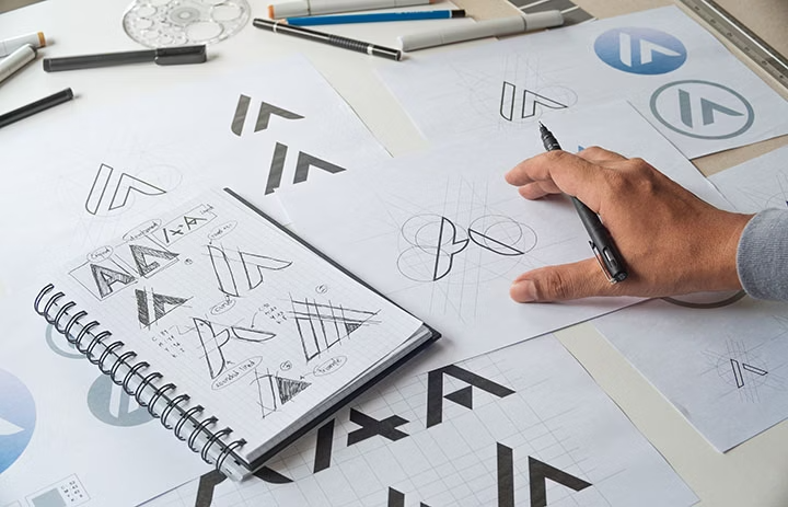
Un graphiste se met à l’œuvre pour dessiner un logo
Illustration and digital art.
Illustration trends favour:
Vibrant primary colours: Bold magentas, saturated reds and deep blues create dynamic, eye-catching work.
Contrasting combinations: Pairing a dominant vibrant colour (like magenta or hot pink) with neutral base colours (sandy beige, taupe, soft grey) or muted secondary colours (olive green, dusty blue) creates sophisticated contrast.
Earthy accents: Olive green, sage, terracotta and warm neutrals integrate seamlessly into diverse colour palettes, offering flexibility and natural appeal.
Tools like Adobe Photoshop's Colourise feature help illustrators test colour combinations efficiently, allowing quick iteration and refinement before finalising artwork.
User interface (UI) and user experience (UX) design.
With increased remote working and e-commerce adoption, we spend more time on screens. Trending UI/UX colours reflect this shift:
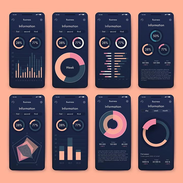
Dark modes: Deep navy, charcoal and true black dominate, complementing popular dark mode settings on smartphones and computers. These colours are psychologically gentle on eyes during extended screen time.
- Neutral sophistication: Soft greys, warm whites and beige provide calm, readable backgrounds.
- Minimalist approach: Flat design with limited colour palettes reduces cognitive load and improves usability.
- Accent colours: Subtle use of colour for calls-to-action and interactive elements – often warm accent colours against cool or neutral grounds.
This trend towards dark interfaces with neutral, easy-on-the-eye colour schemes is expected to continue through 2026 and beyond.
Interior design and architecture.
Interior design rapidly reflects colour trend shifts. The approach has evolved significantly:
From neutral monotone (early 2000s: taupe, soft grey, accent walls) to bold colour statements: Contemporary interiors embrace deeper, richer colours like forest green, navy blue and terracotta that create atmosphere and personality.
Warm, grounded aesthetics: Reflecting increased time spent at home, interiors now feature:
- Warm earth tones (terracotta, ochre, rust)
- Natural materials and raw textures
- Scandinavian and "Japandi" (Japanese + Scandinavian) influences
- Cosy, cocoon-like atmospheres
Colour application: Rather than painting all walls one colour, contemporary design uses accent walls, feature panels or textured elements to introduce bold colours whilst maintaining balance.
Game design and interactive media.
Gaming embraces colour with audacity and nostalgia:
- Retro gaming revival: Bright, saturated colours with a comforting, familiar quality – orange, red, pastel pink, green and blue appear frequently.
- Playful energy: Colours feel bold and joyful, reflecting the escapist nature of gaming entertainment.
- Layered palettes: Combining nostalgic base colours with contemporary vibrancy (e.g., retro pastels with neon accents) creates unique visual identity.
The colour of the year and industry recognition.
Pantone Colour of the Year is the most recognised colour trend authority across creative industries. This annual selection influences fashion, graphic design, illustration, product development and marketing globally.
The Colour of the Year announcement typically signals a broader shift in industry preferences – often reflecting cultural moments, emotional needs or emerging design philosophies. For example, selections have shifted from calm, minimalist tones to warmer, more adventurous hues, reflecting society's collective desire for energy, optimism and authentic expression.
How to stay informed:
- Follow Pantone's annual colour announcements
- Track fashion week colour reports from major designers
- Monitor design trend forecasting platforms
- Analyse competitor colour choices in your industry
- Use Adobe Colour to explore emerging palettes
Interior design colour trends.
Interior design particularly reflects the latest colour trends and shifts. Current preferences include:
Trending paint colours.
Contemporary interior paint palettes emphasise warmth and emotional resonance:
- Warm foundations: Terracotta, burnt orange and ochre create welcoming, energetic spaces reflecting post-lockdown desires for vibrancy and comfort.
- Balanced combinations: Warm colours pair beautifully with neutral, raw materials – creating sophisticated, layered interiors. Accent walls introduce bold colour without overwhelming spaces.
- Strategic colour use: Pantone’s Colour of the Year selections (like vibrant magenta or coral tones) appear in small decorative touches – a feature wall, wallpaper accent or artwork – rather than dominating entire rooms.
Kitchen colour trends.
Recent years saw aqua and turquoise dominate kitchens. Current trends shift towards:
- Warm, inviting tones: Orange, yellow and ochre on cabinetry or splashbacks pair beautifully with raw materials and natural wood.
- Emotional connection: These warm colours create nurturing, social spaces – reflecting kitchens' role as home gathering points.
- Material harmony: Warm painted surfaces complement stainless steel, natural wood and stone, creating cohesive, contemporary kitchens.
Living room colour trends.
Sitting rooms increasingly embrace:
- Terracotta and warm earth tones: These create comfortable, grounded atmospheres.
- Textural layering: Soft furnishings, raw wood, natural textiles combine with colour to build depth and warmth.
- Scandinavian and Japandi influences: Clean lines, natural materials and restrained colour palettes (creams, warm greys, soft greens) create calming, sophisticated spaces.
How to choose a colour palette aligned with trends.
Understanding colour theory foundations helps you make strategic choices when selecting trending colour palettes for your projects.
Understanding colour relationships.
The colour wheel (also called the chromatic circle) organises colours by their relationships to each other. Primary colours are evenly spaced, while secondary and tertiary colours sit between them.
The colour wheel helps you:
- Identify complementary colour pairs
- Explore analogous (harmonious) combinations
- Discover triadic colour schemes
- Make informed colour decisions aligned with theory principles
Building your trending colour palette.
- Step 1: Identify your primary colour. Choose one dominant colour that reflects your brand personality or project direction. Reference current trend forecasts for guidance. Learn more about primary colours.
- Step 2: Add secondary colours. Use colour wheel relationships to select 1–2 supporting colours that enhance your primary choice – typically using complementary, analogous or triadic principles.
- Step 3: Introduce neutrals. Ground your palette with 1–2 neutral colours (cream, grey, charcoal, black) for balance and readability.
- Step 4: Test and refine. Use Adobe Colour to visualise combinations, test across different media (print, digital, physical materials) and gather feedback before finalising.
Tools for trending colour exploration.
Adobe Colour: Create, explore and save colour palettes. Reference trending palettes from other designers, test complementary and analogous schemes, and export palettes to Adobe Creative Suite applications.
Adobe InDesign: Manage and apply colour swatches across multi-page documents, ensuring consistency.
Adobe Photoshop: Use the Colourise tool to test colour applications on images, refine tone and saturation, and experiment with trending hues before committing to final designs.
Pantone Resources: Reference official colour forecasts, view colour combinations, identify colour trends, and stay informed about industry-wide colour trends.
Frequently asked questions.
A colour trend is a directional shift in colour preferences that reflects current cultural values, emotional needs, design movements and consumer psychology. Trends change because:
- Cultural moments: Major events, films or movements influence collective colour preferences.
- Economic cycles: Economic prosperity often brings bolder colours; uncertainty can shift preferences towards calming palettes.
- Generational influence: Younger generations revive aesthetics from their childhood or parents' era – for example, the return of ‘90s fashion.
- Technological shifts: Digital proliferation and tech innovation can influence colour choices (e.g., dark mode adoption).
- Design evolution: Creative industries naturally iterate, seeking fresh visual languages to stay ahead of the curve.
Understanding why trends emerge helps you use them authentically rather than chasing fleeting fads.
Stay informed by:
- Following industry leaders: Track fashion weeks, design publications and brand announcements.
- Monitoring trend forecasting platforms: Services like Pantone, Trend Forecasting reports and design blogs.
- Analysing competitors: What colours are successful brands in your sector currently using?
- Exploring social media: Platforms like Pinterest, Instagram and design communities reveal emerging colour preferences.
- Using Adobe Colour: Browse trending colour palettes created by other designers.
- Attending industry events: Trade shows, conferences and exhibitions showcase current colour directions.
It’s best practice to combine both approaches:
- Use trending colours strategically: For seasonal campaigns, limited-edition products or contemporary branding that feels current and relevant.
- Build timeless foundations: Establish brand colours that remain consistent year to year, building recognition and loyalty.
- Balance boldness with longevity: Incorporate trending accent colours whilst keeping primary brand colours classic and enduring.
For example, a fashion brand might introduce trending seasonal colours whilst maintaining consistent core brand colours across all touchpoints.
There are a host of tools and resources to explore colour trends.
Adobe Colour (free online tool):
- Create colour palettes
- Explore trending colour combinations
- Test complementary, analogous and triadic schemes
- Export to Adobe Creative Suite
Adobe Creative Suite applications:
- Photoshop: Test colours on images with Colorize tool
- Illustrator: Build colour swatches and test designs
- InDesign: Manage consistent colour application across documents
Additional resources:
- Pantone colour systems
- Trend forecasting reports
- Design community platforms (Dribbble, Behance, Pinterest)
- Colour psychology references
Strategies for longevity include:
- Use trending colours as accents: Incorporate trendy hues in secondary elements rather than primary branding.
- Combine with timeless colours: Pair trending colours with classic neutrals or foundational brand colours.
- Choose versatile trending colours: Earthy tones, soft pastels and warm neutrals tend to age better than extremely saturated or neon hues.
- Invest in primary brand colours: Build recognition through consistent, classic brand colours that transcend trends.
- Refresh strategically: Plan seasonal or campaign-specific colour variations rather than constantly overhauling your palette.
This approach keeps your brand contemporary without sacrificing recognition or longevity.
While specific trend predictions vary, several directions show staying power:
- Warm earth tones: Terracotta, ochre and natural browns continue reflecting desire for grounded, authentic aesthetics.
- Dark interfaces: Dark modes and neutral UI colours remain practical for digital products.
- Maximalist boldness: After years of minimalism, audacious colour use persists – particularly among younger audiences.
- Nostalgic palettes: 1970s, 1980s and Y2K aesthetics continue influencing fashion, graphic design and interiors.
- Natural, sustainable colours: Earthy, nature-inspired palettes aligned with environmental consciousness.
However, colour preferences naturally evolve. Stay flexible, monitor industry trends and use colour theory principles to make decisions that serve your specific audience and brand goals.