Master the colour wheel and use colour harmonies effectively
Most people recognise a colour wheel, but don't necessarily understand how it works. In this guide to colour wheel combinations, we’ll explain what the colour wheel is, its technical foundations, its rich history, and most importantly, how to use it strategically for your creative projects.
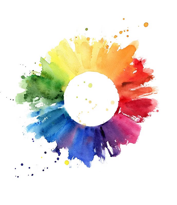
What is the colour wheel?
The colour wheel is a visual tool that represents colours in an organised, systematic way. Whilst some modern colour wheels contain more nuances and variations, the traditional colour wheel comprises 12 primary colours:
- 3 primary colours: Red, blue and yellow (colours that cannot be created by mixing others)
- 3 secondary colours: Green, orange and violet (created by mixing two primary colours)
- 6 tertiary colours: Red-orange, yellow-orange, yellow-green, blue-green, blue-violet and red-violet (created by mixing a primary and secondary colour)
The colour wheel also shows important colour relationships – complementary, analogous and triadic combinations – that form the foundation of effective colour harmony.
The history of the colour wheel.
Understanding the science behind the colour wheel becomes clearer when you know its origins.
From Ancient Greece to Isaac Newton.
The concept of organising colours dates to Ancient Greece, but it was scientist and colour theorist Isaac Newton who developed the first circular representation of colours in the 17th century. After passing light through a prism, Newton observed that white light breaks down into seven distinct colours.
He then arranged these colours in a circle to show the relationships between them – establishing the scientific foundation for the colour wheel. This breakthrough demonstrated that colour is not arbitrary; it follows mathematical and optical principles.
18th-century developments.
In the 18th century, painter and theorist Moses Harris developed a more complex version of the colour wheel, incorporating primary, secondary and tertiary colours.
Harris was among the first to use the colour wheel to demonstrate colour relationships, particularly complementary colours – colours that sit opposite each other on the wheel and enhance each other when combined.

The Munsell colour system.
In the 19th century, painter and colour theorist Albert Munsell proposed a three-dimensional version of the colour wheel, known as the Munsell colour solid.
This innovation represented not only hues (colours), but also value (lightness/darkness) and saturation (colour intensity/purity). This three-dimensional approach provided a more comprehensive way of understanding colour relationships and was revolutionary for artists and designers.
The colour wheel today.
Today, the colour wheel is a fundamental tool used across creative industries – art, graphic design, branding, marketing, interior design, fashion and more. It helps us understand how colours interact and how to combine them harmoniously.
Digital tools like Adobe Colour have made the colour wheel more accessible and interactive, allowing real-time colour exploration and palette generation.
Understanding colour wheel colours and relationships.
The colour wheel is typically structured with 12 colours, though more detailed variations may include additional hues. These 12 colours divide into three primary categories, plus several important colour relationship concepts:
Primary colours.
Definition. Red, blue and yellow are the three primary colours. They cannot be created by mixing other colours, and all other colours derive from these three fundamental hues.
Positioning: Primary colours are positioned equidistantly around the wheel, creating equal spacing that reflects their foundational role.
Key principle: Understanding primary colours is essential – they form the basis of all other colours and colour combinations.
Secondary colours
Definition. Secondary colours are created by mixing two primary colours:
- Red + Yellow = Orange
- Yellow + Blue = Green
- Blue + Red = Violet
Positioning. Secondary colours sit between primary colours on the wheel, creating a logical visual structure.
Application: Secondary colours are more varied than primaries but maintain the foundational colour principles.
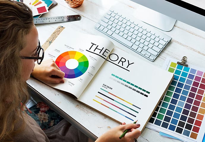
Tertiary colours.
Definition. Tertiary colours are created by mixing a primary colour with a secondary colour. This creates six tertiary hues:
- Red + Orange = Red-orange
- Yellow + Orange = Yellow-orange
- Yellow + Green = Yellow-green
- Blue + Green = Blue-green
- Blue + Violet = Blue-violet
- Red + Violet = Red-violet
Naming. Tertiary colours are named with hyphenated compound names (red-orange, blue-green) reflecting their dual parentage.
Application. Tertiary colours provide subtlety and sophistication, offering more nuanced options than primary or secondary colours alone.
Complementary colours.
Definition. Complementary colours are positioned directly opposite each other on the colour wheel.
Examples:
- Blue and orange
- Red and green
- Yellow and violet
Visual effect. When placed side by side, complementary colours create strong contrast and reinforce each other's vibrancy. They make each colour appear more intense and saturated.
Practical applications.
- Creating visual impact and attention
- Building dynamic, energetic designs
- Emphasising key design elements
- Creating high-contrast interfaces for accessibility
Design principle. Use complementary colours when you want maximum contrast and visual interest. They work well in advertising, branding and calls-to-action.
Analogous colours.
Definition. Analogous colours sit adjacent to each other on the colour wheel, typically 2–3 colours positioned next to one another.
Examples:
- Blue, blue-green and green
- Red, red-orange and orange
- Yellow, yellow-green and green
Visual effect. Analogous colours share similar characteristics and create harmonious, cohesive combinations. They feel natural and pleasing to the eye.
Practical applications.
- Creating harmonious, calming designs
- Building visual coherence and unity
- Developing sophisticated colour palettes
- Nature-inspired and serene design schemes
Design principal. Use analogous colours when you want visual harmony, flow and sophistication. They're ideal for interior design, wellness branding and peaceful compositions.

Les outils pratiques pour s’appuyer sur le cercle chromatique
Triadic colours.
Definition. Triadic colours are three colours positioned equidistantly around the colour wheel, forming an equilateral triangle.
Examples:
- Red, yellow and blue (primary triadic)
- Orange, green and violet (secondary triadic)
Visual effect. Triadic combinations are vibrant and balanced – offering visual interest without the harsh contrast of complementary pairings. They're energetic yet harmonious.
Practical applications.
- Creating dynamic, balanced designs
- Developing playful, energetic visual identities
- Building multi-colour branding systems
- Engaging children's media and entertainment
Design principle. Use triadic colours when you want energy and balance. They're excellent for brands that need personality without a harsh clash of colour.
Tetradic (or square) colours.
Definition. Tetradic colours consist of four colours positioned evenly around the wheel, forming a square or rectangle.
Visual effect: These combinations offer richness and complexity whilst maintaining balance through even spacing.
Practical applications.
- Complex, multi-colour branding systems
- Diverse colour palettes with sophistication
- Design projects requiring multiple distinct colours
Colour temperature.
The colour wheel can be divided into two temperature groups:
- Warm colours. Red, orange and yellow – associated with heat, energy, excitement and warmth. In colour theory, warm colours feel vivid, energetic, and cozy.
- Cool colours. Blue, green and violet – associated with coolness, calmness, peace and tranquillity. Psychologically, cool colours feel serene, calming and restful.
Design application. Combine warm and cool colours strategically:
- Use predominantly warm colours for energetic, welcoming spaces
- Use predominantly cool colours for calm, professional environments
- Mix warm and cool for balance and sophistication
Chromatic vs achromatic colours.
Chromatic colours are all colours with hue – they appear on the colour wheel and carry colour information. Examples include red, blue, green and orange.
Achromatic colours are colours without hue – they exist outside the colour wheel. These include:
- Black (absence of light)
- White (full light reflection)
- Grey (neutral between black and white)
Design principle. Achromatic colours provide foundation and balance. Use them as backgrounds, neutrals and contrast elements to let chromatic colours shine.
Quick reference table.
How to use the colour wheel for your project.
To effectively use the colour wheel, you need to understand colour relationships and how to combine them strategically.
Here's a step-by-step approach to using the colour wheel and understanding colour wheel combinations:
Step 1 – Define your project's tone.
Before selecting colours, clarify the emotional atmosphere your project should convey. Ask yourself:
- Should it evoke joy, energy and excitement?
- Does it need to feel serious, professional and trustworthy?
- Should it be calming, peaceful and meditative?
Colour guidance:
- Warm colours (reds, oranges, yellows) communicate energy, joy and passion
- Cool colours (blues, greens, violets) create calm, harmony and professionalism
- Neutral colours (black, white, grey) provide foundation and balance
- Saturated colours create vibrancy and impact
- Muted colours feel sophisticated and refined
Step 2 – Choose a dominant colour.
Select one primary colour that will be most prominent in your design. This colour sets the foundation and should align with your project's tone and brand identity.
Questions to guide selection:
- What colour represents your brand or project values?
- What colour resonates most with your target audience?
- Does this colour carry cultural or psychological associations that support your message?
Once selected, use the colour wheel to explore supporting colours around it.
Step 3 – Build supporting palettes using colour wheel principles.
Use colour wheel relationships to select harmonious supporting colours:
For complementary contrast: Choose the colour directly opposite your dominant colour. This creates striking visual interest and emphasis. Use this approach when you need high contrast and attention-grabbing impact.
For harmonious unity: Select analogous colours – those adjacent to your dominant colour on the wheel. These create visual flow and cohesion. Use this approach for sophisticated, unified designs.
For balanced energy: Apply triadic colours – your dominant colour plus two others evenly spaced on the wheel. This creates vibrancy with equilibrium. Use this approach for dynamic designs that need multiple distinct colours.
Step 4 – Test your colour palette.
Experiment with multiple combinations before finalising your palette. Tips for effective testing:
- Test across media: Preview colours on screen, in print, and on physical materials (they appear different in each)
- Check contrast: Ensure there’s sufficient contrast between foreground and background for accessibility and readability
- Gather feedback: Share options with colleagues or target audience members
- Iterate: Adjust saturation, value and relationships based on testing results
- Document: Record your final palette with colour codes (HEX, RGB, CMYK) for consistency
Playing with the colour wheel can mean the difference between a bland visual and an effective, impactful design.
Practical tools for using the colour wheel.
Several digital tools help you apply colour wheel principles effectively. Here's how to use the most powerful ones:
- Adobe Colour is the leading tool for creators seeking to enhance projects through strategic colour selection. Move points around the colour wheel to explore different hues and build your own colour palette.
- Adobe Illustrator includes a powerful colour harmonisation tool called the Colour Guide, which functions similarly to a digital colour wheel.
- Adobe Photoshop offers several features for colour wheel exploration and application, such as Hue/Saturation adjustment, Colour Balance and Colour Lookup Tables (LUTs).
- You can access your saved themes in Adobe Photoshop, Illustrator and InDesign via the colour swatches panel. This ensures consistency across all your creative work.
Pro tip: Use the camera icon to extract colours from photographs or uploaded images – perfect for creating palettes inspired by real-world references.
Frequently asked questions.
The colour wheel is a visual representation of how colours relate to each other, organised in a circle showing colour relationships and harmony. It's important because it:
- Guides colour selection: Shows which colours work well together.
- Creates harmony: Helps ensure your palette is visually pleasing.
- Builds consistency: Ensures professional, cohesive colour use.
- Communicates emotion: Different colour combinations evoke different feelings.
- Saves time: Replaces guesswork with proven colour theory principles.
Understanding the colour wheel is fundamental to effective design, branding and visual communication.
Chromatic refers to colours that have hue – colours that appear on the colour wheel with distinct colour properties. Examples include red, blue, green, orange and yellow.
Chromatic colours are all hues with colour information. They can be:
- Saturated (vivid, intense)
- Desaturated (muted, toned down)
- Warm (red, orange, yellow tones)
- Cool (blue, green, violet tones)
The opposite of chromatic colours are achromatic colours (black, white, grey) – colours without hue that exist outside the colour wheel.
The traditional 12-colour chromatic circle comprises:
Primary colours (3):
- Red
- Yellow
- Blue
Secondary colours (3):
- Orange (red + yellow)
- Green (yellow + blue)
- Violet (blue + red)
Tertiary colours (6):
- Red-orange
- Yellow-orange
- Yellow-green
- Blue-green
- Blue-violet
- Red-violet
This 12-colour structure balances simplicity with comprehensive colour representation, making it ideal for both artists and designers.
To create a colour palette using the colour wheel, follow this step-by-step process:
- Define your tone: Clarify whether you want energetic, calm, professional or playful
- Choose a dominant colour: Select one colour that represents your project's core
- Apply colour wheel principles: Use complementary, analogous or triadic relationships to select supporting colours
- Select 3–5 colours total: Avoid excessive colours; a focused palette is stronger
- Add neutrals: Include black, white or grey for balance and contrast
- Test combinations: Preview across digital and print media
- Ensure accessibility: Check contrast ratios for readability
- Document colours: Record HEX, RGB and CMYK codes for consistency
- Refine: Adjust based on testing and feedback
- Apply consistently: Use your documented palette across all applications
Tools like Adobe Colour streamline this process by providing instant colour suggestions based on wheel principles.
There are a few key differences between the colour wheel and the Munsell colour system, best seen in comparison:
Colour wheel:
- Two-dimensional representation
- Shows hue relationships
- Foundational for understanding colour harmony
- Simplified but accessible
Munsell colour system:
- Three-dimensional representation (colour solid)
- Includes hue, value (lightness) and saturation (intensity)
- More comprehensive and precise
- Used in professional colour specification and matching
- Essential for technical applications requiring exact colour reproduction
While the colour wheel is ideal for design and harmony decisions, the Munsell system is used when precise colour specification matters (professional printing, colour matching, etc.).
To use the colour wheel for interior design, consider the following:
- Assess your space: Identify the mood you want (cosy, professional, energetic, calm)
- Choose a dominant colour: Select a wall colour or furniture colour as your base
- Apply colour wheel principles:
- Analogous: Create harmonious, flowing spaces
- Complementary: Create visual interest and dynamic contrast
- Monochromatic: Achieve sophisticated, unified rooms
- Use neutrals as foundation: Paint most surfaces neutral (white, grey, taupe) with colour in accents
- Consider natural light: Test colours in your actual lighting conditions
- Layer textures: Combine colours with different textures and materials
- Use the 60-30-10 rule: 60% neutral, 30% secondary colour, 10% accent colour
Pro tip: Use Adobe Colour to extract colours from furniture or art pieces you love, then build your palette around those reference colours.