Master different font types and styles.
Serif, sans-serif, script, monospace, decorative – font types can feel overwhelming at first. Whether you’re designing posters, websites or branding materials, understanding different font styles is essential.


Serif, sans-serif, script, monospace, decorative – font types can feel overwhelming at first. Whether you’re designing posters, websites or branding materials, understanding different font styles is essential.
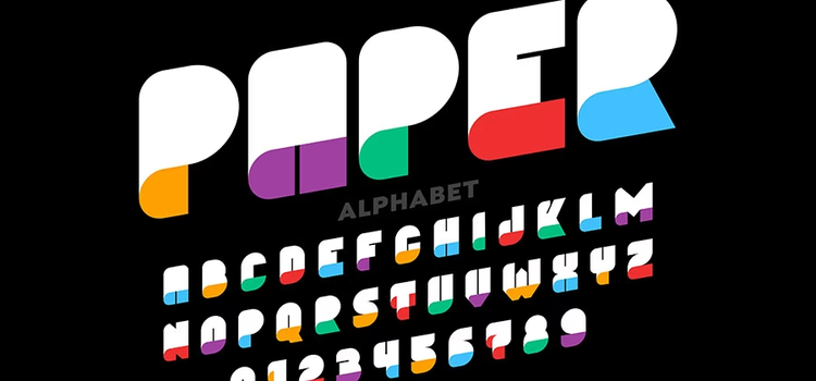
A font is a complete collection of characters – uppercase letters, lowercase letters, numerals, symbols and punctuation marks – all sharing a similar design. Some examples are Arial, Helvetica or Times New Roman. These are classic examples of fonts used worldwide.
You’ll often hear the words font, typeface and typography used interchangeably, but they have distinct meanings:
Selecting the right font style shapes how your audience perceives your message. Different fonts communicate different tones – some feel professional and modern, others feel elegant or playful.
The best fonts for your project depend on:
Most brands use 2-3 carefully chosen font types across their communications.
These fonts are typically defined in a brand guidelines document, ensuring visual consistency across all materials and strengthening brand recognition.
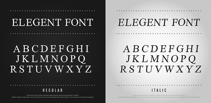
There are several main font types and styles. Understanding each helps you choose fonts that fit your design needs. Here’s a breakdown of the most common types of fonts:
Serif fonts feature small lines or ‘feet’ at the ends of letter strokes. These fonts communicate tradition, elegance, trust, sophistication, authenticity and heritage.
Font examples: Georgia, Times New Roman, Garamond, EB Garamond.
Best for: Books, newspapers, formal documents, luxury branding, editorial design.
Readability tip: Serif fonts work well in print for body text but can be trickier on screens at small sizes. Use larger sizes or pair with sans-serif fonts for web projects.
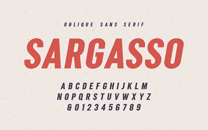
Sans-serif fonts (or ‘sans’ meaning ‘without’) have no decorative feet. Also called linear or stick fonts, they convey minimalism, clarity, modernity and forward-thinking.
Because sans-serif fonts lack ornamental details, they offer the greatest readability, making them the go-to choice for web design and digital interfaces.
Font examples: Helvetica, Arial, Verdana, Open Sans, Futura.
Best for: Web design, digital interfaces, modern branding, corporate communications.
Readability tip: These fonts are the most legible on screens, especially at smaller sizes.
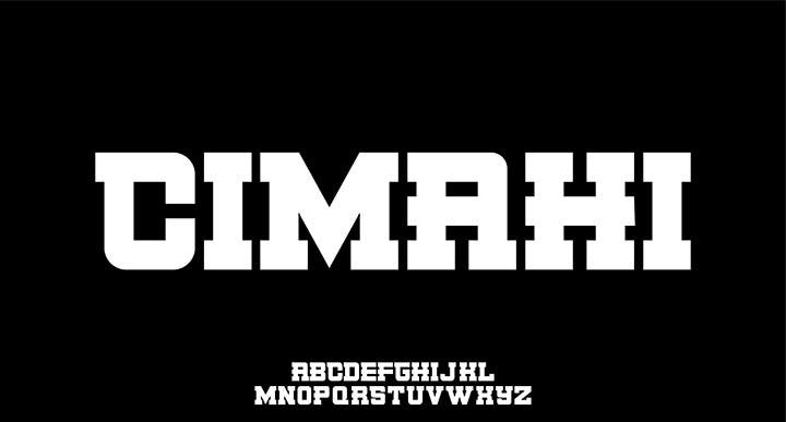
Slab-serif fonts (sometimes called Egyptian fonts) are a hybrid. They feature styles typical of traditional serif fonts, but are much thicker – forming bold blocks at character ends.
These fonts convey stability, confidence, strength and security, making them ideal for bold headlines or contemporary branding.
Font examples: Courier, Rockwell, Clarendon.
Best for: Headlines, posters, modern branding, editorial covers.
Pro tip: Pairing a slab-serif font for headings with a sans-serif font for body text creates strong visual contrast and improves readability.
Script fonts mimic handwriting and calligraphy, offering a natural, flowing aesthetic. These decorative fonts communicate freedom, softness, creativity and refinement.
Avoid using script fonts for body text – they’re difficult to read in large passages. Reserve them for titles, logos, invitations and special graphics.
Font examples: Brush Script, Edwardian Script, Great Vibes.
Best for: Wedding invitations, logos, posters, book covers, greeting cards.
When to use decorative script fonts: Keep them for short, impactful text only.
In monospace fonts (also called fixed-width or typewriter fonts), every character occupies the same horizontal space. This differs from most modern fonts, where narrow letters like ‘i’ or ‘u’ take up less space than wide letters like ‘w’.
Monospace fonts have a vintage aesthetic, evoking old typewriters and early computers. They’re ideal for code displays and technical documentation but should be used sparingly elsewhere due to their distinctive appearance.
Font examples: Courier New, Lucida Console, Courier.
Best for: Code snippets, technical writing, vintage design, terminals.
Readability tip: Monospace fonts offer excellent readability for technical content but look unusual in regular body text.

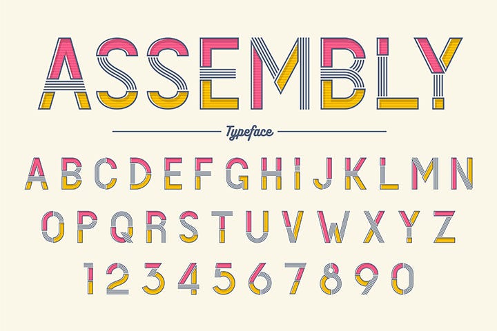
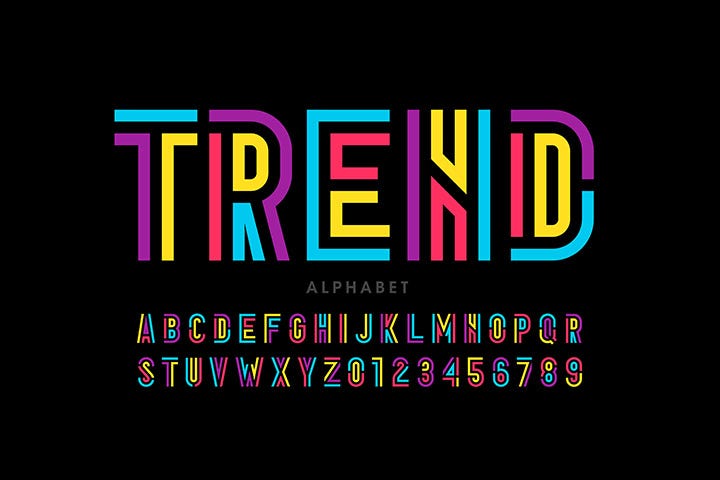
Decorative fonts (also called fantasy fonts) break traditional typographic rules to emphasise originality and personality. These fonts are typically designed around specific themes or ideas.
Use sparingly: Decorative fonts are excellent for logos and posters but should never be used for body text – they sacrifice readability for visual impact.
Font examples: Comic Sans, Impact, Curlz MT.
Best for: Logo design, posters, headlines, event graphics.
Fonts for decorative use: Choose fonts that reflect your brand’s personality but ensure they remain legible at your intended size.

In graphic design, advertising and web development, certain fonts consistently stand out.
Helvetica is a clean, versatile sans-serif font that pairs effortlessly with other typefaces. Its timeless neutrality has made it the foundation of logos for major international brands.
Why designers love it: Adaptable, elegant, highly readable.
Best for: Corporate branding, signage, professional documents.
These serif fonts are particularly favoured in fashion and luxury branding. Simultaneously classical and bold, they evoke elegance and prestige.
Why designers love them: Sophisticated, timeless, fashion-forward.
Best for: High-end branding, editorial design, luxury packaging.
This sans-serif font offers perfect readability without rigid geometry. It’s a versatile, stylish choice that adapts to most audiences and cultures, making it ideal for international brands.
Why designers love it: Flexible, readable, culturally universal.
Best for: International branding, signage, publications.
Choosing the right font type is only part of the equation. Colour selection is equally critical for effective design communication.
Colours communicate emotion and meaning through colour psychology and colour symbolism.
While personal interpretation varies, broad trends exist:
When pairing fonts with colours, think about the following.
Follow your brand guidelines: If designing for a brand, adhere to their established colour and font guidelines.
Prioritise contrast: Ensure text is readable against its background. For large formats and posters, experiment with complementary colours.
Consider text length: For long passages, stick to black or dark grey on white or off-white backgrounds. Bright colours tire the eyes quickly during extended reading.
Match sector and audience: Luxury brands often use black, violet or gold. Tech companies favour grey and blue. Choose colours that align with your industry and target audience.
Adobe Creative Cloud makes working with different font types and styles straightforward.
Adobe Fonts offers an extensive library of additional typefaces. Access them directly from Illustrator:
Pro tip: Activated fonts sync automatically across your Creative Cloud applications – use them in Photoshop, InDesign, Premiere Pro and more.
The most readable fonts depend on context. For print and body text, Georgia, Helvetica and Garamond are excellent.
For web and digital design, sans-serif fonts like Open Sans and Arial excel because their clean lines display crisply on screens.
For people with dyslexia, sans-serif and monospace fonts tend to be more accessible.
Absolutely. In fact, combining fonts is a best practice. A popular pairing is a serif font for headlines with a sans-serif font for body text (or vice versa). This creates visual contrast and improves readability.
Stick to 2-3 fonts maximum per project to maintain cohesion.
Browse thousands of professional typefaces at Adobe Fonts.
Based on your location, we think you may prefer the United States website, where you'll get regional content, offerings, and pricing.


