.

Your complete guide to creating and using a graphic charter.

Graphic charters are a useful tool for keeping your brand, website and wider business visuals in check. But what is a graphic charter and how do you create one?

We've got the answers to help you build a graphic charter that strengthens your brand identity and keeps your visual communication consistent across every touchpoint.

What is a graphic charter?

A graphic charter is a comprehensive document that defines and formalises the visual elements of a company or brand. Think of it as your brand's visual rulebook – a single source of truth for anyone creating content on behalf of your organisation.

A graphic charter typically includes your:

  • Logos – the primary logo plus any other variations. For example, different colour ways or simplified versions.
  • Colour palette – your brand colours with specific codes for consistency.
  • Typography – approved heading styles and fonts, and how to use them.
  • Layout guidelines – spacing, margins and composition rules.
  • Icons and symbols – visual elements that define your brand.
  • Imagery style – photography and illustration guidelines.
  • Additional elements – audio signatures, textures or other brand assets.

A strong, well-documented graphic charter means your brand stays recognisable, professional, and cohesive across every channel—from your website to your packaging to your social media.

You might also include it as part of your wider brand guidelines, so it’s easily accessible for anyone in your organisation or external partners. This ensures consistency in how your brand looks and feels, regardless of the medium, the designer involved, or where it appears.

Why are graphic charters important?

Building brand consistency and recognition.

A graphic charter is designed to work across all platforms and formats. It ensures consistent visual communication and helps you build and strengthen your brand identity over time.

When every piece of content follows the same visual guidelines, your audience recognises your brand instantly. This should be true whether they're scrolling social media, reading an email or walking past point-of-sale displays in a shop.

Saving time on new projects.

One of the most practical benefits of a graphic charter is the time it saves when creating new content and campaigns. Whether you have an in-house marketing team or work with external designers, your graphic charter acts as a quick reference guide.

Instead of having to hunt down specific colour codes, font names, or logo variations, everything is clearly documented in one place. This speeds up the creative process and reduces the odds of endless back-and-forth approvals.

Maintaining professional standards.

A graphic charter helps your organisation maintain professional standards across all communications. It prevents inconsistencies that might confuse your audience or damage your brand reputation. It also makes it easier for new team members to understand your visual identity and create content that aligns with your brand values.

What to include in your graphic charter.

For your brand to build and maintain a strong visual presence, your graphic charter should include clear guidelines on the following elements:

Logo and logo variations.

Document the rules for using your logo, including sizing, spacing and positioning. You should also include approved variations, such as a black-and-white version, a horizontal version, and versions with and without your tagline. Clear rules prevent misuse and keep your logo looking professional everywhere it appears.

Colour palette.

List all brand colours with their specific codes. This includes:

Specify how each colour should be used—for example, which colour is for backgrounds, which is for text, and which is an accent colour. Consistency in colour across all media helps your brand become instantly recognisable.

You can use Adobe’s colour palette generator to help build your own brand colour wheel.

Typography.

Define the fonts and typefaces you use, including the weights (bold, regular, light) and sizes for different applications. Include guidance on when to use serif fonts versus sans-serif, and how to handle typography across different mediums—from print to digital.

Learn more about typography design for UK businesses.

Layout and spacing guidelines.

Document any rules around margins, line spacing, alignment and grid systems. These guidelines ensure that whether someone is designing a poster, a webpage or an email, everything aligns and matches your branding.

Icons and symbols.

If your brand uses custom icons or symbols, you might want to include a complete icon library with guidelines on sizing, colour application and when to use them. Icons can add visual interest to content – but they need to be used consistently.

Photography and imagery style.

Provide examples of photography, imagery and illustration styles that match your brand. This might include guidance on tone, subject matter, composition or editing style. For example, whether you prefer something bright and airy versus moody and dramatic.

Beyond the basics: additional brand elements.

For larger organisations, a graphic charter might extend beyond visual design to include:

  • Audio elements – brand music, jingles or sonic signatures.
  • Sensory elements – distinctive textures or scents associated with your brand.
  • Tactile elements – specific materials or textures used in packaging or products.

These elements are particularly important for premium or lifestyle brands that want to create a complete sensory experience.

Graphic charter vs. editorial charter: what's the difference?

It's easy to confuse these two important documents, but both have different functions:

  • Graphic charter – covers all visual design rules, such as colours, fonts, logos and imagery.
  • Editorial charter – covers any written rules around tone of voice, terminology, punctuation, and whether to use formal or informal language.

Together, they ensure your entire brand communication – both visual and written – remains consistent and recognisable.

Graphic charter examples.

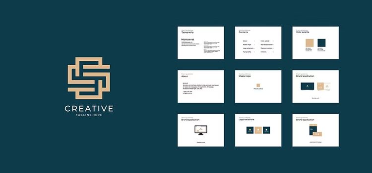
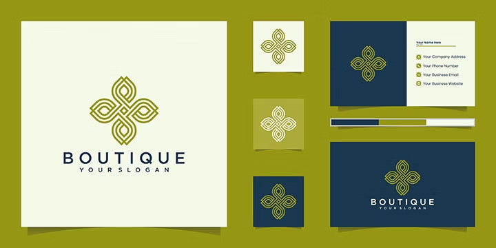
Here are some examples of graphic charters you could use to build out your own.

How to apply the graphic charter to reinforce your brand identity.

Your graphic charter only works if it's consistently applied across all your communications. Here's where you should ensure your graphic charter guidelines are followed:

Your logo is the cornerstone of your brand identity. Ensure it's used consistently across all marketing materials and beyond. The colour choices, typography and design elements of your logo should align with the rest of your graphic charter.

Business cards.

Business cards are a perfect opportunity to showcase your graphic charter in a compact format. From the logo placement to the colour scheme to the font choice, a well-designed business card communicates professionalism and brand consistency.

Posters and video content.

Whether you're creating a printed poster or video content, make sure you use the typography and colours from your charter. For videos, this might mean branded intros and outros, colour bars or your logo in the corner of the screen.

Product packaging.

Packaging is one of the most visible touchpoints for your brand. Use the colours and typography from your graphic charter to create packaging that's instantly recognisable and reinforces your brand identity.

Your website and mobile apps.

Every element of your digital presence should follow your graphic charter – from the fonts used in headings to the colour of buttons and links. A cohesive website design improves user experience and reinforces brand trust.

Social media.

You should also apply your charter to any visuals on your social media channels. This includes your profile pictures, cover images, post graphics and event banners. This consistency helps your audience recognise your brand instantly as they scroll through their feeds.

Invoices and financial documents.

Even formal documents like invoices deserve the graphic charter treatment. Include your logo at the top, use brand colours in headers and table elements, and apply brand fonts where appropriate.

Employee uniforms and merchandise.

Where appropriate, ensure that employee uniforms or branded merchandise reflect your graphic charter. This extends your brand presence and creates a cohesive look, especially for customer-facing teams.

Internal documents and communications.

Your graphic charter should cover internal communications too. Think presentations, memos, training materials and internal reports. This reinforces your brand values within your team and makes everything look polished and professional.

How to create a graphic charter with Adobe.

Two of the most important elements of any graphic charter are the logo and typography. Here's how to create both using Adobe tools:

Designing a logo for your graphic charter.

Adobe Illustrator is the ideal tool for creating a professional logo. Follow these steps:

  1. Open a new project in Adobe Illustrator.
  2. Select a typeface and type your company or brand name.
  3. Customise the typography as you wish.
  4. Add and arrange geometric shapes to enhance your design (optional).
  5. Apply your brand colours to your creation.
  6. Refine details and overall polish.
  7. Export your logo as PNG with a transparent background, so you can place it on any colour or image.

Once you have your main logo, create and document any variations.

Creating custom fonts for your graphic charter

Adobe Illustrator also lets you create or customise typefaces that truly reflect your brand personality:

  1. Sketch letters by hand on paper to develop initial concepts.
  2. Scan or photograph your hand-drawn letters and import them into Adobe Illustrator.
  3. Vectorise your letters so they become scalable digital fonts.
  4. Refine each letter to ensure perfect legibility and alignment with your brand aesthetic.
  5. Export your custom font using font-creation tools or extensions.
  6. Use your unique typeface consistently across all visual communications.

Pro tip: Most graphic charters include two or three different typefaces rather than just one. Different fonts work better for different purposes – one might be perfect for headlines, while another is better for body text. Your charter should clarify when to use each.

Top tips for creating an effective graphic charter.

Creating a graphic charter requires more than just listing design specifications. Here's how to create one that actually works.

Start with your brand values and personality.

Before choosing colours or fonts, define the values and emotions your brand should convey. Are you playful or serious? Modern or traditional? Luxury or accessible? Let these values guide every design choice.

For example, think about colour psychology. What emotions do your chosen colours evoke? Consider the personality conveyed by each typeface. Your graphic charter should visually communicate who your brand is.

Make your graphic charter unique.

While it's smart to research graphic charters from competitors and industry leaders, your charter must be unique to your brand. The whole point is to create a distinctive visual identity that sets you apart. Avoid copying existing charters and instead, use them as inspiration while creating something authentically yours.

Test across all formats and mediums.

Your graphic charter needs to work everywhere – from large-format print to tiny social media icons. Test your logo, fonts and colours on both digital screens and printed materials. Make sure your logo is legible on a billboard and on a mobile phone. Test how your colours appear in print versus on screen. This testing phase often reveals adjustments you'll need to make.

Build in flexibility for evolution.

A graphic charter isn't set in stone forever. It should evolve as your brand grows and market trends shift. Plan for occasional updates, such as refreshing your colour palette or introducing a new secondary font. A charter that never changes risks looking dated.

Document everything clearly.

The more detailed and clear your graphic charter, the easier it is for others to follow it. Include visual examples, specific measurements and clear "dos and don'ts."

Consider creating both a full-version charter that’s more detailed, for designers. Then craft a simplified version for non-designers who need to use brand elements.

Frequently asked questions.