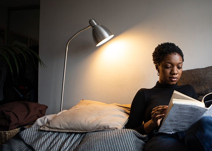
Consider your reader.
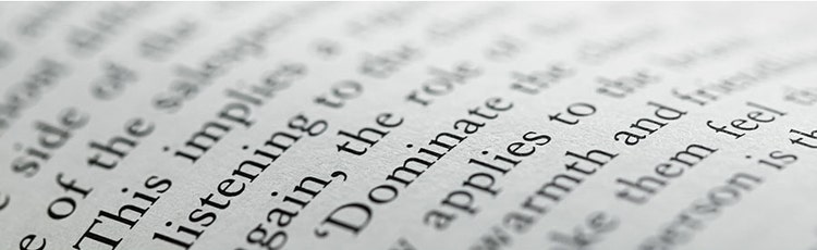
Today, we encounter multiple media formats daily, and our attention depends on creativity and presentation. This applies especially to text layouts. Different typefaces require different leading amounts.
Text size determines leading choice: small characters need more generous line spacing because they demand more reading effort.
Line length also matters – shorter lines need less space; longer lines need more space and greater leading to maintain reading flow.
Remember that leading adds balance and light to your designs. Use it to maximise document readability. Where possible, opt for single line spacing adapted to your text.
What is single line spacing?
Single line spacing is the default leading set at 120% of character size.
Example: For 10-point text, line height would be 12 points.
In most cases, don’t exceed 150% of character size for optimal readability.
Design and leading.
From a graphic design perspective, strategically manipulating leading can attract reader attention and establish reading hierarchy.
Display type leading may differ significantly from body text for visual impact.
Titles and leading.
Titles establish layout hierarchy. You can reduce leading for titles or use negative leading if titles span multiple lines.
In graphic design, white space is as important as characters. It increases readers’ focus on certain areas. Text without line or paragraph spacing (like newspapers) is more fatiguing than well-designed magazines with more intricate layouts attracting reader attention.
Coloured text and backgrounds.
Black text on a white background offers maximum typographic legibility.
When using other colour combinations, increase leading. Do this when placing light text on dark backgrounds too. Also consider using lighter font weights.