#1e1e1e

Tips and tricks for choosing the right font.

Selecting the right font is a crucial step in any visual, written or design work containing text.

Find out about font families, what typography is, and discover practical tips and tricks to help you choose the perfect font. From script fonts to serif fonts and the best fonts for presentations, business cards and more, whatever the nature of your project – we can help.

What is a font?

A font is a complete set of characters (letters, numbers, symbols, punctuation) from the same group with an identical visual style. These are known as ‘font families’.

For example, Helvetica, Arial, Times New Roman and Sans Serif are fonts.

Each typeface has a particular visual style and can convey different emotions and values. Choosing one font over another can make a big difference in an advertising campaign, and for a company's overall image.

Some brands are even recognisable at a glance because of the font they use. In these cases, the font is a cornerstone of their visual identity.

Campervan graphic poster with stylish font

A history of fonts and typography.

While you may think fonts and typography date back to the beginning of the printing era, styling characters has actually been happening for millennia, with the transformation of pictograms into alphabet letters.

Typographic printing.

Printing content using movable characters began in the 11th century in China, where movable type made of terracotta was created to print characters.

Printing in the West.

It was in 1440 that printing using movable characters appeared in the West. The evolution continued with mechanical presses, then towards increasingly automated technologies. Today, most font design work is done using vector drawing software.

Evolution of character styles.

Since the beginning of printing, typefaces have become more refined, more thoughtful and more stylised, with each major era represented.

The Age of Enlightenment was characterised by fine serif scripts, while the Industrial Revolution saw the rise of thicker fonts. Later, in the post-war period, more straightforward, unadorned typefaces surged in popularity, while the 1960s and ’70s gave rise to more original rounded fonts.

This paved the way for today's modern fonts featuring clean, minimalist characters.

The importance of fonts.

Font selection is an important component of graphic design, and for good reason. Different feelings, atmospheres and emotions can be expressed simply through font choice and style.

Behind the advertising messages and texts you read on a daily basis, a designer has taken time to think about the relationship between what words say and how they look.

It's also worth noting that a poorly chosen font can impact how readable a message is.

Different font categories.

Today, there are thousands of different fonts to use in projects and communications, which doesn't make choosing one easy!

To avoid drowning in a sea of options, a good tip might be to first choose a broad font type and then search within that category for a font suited to your needs.

Here are some options:

Serif fonts: Typefaces with serifs (small additional strokes at the ends of characters are classical and elegant (Times New Roman, Bodoni, Garamond, Didot, etc.).

Sans-serif fonts: Typefaces without serifs are more modern and minimalist (Helvetica, Univers, Arial, etc.).

Slab-serif fonts: These feature thicker serifs than traditional serif fonts. They evoke feelings of strength and stability (Clarendon, Serifa, Rockwell, etc.).

Script fonts: These resemble handwriting and convey refinement and softness (Gigi, Lucida, Monotype Corsiva, etc.).

Monospace fonts: Here, all characters occupy the same width. Depending on the font chosen, monospace fonts can evoke a vintage style (Lucida Console, Courier New, etc.).

Special or decorative fonts: These are particularly original and refined typefaces. While not suitable for long text passages, they can, however, be particularly useful for creating logos or posters (Fraktur, Impact, etc.).

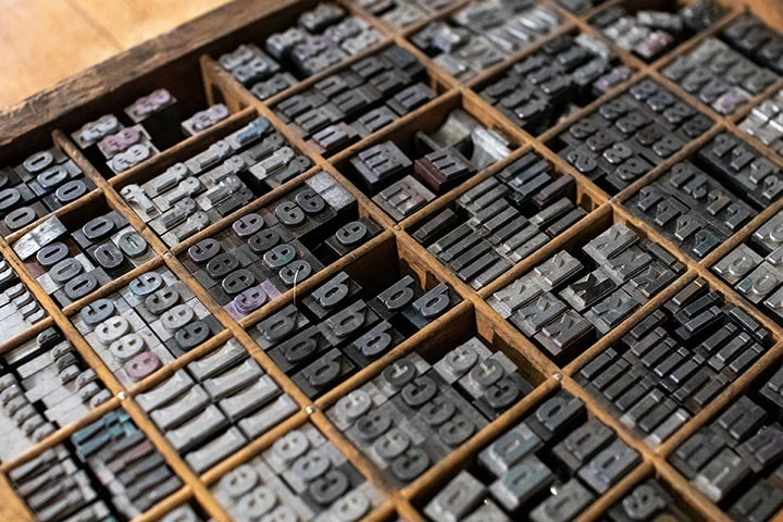
Lead letters in a box for letterpress printing

How to choose the right font.

When choosing a font for a logo, a website, a poster or any other visual creation, certain points are extremely important to keep in mind.

Consult this checklist when wondering what font to use.

  • Define your content objective. Is it a task like a poster, or a website? In the first case, creativity and grabbing attention are more important. In the second case, decorative typefaces should be avoided.
  • Consider the medium. Some fonts are more suited to certain mediums than others. It's generally accepted that sans-serif fonts should be prioritised for screen-based creations, and serif fonts for print on paper.
  • Study your audience and sector. A financial services company will likely display a different font than a theme park or a fashion brand. Do you want to evoke a sense of fun, style or credibility?
  • Think about readability. Style shouldn't come at the expense of readability. Therefore, ensure you choose a highly readable font, especially if your design contains lots of text.
  • Combine fonts. It's recommended to use 2–3 different fonts in the same visual creation or web page. However, ensure a certain harmony by always choosing the same font for headings, another for body text, another for calls-to-action, etc. Obviously, you must also choose fonts that work well together. Try alternating between serif and sans-serif fonts (for headings and body text, for example).
  • Consider the overall layout.
  • The available space for text and the overall design of your creation can also limit your font choices. Some fonts take up more space than others. Meanwhile, others warrant generous line spacing to optimise reading. Here, there is room to experiment whilst considering your design's overall appearance.
  • Work with colour. Have you found the perfect font for your graphic design? Now it's time to choose its colour. The key here is having good contrast, always with clarity and readability in mind. Be careful with bright colours—they generally don't make for comfortable reading and quickly strain the eyes.
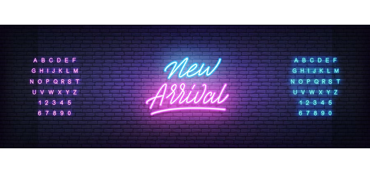
Psychedelic poster with custom font

Best practices for using fonts.

Lots of people spend a great deal of time searching for the right font for a logo or researching what the best font for a CV is. But there are some simple tips that will help:

Choosing a font for a poster.

For poster creation, limit yourself to two or three fonts maximum. Too many different fonts could distract the viewer and might even discourage them from reading the poster. Opt primarily for sans-serif fonts, which are generally more visible from a distance.

The logo is at the very heart of brand identity. Font selection should be made according to the sector and brand values. With logos, any type of font can work. Serif, sans-serif, decorative, script—there are many options. It's mostly about testing and staying true to the brand image.

Finding the best font for a CV.

When it comes to CVs, prioritise sober, professional serif and sans-serif fonts. Avoid overly decorative fonts as they may end up distracting recruiters. Certain space and layout constraints can also guide your choices when finding the best font for a CV.

Determining the best font for websites.

Limit yourself to 2–3 fonts maximum and prioritise serif and sans-serif fonts. For example, you might opt for serif for headings and sans-serif for body text, or vice versa.

The essential thing is choosing perfectly readable fonts that are generally simple and modern. Remember that many internet users browse websites from their smartphones, so consider good readability, regardless of screen size.

Choosing a font for a business card.

Base your choice on sector, audience and values to convey. Also, ensure you choose a perfectly readable font—a business card format is relatively small and your contact information must be quickly identifiable and legible. Choose a font designed for numerals too, if you’re including a contact number.

Choosing fonts for a book.

Here, opt for a single font throughout the book, or one for body text and another for headings and chapters. In any case, it's advisable to avoid script and decorative fonts, which would hinder smooth reading. Serif fonts are best for print. If choosing a font for a digital book (or e-book), opt for a sans-serif font instead.

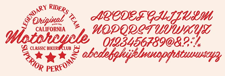
Typography example

Frequently asked questions.

What is the most commonly used font?

While Arial remains the most well-known font, the most used font worldwide is actually Helvetica. This sans-serif font—sober and suited to absolutely all mediums–is considered the most pleasant font to read. Many brands have also adopted this font for their logos.

What font is the best for beautiful handwriting?

To evoke beautiful handwriting, the best fonts remain script fonts, also known as cursive fonts. This type of font recreates the imperfect and fluid strokes of handwriting or calligraphy. However, be careful to use them sparingly—they're ill-suited for long text passages. Reserve them for headings instead.

How do you know which font is being used?

To identify which font is used in an image, website or document, take a screenshot of the text and go to Adobe Fonts.

  1. In the search bar, click the camera icon.
  2. On the next screen, select the text and click ‘next’.
  3. Confirm the text and click ‘next’ to access the search results for similar fonts.

What is the difference between a font and a typeface?

A typeface is the design family itself (e.g., Helvetica). A font is a specific variation of that typeface, including size and weight (e.g., Helvetica 12pt Bold).

What is typography?

Typography is the art and technique of arranging and styling type.

What are the best fonts for different projects?

  1. Best fonts for websites: Simple, modern sans-serif fonts (Helvetica, Arial, Open Sans) for optimal screen readability
  2. Best fonts for presentations: Professional sans-serif or serif fonts that remain clear at various sizes
  3. Fonts for branding: Consider your brand personality—luxury brands favour elegant serifs; tech companies prefer clean sans-serifs
  4. Fonts for business cards: Readable serif or sans-serif fonts designed for small sizes and numerals
  5. Fonts for readability: Sans-serif fonts generally offer superior readability on screens; serif fonts excel in print.

Can I combine serif and sans-serif fonts?

Absolutely. Combining serif and sans-serif fonts is actually best practice, if used in the right way.

A popular pairing is serif for headings with sans-serif for body text (or vice versa). This creates visual contrast and improves overall readability. Just ensure the fonts complement each other and stick to 2–3 fonts maximum per project.