
Much like a book cover, a social media post, or even a flyer, the visual design of an album cover conveys the mood of what it represents. It may not be the main attraction, but the color palette, the typography, the imagery—all these elements help reinforce the music experience for the consumer. Understanding how these design elements work in harmony can help you not only create better graphics with Adobe Express, but also think about your brand in visual ways. In this post, we’re breaking down key design learnings from fabulous album covers throughout the decades and offering up tactical ways to accomplish groovy effects right in Adobe Express.
1. Ruth Lorenzo Planeta Azul
Play with color as a visual highlight as this album cover does. Our eyes are drawn in towards the singer’s floating form, thanks to the vertical rays of light and the horizontal flow of the gown. Gradient shades of blue leave us wondering if she’s soaring in the sky or floating through blue water. Meanwhile minimalist text in complementary colors keeps the focus on the color and image.
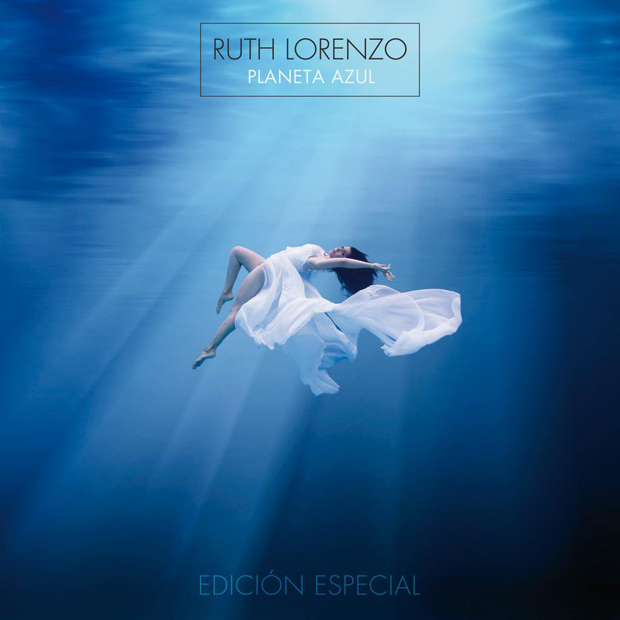
© Roster Music
Easily accomplish a similar effect in Adobe Express by finding a dreamy, surreal photo from a stock photo service (here are sources we love!) and using Adobe Express’s suggested color palettes to explore complementary text colors. You can also bring in colors from the background image to create cohesion by using Adobe Express’s handy color-picker.
2. Pink Floyd The Dark Side of the Moon
Explore contrast and color like this iconic album cover. By disrupting the primarily grayscale design with the colors of light passing through the prism, the simple image becomes more intriguing.

© Storm Thorgerson / Harvest / Capitol
The above example employs advanced design techniques, but you can accomplish something as intriguing in Adobe Express by using the new icons available for free. Just tap the plus button and search from thousands of shapes and icons provided by The Noun Project.
3. Fleetwood Mac Tango in the Night
Let color tell your story as it does in this dreamy jungle scene. Layered color and texture create a fantastical dream scene that feels alive. The passivity of the dominant color is given a playful punch of orange, an active color, that adds life to the sleepy jungle scene.

© Brett Livingstone Strong / Warner Bros Records
We’ve discussed on our Instagram how jungle-inspired imagery is seeing a resurgence of late. You’ll find tons of license free, on-trend imagery to choose within Adobe Express, including this jungle-inspired pattern by The Pattern People below.
4. Morris Day and The Time The Time
Direct the eyes of your audience using visual hierarchy. This black and white photo centers on Morris Day, showcasing his position as leader of the band. The street scene and contrast of dark and light lend themselves to the cool swagger of the band’s sound. Meanwhile a contrasting color in type pops, while not conflicting with the image.

© Warner Bros Records
5. Sigur Ros Takk
Visual textures take the lead in this minimalist design. Layered shades of black and cream create a feel like an old time sepia photograph. The result is dreamy and otherworldly, much like the music. The takeaway: Think abstractly about how imagery can convey a mood.

© Geffen Records
Pro-Tip: Search under the pattern selection in Adobe Express to explore texture in your design.
6. The White Stripes Elephant
Be consistent with your visual identity. The White Stripes are known for their use of three shades: black, white, and red. Their entire discography carries with it a cohesion that makes their albums easily recognized and reinforces their brand.

© XL Recordings LTD
7. Touché Amoré Is Survived By
Monochrome blue creates a hazy feel in this cityscape scene, allowing a photograph to take on an abstract feel. The darker color of the band members gives them weight and visual hierarchy while the lighter toned cityscape recedes into the distant horizon. We also dig the borders on each side of the image as a framing tool, which can easily be accomplished in Adobe Express, by selecting a collage layout.

© Nick Steinhardt / Deathwish Inc.
8. Talking Heads Fear of Music
Dazzling doesn’t have to be difficult. Get graphic with a simple, text-driven design that draws attention to your brand name. Here, visual texture provides depth to a monochromatic background, providing an industrial vibe. The bold green text and lines command visual hierarchy, while the flat black behind the modern type differentiates the space even more from the textured black background. Leading creates symmetry with the text.

© Sire Records
9. Daft Punk Discovery
Make a splash by using futuristic type against a striking black background. Central alignment of the text keeps all eyes on the title, while the reflective silver lettering and colorful drop shadows make this simple design far from boring.

© Virgin Records
Pro-tip: Treat your text like art by using the cut-out effect in Adobe Express! You could find a highly metallic or textured image, then apply the cut-out so that background image only comes through the type. Use drop-shadows and color pairings to further highlight text.
10. Black Sabbath Heaven and Hell
A black background can make your type and design pop. Visual highlighting in white brings our attention to the black humor of an angel smoking and playing cards. How can you use color to direct attention to your message?

© Lynn Curlee / Vertigo Records
11. The National Trouble Will Find Me
Contrasting color and a surreal rendering of a black and white photo create intrigue and curiosity. The sans serif type is clean and modern while a repetition of non-conforming lines slices up the cover design.

© Bohyun Yoon / 4AD
12. Johnny Cash American IV: The Man Comes Around
Experiment with the ways typeface selection and alignment contribute to your message. Here the album title is elevated to the top and aligned in the center, with a simple and modern sans serif type in all caps. Bold, minimalist, and iconic.

© American Recordings / Universal
13. Blondie Parallel Lines
Make your message stand out by using bold red against a graphic black and white backdrop. Experiment with mixing different types like the modern, sans serif and the playful cursive used here—a type pairing made in heaven!

© Chrysallis Records
14. MIA Kala
A busy design doesn’t have to distract from your brand or message if you create order in the chaos. A sense of symmetry successfully carries this visual, with balanced elements on each side. Backing shapes do wonders to create order and legibility on top busier images.

© XL Recordings LTD
15. Julieta Venegas Otra Cosa
Typography helps tell your story. The flowing white script adds to the feeling of fantasy created by the scale of the flowers engulfing the singer and the overlay of the bird graphics.

© Sony Music International
16. Pink Floyd Endless River
Focusing your design around a focal point or general direction leads the viewer’s eye and mind. Here it’s the nice relationship between the sun rising and the surreal figure skating down a cloud river. The image is further supported by an expressive, unusual type. This particular type style is custom, but you can find a similar style, along with other loud or expressive font, in Adobe Express. Like something like this? Just select Megrim font, which contains similar eccentricities.

© Ahmed Emad Eldin / Parlophone
17. Jimi Hendrix Axis: Bold as Love
Don’t be afraid to embrace a cacophony of complementary colors. The symmetrical design and balance of intricate detail on the bottom and simple lines on the top provide the perfect framework for the bold blues, oranges, and pinks of the psychedelic design.

© Roger Law & Karl Ferris / Track Records
18. Tame Impala Currents
Get graphic with striking diagonal lines that pull the eye toward the focal point of your design. The red line pops out from the black and white pattern, tethering the disruptive circular shape and anchoring the image.

© Robert Beatty / Modular / Universal
19. The Eagles The Complete Greatest Hits
Type that stays on theme carries the mythical desert vibe from the central image through to the text. Be adventurous with the scale and style of your font against a simple background.

© Warner Bros Records
20. Roberta Flack Love Songs
Visual highlighting conveys a mood, like the soft light illuminating the singer’s face. Balance is created with the light color choice for the type, and the whimsical sprinkling of stars in her hair.

© Rhino Entertainment
21. Stevie Nicks Bella Donna
Take your cover photo to the next level with transformative type. The striking central image draws our eyes in, thanks to the contrast of white against the textured black background. The fantastical font, neatly aligned with the white parrot, adds to the sense of magic.

© Modern Records
22. Madonna MDNA
Primary colors anchor the margins on the pop art style of Madonna’s album cover. The repetition of vertical lines creates continuity in chaos. The clean white lines of the all caps serif text allows the album title to shine, even amongst the fragmented design.

© Interscope Records
23. The Smashing Pumpkins Mellon Collie and the Infinite Sadness
The rule of thirds provides visual interest against the dreamy blue night sky. Despite all the eye candy, the white text of the title still draws our eyes with a rolling script that matches the otherworldly design.

© Virgin Records
24. Tears for Fears Tears Roll Down
Yellow dominates the hierarchy, perfectly centered, with a 3D effect that radiates out through the lines of the sun’s rays and the texture in the accent leaves. The yellow and green anchor the busy collage effect circling out of the design.

© Mercury Records
25. Zac Brown Band You Get What You Give
Balance an ornate script with a neutral background to ensure your copy doesn’t get lost in the design. Here, the scrolling type takes hierarchy thanks to its rich blue color and scale, while the stone-colored background offers visual interest with its repeating, textured pattern. The band’s name is second in command in the visual hierarchy—the clean, modern type in red a sharp contrast to the elaborate script of the title. Play with type and color for your own designs using Adobe Express.

© Atlantic Records
26. Tycho Dive
Elevate a simple design by using complementary colors. Blue and orange—opposites that attract on the color wheel—impart a sense of energy and life. Here, a familiar scene–a sunset on the horizon–takes on a surreal look thanks to the interesting play of color and texture.
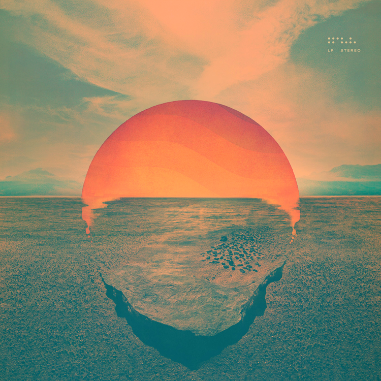
© Ghostly International
Collages can help you make whole new images from other artists’ great work (#steallikeanartist), but collages work best in design when the images used have something complementary about them, like shape, color, or texture. A filter applied to the whole image can help create cohesion. Case-in-point: the astonishingly simple collage below delivers a new way of seeing familiar objects.
27. Grace Jones Muse
Simple, bold, and beautiful—primary colors anchor the soft focus, black and white photo that serves as the backdrop for the rainbow-toned rolling script. The busy color palette creates competition for hierarchy, but you can take your text to the front lines like the graphic designer did here by using drop shadowing in contrasting colors. Play with fonts and color on Adobe Express.

© Richard Bernstein / Island Records
28. The Who Tommy
Play with negative and positive space to grab the eye. As we focus in on the black and blue 3D grid, the faint images of the band members reaching out of the darkness come through.

© MCA / Universal
29. Owl City Maybe I’m Dreaming
Use negative space and modern type to make your title pop. The scale and color depth of the text take hierarchy against the pastel-toned dreamscape, while the sprinkling of neon starlight provides a playful accent.

© Universal Republic Records
30. Ta-ku Love Again
Clean type, kerning, and leading keep the centrally aligned text the star of the show—providing a perfectly ordered rectangle against a tangle of dark flowers.

© Samuel Johnson / HW&W Recordings
Ready to create your own? Tap the examples below to make them your own or check out more album cover design templates.


