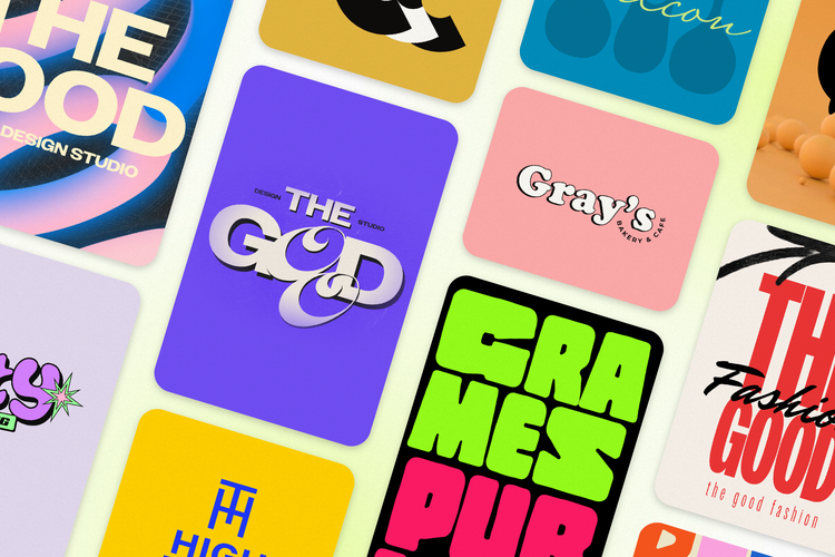
The right logo for your brand exists; it’s just waiting for you to find it.
Building your brand identity isn’t just about choosing a suitable name for your company or product; it also involves color, and typography. The font you choose for your branding matters because it’s what leaves an impression on your audience. With thousands of fonts to choose from, picking the right one can feel overwhelming. A font might look good, but it might not accurately represent your brand, connect with your audience, or remain relevant over time. In this guide, you’ll explore the main font types, discover 40 fonts, and learn how to combine fonts effectively.
Why your logo’s font is important
There’s more to a font than aesthetics. Much like color in design, typography sets the tone and shapes people’s emotional response before they can fully process the words.
And brands know this. For example, Coca-Cola’s iconic script is often associated with familiarity and tradition, while Netflix’s bold, simple font feels clear and attention-grabbing. These weren’t accidents. They’re deliberate font choices to help shape first impressions and reinforce how brands want to be perceived when people come across their logos.
These patterns are widely studied in design. It’s called font psychology. Font psychology refers to how fonts and typography can affect the thoughts, behaviors, and feelings of people in response to design.
Different fonts stir up different subconscious reactions from the audience, which is why choosing the right font for your brand matters. If your brand wants to be seen as serious, committed, and professional, a more structured, clean font can support your goal. The key is alignment. Your typography style should reflect the personality and intent of your brand, so the overall message feels consistent and intentional.
A logo is often processed at a glance, and the font plays a key role in shaping that first impression. According to MIT, human brains process images (like logos) in as little as 13 milliseconds. This is why elements like font and color are crucial. They play a key role in establishing tone quickly and helping brands create a clear, memorable visual identity.
The 4 main types of fonts used in logo design
So what are good fonts for logos? While there are hundreds of thousands of fonts in existence, most logo and branding work is built around four core font families. Each of these fonts has distinct visual traits that tend to align with different brand personalities and use cases. Understanding these basics makes it easier to narrow down your choices and select typography that fits your brand direction.
1. Serif. All serif fonts have small decorative strokes (or feet) at the ends of letters. These fonts are often associated with a more classic and structured look, which can support brands aiming for a sense of tradition, credibility, or refinement. This style is commonly used in industries like fashion, finance, and luxury.
Used by: Tiffany & Co., Rolex, The New York Times
Font examples: Garamond, Bodoni, Playfair Display
2. Sans Serif. This font family has no feet at the end of the letters, making them look clean and minimal. These fonts are often associated with clarity, modernity, and simplicity. Sans-serif fonts are a strong fit for tech brands, startups, and companies looking for a contemporary and approachable aesthetic.
Used by: Google, Facebook, Spotify
Font examples: Futura, Montserrat, Poppins
3. Script. Script fonts are designed to mimic handwriting or calligraphy, giving them a more expressive and decorative feel. They often communicate personality, creativity, and a handcrafted touch, which can work well for brands in creative industries, beauty, food (like cafés), and those who want a more distinctive visual identity.
Used by: Coca-Cola, Instagram, Cadbury
Font examples: Great Vibes, Pacifico, Quintessential
Tip: Use script fonts sparingly, as their readability tends to drop at smaller sizes.
4. Display or Decorative. These fonts are typically designed with strong visual character, often using heavier strokes, unique proportions, or stylized details. They’re often used when a brand needs a distinctive or attention-grabbing look, like brands in creative industries or businesses requiring high visibility.
Used by: Disney, HUF, Superrradical
Font examples: Bebas Neue, Shrikhand
Tip: Best used in short, prominent applications where strong visual impact is the priority
These four font families provide a practical starting point when narrowing down logo font options. The right choice depends on your industry, brand positioning, and the tone you want to communicate.
Try experimenting with different font categories in a logo maker to compare how each style affects your brand’s overall look and tone.
40 impactful fonts for logos
Not all fonts are created equal, and not every font suits every brand. The 40 fonts below offer a range of styles that support different brand directions. They include both free and premium options to give you practical choices across different design needs.
You can test these fonts in a logo maker, allowing you to preview how each option works with your actual brand name.
Serif Fonts
When it comes to serif fonts, the small strokes at the end of each letterform give them a more structured and traditional appearance. This style is commonly used by institutions, luxury brands, and companies that prefer a more established and formal visual look.
1. Garamond
Works well for: Brands aiming for a classic, balanced, and refined feel, such as publishing, legal, and premium-focused brands.
2. Bodoni
Works well for: High-fashion and editorial brands that need dramatic contrast and a commanding presence, such as fashion magazines and premium cosmetics.
3. Playfair Display
Works well for: Upscale restaurants, lifestyle brands, and boutique businesses that want an elegant, editorial look.
4. Cormorant Garamond
Works well for: Luxury and fashion brands that want a refined and understated style.
5. Abril Fatface
Works well for: Brands that want a bold serif with a strong visual presence, including lifestyle media, food packaging, and restaurants.
6. Cinzel
Works well for: Brands that want a classic and elegant look, often used in hospitality, heritage-inspired, or premium-focused designs.
7. Bree Serif
Works well for: Lifestyle and community-focused brands that want a serif style with a more approachable and relaxed feel, like food brands and community organizations.
8. Rufina
Works well for: Brands that want an elegant and expressive serif style. It’s often used in fashion, events, and artisan food and wine labels.
Sans Serif Fonts
These fonts have clean lines and no decorative strokes. Sans serif fonts are widely used across tech, lifestyle, and consumer brands because they prioritize readability and a straightforward visual style.
9. Futura
Works well for: Brands that want a clean, geometric look, like architecture firms, design agencies, and tech brands.
10. Montserrat
Works well for: Luxury, lifestyle, fashion, and creative brands that want a sleek, modern design style.
11. Poppins
Works well for: Tech startups and retail brands that want a professional yet approachable look. It’s often used in SaaS products, e-commerce, and wellness apps.
12. Avenir
Works well for: Companies that want to balance professionalism with warmth, like tech brands, consultancies, and financial services.
13. Proxima Nova
Works well for: Digital brands that need a font performing consistently across screens and platforms, like media companies and modern businesses.
14. Lato
Works well for: Service-based businesses and health brands that need a modern, neutral, and versatile logo font.
15. Work Sans
Works well for: Tech companies and creative agencies looking for a polished, practical look.
16. Nunito
Works well for: Startups and digital products that need a friendly, approachable tone. It’s well-suited for children's education apps, family services, and community platforms.
17. Josefin Sans
Works well for: Brands that want a geometric sans serif with a more stylistic, vintage-leaning feel, like boutique hotels, fashion studios, and minimalist lifestyle brands.
18. Cabin
Works well for: Brands that prioritize readability and a clean, modern tone, like health and wellness brands, productivity tools, and lifestyle apps.
Sans Serif and Display
These fonts take the clean lines of sans serifs but combine them with more distinctive shapes, contrast, or stylized details. This gives them a stronger visual presence while still maintaining clarity. They’re ideal for brands that want a modern look with more personality, such as those in tech, gaming, and creative industries.
19. Bebas Neue
Works well for: Brands that need maximum visual impact in headlines and logos. It suits sportswear, streetwear, and entertainment-focused branding.
20. Oswald
Works well for: Brands that need a bold, condensed sans serif with strong visual presence in headlines and logos, like sports brands, media companies, and lifestyle brands.
21. Space Grotesk
Works well for: Tech and creative brands that want a geometric sans serif with subtle personality.
22. League Spartan
Works well for: Brands that want a bold, structured sans serif with a strong and modern feel, like tech companies, modern retail, and corporate brands.
23. Raleway
Works well for: Brands that want a refined sans serif with a slightly elegant and polished feel, like fashion, architecture, and premium lifestyle brands.
24. Quicksand
Works well for: Wellness and lifestyle brands that want a soft, modern sans serif with a more friendly tone, like wellness apps, lifestyle e-commerce, and beauty brands.
Script Fonts
Script fonts give a more expressive and personal feel. They’re often used when a brand wants to communicate creativity, warmth, or a handcrafted identity. Because of their detailed letterforms, they work best in short applications like logos, where readability can be maintained. It’s helpful to test them across different sizes and formats to ensure they remain clear in real-world use, including marketing materials.
25. Pacifico
Works well for: Brands that want a relaxed, friendly script style inspired by 1950s surf culture, like cafes, juice bars, and lifestyle brands.
26. Great Vibes
Works well for: Brands that want an elegant, flowing script style resembling formal handwriting, like wedding services, boutique hotels, and beauty brands.
27. Lobster
Works well for: Brands that want a bold, expressive script with a strong retro influence, like food trucks and casual retail.
28. Grand Hotel
Works well for: Brands that want a vintage-inspired script style with a refined yet approachable feel, like bed and breakfasts, boutique accommodations, and cocktail bars.
Expressive Display Fonts
Display fonts are for making a statement. They’re typically used at larger sizes, where letterforms can be more detailed and distinctive without affecting readability. This makes them well-suited for logos, short brand names, and headline use.
29. Alfa Slab One
Works well for: Brands that need a bold slab serif with strong visual weight and impact, like sports brands, entertainment, and consumer products.
30. Lobster Two
Works well for: Brands that want an expressive script-style font but with a softer and more refined feel, like food brands, lifestyle products, and creative packaging.
31. Bodoni Moda
Works well for: Brands that want a high-contrast serif with a dramatic, editorial feel, like luxury perfume brands, high-end jewelry, and premium lifestyle brands.
32. Righteous
Works well for: Brands that want a retro-inspired display font with a bold character, like entertainment brands, food and beverage, and creative studios.
Versatile fonts for everyday use
These fonts are designed for broad application, balancing readability with subtle character. They perform well across logo, print, and digital, making them practical choices for consistent brand use. Plus, they work for brands across a wide range of industries.
33. Libre Baskerville
Works well for: Brands that want a readable serif with a balanced, elegant tone that works well across print and digital. It comes in handy for those in publishing, education, and professional service industries.
34. Source Serif 4
Works well for: Brands that want a contemporary serif optimized for clarity across print and digital formats. Some use cases include corporate annual reports, business communications, and premium newsletters.
35. Alegreya
Works well for: Literary and education-focused brands that want a serif with a more expressive, humanist tone, like publishers, online learning platforms, and cultural institutions.
36. EB Garamond
Works well for: Brands that want a classic serif with a traditional, elegant tone, like academic institutions, independent publishers, and cultural organizations.
37. Bitter
Works well for: Digital-first brands that want a slab serif designed specifically for screen readability, like online publications and news platforms.
38. Open Sans
Works well for: Brands that need a neutral, highly legible sans serif that works cleanly across print and digital applications, like healthcare, corporate, and e-commerce.
39. Noto Sans
Works well for: Global brands that need a clean, readable typography across multiple languages, like international businesses, tech companies, and nonprofits.
40. DM Sans
Works well for: Modern brands that want a clean and simple font with no fuss, like consumer lifestyle brands and retail.
In the end, the most effective logo font is the one that honestly reflects what your brand is about.
How to choose the right font for your logo in 5 steps
Step 1: Define your brand personality.
Before exploring good fonts for logos, write down 3-5 words that describe your brand. Are you bold and disruptive? Warm and handmade? Sleek and minimal? Let these adjectives become your reference point when testing different font choices. From there, you can use Adobe Express's logo maker to see how different font styles look with your actual brand name.
Step 2: Research your competitors' typography.
Look at 5-10 competitors in your industry and note their fonts. You’re analyzing their fonts not to imitate, but to understand the visual language of your market. Once you get a good idea of what’s common in your market, decide where you want to fit in and where you want to stand out.
Step 3: Test the fonts in every size.
A great logo font should remain legible on compact applications like business cards and website favicons while still maintaining visual impact in larger formats such as signage or posters. Test your shortlisted fonts at 10px and 200px. Apply the "Il1 test"; if you can't distinguish between similar shapes like capital I, lowercase l, and the number 1, the font may cause readability issues.
Step 4: Limit your font system to one or two typefaces.
Keep your logo typography focused by selecting one font for the primary brand name and an optional, secondary font for supporting text, such as taglines. Common pairing rules include combining a serif with a sans serif or using different weights within the same type family for a more cohesive look. Three or more fonts can create visual chaos. When you're ready, you can create and refine your final logo layout using tools like Adobe Express.
Step 5: Check licensing before you lock in.
Before committing to a font, review its licensing terms to make sure it can be used for your intended purpose. Some typefaces are available for broad commercial applications, while others are free for personal use only. For larger brands, consider a licensed premium font or a custom typeface to ensure exclusivity. Not sure where to start? Browse Adobe Express templates to see how fonts look when they’re applied to your designs before making your final call.
Where to find your perfect logo fonts
Here are some resources where you can do some font-searching:
- Google Fonts and Font Squirrel (free fonts)
- Adobe Fonts (free access to 4,000 fonts via Adobe Express)
- MyFonts and Fontspring (free and paid fonts)
Before making your final font choice, preview your chosen font in an actual logo design. Adobe Express's logo maker lets you quickly preview how different fonts perform within an actual logo composition.
Once you've chosen a font, use it as part of your brand kit. Every design you create from that point forward — social posts, flyers, or ads — should use the same typeface. A content scheduler can help you stay consistent by allowing you to plan, preview, and schedule content in one place.
Only revisit your font choice if your brand goes through a significant change, like a shift in brand direction, positioning, or audience. Your font choice shouldn’t be based on visual preference alone.
The right font makes your brand more recognizable
Many well-known brands rely on typography as a core part of their visual identity. Consistent use of fonts helps create familiarity across various touchpoints. The same principle can be applied to your brand. The goal isn’t to choose the most appealing or unique typeface, but one that reflects your brand.
With Adobe Express, you can browse templates and preview your fonts in real designs. Start designing your logo now.