
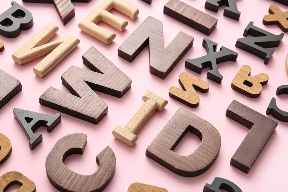
Choosing the right fonts is not just a design decision. For teachers, it is a readability decision, an accessibility decision, and an instructional decision. The fonts used in handouts, slides, classroom signs, worksheets, and digital materials can influence how easily students scan text, recognize letters, and stay engaged with what they're reading. Good font choices help materials feel clearer and more usable. Better font choices can also support diverse learning needs and make instruction more inclusive.
The best classroom fonts usually do three things well. First, they prioritize clarity, so letters are easy to distinguish, and text is easy to follow. Second, they support accessibility, which matters for students with low vision, reading fatigue, and other learning needs that make dense or ambiguous text harder to process. Third, they support engagement, because materials that feel approachable are easier for students to enter across age groups.
That is why teachers should know a small group of dependable fonts rather than treat all fonts as interchangeable. A readable, well-matched font can make instructional materials more effective. A poor choice can make the exact same lesson feel cluttered, intimidating, or harder to decode.
Key takeaways
- The best fonts for teachers prioritize clarity, accessibility, and student engagement across age groups.
- Choosing the right fonts improves readability, supports diverse learning needs, and makes instructional materials more effective and inclusive.
- Atkinson Hyperlegible is especially useful when character distinction and low-vision accessibility matter.
- Lexend was developed around the idea that typography can reduce visual stress and support reading fluency.
- Open Sans is a strong general-purpose classroom font because of its neutral, readable design.
- Source Sans 3 is well suited to slides, digital materials, and clean instructional layouts.
- Comic Neue can work well in early literacy materials because it feels friendly while keeping letterforms more consistent than rough handwritten fonts.
- Tools in Adobe Express for Education can help teachers apply strong font choices consistently across worksheets, posters, presentations, and PDFs.
What makes a classroom font a good choice?
A good classroom font should be easy to read quickly and repeatedly. That means clear letterforms, steady spacing, and shapes that don’t collapse into one another at smaller sizes. It also means the font should suit the context. A playful early-reading worksheet and a high school research handout don’t need the exact same tone, but both need readability.
Teachers should also think in terms of instructional fit. Some fonts are better for long passages. Some work better for headings and slides. Some are especially useful for accessibility. The goal isn’t to find one perfect font for every task. The goal is to know which fonts are dependable for which teaching situations.
Which fonts should teachers know?
Here are five examples
1. Atkinson Hyperlegible for accessibility and distinction
Atkinson Hyperlegible was created by the Braille Institute to improve legibility for readers with low vision. Its design emphasizes character distinction, with special attention given to commonly confused forms such as O and 0 or 1, I, l, and i. The Braille Institute also expanded the family in Atkinson Hyperlegible Next, adding more weights, broader language support, and variable options.
For teachers, this is one of the most useful fonts to know when accessibility matters. It can be especially helpful in reading supports, accommodations, clear-print handouts, and digital materials intended to reduce visual confusion.
2. Lexend for reading comfort and fluency support
Lexend was developed around the idea that typography can be adjusted to support easier reading and reduced visual stress. The project describes the font as a variable system designed to improve reading proficiency by giving readers forms and spacing that better match their needs.
For teachers, Lexend is worth knowing because it’s often discussed in relation to readability, reading comfort, and student-facing materials. It can be a strong choice for digital reading passages, intervention resources, and classroom materials where ease of sustained reading matters.
3. Open Sans for all-purpose classroom clarity
Open Sans is one of the most dependable all-purpose fonts teachers can use. Google Fonts describes it as a humanist sans serif designed by Steve Matteson, and that humanist structure helps give it a clean but approachable feel.
In practice, Open Sans works well because it’s neutral, highly readable, and flexible. It performs well in handouts, instructions, newsletters, learning platforms, and long passages of classroom text. If a teacher wants one safe, readable default for mixed-age instructional use, Open Sans is a strong candidate.
4. Source Sans 3 for digital lessons and clean design
Source Sans 3 is Adobe’s open-source sans serif family, designed by Paul D. Hunt. Google Fonts notes that it was intended to work well in user interfaces, and that strength carries over into educational use.
Teachers should know Source Sans 3 because it performs especially well in slide decks, digital assignments, online instructions, and visually clean classroom layouts. It feels modern without becoming distracting, which makes it useful for secondary and adult-learning contexts as well as general classroom design.
5. Comic Neue for early literacy and approachability
Comic Neue is a polished redesign of comic-style lettering that keeps a friendly, handwritten tone while improving consistency and readability. That makes it useful in early literacy materials, phonics supports, classroom labels, and beginner worksheets.
Its value is not just that it looks playful. It also helps younger learners by making the page feel more inviting. For teachers working with emerging readers, that emotional tone can support engagement without sacrificing order.
How can teachers choose the right font for the right job?
Use this quick checklist:
- For accessibility needs: Choose Atkinson Hyperlegible.
- For reading comfort: Consider Lexend.
- For everyday handouts and general use: Use Open Sans.
- For slides, digital lessons, and clean layouts: Use Source Sans 3.
- For early literacy and welcoming beginner materials: Use Comic Neue.
- For long reading passages: Prioritize simple sans serif fonts with clear spacing.
- For younger students: Use fonts that feel approachable without becoming messy.
- For older students: Use fonts that are clean, neutral, and distraction-free.
The following statistics reflect the importance of font choice for learners:
- Child font fit can make a big difference: In a 2024 study of students in grades 3–5, the average gap between a child’s best-fitting font and worst-fitting font was 101 words per minute, with no reading-comprehension tradeoff observed.
- Personalized font settings can improve understanding: In a 2023 study of K–8 readers, children achieved 18.4% higher comprehension accuracy in their personal best font variation than in their personal worst variation.
- Typeface choice can improve fluency: A study of low-progress readers found they read 75.7 vs. 70.4 words per minute — about 7% faster in Dyslexie than in Arial when matched on display size.
How can you use fonts well in teaching materials?
Here are 7 essential steps
Step 1: Choose for readability first
A decorative font may look appealing in isolation, but if students have to work harder to read it, it’s the wrong choice for instruction.
Step 2: Match the font to the age group
Younger learners often benefit from fonts that feel warmer and more approachable. Older students usually benefit from fonts that feel clean and direct.
Step 3: Limit the number of fonts
Most classroom materials work best with one font for body text and one for headings. Too many fonts can make a page feel unstable.
Step 4: Use strong contrast
Even the best font loses value if the text blends into the background. Dark text on a clean light background is usually the clearest option.
Step 5: Keep spacing generous
Readable fonts still need a good layout. Use enough line spacing, paragraph spacing, and margin space so the page doesn’t feel crowded.
Step 6: Stay consistent across materials
When teachers use the same readable fonts across handouts, slides, and posted materials, students get a more stable visual environment. Adobe Express can help by making it easier to reuse templates and maintain consistent type choices across formats.
Step 7: Test with students
The most reliable test is real classroom use. If students scan, track, and respond more easily with one font than another, that evidence matters.
Best practices for classroom fonts
- Choose fonts for clarity before style.
- Use accessible options when student needs call for them.
- Keep layouts simple and uncluttered.
- Reuse dependable fonts across classroom materials.
- Use tools like Adobe Express PDF export features to carry readable design into printable and shareable materials.
Quick font choice checklist
✅ Use Atkinson Hyperlegible when accessibility and character distinction matter.
✅ Use Lexend when reading comfort is a priority.
✅ Use Open Sans for dependable all-purpose readability.
✅ Use Source Sans 3 for slides and digital materials.
✅ Use Comic Neue for early literacy and child-friendly materials.
✅ Keep contrast high and layouts uncluttered.
✅ Use consistent fonts across worksheets, posters, and presentations.
✅ Test your materials with real students before standardizing them.
The best fonts for education are the ones that help students read more easily, support diverse learning needs, and make instructional materials clearer and more inclusive. When teachers choose fonts intentionally, the page becomes easier to enter, the lesson becomes easier to follow, and the classroom becomes more accessible for more students.