



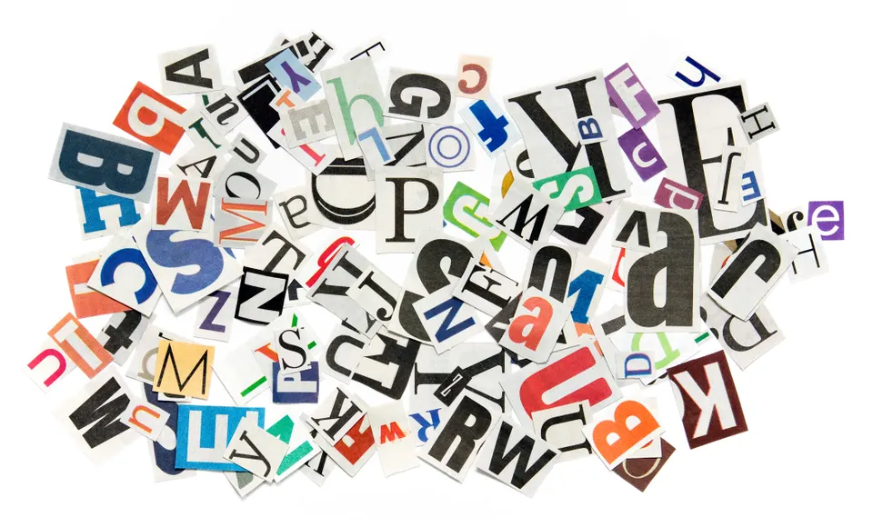
Just like with an image, illustration, and color choice, visual judgments from typography happen in a matter of seconds. Type is one of the dominant visual cues that determines whether you think something is credible or how you comprehend something.
Before a student reads a sentence, or a customer registers a claim, their brain has already started to weigh whether or not something is worth their time. These judgments happen in a snap and influence everything from comprehension to credibility, and even engagement.
Key takeaways
- Typography is a dominant visual signal, so font choices affect how information is received before meaning is consciously processed.
- Typeface, spacing, and hierarchy affect cognitive load, so clear, well-structured typography supports faster reading and better comprehension.
- Serif and sans serif fonts communicate different psychological cues. Serif fonts tend to be more traditional while sans serif fonts tend to be more modern.
- Typography plays a role in perceived trust and professionalism, and clear, consistent type works best.
What is the psychology of font?
The psychology of font refers to how letterforms affect our thoughts, feelings, and behavior as well as cognitive load — how hard something feels to read. More specifically, type also influences perceived trust and credibility, whether something is warm, playful, authoritative, or serious, and behavioral outcomes like retention, engagement, and action.
Depending on typography, the same words can feel accessible versus intimidating, modern versus outdated, or trustworthy versus suspicious. This is amplified in digital environments where people scan before they read.
How the brain interprets type: serif versus sans serif
Of the roughly five basic classifications of typefaces, serif and sans serif are used for body copy and headlines. Script and display are only used for headlines, and monospaced is generally used for displaying code.
A serif is a small, decorative line or stroke (sometimes called tails or feet) that finishes off a letter. So, fonts without these lines are sans serif. Serif typefaces — like Times New Roma, Garamond, and Georgia — are often associated with academic rigor, formality, and credibility. Because they resemble traditional print materials, they’re best used for educational handouts, long-form content, and high-trust communication.
On the other hand, sans serif — like Helvetica, Arial, and Calibri — signal simplicity, modernity, and accessibility. Since these are easier to scan on screens and are perceived as more approachable, they’re best for presentations, marketing materials, and social and mobile content.
Designing for learning and engagement
When applying typography psychology, you first need to define your audience (students, customers). Next, figure out the emotional goal — do you want to build trust, excitement, clarity, etc.? Once you know your direction, you can choose the type that supports that goal.
Typography in education
The right font accelerates reading speed, encourages attention, and reduces perceived difficulty, and educators should take this into consideration. Clear typographic hierarchy of headings, spacing, and contrast helps students understand structure before fully processing meanings. In contrast, poor typographic choices increase cognitive load, which makes learning feel harder.
The bottom line is that typography prioritizes clarity and intention over decoration.
Typography in marketing
In marketing, fonts can indicate brand personality, quality, and credibility as an emotional shorthand. A well-written message is only part of the package — typography is what completes everything. A single font change can affect time on page, click-through rates, and engagement.
Quick typography do’s and don’ts
- Do establish a typographic hierarchy by defining a variety of factors like size, weight, color, and contrast.
- Do use the right font for the body text so that it’s legible (remember sans serif may be easier to read in long form and on screens)
- Do keep your fonts to no more than two or three. Even though there are so many great fonts out there, if you use too many different ones on one page, it’ll be confusing.
- Don’t crowd your text. If you give your text room to breathe, it’ll be easier to read. Increase your line-heights so it’s easier for the eye to track from line to line.
- Don’t ignore contrast between your text and the background. Low contrast hurts readability.
People judge visual communication almost instantly, and typography plays a role in that snap judgment. With Adobe Express, you get access to curated font pairs that support clear hierarchy and spacing. Even more, you can remix templates that have already been optimized for readability and engagement.


