Why you need brand guidelines (plus how to create them in three easy steps)

We scroll mindlessly past hundreds of messages every single day and only remember a fraction of what we see. Your consumers are the same way. They’re speed-reading articles, scanning emails, and quickly scrolling through their apps without thinking about who is feeding them this content.
So how do you get users to truly pay attention? A great brand guide can be your magic wand. Here’s what you need to know to create your own.
Summary/Overview
What are brand guidelines?
Brand guidelines, also known as a brand style guide, are the set of rules that define the overall look and feel of your brand. They help you build a brand identity that your audience can recognize across all platforms.
A comprehensive brand style guide outlines everything from your typography and color palette to your tone of voice and mission statement. By doing so, it provides all of the instructions you need to communicate the right messages in the right manner every time you create marketing materials for your company.
The result? The messaging you create feels connected.
Why brand guidelines matter?
Creating an attractive Instagram grid is always a plus, but using a brand manual can help you do far more than become follow-worthy. We’re talking real, measurable results that will make any boss happy (especially if that boss is you).
Here are five reasons to put brand guideline creation at the top of your to-do list:
1. Consumers respond to consistency
Brand consistency is a big money-maker. When you use the same branding guidelines across your marketing collateral — including your blog posts, social media posts, and Google ads — you can increase your revenue by as much as 23%.
The power of consistency comes from the fact that repetition drives brand recognition. Just using the same brand color scheme can greatly increase the amount of consumers who can identify you, so when all of your brand elements come together, you can expect results.
Take a look at this Instagram feed for example:
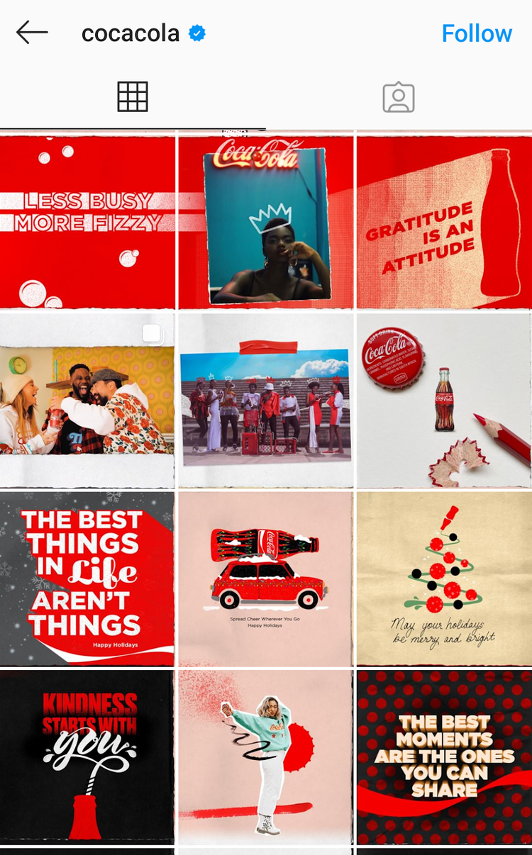
Without even looking at the handle, you could immediately identify the brand as Coca-Cola. The massive soft drink brand has used the same visual elements for decades — including its cursive font, bottle icon, and classic shade of red — proving the incredible impact of consistency over time.
When you continue doing things by the brand book, your audience’s moment of recognition will come sooner and sooner.
2. Your team will work faster
If you love a tool that does most of the work for you, you’ll love a brand style guide. Setting brand identity guidelines is an easy way to send your marketing efforts in the right direction before the ideation even starts.
When the brainstorming begins, these brand standards can quickly help you narrow down your best options, all while avoiding an opinion-based debate among team members, not to mention extra meetings. Decision-making is sped up, and your team doesn’t get into a fist fight — it’s a win-win.
3. Your brand becomes more tangible
Every company has a brand, but some are much more clearly defined than others. When your brand isn’t concrete, you’ll end up being defined by your product or service, which doesn’t create the strongest impression.
With brand guidelines, you can pull together all the elements that establish an identity beyond what you sell. As a result, your customers will understand what you stand for when they hear your name.
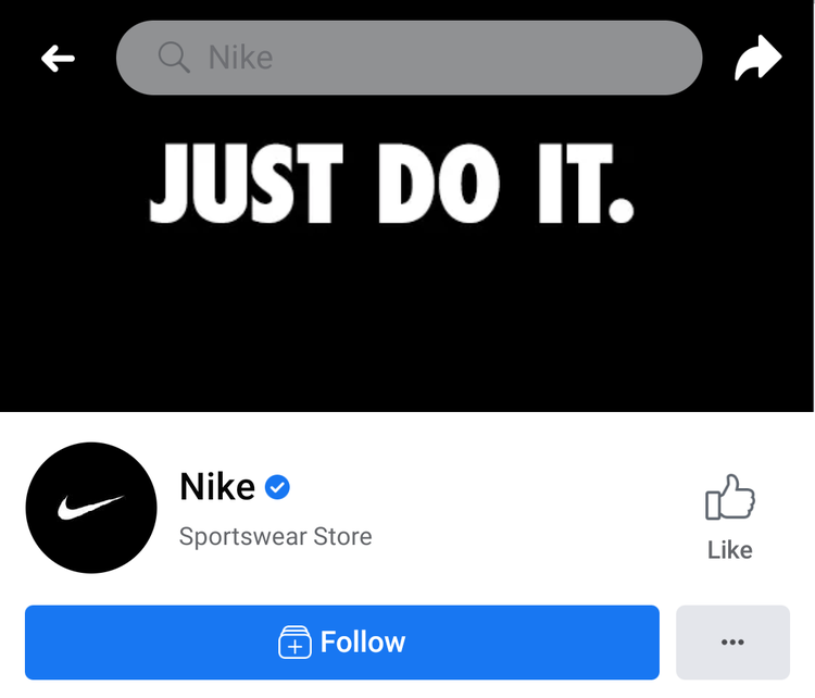
Think of Nike, for example. Just one look at its iconic swoosh and inspirational tagline on Facebook, and you know what business page it is.
As we continue to live much of our lives online, having a concrete visual identity is more important than ever. Since the relevance of image search is rising, more people are discovering brands on search engines through visuals alone.
To boost your image SEO, you need to use high-quality, wholly unique, and branded templates that people want to share. As your visuals get more engagement and shares — especially on keyword-rich platforms like Pinterest — your recognizable brand visuals will get more hits on image search, along with your website.
4. You’ll stand out from the crowd
Most of us spend more time than we care to admit on the internet, so we know the heaps of content marketing you see can start to blend together. But when your audience sees a clearly consistent brand theme, they’re bound to pay attention at least once.
A consistent brand voice is exactly what’s made Wendy’s tweets go viral. Their followers have come to expect the brand to have the best comebacks for just about any situation.

Whether you commit to a sassy brand personality or a friendlier tone of voice, staying within your own brand guidelines can help you boost brand awareness, and become a brand that people want to hear from.
5. Great branding boosts loyalty
When people become loyal customers, it’s not just because of a product or service. Think about ridesharing companies, for example. Uber and Lyft provide nearly identical services — often sharing the same drivers — and yet many users have a preference. Branding plays a strong role.
Consumers develop emotional connections with companies that share the same core values. And your brand guidelines help you translate those values to your audience in a unique way. When you gain a loyal customer, they’ll spend 67% more than new buyers.
3 steps to build your brand guidelines
At this point, it’s clear that brand guidelines are necessary, so how do you get started? Here are three steps to set up your visual identity with the help of Adobe Express.
1. Create a logo
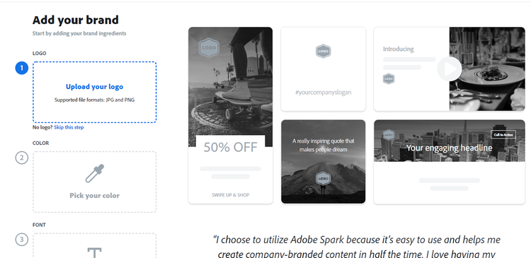
Your logo is central to your visual identity and helps customers quickly identify your brand. When fleshing out your basic brand guidelines, one of the first steps is settling on a logo.
You can use Adobe Express to experiment with different icons, fonts, and colors until you have a few options to decide from. Then, select the one that best reflects how you want your brand to be perceived.
When your final design is ready, head to the “Brands” section of your account to upload your logo, so it can be automatically added to all your designs
2. Select your brand color
Another key aspect of your visual identity is your primary brand color. This color is easy to select, since it’s typically the most prominent shade used within your logo.
You can complete the next part of your Adobe Express brand guidelines by selecting the overarching color that will take the spotlight in your branded graphics. If you’ve already uploaded your logo, Adobe Express will automatically suggest colors from your design, so you don’t have to worry about finding the correct shade.
3. Choose your fonts
All of your brand’s text should follow a consistent style. You’ll want one primary font that you’ll use on all your headers and across all designs.
Once you plug your selected font into the last step of your “Brands” section, you can tap “Apply brand” on any Adobe Express template to instantly align your design with your company’s brand.
Common branding mistakes to avoid
1. Inconsistent logo use
Your logo is the face of your brand, so it should show up uniformly across platforms. If it doesn’t, it’ll become less recognizable. Some common mistakes include:
- Using multiple variations of the logo that aren’t in the official brand guidelines.
- Stretching, distorting, or altering the logo’s proportions.
- Placing the logo on backgrounds that reduce readability.
2. Using too many fonts and colors
A cohesive visual identity relies on a carefully chosen color palette and typography. However, some brands fall into the trap of:
- Constantly changing fonts in marketing materials.
- Adding colors that aren’t part of the brand identity.
- Using clashing color combinations that reduce readability.
3. Ignoring brand messaging consistency
A strong brand isn’t just about visuals, it’s also about the words you use. Some businesses make the mistake of:
- Shifting between casual and formal tones in different communications.
- Using inconsistent taglines or mission statements.
- Failing to align messaging with brand values.
More brand elements to consider
Once you’ve developed the basic look and feel of your brand, you’ll want to ensure all your content aligns. Follow these three steps:
1. Deepen your visual identity
Your brand guidelines don’t have to stop at defining your primary look. Here are a few more visual elements to consider:
Color palette
Maintaining a consistent brand color palette is one of the easiest ways to help your target audience identify you. Beyond a primary color, most brands have a palette of one to four additional colors that can be used within each graphic.
The color palette you choose makes a big difference in the look and feel of your brand. Consider these otherwise identical event graphics, for example:


The colors in the first graphic do a better job of conveying a fun, bold brand. The second, on the other hand, is a bit softer and more understated. Neither is wrong, but the images definitely have different effects.
Pro tip: Use the Adobe color wheel to select a palette that doesn’t clash.
Typography
You may already have a primary font, but most brands also have secondary typefaces for subheads and smaller text. It’s important to stick with two fonts, at most — and avoid having more than three.
Your brand style guide should also create rules for your font colors, text sizes, and letter spacing. Plus, think about whether or not you want to allow bold or italicized fonts, and, if so, on what occasions.
Secondary logo designs
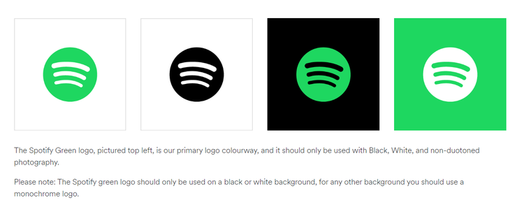
Beyond your primary logo, you can also create several variations of your logo design. For example, Spotify’s full logo includes its icon and company name in green, but the company also includes some text-free designs in its brand guidelines with acceptable color variations.
While your full logo should be used whenever possible, having some set variations will help you integrate your branding into different designs. A square logo variation is particularly useful for keeping your profile pictures across social media channels consistent.
Defining use cases for each logo variation also helps you stay consistent.
Visual elements
Finally, you’ll want to add brand guidelines for what your visual elements look like. Does your content primarily include photographs? Illustrations? Animations? Videos? Think about your personal skills, your budget, and the talent you have on your team or in your network before you decide.
Your visual elements should also follow a similar aesthetic, which may require rules for lighting, approved subjects, and more.
2. Decide on your brand message
Your logo alone isn’t going to create customer loyalty. You also need brand guidelines for the messages you send. This is your time to define what you stand for. Here are four easy steps.
Brand mission
If you have a business plan, you probably already have a mission statement that you can add to your brand style guide. If not, your mission statement should be a one-sentence phrase that defines why your brand exists. How do you intend to impact the world and make a difference in your customers’ lives?
Including your brand mission in your brand guide creates a consistent framework for your marketing. If a message doesn’t align with your mission, you know it’s not consistent with your brand.
Brand story
Beyond the brand mission, adding your brand story to your brand book is another best practice. Your brand story is a compelling narrative that explains how your company came to be and where it’s going. Make it a story that your target audience can personally identify with so you start creating an emotional bond.
Core values
Perhaps even more than your brand mission and story, your customers will identify with and emotionally connect with your core values. Choose 3–10 principles or beliefs that drive your company.
Each core value can be as simple as one word (“honesty”) or be a short phrase (“to provide transparency for every customer”), but ultimately should define how your brand interacts with any stakeholder.
Tagline
Once you have all of these elements added to your brand guide, the next step is to sum it all up in a tagline. This should be an extremely simple, yet memorable phrase that’s no more than eight words.
A few catchy taglines that are recognized across the U.S. include:
- “Think different.” (Apple)
- “I’m lovin’ it.” (McDonald’s)
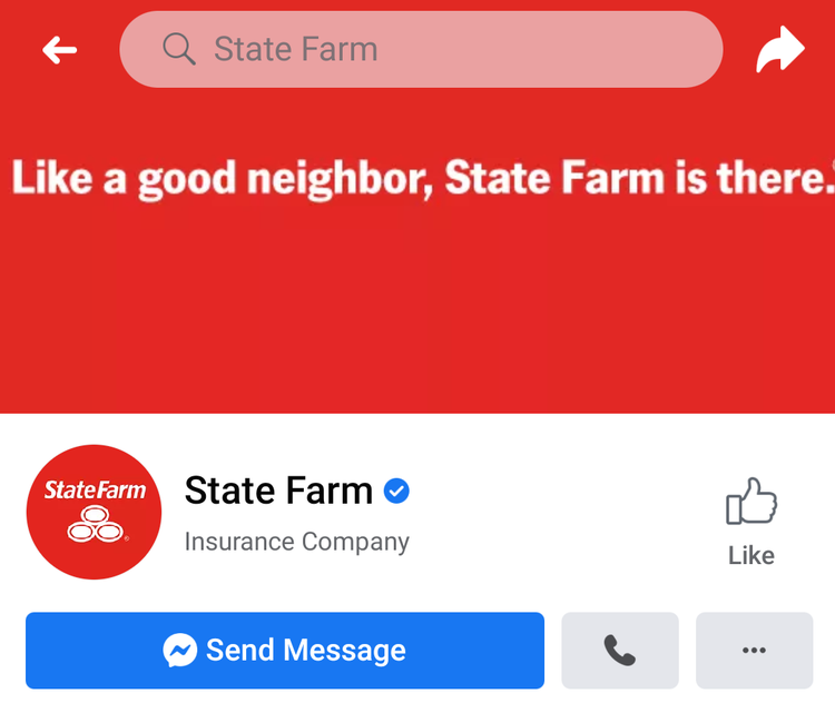
- “Like a good neighbor, State Farm is there.” (State Farm)
3. Create your brand’s personality
You now know what your company looks like and what it stands for. The final step is outlining how you communicate your messages.
Your brand should have a distinct personality that your audience can recognize just by reading your text. Any copy that’s published by your company should essentially read like it’s written by one person — even if you have a team of writers behind the scenes.
It might be helpful to add a brand persona to your guide that describes who your brand would be if it were a person. Consider its likes and dislikes, essential values, and key traits. How does this person interact with others and make friends? What does this person do for work and how do they spend their free time? Creating a character you can imagine can help you put yourself into its shoes and embrace the complete brand personality.
Finally, make sure to define your brand’s voice and tone. Some questions you can consider include:
- What feelings should your content evoke?
- Is your brand more educational or entertaining?
- What words are preferred over others?
- How do you use punctuation to highlight words or phrases?
How to share your brand guidelines
Once you’ve created your brand guidelines, you’ll want to share them broadly throughout your team and beyond. It’s important for everyone on the team to have this reference at their fingertips.
Digital or PDF brand guidelines: Which is better for your team?
When it comes to sharing brand guidelines, there are two main options: a traditional brand guidelines PDF document or a dynamic, digital brand guideline. While both serve the purpose of maintaining brand consistency, they offer very different experiences in terms of accessibility, collaboration, and updates.
1. Accessibility & updates
PDFs are static, meaning every time you make an update, you need to redistribute the latest version. Digital brand guidelines, hosted online, allow for instant updates — ensuring that teams always have the most current information.
2. Interactivity & usability
Unlike PDFs, digital brand guidelines can include interactive elements such as videos, clickable links, and embedded brand assets. This makes it easier for designers, marketers, and partners to quickly access the right resources without searching through pages of a document.
3. Collaboration & permissions
Cloud-based brand guidelines allow teams to collaborate in real time and control permissions, ensuring only authorized users can edit while others can view or comment. PDFs, on the other hand, can be easily shared but lack version control, leading to inconsistencies when outdated files are used.
Which should you choose?
If you need a simple, one-time document, a PDF may suffice. But for growing brands that require flexibility, easy updates, and seamless sharing, a digital brand guideline is the way to go.
Start using Adobe Express to create stunning graphics, web pages, and animations that follow your brand guidelines to a T. When you save your visual identity rules to your account, you’ll be able to customize templates to your brand in just one tap.